Brand Identity Lessons You Can Learn from Marvel Studios

(Guest writer: Manas Chowdhury)

From publishing an artist’s resignation letter on the internet, trademarking the word “zombies”, and now giving a whole new meaning to terms such as Captain, Iron, Thunderbolt, and many others — there is nothing this Studios would step back from. Yes, I am a Marvel fan, and it seems obvious.

However, its amazing graphics, storytelling, and an interesting sense of how regular superheroes can be, are not the only aspects that pull us into the Marvel Universe. In fact, it is more about how they combined it all together to connect with the audience like none of the others in the industry.

Why Proper Brand Design Is Important

Why Proper Brand Design Is Important

Some people think that traditional branding design is becoming irrelevant in the age of social networking, new media,… Read more

Branding Formulas to Live By

Marvel Studios have not only impressed the world with their independent movies but also showed how an ongoing narrative is done in the right manner. Through this ongoing narrative, a brand like never before has taken its place in the cinema industry.

Read more: How Marvel Went to Bankruptcy to Billions

“Just because something works, doesn’t mean it can’t be improved.” — Shuri, Black Panther

Up until the year 2019, Marvel Studios had enjoyed a commercial success worth $14 billion through 21 consecutive, top-ranking movies in the course of 11 years. Starting with ‘Batman and Robin,’ the entire Marvel universe has been disrupting the industry which was presumed extinct as per some of their competitors.

Speaking of competitors, I understand that many of the cinematography enthusiasts have a question: with DC’s characters being more recognizable as compared to the Marvel characters, why does MCU (Marvel Cinematic Universe) hold 1st place commercially and in overall success? The answer is its branding approaches.

Taking (Calculated) Risks

We have come across this phenomenon a lot of times in our lives, but to understand it a bit deeper — and inaction — let us see what Marvel Cinematic Universe has to portray. Here are some calculated risks which were taken by Marvel Studios:

  • Even with the ‘The Incredible Hulk’ leading MCU to the bench, the company did not change its course from highlighting Avengers.
  • Some viewers may not understand — and do not — understand the Marvel universe if they step in at a random movie without knowing the backstory of characters and plots. However, that did not stop MCU from creating storylines from the very beginning.
  • Attempting to bring change through a genre exploration and bringing action comedies, ‘Ant-Man’ and ‘Guardians,’ into the universe.

Having said that, Marvel Cinematic Universe made sure that these risks were not an impulse or a hunch, but a calculated path towards exploration. Take it from MCU, taking risks does not have to be a hasty decision.

Instead, a careful and well-researched risk can take the brand places you would not imagine.

Read in detail: What You Can Learn from the Marvel Cinematic Universe About Taking Risks

Being the First

Okay, be it the first one to ask a question in a class or the first one to build the Wright Flyer, it will always have its pros and cons. For instance, Apple did not act promptly on launching mp3 players, but the iPod was certainly worth the wait. On the contrary, Samsung amused us all by being the first one to launch flip phones but did not see success at its best.

Having said that, the Marvel Cinematic Universe has managed to do it all. Not only is Marvel Studios the first one to create interconnected movies, but it has managed to do it right in all manners.

Following the MCU, Warner Bros’ DC Comic Studios and Universal Pictures have also given their shot at creating a universe out of their movies and series. While DC did it effectively, Universal Pictures tried to force-feed the viewers with sequels at a lighting speed, giving them no time to get invested in a character or plot.

All in all, Marvel Studios is a brand you look up to when you want to combine promptness with effective storytelling and patience and create a brand up to similar standards.

Understanding the Importance of People
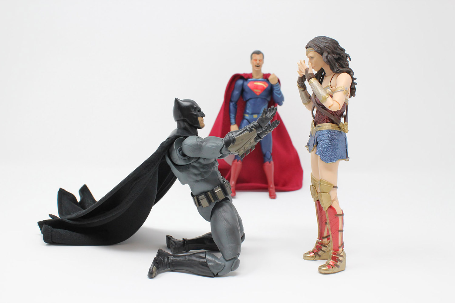
importance of people

With time, entrepreneurs, hiring managers, and brand managers understand that products, increasing sales, and customers are not all the ingredients when it comes to brand fruition. However, you can be a brand that understands the importance of people but undervalues them all the same.

If we zoom in on the Marvel Cinematic Universe, we will notice that their key is not to simply hire talented people, but also to keep them and enrich their talent for the greater good of everyone: the people as well as the brand.

The universe did not only lock in some on-screen actors but also does the same with the off-screen people involved in the entertainment industry. On the other hand, Warner Brothers face struggles in engaging the viewers with the same artist for more than 3-4 years.

I understand, to this approach, many hiring managers might come across a concern that this can lead to missing out on fresh talent and create a monotonous environment, especially in the entertainment industry. However, the Marvel Cinematic Universe has successfully proven that it is not true.

You can work with the same employees and achieve growth at the same or higher rate without having to go through the hiring trouble every 2 years. All you have to do is align your teams’ goals with your brand and ensure that it benefits every member of the company.

Working on Brand Consistency

Beating its competitors at Brand Linkage score, Marvel Cinematic Universe indicates more consistency than any other brand. For instance, even with a better character arc(s), DC’s inconsistent character connections led to a decrease in audience engagement.

The company takes brand consistency under its to-do lists and has not removed it for more than 10 years; including promotions, designs, characters, and trailers.

Related: Marvel Brand Identity Spotlight — Step by Step Design process

I would like to highlight that you need not be a well-established brand such as Marvel Studios to give attention to consistency. Even as a budding brand or startup — especially as a budding brand or startup — you need to make sure that your brand is memorable and recognizable, which cannot be achieved without being consistent with your marketing, product packaging, designs, and other aspects of branding.

Becoming a Brand Like Marvel

Firstly, no, it will not be easy; but no, it is neither impossible. The key is to understand that with the world having access to almost everything through the internet — what your brand does, what it stands for, who works for it, what others have to say about it — every tiny detail matters.

Read also: 5 Steps to Building a Strong Brand Identity When the Game is Constantly Changing

Even with Marvel Studios, if something as impactful as backstory needs attention, so do the silly jokes and callbacks of the same jokes. In fact, this is what helped MCU build a web of characters that is interesting and relatable, all while being a superhero. For instance, Captain America was an orphan, insecure kid who had an urge to prove himself.

Similarly, Black Panther turned out to become an orphan in adulthood, overcoming his demons to become a better man. Both these leaders are adored because the audience sees themselves in those capes.

Similarly, your brand needs to be relatable, inspiring, and consistent to reach its fullest potential. You may not have superheroes doing it for you, but being authentic, transparent, approachable, motivated, and innovative are some powers you and your brand will always have, and fly using the same to reach the peak.

(This guest post is written by Manas Chowdhury for Hongkiat.com. Manas is a Digital marketing enthusiast with a PG in Economics and a specialization in Finance. He is an entrepreneur who has a keen interest in stocks, bullions, gaming, and blockchain technology. While he runs his own startup, he also enjoys writing on a variety of topics and being a philanthropist; he is also involved in various activities contributing to the betterment of the environment and society. You can connect with Manas on LinkedIn.)

(Image Credit: Unsplash)

The post Brand Identity Lessons You Can Learn from Marvel Studios appeared first on Hongkiat.

Did you miss our previous article…
https://www.1clanek.info/?p=483

Beautiful Landing Pages (Tips and Examples)

(Guest writer: Laura Moisei)

Hundreds of witty articles have been written around the topic of landing pages. We all know the basic facts – that these are the pages a visitor reaches after clicking on a banner ad or a promotional link, and that they play a crucial marketing role by converting leads into customers for the business. When it comes to designing a landing page yourself, however, matters seem to be far more delicate than you would have expected after going through how-to documentation. This is why today, we have chosen to share a collection of actual landing page examples for inspiration.

According to a pretty scholarly classification you may find in Wikipedia, landing pages fall into two major categories: reference and transactional. If they are to be called a reference, pages have to display information that is both appealing and relevant to the visitor (text, multimedia). “Transactional” landing pages are the ones that aim at immediate sales or at least in capturing strong sales leads.

As you will probably agree with me, all landing pages meet both criteria: they inform the visitor upon the offer as well as incite actions from his side. Otherwise, we wouldn’t need calls-to-action on absolutely any landing page, would we?

What needs to be clear before launching any landing page in the www is the nature of the desired visitors’ action. Is increasing newsletter signups your goal? Then design a CTA with the message “Signup now to our newsletter”. Do you aim to have trial purchases from visitors? Say so. Generally speaking, the essential recipe is to make your landing page express this offer as clearly and as enticingly as possible.

Coming Soon Pages & How to Do Them Right

Coming Soon Pages & How to Do Them Right

For a coming soon page, all upcoming websites can ever do is to show an empty screen with… Read more

Tips for Designing a Landing Page

Some quick tips to start from when designing a landing page:

1. Use the AIDA principle

This is a chain of events that we desire to happen once a lead reaches the platform displaying the promoted product or service. Mainly, the steps are:

  1. Awareness – attract attention from the visitor
  2. Interest – which can be aroused by highlighting the benefits to the customer
  3. Desire – induce in customers the idea that they want the product or service
  4. Action – customers performing the purchase process
2. Not too many distractions; leave A way out

The idea is simple. If the landing page has virtually no navigation option except for the CTA button, visitors will force their exit. Don’t think that if you don’t provide any navigation, they won’t find a way to leave – they will, maybe even by shutting down the browser. And these visitors will not come back.

3. Make it pass the blink test

Typically, a landing page has to catch the visitor’s attention in the first 3 seconds of entry. If the guest blinks, and can’t see clearly what he should find on the page or isn’t interested with what he saw, he is most likely to bounce away empty-handed.

4. Don’t create false expectations

The landing page has to be consistent with the hints provided by the original ad, or vice versa. Visitors have to find on the landing page what they were first promised in the ad they clicked.

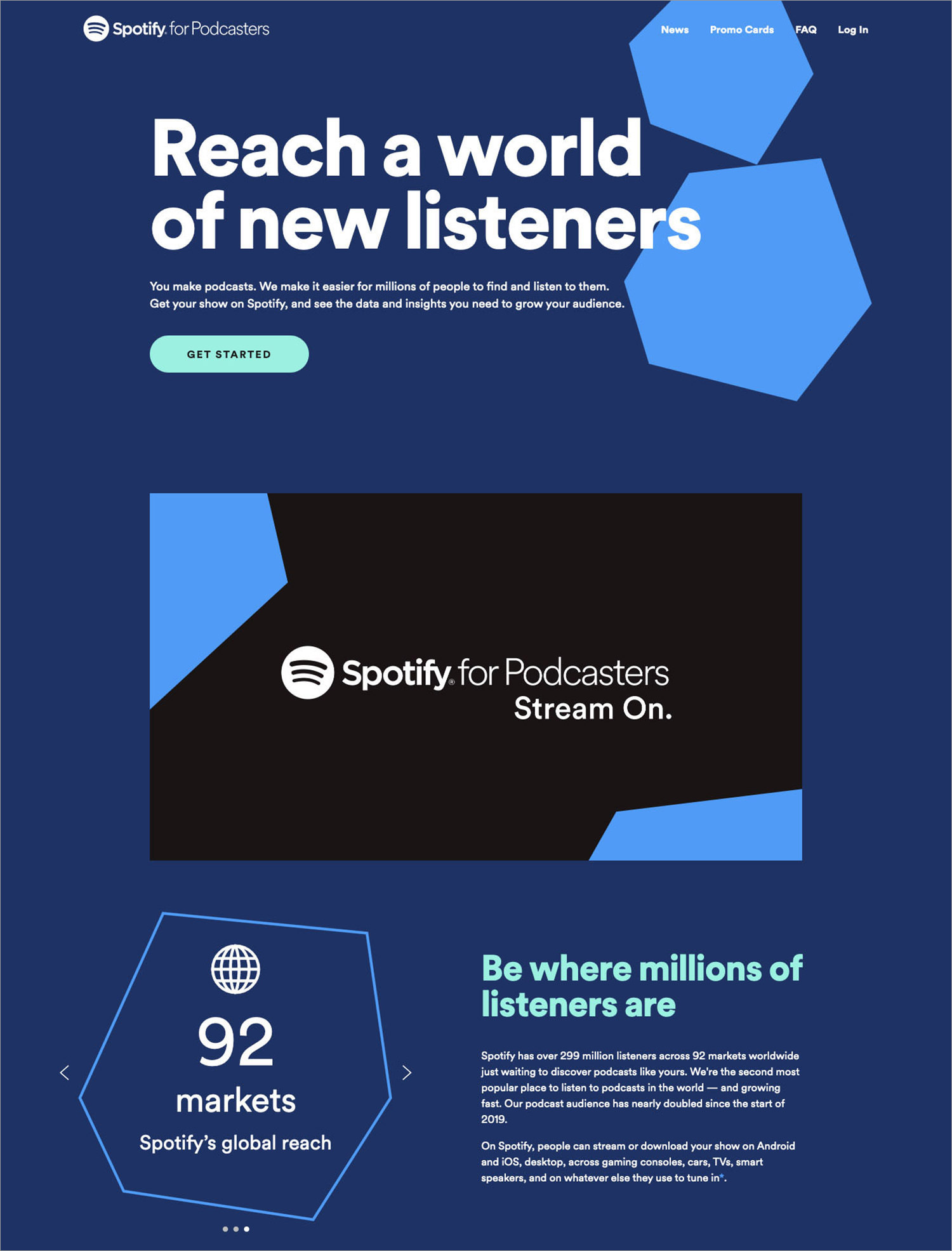
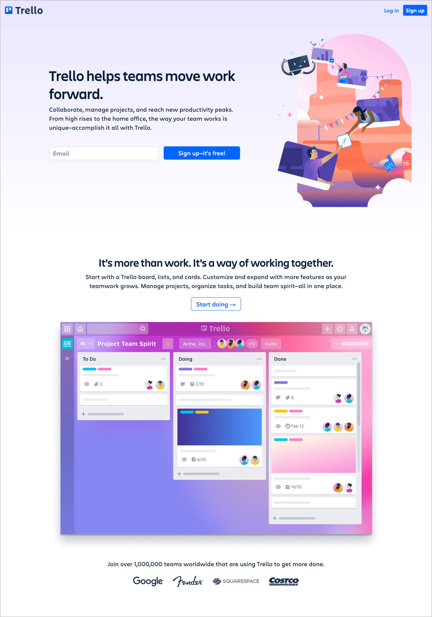
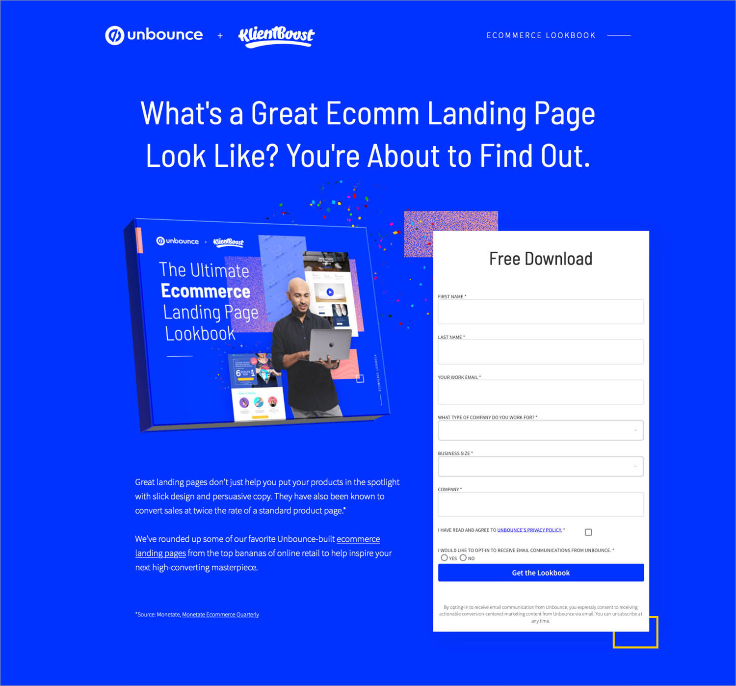
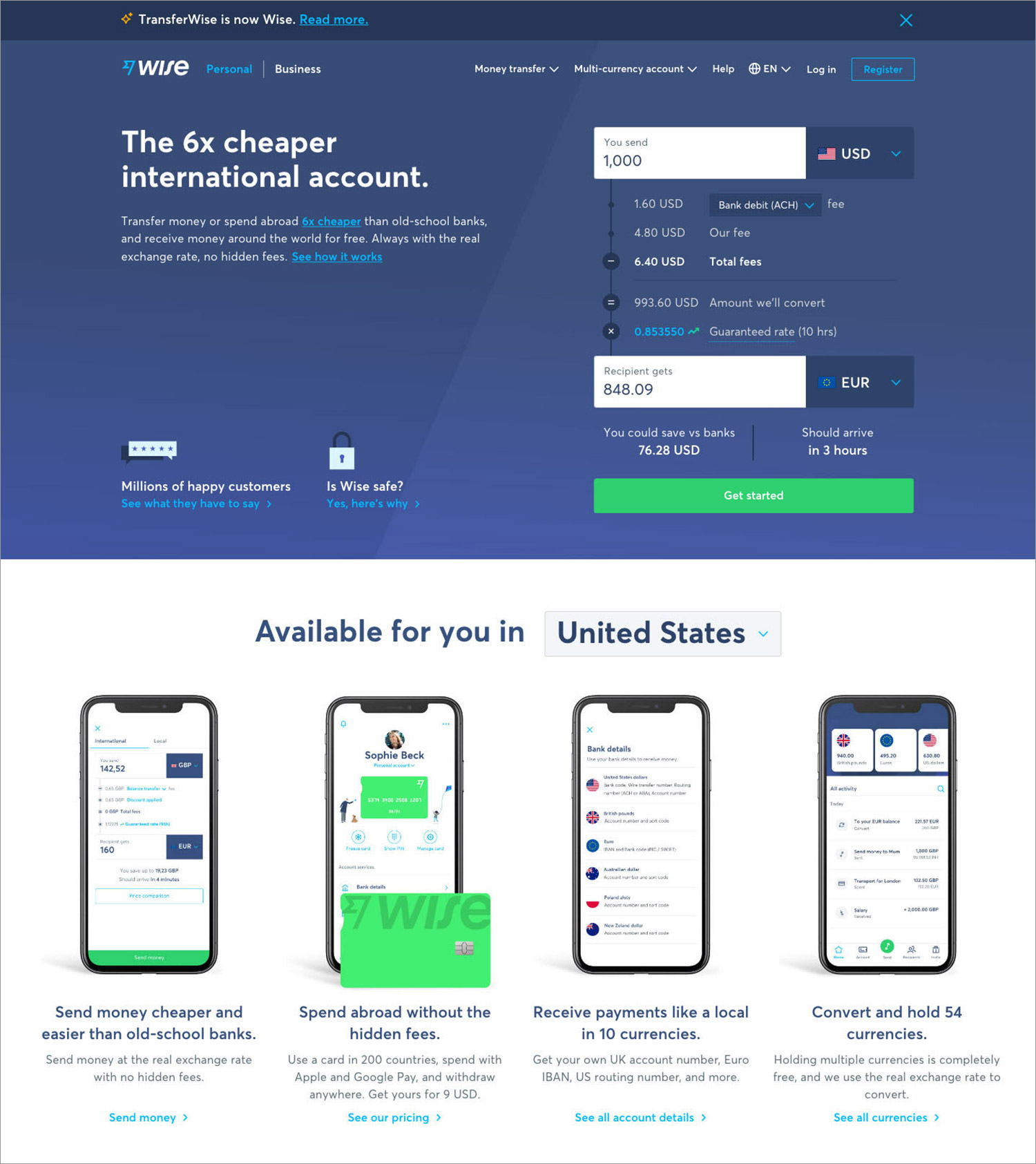
As we have promised, let’s tour some nicely designed and effective landing pages of B2B and B2C. We will explore their strengths and inevitable weaknesses. Watch out for the following in the gallery below: visual communication, branding and trust indicators, content effectiveness, calls-to-action.

Showcase: Beautiful Landing Pages

Click image to view full landing page.

Asana
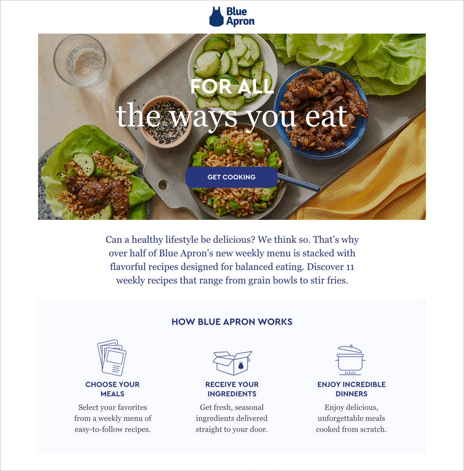
Blue Apron
blue apron
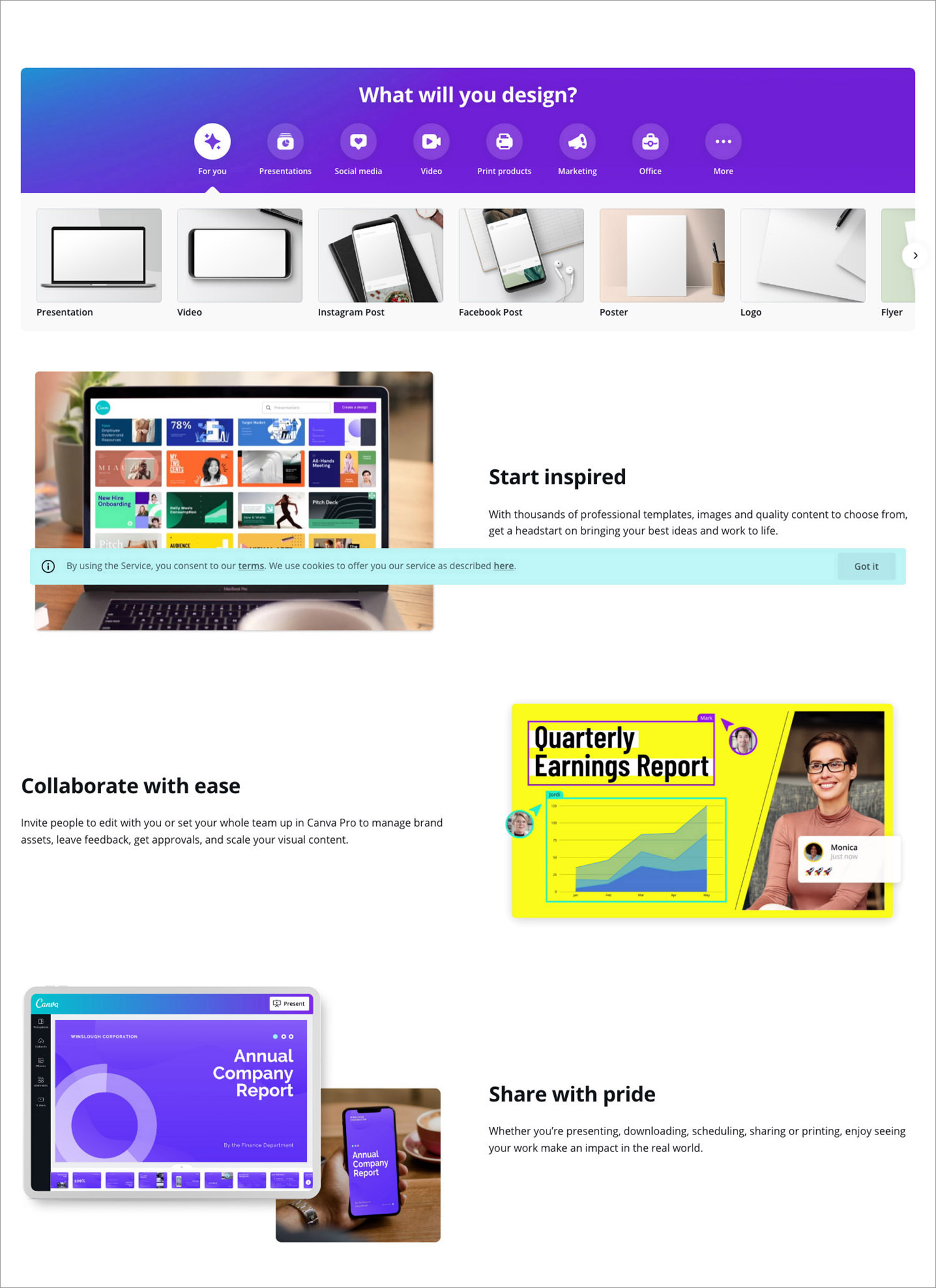
Canva
canva
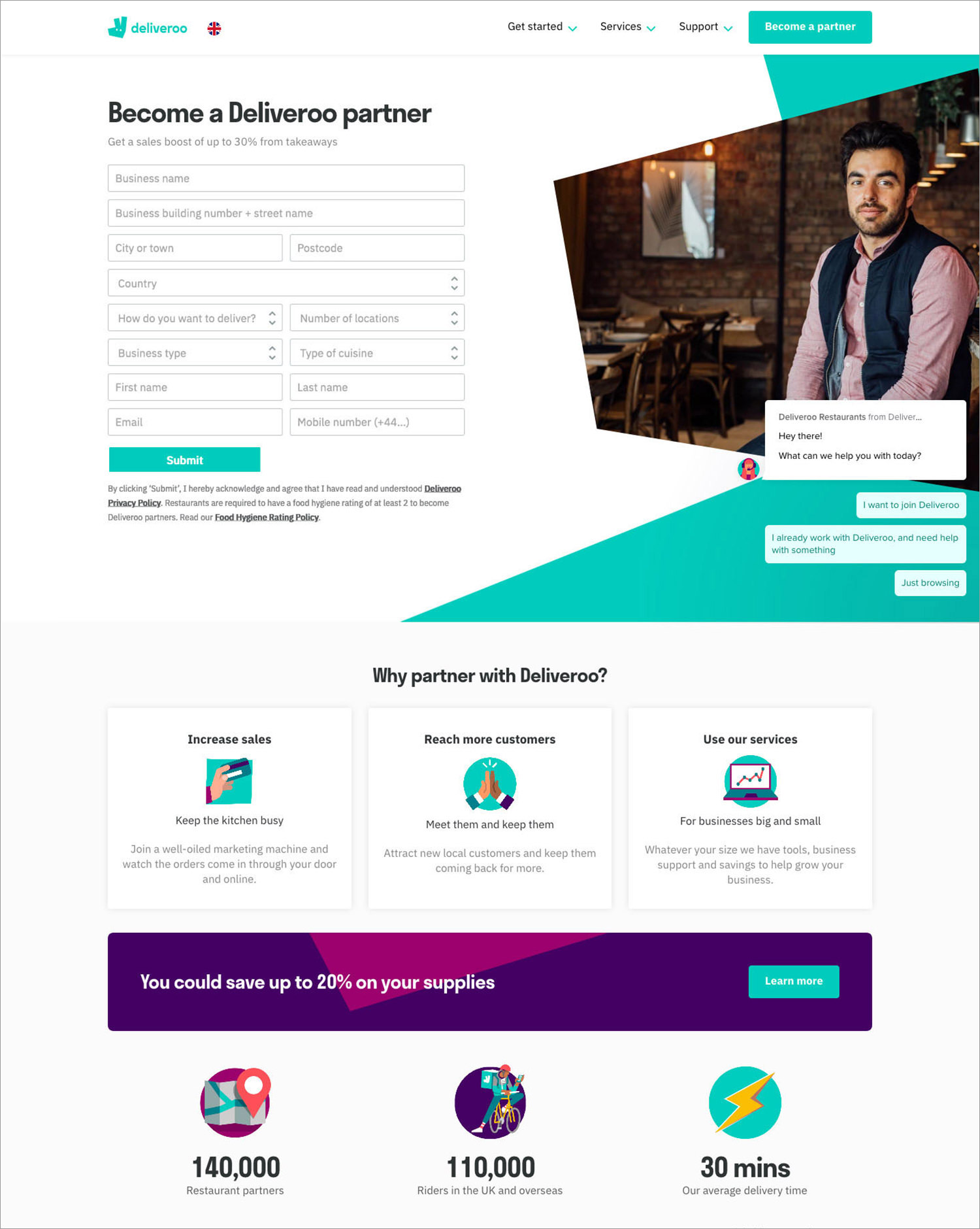
Deliveroo
deliveroo
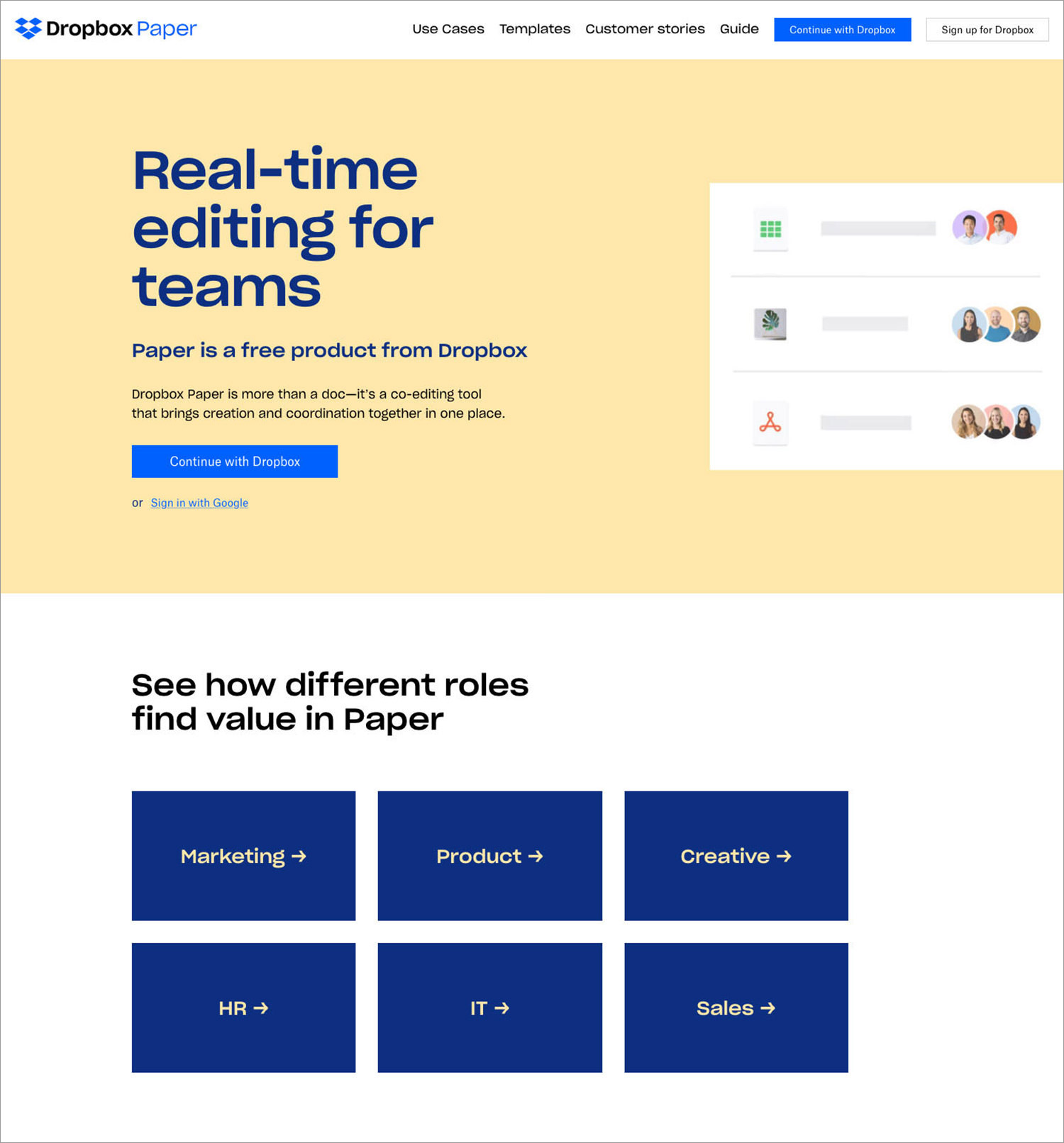
Dropbox Paper
dropbox paper
Spotify
spotify
Trello
trello
Unbounce
unbounce
Wise
wise
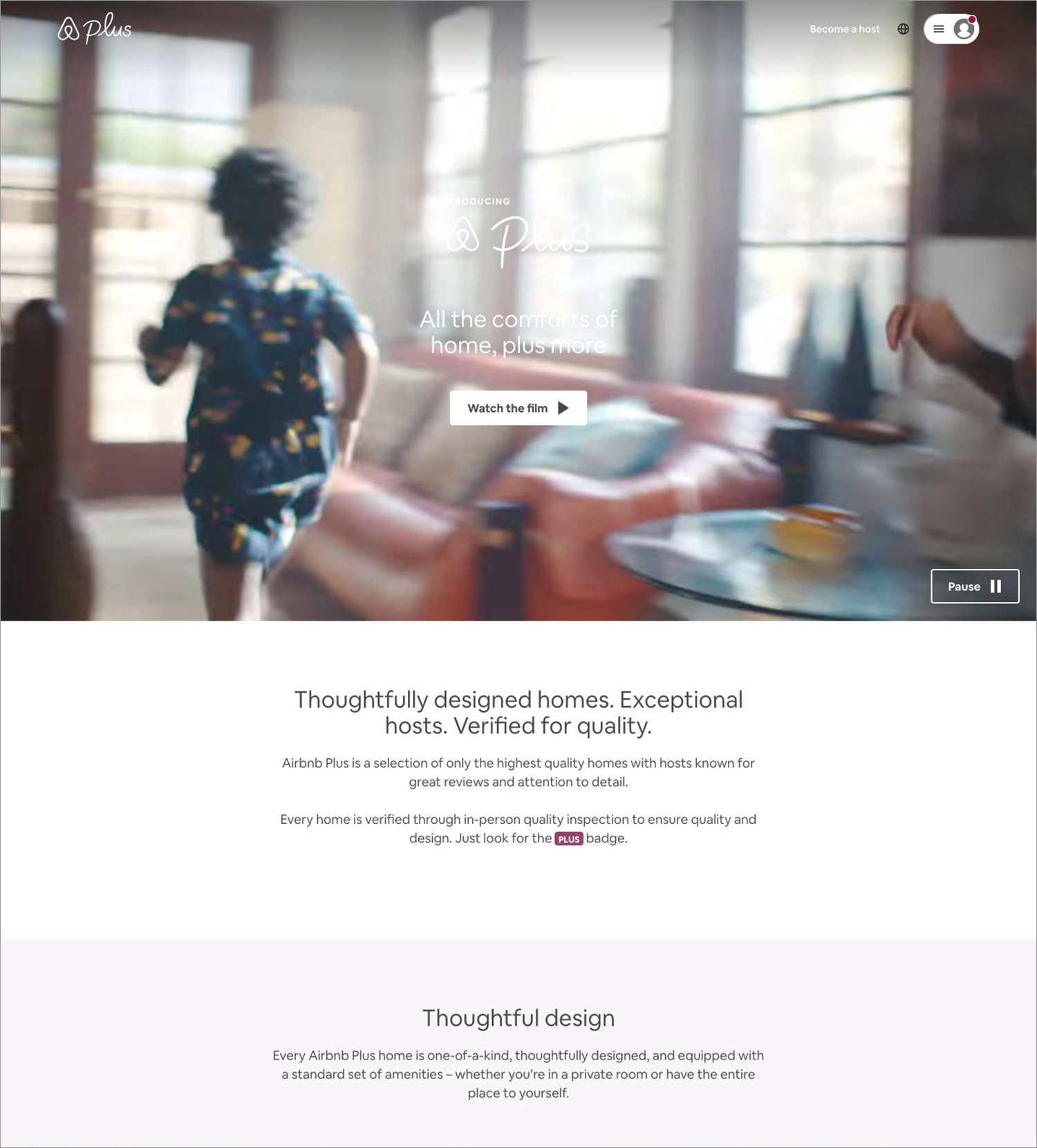
AirBnB
airbnb

(This guest post is written by Laura Moisei for Hongkiat.com. Laura has a bachelors degree in Communication Science and spends most of the time pursuing her passion for design and writing. She works for 123ContactForm (123contactform.com), an online form and survey builder that helps users create beautiful forms for any web page.)

The post Beautiful Landing Pages (Tips and Examples) appeared first on Hongkiat.

Did you miss our previous article…
https://www.1clanek.info/?p=473

How Does Logo Design Affect Your Online Brand Perception?

(Guest writer: Amtul Rafay)

Logos are one of the core parts of a company’s branding strategy. These company symbols are the first thing that a consumer is exposed to. If it does not portray your brand message effectively, it will fail to attract and drive leads to the company.

Although there are many other components to a business’s branding plan, the logo occupies a special place of importance. As a visual medium of communication, it’s the logo’s job to convey your brand values and message to a possible lead, attracting them into wanting to learn more.

Moreover, it helps people remember your brand more easily. Statistically, people find it easier to absorb information visually than through any other medium. And if the logo design itself is simple, it makes it even easier for a consumer to remember and associate that symbol with your brand.

According to RenderForest, logos are the most recognizable brand identifiers at 75% in 2021. Therefore, let’s look at how the design of your logo can affect consumers’ perceptions of your brand.

5 Things Your Brand Must Have Besides A Logo

5 Things Your Brand Must Have Besides A Logo

Lots of people, many designers included, think a “brand” is just a nice looking logo. Wrong. So, so… Read more

Simple Design Equals Highly Memorable

If you look at a few of the most famous symbols depicting a business or personal brand, you will notice that they all have one thing in common. They all sport a simple yet distinct design.

Suppose we take the example of the McDonald’s logo. The simple golden arches of the symbol have become so iconic that even a child as young as four years of age can recognize it by design alone. However, it is so distinct that it is hard to mistake the logo for anyone else’s.

Similarly, logos for brands like Twitter, Facebook, and Nike are simple in design yet sufficiently unique. Consumers do not find it hard to associate with the brand. All these examples point to one fact – the simpler the design, the easier it is for a consumer to remember it.

But it takes a fine line between making a logo unique and straightforward and turning it into a generic design. Moreover, your logo needs to be able to embody and portray your brand message effectively. Let’s look at a few symbols to understand how to keep your design simple yet effective.

Minimalist Logos That Effectively Portray Their Brand

In branding, we have many examples that successfully portray simplistic logo design effects on brand perception. From many fictional superhero logos to real-life company logos that have made their intended mark, minimalist designs have shown effectiveness.

Let’s take a look.

Batman Logo

Batman’s iconic logo has changed many times over the years. The underlying concept has always been the same. But over the years, changing notions of how specific comic characters should be perceived, his logo has taken on a darker color palette.

The initial design featured a simple silhouette of a bat with flared wings, thrown in shadow due to bright light behind it. The plan depicted the character’s predisposition to be a vigilante at night and be as stealthy as a bat. The design was predominantly created for print on paper. Therefore the choice of a brighter color combination was made.

Over the years, with TV and film eclipsing the popularity of print comics, the logo has taken on a darker color to portray the character and their personality better. Now sporting a deep black over dark grey, the new design suits Gotham’s vigilante aesthetic far better than any previous logo.

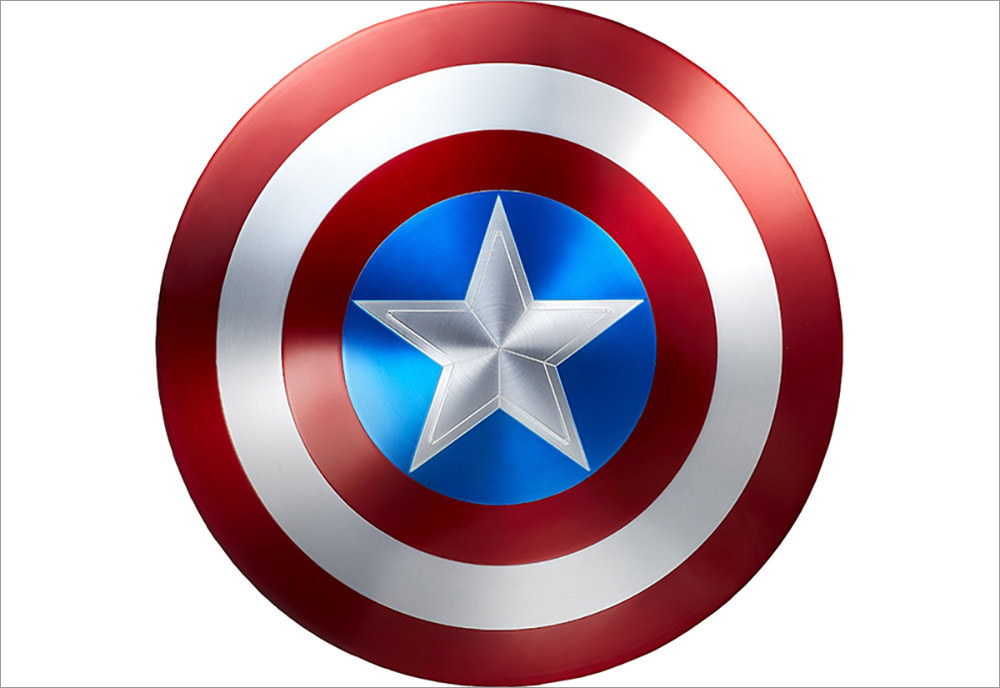
Captain America Logo

Next up, we have Captain America’s logo. Unlike Batman, Cap is a character that acts in the open. Moreover, he is meant to be a role model and a rallying symbol for the entire United States of America.

That is why the symbol and his popular color palette contain bright shades and a distinct design meant to stand out rather than blend in.

Sporting the colors of the US flag, Captain America’s logo features a big and bright white star in the middle of the shield. Encircling the star are four alternating colorful blue and red bands, signifying America’s trademark “stars and stripes.”

The entire theme of this simple logo effectively portrays the character as a bright, shining beacon of hope, strength, and trustworthiness. That makes it one of the best examples of how logo design can affect a brand’s perception.

Punisher Logo
punisher-logo

Punisher is another character that uses its logo design to affect how viewers perceive the brand. In the comics, the antihero is usually working against established villains, making a reader assume that the character is a hero. Yet, the actions of the Punisher are often quite similar to those used by the villains themselves.

Now, this might have confused comic fans who were not aware of the character’s fictional history. However, the logo for the Punisher makes it assume that he is anything but a superhero.

Utilizing an elongated white skull over a black background, the logo can be easily considered a symbol representing one of the bad guys. Now you might be thinking, doesn’t that cause mixed signals in the minds of the readers?

Surprisingly, no. The entire premise of the character is that the Punisher doesn’t want normals or other good guys thinking that he is a hero. Yet, he doesn’t care what his foes feel about him. That is why the symbol is the perfect identification for the Punisher and gives the accurate perception that the character hopes to portray.

Twitter Logo
Twitter Logo

Now let’s come to a real-life brand that has used a simple logo design to affect consumer perception.

The name, logo, and operating concept of Twitter have always been unique. Taking inspiration from the short and shrill sound a bird makes, the social media platform developed a way to communicate via short messages.

The logo is straightforward, featuring a simplified outline of a small bird’s body, effectively portraying the name. And when taken as part of a larger branding strategy, it is pretty ingenious. The logo brings to mind the name of the brand, which makes us remember the platform USP.

The bright blue color palette also signifies freedom of expression that is the platform’s hallmark.

Logo Design and Social Media

An essential aspect of logo design for your brand is that it should look and be perceived the same, whether for a digital medium or a physical one.

That is where social media comes in. As one of the most popular and vital marketing tools nowadays, your brand logo must be perfectly legible and compelling.

Featuring on various social media platforms on different screen sizes, such as Instagram, which allows a maximum resolution of 180 x180 pixels, your logo needs to be distinct to instill the desired perception.

That is how a logo’s design can affect its brand’s perception in the eyes of its consumers.

(This guest post is written by Amtul Rafay for Hongkiat.com. Amtul is a content marketer at leading graphic design agency – Logo Poppin (logopoppin.com). She loves to explore futuristic trends in the tech industry while believing in the influential power of research-backed opinions. Being passionate about blogging, she writes on a variety of topics including digital marketing, graphic designing, branding, and social media. Besides that, she is also fond of traveling & an avid reader by heart.)

The post How Does Logo Design Affect Your Online Brand Perception? appeared first on Hongkiat.

Did you miss our previous article…
https://www.1clanek.info/?p=469

Fresh Resources for Web Designers and Developers (October 2021)

We’ve been running this series for several years now and feels like we are never running out of great new resources for designers and developers. In this round of the series, we have tools, articles and tutorials that both backend PHP developers and front-end developers.

We have got a resource to get dummy logo, a tool to generate image mockups, a GUI tool to scaffold your next cool application with Laravel, and a lot more.

Let’s jump in to get the full list.

Fresh Resources for Web Designers and Developers (September 2021)

Fresh Resources for Web Designers and Developers (September 2021)

There is lot happening this month in the tech industry; from Docker updating their business and plans, prominent… Read more

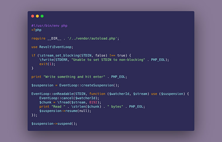
Showcode

A web application to generate nicely prsent your code with image. You can customize the background color, the code editor frame, and the size. It supports many programming language such as PHP, JavaScript, as well as templating language like Twig. A handy tool to share code beatifully.

EventLoop

With PHP8, PHP got a boost of improvements including Fiber that’s coming to PHP8.1. This addition allows PHP manage concurrency operation natively, and developer to build framework on top of it such as to build “Event Loop”. Event Loop is a mecanism that will allow PHP to perform non-blocking I/O process. Not many reference for Event Loop on PHP, at the moment, but you can look into the same concept from the Node.js reference.

EventLoop

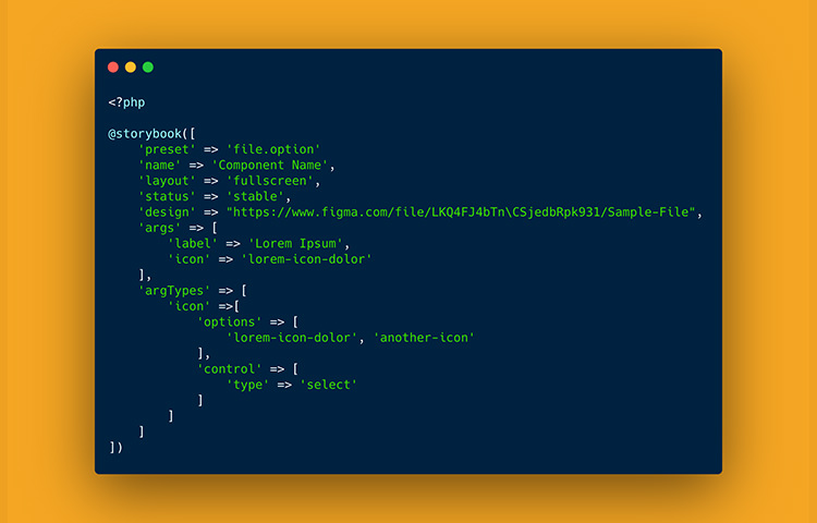
Laravel Storybook

This library integrates Storybook, a popular application to manage UI and design system, to Laravel. it allows that you can render unit of your Larvel components using the Blade templating and Storybook Server right within your Laravel app.

Laravel Storybook

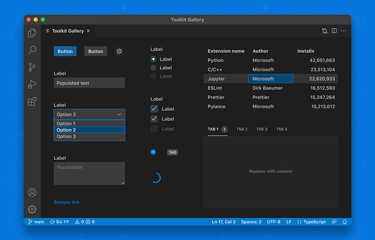
VSCode WebView UI

A UI and design library for Visual Studio Code (VSCode) editor. It contains of common interface for the editor like the button, select, textarea and input. A great resource if you plan to build an extension for VSCode and maintain consistency of your extension with the editor.

VSCode WebView UI

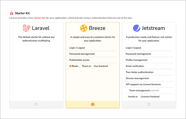
Laravel Initializer

A web application to generate a scaffold with Laravel. The app supports on generating the bare Laravel framework, “Breeze” that already bundled with some utitlies (e.g. user authentication, UI framework), and “Jetstream” which is a more advanced upgraded version of Breeze. On top of that, you can also set the stack such as the database — whether you’d like to choose MySQL or PosgreSQL, Authentication method, Storage, Cache, and even the Payment system.

Laravel Initializer

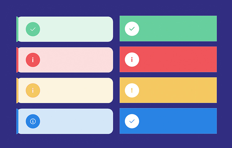
PHP Flasher

A framework to manage a notification system with PHP. It allows you to show various type of notifications simultaneously, render notification from JSON, and even send notification to the OS system. If you’re a developer who is very comfortable with PHP, you will definitely will appreciate this framework.

PHP Flasher

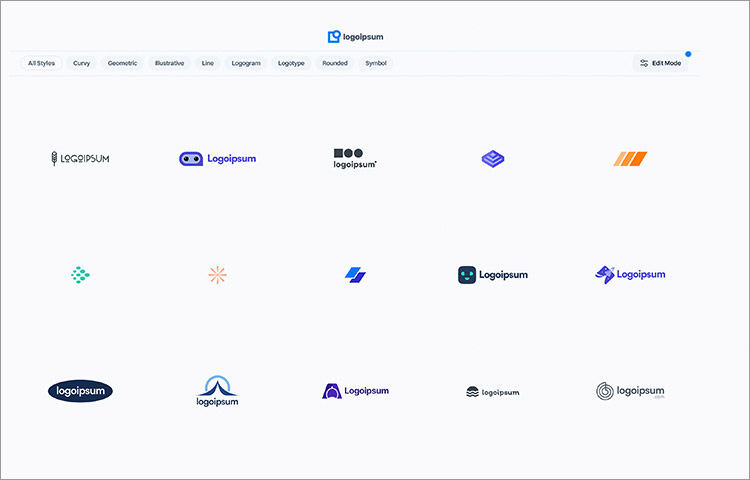
LogoIpsum

A collection of free dummy logo you can display on your mockup, template, or dummy website and application. It has quite a handful of collection that’s designed to fit in any UI or graphic styles. You can customize the styles, color, and download each logo as SVG.

LogoIpsum

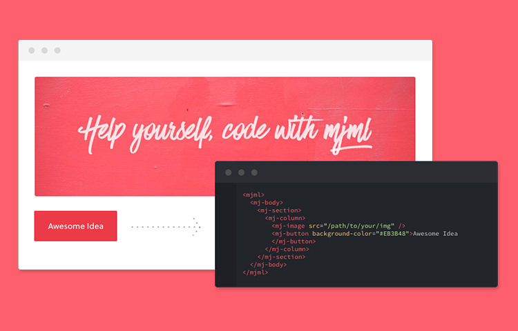
MJML

MJML is a markup that aims to make it easier when composing layout for email template. It’s abstracting the complexity of email template with its own HTML custom element. You can start adding the component. The doc is pretty comprehensive if you’ve just get started. And then you can compile the markup with the yarn build to get the real output you can send to emails.

MJML

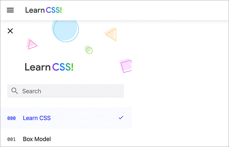
Learn CSS

An initiaive from Google Developer to provide a comprehensive resource to learn CSS. It covers the very fundamental of CSS such as Box Model, Selectors, Cascade, and Inheritance and Specificity that gives a solid foundation of how CSS works. Whether you just got started or an advanced front-end developers will certainly level-up your CSS skills.

Learn CSS

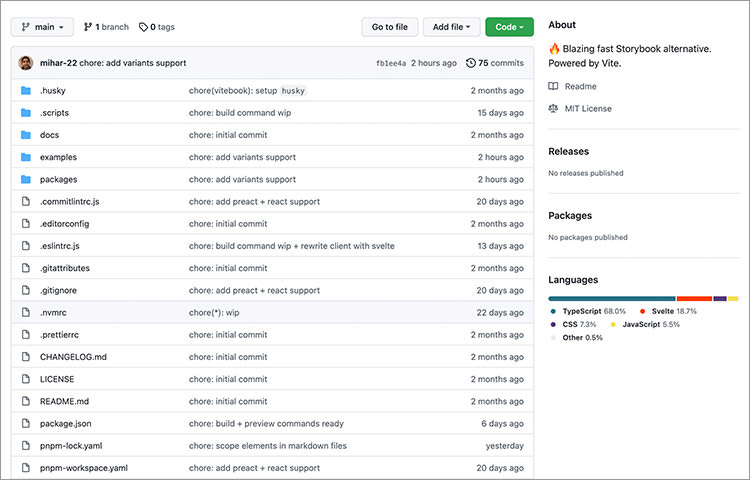
ViteBook

ViteBook aims to provide a alternative to Storybook — a popular open-source tool to manage UI and design system. ViteBook key focus is performance with it being built on top of Vite.js. ViteBook is currently in early WIP. I’m looking forward to how it will evolve.

ViteBook

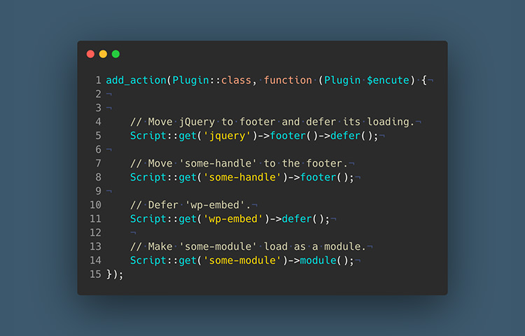
Encute

Encute is a PHP library to load and manage scripts and styles on WordPress with Object-oriented Programming (OOP) pattern. So we get a nicer syntax plus it adds some additional features. For example, you can enqueu script with “defer” or “async” load, and load it as a “module”

Encute

Bootstrap Icons

Bootstrap used to include FontAwesome icon in its bundle. It’s now created its own official set of icons. The set contains more than 1.300 icons. Each icon comes in two different styles, outline and filled style, and comes with two format font icon, and SVG. Like Bootstrap, these icons are free forever.

Bootstrap Icons

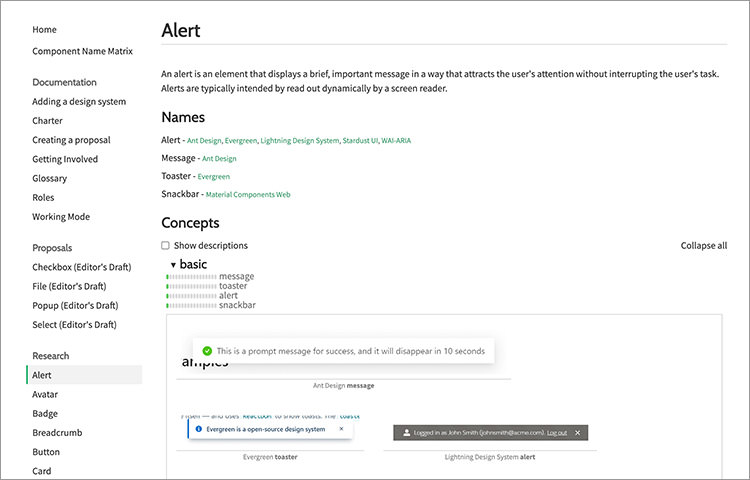
Open-UI

An initiative and collaborative effort from web developers and engineers to create standard user interface with an open specification that developer can adopt and implment regardless of the platform used on the website. It’s currently still in a work in progress. I’m looking forward how this will affect the web development in the future.

Open-UI

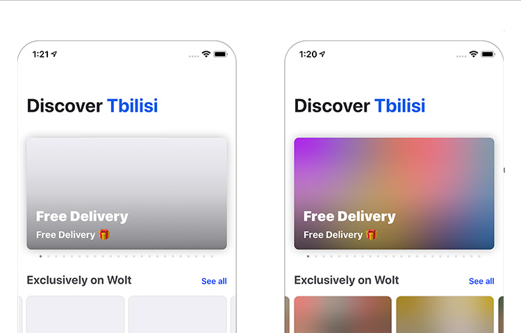
Blurhash

An algortihm to generate a “blur” representation of an image. This gives you a small beautiful image that you can use as a placeholder while the real image is loaded fully. No more ugly empty boxes.

Blurhash

CORS

Have you encountered CORS error on your website? Are you wondering how that happens and how to fix it properly? This article provides all the answer with detailed in-depth explanation.

CORS

Mo

Mo is a handy CLI utility that allows you to find unused Node.js modules from, your computer system. It will also examine memory usage and provide you an option if you want to remove it from your computer. It’s great way to free up some disk space in your computer.

Mo

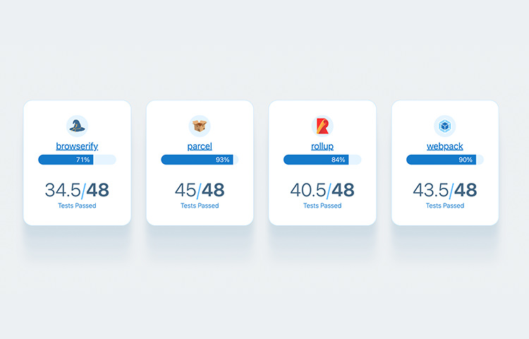
Bundlers Tooling Report

“Bundlers Tooling Report” provides a detailed report of features of a bundler. There are several on the list such as Webpack, Browserify, Rollup, and Parcel. If you’re not sure which one is would be fit in your application, this report should help you.

Bundlers Tooling Report

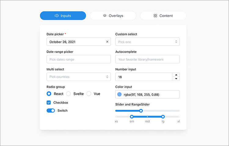
Mantine

A set of more than 120 components to build modern web and application with React. Aside of components, it also provides a list of custom React Hooks that can be handy in a lot of situation such as to accessing the DOM reference, perform “debounced” function, state management, etc.

Mantine

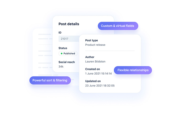
KeystoneJS

An open-source Node.js based Headless CMS. It helps developer build appliation or site with custom datamodel faster. You simply need to describe the schema, It will automatically provide you the UI as well as GraphQL API to access the data on the front-end.

KeystoneJS

LoremSpace

A handy tool to generate dummy image or mockup. Instead of generating random image, it allows you to choose the theme of the image. Such as the “movie” will generate the list image movie poster image, “album” to generate music album cover, and “game” to generate game cover image. You can select that would fit in the theme of your website.

LoremSpace

The post Fresh Resources for Web Designers and Developers (October 2021) appeared first on Hongkiat.

Did you miss our previous article…
https://www.1clanek.info/?p=449