Perfection in Design: Why It’s a Bad Idea

If you are a designer or a developer, you’d probably know that trying to make your project perfect can extend the time needed to complete the project-even several times. There’s always that one last element you want to improve quickly before sending it. But in my opinion Perfection is equal to fascism.

That’s a bold statement, I know. But look around you. Is there at least one defective item in your house or garage?

Your car? You need to refuel it and once in a while, it breaks down-not perfect. Your computer? Breaks down, and crashes, and the hard drive dies before you can manage to back up your data-not perfect. Bread? It goes stale too soon-not perfect. Glasses? Glass is vulnerable-far from perfect. So what’s the conclusion?

Why Designing Without A Design Brief Is Like Playing Charades

Why Designing Without A Design Brief Is Like Playing Charades

(Guest writer: Devora Homnick) We had a wonderful moment in the Kars4Kids design department recently when our manager… Read more

Perfection harms development

Nothing that surrounds us is perfect. There’s always at least one thing that can be improved. If everyone leads their product to perfection before launching it to the public, then today we would have nothing! Not even electricity or wheel.

Since everything surrounding you is not perfect, would you rather not own them? Would you rather wait until someone leads them to perfection before they let you have them? Probably not.

Therefore while working on your projects, always takes other’s failures as a reference – be creative, but don’t try to be perfect.

Why is perfection harmful?

Because it doesn’t favor achieving goals when starting the work, you always have some actual goals to reach with the design. It can be something as apparent as increasing sales or unusual ones like creating some awareness for your aquatic kickboxing training center.

Nevertheless, those should be the goals you need to focus on, and every time you want to do something new, you should ask yourself the question: “does this thing bring me closer to the goals?”

And now the funny part. The pursuit of perfection does not bring you closer to the goals. On the other hand – coming up with the simplest possible solution does. That’s right – most straightforward and reliable, not the best. In one of the early stages of the project, you can’t be 100% sure which solution will be the best one.

Because how would you know this when you haven’t even launched it? Only the feedback from the market (the real users) can give you genuine ideas for possible improvements to your website and its usability. That feedback is the improvement you need to focus on. not what you’ve thought would be the best for them.

This is the blatant truth (unfortunately). You’ll never know what people want or need, so working on some complex solution, which can end up not being needed, is a waste of time. That’s why you need to start with the solution that makes it possible to achieve the goals in the simplest possible way. And one more thing you should know:

Perfection very often remains unnoticed.

Unfortunately, all this extra time you’ve spent pursuing perfection can remain unnoticed and unappreciated. There’s a reason why the recipient of your project might not even notice your extra effort.

And that is simply because they didn’t see the previous version of the project, so they don’t have anything to refer to and compare to. The only thing they’ll notice and criticize will be basic functions and elements.

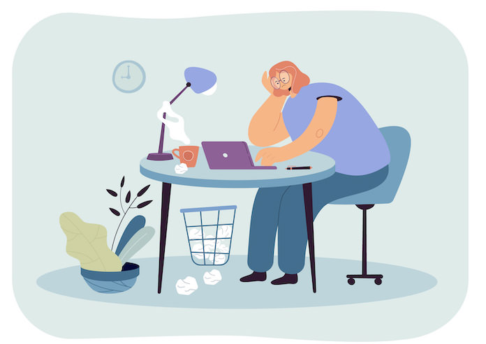
Working on details (tiny fragments of your graphic design) robs most of your time. That one little thing that keeps agitating you or some additional function you think would be cool and handy.

So, before you realize it, the total project completion time has extended several times. Do you want to spend 60% of your work time perfecting the details and only 40% on achieving the goals?
trying-for-perfect-design

If you’re freelancing, you can be sure that every client will be 100 times more grateful for a simple, easy to use and understandable project focused on achieving goals than a beautiful work of art, which looks great but doesn’t put any extra money in their pocket.

Abandoning perfection is far from abandoning a good project.

As I’ve said before, during the creation phase of the project/product/design, you can’t be sure what will the perfect solution really be, so the whole idea of pursuing it is doomed from the get-go.

When you’re working on something, then the only way you can judge perfection is by your own subjective motives-One man’s meat is another man’s poison.

The most important rule of designing: You are not your client or visitor. That’s why you can’t judge the thing you’re designing only according to your own opinions and assumptions.

You will create a much better website by not being perfect.

It’s simple (and true). If you did not try to make every detail perfect and focus on the most important key elements instead, these key elements will not only be clearly visible in the final solution, but you will also finish the work earlier.

So by hiding perfection in the pocket, you’ll be much more productive and deliver much better results.

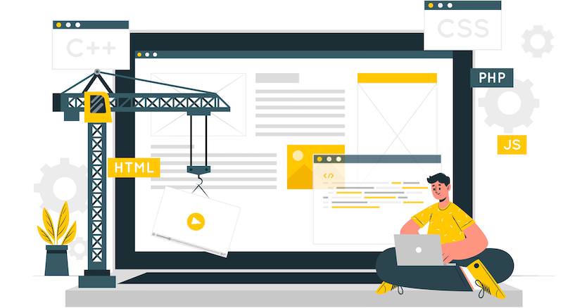
Here are the benefits that can be brought by forgetting about perfection and creating a simple version of the website instead:

  1. The website can be launched earlier.
  2. The website can make money / get exposure earlier.
  3. The feedback from visitors will arrive earlier.
  4. Because of the early feedback, you will improve the website by focusing on the things the visitors pointed out (not only the things you thought would be cool).
website-creation

The most important conclusion here is (even though it sounds kind of strange) that a simple solution is better than a perfect solution. “Ok, but how to implement this approach?”

Divide your tasks into two groups: “Important ones” & “Details.”

The important ones are important such as achieving goals and objectives, building the basic functions, etc.), and the details are just, well, just details.

Details consume a massive amount of time. That’s why you need to skip them and get back to them later, during one of the next phases of the work (or don’t get back to them at all). So what do I mean by “later”? When is the best time to get back to details?

Work iteratively

Here’s what I mean, just bear with me – When you finish dividing the tasks into two groups, then in the first iteration, you should try to focus only on the important ones and try to complete them in the easiest possible way. At the end of this iteration, you will have a finished website ready to be launched (SCRUM-like approach). You can start another one if you want to.

In this iteration, you can try to improve the previous version. (You will get the ideas for improvement from the feedback from your clients/visitors.) After the second iteration, you will have an improved version of the website.

If you want to continue the work and constantly improve the website, you can start the third iteration and then the next ones. This is the right moment for getting back to the things you’ve classified as “details” at the beginning of the work, but you might as well realize that these “details” are completely redundant judging by the reaction of the visitors/clients (a very common thing).
work-iteratively

This is a real strength of the iterative approach. During each step of the work, you have a complete website ready to be launched, and you can improve it constantly. This is a much better situation to be in compared to working on something in a closed room for ten years, trying to make it perfect without any feedback from the world.

The iterative approach is much safer as well. What is a better scenario – Realizing that your idea is a piece of you-know-what and there is no demand on the market after a month of work, or realizing it after ten years of work?

Just a side note: Due to this approach, I was able to complete my Master’s Degree paper a couple of months before my colleagues did. What I did was focus on the most important thing about each chapter, got it done as soon as possible, and left all the details for later.

If I had wanted to make each perfect chapter right from the beginning, then probably I wouldn’t have finished it until today. Also, it has been over two years now since I’ve defended my M.Sc.

Work quickly and effectively.

This is an all-purpose tip, and it can be put into practice while working on a project for your client as well as while working on your own website. These are the only things that matter now: quick work and fast results. It’s about time to adapt.

Always try to deliver fast results (focus on achieving goals) by providing the simplest possible solution, not the “perfect” solution by your own subjective opinion. Remember – you don’t need to be perfect. “Good enough” is good enough.

One more thing – What are your experiences with projects at which you’ve tried to deliver a perfect solution?

The post Perfection in Design: Why It’s a Bad Idea appeared first on Hongkiat.

Did you miss our previous article…
https://www.1clanek.info/?p=673

40+ Tools to Build Premium-looking Website

Below, we handpicked 40+ super tools that will help you create and run a premium website in 2021.

These tools are covering all the aspects you need for your website, i.e., website creation, logo, invoicing, fonts and icons, optimizations and development.

You will find complete info about these solutions and in plus we included a super development team that will help you big time if you have complicated and hard projects.

If you have a WordPress website, don’t forget to check the guide about optimizing core web vitals, it is the best in the market.

Take your time to read the article, it is long but useful.

1. BrandCrowd — Online Logo Maker

BrandCrowd is a superb online logo maker that features world’s largest DIY logo library (over 50,000 designs) and is the only platform with all the icons handcrafted by designers.

On this platform you will find logos created with gorgeous icons as well as free icon libraries. The quality of these logos is outstanding as if created by professional designers. And the price is almost nothing for such fine quality.

To use BrandCrowd, write your business name or select the industry you are in. Within seconds, the platform will show you thousands of logo design ideas. When you see the one you like, click the Edit button and start customizing it. You can change text, fonts, colors, background, layout, and even request complex edits (you will hire a BrandCrowd in-house designer for that).

2. pCloud — Secure Cloud Storage
pCloud

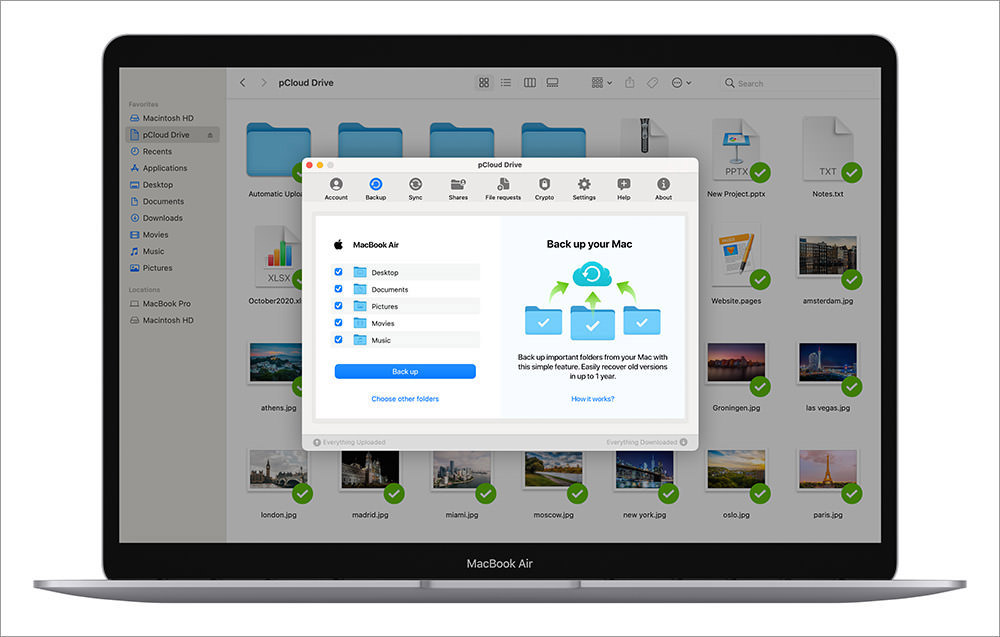
Cloud storage is the future and pCloud makes it easy for all of us. It is Europe’s most secure cloud storage, is super easy to use, and offers the best free plan in the market — up to 10 GB of free cloud storage for lifetime.

pCloud works on all OSs (Windows, Mac, Linux, etc.), mobile devices (iOS, Android), and the web so you can access and store your files with any of these devices. The sync and backups are made in real-time so any modification you make, will be instantly seen on all the other devices.

In terms of computer backups, pCloud lets you choose any local folder to be backed up. The backups are made automatically, in real-time, and you can access older versions till up to 1 year.

As for file sharing, it has many interesting features to offer such as password-protected download, expiration date, and upload/download access.

pCloud offers a free version – with limited features – or pick the premium plan with advanced features and one-time payment, and a bundle of features.

3. Total Theme
Total Theme

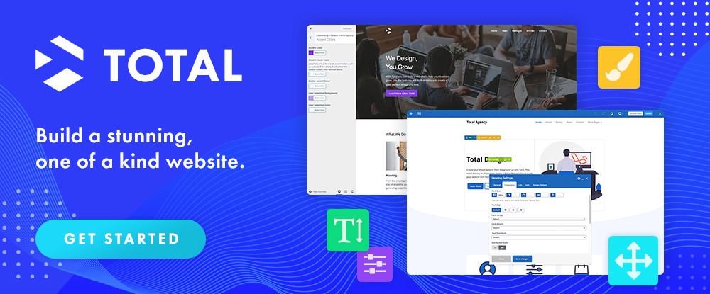
Total is the WordPress theme with a whole bunch of features. There are 40+ high-quality pre-made designs that you can install with just one click and your website will look exactly as in the selected demo.

The theme is bundled with 3 premium plugins namely Visual Page Builder, Templatera, and Slider Revolution and a lot of customization options.
4. 99 Robots
Robots

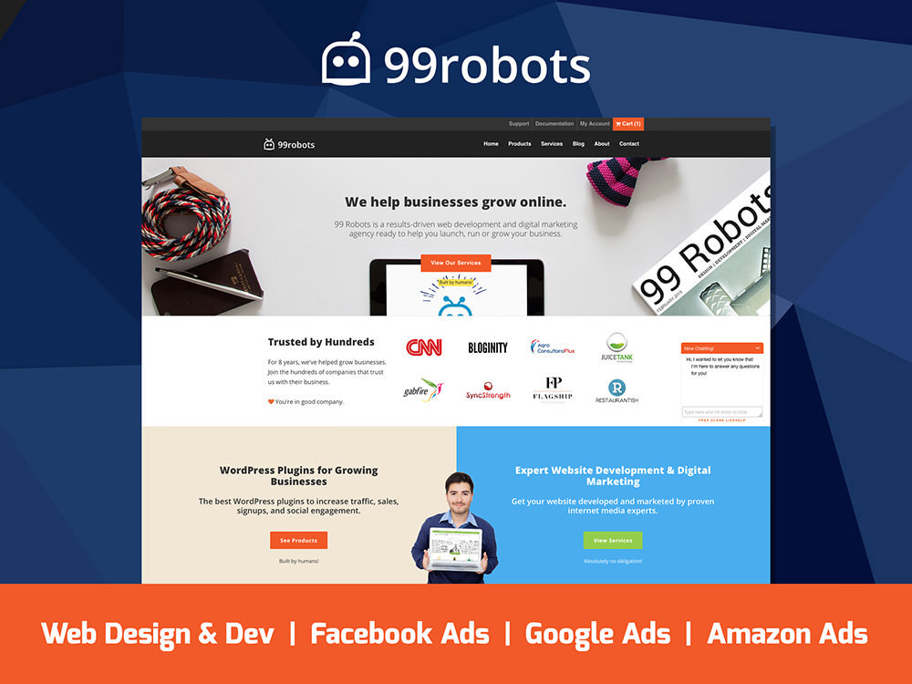
99 Robots is a premium digital agency that will stimulate the growth of your online. They help you in managing Amazon, Facebook, and Google PPC ads as well as WordPress development, and web designing services.

The agency is specialized in creating stunning websites which are optimized for SEO, traffic, navigation, and sales.

5. Mobirise Website Builder
Mobirise

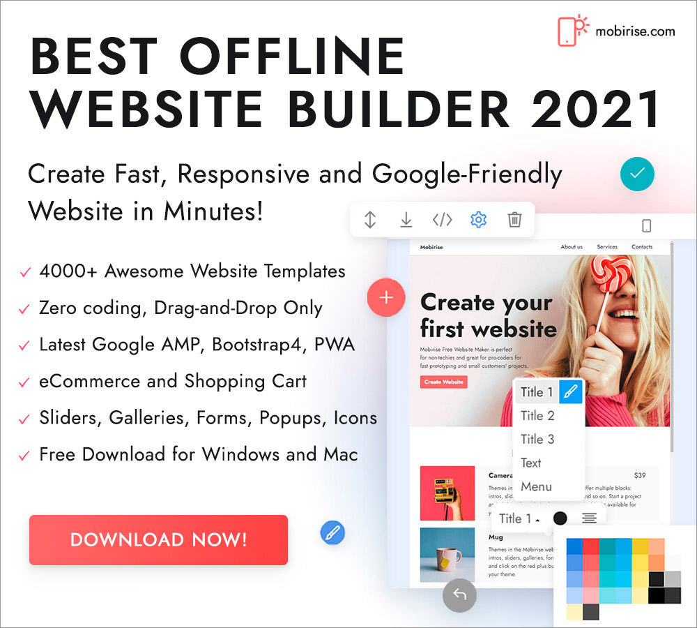
Mobirise is an offline website builder to create a stunning website for your project, no matter which industry you are in. You will find over 4,000 awesome website templates, and tons of elements to create stunning websites on this platform.

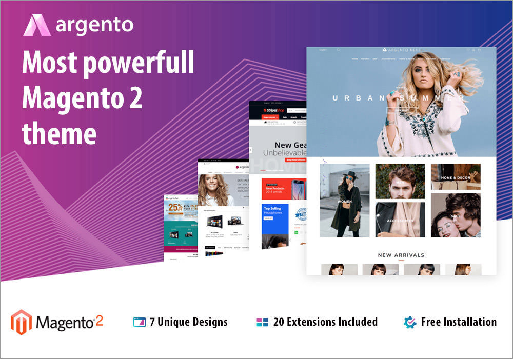
6. Argento Theme
Argento Theme

If you need the best Magento theme for your store, take a look at Argento. The theme looks very professional, loads lightning-fast, s easy to customize, comes with free installation, and includes 7 unique designs to choose from and 20 extensions that will add tons of cool functionalities to your store.

7. Taskade — To-do List for Remote Teams + Mindmap

Taskade is a free productivity app for the web, mobile, and desktop, to collaborate with your remote teams. The platform is very simple to use and intuitive, and you can create a unified workspace for remote teams and projects, keeping everything well organized.

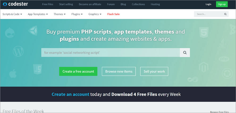
8. Codester
Codester

Codester is a popular marketplace filled with premium PHP scripts, app, codes, website themes, and much more. They have a Flash Sale section where you can find hugely discounted items are being sold.

9. Deeezy.com
Deeezy

To create a super website, you need super graphics, fonts, photos, templates, textures, etc. You will find all these high-quality creative resources here, on Deeezy.com.

10. Goodie
Deeezy

Goodie is a professional web development service by the famous Xfive company. It will help you with simple websites, WordPress development, newsletter designs, and much more.

11. Ampfluence
Ampfluence

Ampfluence is a highly popular agency that will grow your Instagram account using the right methods, no bots or gimmicks. They have huge experience in working with all kinds of companies and brands, delivering outstanding results.

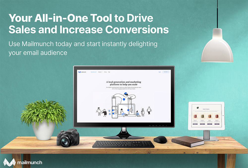
12. Mailmunch
Mailmunch

Mailmunch will exponentially grow your email list by helping you create stunning forms and landing pages. The platform is feature-rich, contains tons of highly customizable templates, and thousands of royalty-free photos. Also, the interface is super intuitive to use.

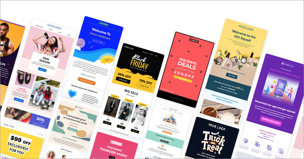
13. Unlayer
Unlayer

Unlayer is an email editing tool capable of boosting your email marketing campaigns for getting more qualified leads. The software offers multiple drag and drop design features to build beautiful emails.

14. Ramotion
Ramotion

Ramotion will help you with brand identity, UI/UX design, web design, and app development. They will take your company at the next level in terms of creating a solid online presence.

15. Miquido — Custom Software Development Company
Miquido

Miquido helps you design visually stunning, functional and user-oriented websites or mobile apps, develop future-oriented software, or deploy a Cloud. They excel in UX/UI design, product strategy as well as custom web, and mobile development.

They have over 10 years of experience and they created over 150 digital products, being one of the leading software development companies in the world.

16. Web Designers in Kansas City
Web Designers in Kansas City

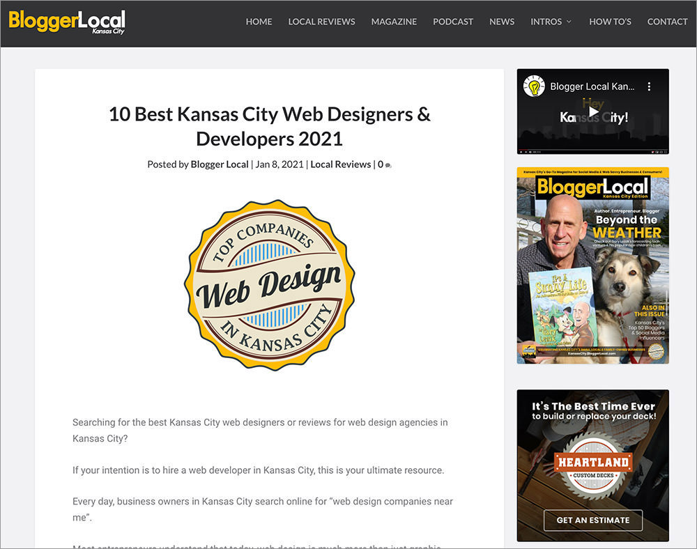
If you are looking for a local web designer or developer located in Kansas City, check this page out. Here you will find complete information about the best 10 web designers and developers in the city.

17. Complete SEO
Complete SEO

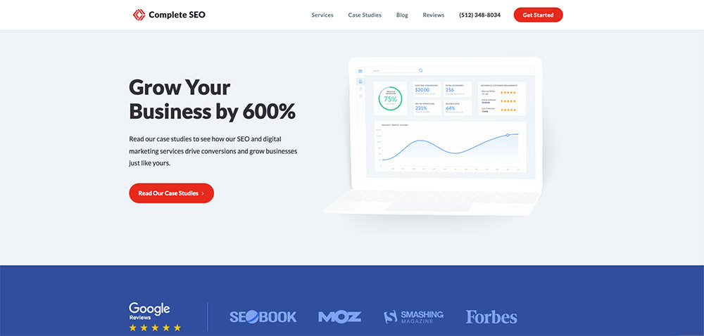
Complete SEO is a digital agency that enables you to get large volumes of organic traffic from search engines. They have decades of experience in helping companies from different industries with smart SEO strategies.

You can get a free consultation and website audit from Complete SEO to find out where you stand and the elements that you can improve.

18. DWS
DWS

DWS is a complete agency offering all kinds of services including SEO, content, blogger outreach, animation, and website development). You can either select the service you need or get a package of services tailored perfectly for your needs.

19. Heroic Inbox
Heroic Inbox

If you have a WordPress website and you want to quickly manage customer support emails directly from your website, get Heroic Inbox plugin. The plugin is feature rich and very simple to use.

20. Web Design Auckland — Web design company

Web Design Auckland is a complete internet design agency offering all kinds of services including custom website design, unique branding, stunning photography, SEO, and digital marketing etc.

Fresh Resources for Web Designers and Developers (May 2021)

One of the things that I like being a web developer is that you never stop learning. There’s always something you could learn every day despite being in the industry for a decade.

In this round of the series, we’ve gathered a couple of references to help you get better at testing web performance and a handful of new tools that can help you in being more productive. So, let’s take a look at the full list.

Fresh Resources for Web Designers and Developers (April 2021)

Fresh Resources for Web Designers and Developers (April 2021)

A great product these days relies on the ecosystem. Imagine iPhone without the apps or WordPress without the… Read more

Notea

Notea is a self-hosted note-taking web application that can be installed on your own server with Docker. You can use it to write and share almost any type of content such as documentations, Wikis, blogs, and even newsletters with beautuiful typography.

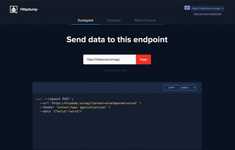
HTTPDump

This tool provides a unique URL where we can mock response, dump data over an HTTP request, and shows it in a human-friendly way. It’s useful for testing the integration of third-party APIs or Webhooks.

httpdump

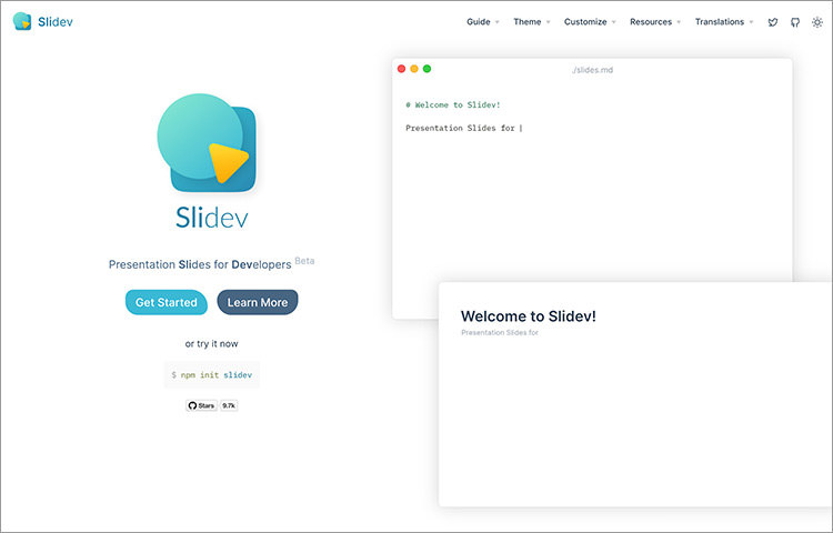
Slidev

A Slide framework built for developers. It’s similar to PowerPoint or Google Slides where you can create presentation slides except it also comes with features that developers will appreciate such as being able to embed code snippets, interactive components, and a live code editor.

slidev

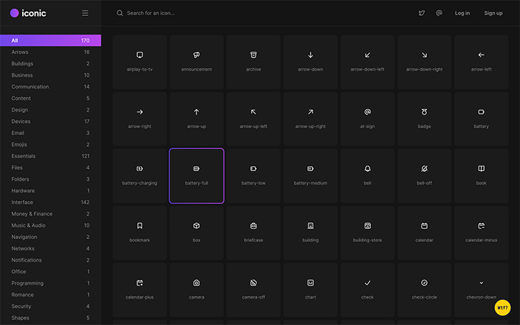
Iconic

A huge collection of free icons that you can use on your website and in your apps. It features icons from many categories including Arrows, Folders, Files, Business, Finance, and many more.

iconic

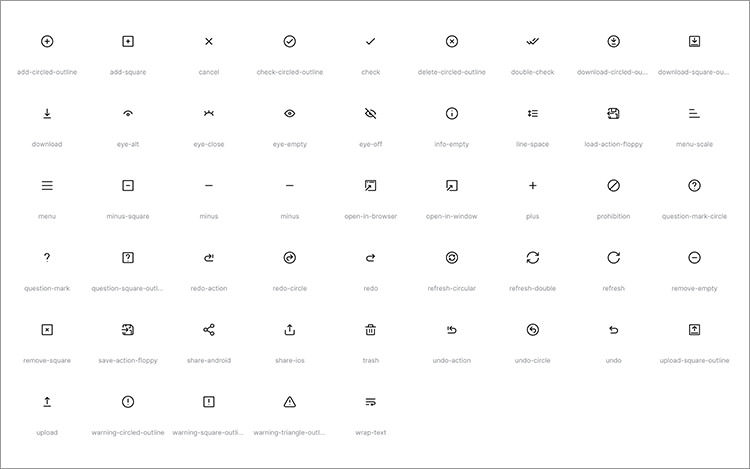
Iconoir

Another website where you can find a good collection of icons for your web or app design projects. At the time of this writing, it contains more than 900 icons in SVG. It’s open-source, completely free and without any limits and restrictions.

iconoir

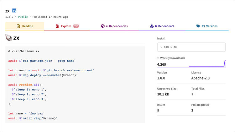
ZX

ZX is Google’s initiative to help you create scripts with JavaScript and Node.js libraries more conveniently. It provides wrappers around Node child_process, escapes arguments, and sensible defaults that allows you to be more productive in writing scripts instead of setting up the library configs.

zx

Playground macOS

A macOS desktop UI replica built with React.js, Redux, and TailwindCSS. A good source if you’d like to dig in front-end development and sharpen your skills around the stacks.

playground-macos

RustDesk

A remote desktop client built with Rust. It’s free and open-source. You can configure it with your own server so you have control over the entire data. It’s a good alternative to TeamViewer and AnyDesk.

rustdesk

WebDev for Beginners

A curriculum provided by Azure Cloud Advocates at Microsoft that includes lessons, exercises, and quizzes of basic HTML, CSS, and JavaScript. A great resource for anyone who is just getting started in web development.

web-dev-for-beginners

Vanilla Extract

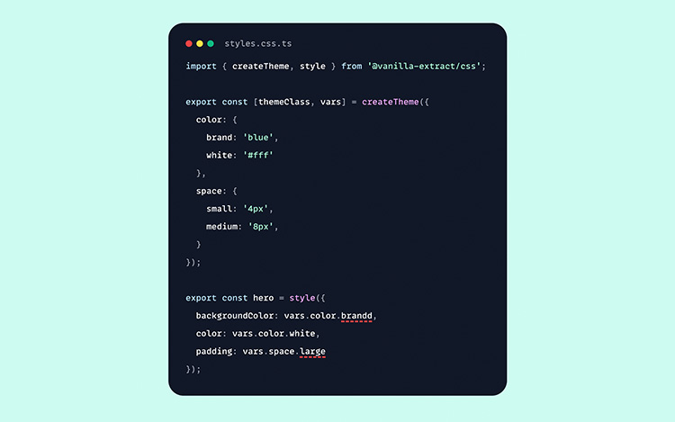
A tool that provides a new take on building CSS for your JavaScript application. You can use TypeScript to compose your CSS selectors, variables, and themes, etc., and generates a static CSS file on build. It works with any front-end framework including webpack, esbuild, and Vite.

vanilla-extract

CSSHell

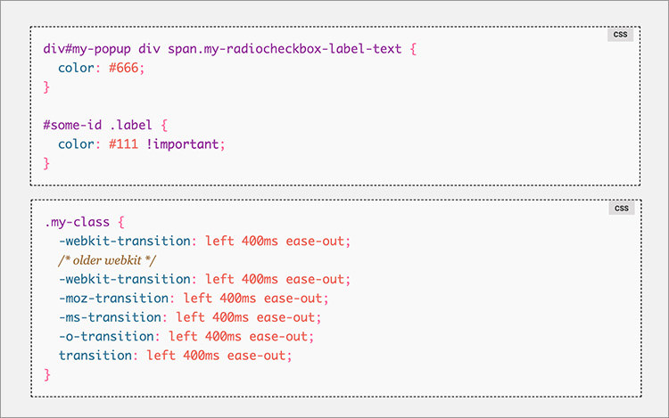
This site provides a collection of common CSS mistakes; you will find why certain ways of writing CSS is a mistake and it also shows you how to fix them. This a great resource to sharpen your CSS skills.

csshell

Puppeteer Recipes

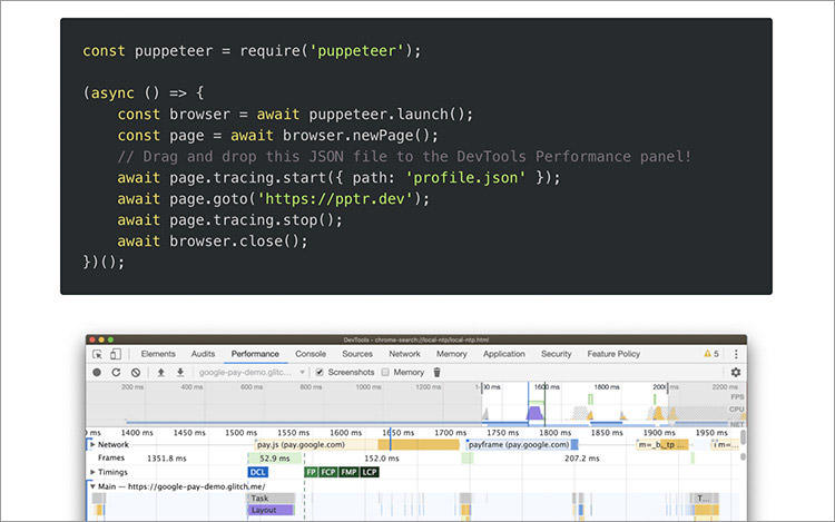
Puppeteer is a great tool to run performance testing on your website. But sometimes it might not be so obvious as how should we get started. In this article, Addy Osmani – one of Google Chrome Engineers – shares some handy code recipes you can copy and reuse to start profiling your website performance with Puppeteer.

puppeteer-recipes

Kretes

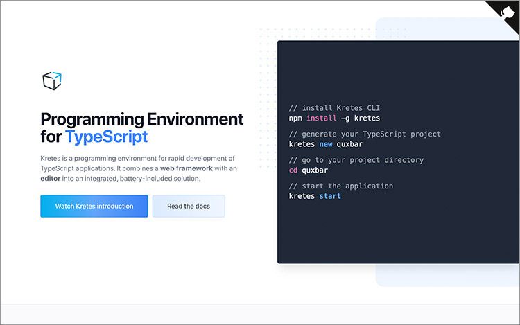
Kretes provides a coherent environment for developing applications with TypeScript, the build tools, and deep integration with Visual Studio Code editor. This tool gives you a boost in productivity when starting application development.

kretes

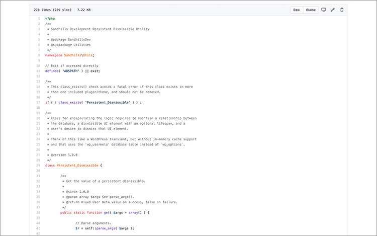
Persistent Dismissable

A PHP library to handle custom dismissable notice in the WordPress admin area. It optimizes the database call under the hood and is compatible with WordPress Multisite setup out of the box. Overall it’s a handy PHP library for WordPress plugin developers.

persistent-dismissable

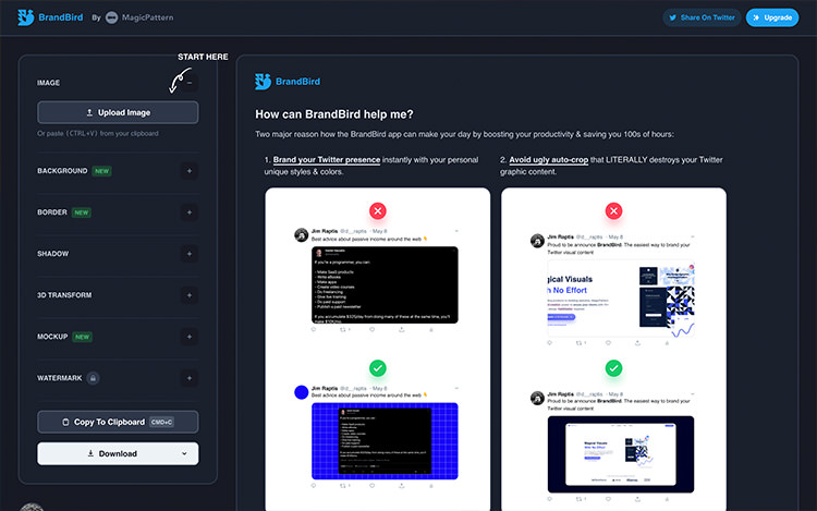
BrandBird

BrandBird helps you generate a perfect image for your website. It’s a useful tool to make sure that your brand looks good on social media and helps you avoid awkward auto-cropping when shared on social media like Twitter. You can set the background, border-radius, shadows, and some other elements of the image.

brandbird

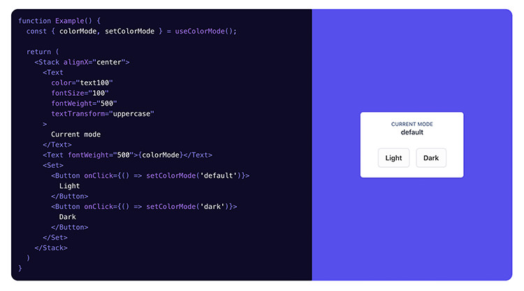
Bumbag Styles

A collection of UI React and ReactNative components. It’s themeable, composable, and accessible out of the box. This library makes it fast to create applications that works across different platforms.

bumbag-style

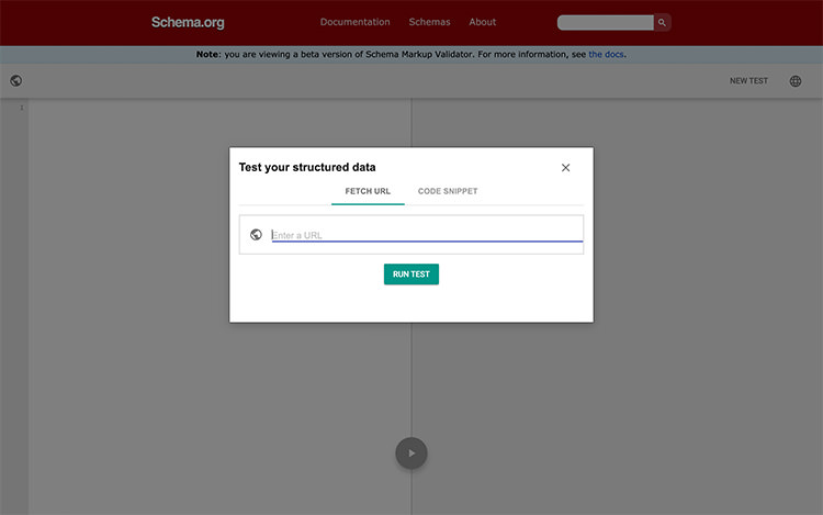
Schema Validator

An online tool to validate Schema structure on a website. It’s compatible with several specifications including JSON-LD, RDFa, and Microdata. It’ll display these data and show if it identifies the syntax error.

schema

TypeSense

TypeSense is a tool designed to improve performance and search accuracy with typo tolerance, configurable ranking, synonyms, grouping, and a lot more. It’s easy to configure and free, which makes it a great alternative to ElasticSearch and Algolia.

typesense

MermaidJS

Mermaid.js is a JavaScript library that allows you to generate flowcharts, diagrams, and other types of visualizations with just text and code syntax; it’s like Markdown for graphics. The library provides API for configurations and integrations. Most likely this library is already integrated into your favourite tool or application; see this “Integration” page.

mermaid

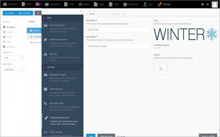
WinterCMS

WinterCMS is a fork of its predecessor, OctoberCMS, due to the switch of the project into a proprietary CMS. WinterCMS inherits the features and flexibility including the theme and plugins.

The team also puts an exciting roadmap to develop WinterCMS further such as Laravel 9 LTS support, Tailwind-based CSS and UI, and CLI to improve productivity for developers.

wintercms

The post Fresh Resources for Web Designers and Developers (May 2021) appeared first on Hongkiat.

Did you miss our previous article…
https://www.1clanek.info/?p=606

Using High Colour Contrast For More Accessible Design

A high bounce rate is frequently caused by the poor visual accessibility of a website. When fonts are too small, or they are hardly legible, when there are too many distractions or not enough whitespace, many people just leave the site without a second thought.

One of the most frequent reasons for early abandonment is the poorly selected colour schemes that decrease the readability of the content.

According to the statistics of WHO, there are about 285 million visually impaired people around the world, many of whom are partially or fully colour blind.

Visual disabled people see colours differently, so avoiding low colour contrast in our designs is inevitable if we want to provide our customers with an accessible and user-friendly website.

Web Standards For Colour Contrast

Colour contrast ratio measures the difference in contrast between two colours. The higher the value is, the easier it is to distinguish the object (text, image, graphic) in the foreground from the background.

Colours can contrast in many different ways, such as in hue, value and saturation. Colour contrast ratio is calculated by a formula provided by W3C, the main international standards organization for the World Wide Web.

It can take a value between 1:1 (no contrast at all, the foreground and the background have the same colour) and 21:1 (the maximum contrast that only exists between black and white).

W3C’s lastest Web Content Accessibility Guidelines (WCAG) 2.0 provides web developers and content creators with benchmarks for the minimum (Level AA) and the enhanced (Level AAA) value of acceptable colour contrast ratio.

Level AA requires at least 4.5:1 ratio for regular text, and 3:1 for large text. It’s much easier to read large text like subtitles, that’s why it needs a lower colour contrast.

If you want to reach Level AAA which is the enhanced level, you need to design your colour scheme with a greater care, as it requires at least 7:1 contrast ratio for normal text, and 4.5:1 for large. If a text is part of a logo or a brand name, there’s no minimum colour contrast requirement at either WCAG level.

We can only call a website visually accessible if the colour contrast ratio between every foreground object and its background reaches at least Level AA.

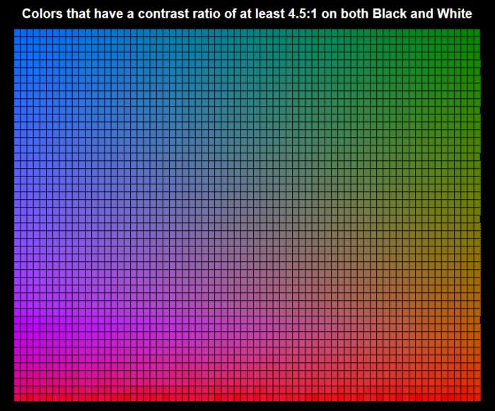
Colours With Suitable Contrast
Benefits of High Colour Contrast Ratio

By ensuring better readability you don’t only engage visually impaired users, but also people who read your content on small screens such as on a smartphone or a smartwatch, among bad lighting conditions, and on lower quality monitors.

People also read faster when there’s higher contrast between the text and the background, so it will most likely take more time for them to get bored with the content of the site.

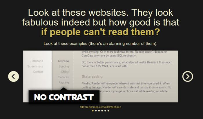
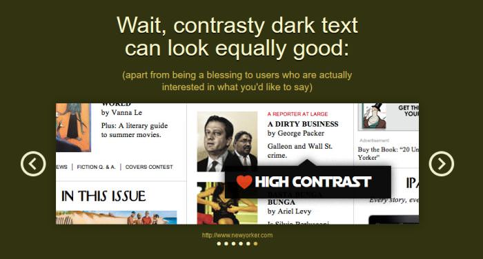
If you worry that applying higher contrast ratio will have a negative impact on the aesthetics of your design, you need to check out the Contrast Rebellion web project which proves, with real-life examples, that sticking to the high contrast ratio rules can still result in attractive and cool designs.

Example for No Contrast
Example for High Contrast

Apps For Checking Colour Contrast

There are many great free tools all over the web that can help designers check the colour contrast ratio of their website.

The easiest way of testing your design for colour contrast is to pick the main colours with either Photoshop or a suitable browser extension like this one for Firefox, and copy the values into one of the apps below.

The most important thing to remember is that you always need to compare the foreground colour such as text colour to its surrounding area (background colour).

1. WebAim Colour Contrast Checker

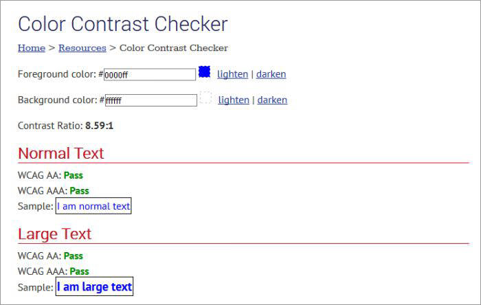
WebAim (Web Accessibility In Mind) is an organization promoting web accessibility that offers developers a simple but reliable colour contrast checker among many other great accessibility tools such as Wave, a general accessibility evaluation app that can help you quickly assess your site’s accessibility issues.

WebAim’s Colour Contrast Checker tells you if your colours pass the WCAG AA and AAA tests, both for normal and large texts.

WebAim Colour Contrast Checker
2. Snook Colour Contrast Check

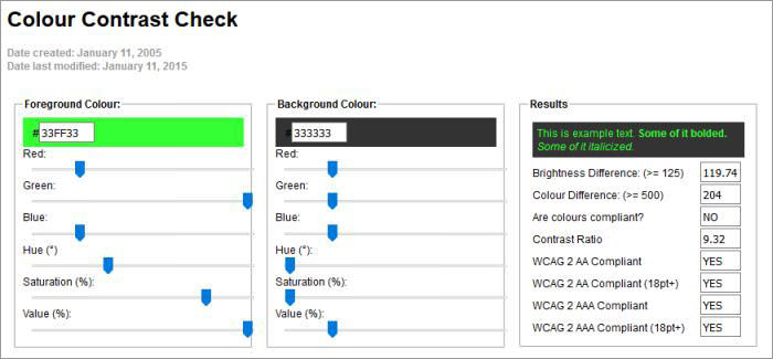
Jonathan Snook, currently working as lead front-end developer at Shopify, has been hosting his handy colour contrast check tool for over a decade. Snook’s app allows you to change the HSL and RGB values of the foreground and background colour one by one by using convenient range sliders until you reach a result that is compliant with the WCAG 2.0 benchmarks.

Snook Colour Contrast Check
CheckMyColours

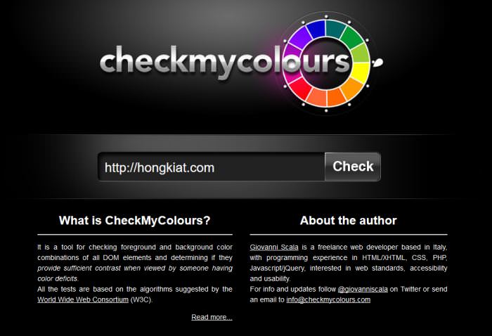
CheckMyColours created by Giovanni Scala allows you to check the colour contrast ratio of all foreground-background colour combinations on a live website.

It calculates luminosity contrast ratio, brightness difference, and colour difference, and provides you with a full report about the results. CheckMyColours’ report can significantly facilitate your understanding of how you can improve the visual accessibility of your site.

CheckMyColours Contrast Checker Tool
Color Scheme Designer

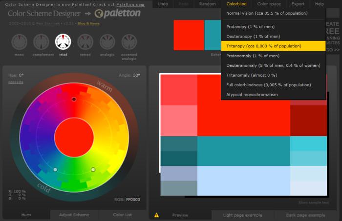
Color Scheme Designer is not particularly a colour contrast checker, but a tool for designing complete colour schemes.

We include it in this collection, because it has a feature that allows you to see how your colour scheme is perceived by people with different types of visual disabilities.

You can test your colours for full colour blindness, protanopy, deuteranopy, and many other visual impairments. The app has a newer version called Paletton that makes even a more sophisticated vision simulation possible (you can also test for things like lousy LED display or weak CRT display).

Color Scheme Designer

W3C also provides you with a huge Web Accessibility Evaluation Tools List where you can find many other colour contrast tools such as this helpful Accessibility Color Wheel.

Tips For Creating Visually Accessible Websites

If you want to create a visually accessible website, it’s always a good idea to avoid using colour alone to convey functionality or meaning. Icons that change their colour based on their current state are typical examples for this.

If it’s possible, always design additional visual cues that assist people who see colours differently in understanding functionality.

Never forget to pay extra attention to the colour contrast of buttons, links and menus, as they are the means of navigation on your site. If users can’t navigate easily on your site, you’ll quickly lose them. Accessible colours for call-to-action buttons are also crucial for good conversion rates.

It’s a good workflow practice to test colour contrast ratio as early as possible in the design process as it will be hard to persuade your client to change the colour scheme of the site later on down the design process.

Now Read:
Practical Approach To Choosing Website Color Scheme

The post Using High Colour Contrast For More Accessible Design appeared first on Hongkiat.

Did you miss our previous article…
https://www.1clanek.info/?p=597

Why Designing Without A Design Brief Is Like Playing Charades

(Guest writer: Devora Homnick)

We had a wonderful moment in the Kars4Kids design department recently when our manager said, and I quote, “So we all agree the design brief works, now how do we…” And the soundtrack played its crescendo in the background and I shed some happy tears and thought, “my work here is done.”

The story leading up to this epic piece of drama is a delightful journey that goes something like this. But first, my background story. As the art director of an in-house design team, part of my job is to streamline the process for the graphic design projects that come our way from the many and varied departments of our organization.

Freelancers: Collecting Comprehensive Creative Brief from Your Client

Freelancers: Collecting Comprehensive Creative Brief from Your Client

I had ordered a special cake for a friend’s birthday and had given the receptionist all the specifications… Read more

The quest for the perfect design brief

It was a couple of years ago, and we as a company, especially the marketing team, were growing fast. I was set on the very specific project of creating an official process for the design projects we tackle.

Until then, we operated in a very casual, informal way but it quickly became clear that some order was in order, if we were to be an efficient design team.

After much research and mad professor-ish note-taking, I revealed my magnum opus: The Design Brief. For some well-oiled-machine designers, that might have been a duh moment, but for me, it was putting a name to a face, the answer to my “there must be a better way” quest.

Behold, Le Design Brief

The design brief is a who, what, when and why form for design projects that has to be filled out with all the project details and goals before we do any actual design. By customizing the information gathered on the brief, I was able to provide a valuable tool in avoiding some of the most frustrating problems our team encounters.

Never again would we get halfway through a project without knowing what exactly it is that we’re asking the target market to do. The information would be right there, on the line next to “call to action.”

Instead of adding a mailing block and indicia to a brochure right at the deadline as it was on the way to the printer, we would simply fill in the “method of distribution” space on the brief with “self-mail, bulk indicia” right at the beginning of the project.

And most importantly for an in-house team, my design brief has a slot for “internal goal for this project.” This not only helps focus the entire project, it allows us to measure the project’s success for future action.

Getting the design brief accepted

There was only one problem with my dream solution: getting the other departments, ultimately our clients, to accept what they saw as, at best, red tape and at worst, cruel and unusual punishment.

Part of the challenge of working in-house is familiarity. You and your “clients” are like an old married couple. They can drive you nuts and do everything you asked them not to do in the safety of knowing that you’re not going anywhere and will still work like crazy to get them a good product.

taking-design-brief

So if I wanted to change the way we worked with the other departments, I was going to really have to sell it. How did I explain why we can’t just take notes on a legal pad as the project is described in a minute or two and then work out the details as we go along?

Designing a project without a design brief is like…

Being a fan of metaphorical speaking, I became a veritable storyteller of a tale with many twists. The title: Designing a project without a design brief is like…

Here are the best of Designing a project without a design brief is like…

  1. Filling an order for a steak in a restaurant kitchen which reads, “I’ll have a cow piece, thanks.
  2. Playing charades. Designer: “Okay, you’re pointing to a paper, so this must be a print project… no? Wait – Web! You’re holding up three fingers, so you need it in three weeks? WHAT?! THREE HOURS?
  3. playing-charades
  4. Being a fortune teller with a crystal ball. Designer: “Ooooh, I see you have a big event coming up. You will need an advertising campaign. It will be all wrong until 4 a.m. the night before we go to print. Yes, the Great Designer never guesses, she knows.
  5. A forensic artist drawing a suspect. Designer: “From what you described, this is what you want for your brochure.” Client: “No, that’s basically my competitor’s brochure. I wanted that but BETTER.
  6. Buying your wife surprise jewelry. Designer: “Last time we met, my client mentioned tri-folds. She probably wants a tri-fold. And she always signs her email in comic sans. She must like comic sans. And the design will match her signature!

Closing argument

If your design department is not using a formal design brief, be the hero and introduce it. Just remember, a little humor goes a long way in making something new and unfamiliar acceptable. Here are a few more posts that can help you sort this out while still staying on your client’s good side:

(This guest post is written by Devora Homnick for Hongkiat.com. Devora is the Art Director at Kars for Kids, a national car donation charity that funds educational and youth programs, where she leads a team of talented designers and creative marketers. You can find Devora on LinkedIn.)

The post Why Designing Without A Design Brief Is Like Playing Charades appeared first on Hongkiat.

30 Books For Web Designers and Developers

If you are a designer or developer, you probably know that this field is one of the most innovative and fastest growing industry in the world. If you want to keep up to date and stay ahead of your competitors you must learn new things all the time and follow trends.

Even though the Internet is the best place for the Creatives to learn anything for free, I would highly recommend you to spend a few bucks and get some design and development books. There are a lot of experts who have encountered problems and found solutions which they share with us in the books, so why not take advantage of their best practices and smart approaches to problems?

These books will definitely help you become a better designer, developer or both. You will gain a lot of useful and practical knowledge in design psychology, user experience, branding, storytelling, programming, coding, business and much more.

Hopefully this list of books will help you choose the next book to read during rainy evenings.

Why All Developers Should Learn Command Line

Why All Developers Should Learn Command Line

Some developers cringe at the mere thought of opening a terminal window. For the uninitiated it can be… Read more

1. How to Build Habit-Forming Products

Written by Nir Eyal, Hooked is a practical guide to help you create the kind of products that people would want to use. It introduces the ‘hook model’ – a four-step process that most brands use to shape consumer habits.

The book is packed with consumer behavioral insights, tips on taking actionable steps in creating enticing products, and many case studies to help you understand the concepts.

It is written for designers, product managers, marketers, start up founder, or just any one who’s interested in consumer behavioral patterns.

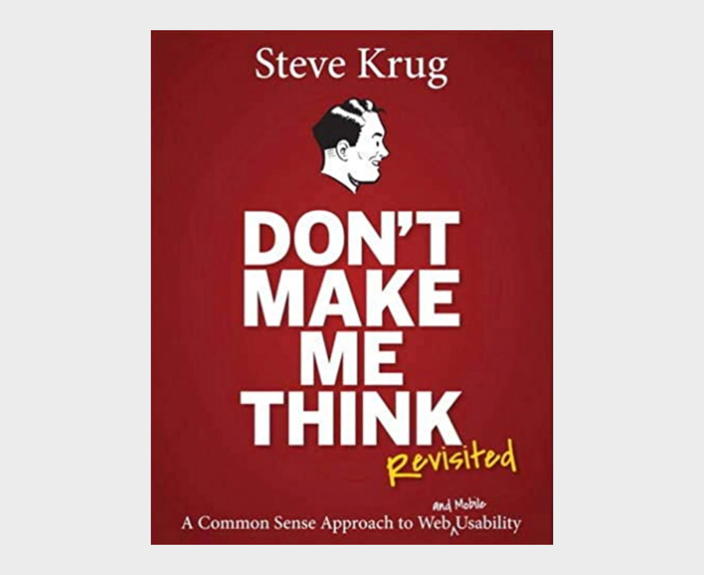
2. Don’t Make Me Think

Don't Make Me Think, Revisited:

Dubbed as the usability guru, Steve Krug is the writer of this wonderful book Don’t Make Me Think that talks about intuitive navigation and information design. This revised version gives you fresh perspectives and updated case studies along with a chapter on mobile usability.

You will find the book to be witty, highly practical, and full of commonsense-based points. Either you’re a web or graphic designer or a web developer, you’ll find the usability concepts mentioned in the book to be highly applicable to everyday designing.

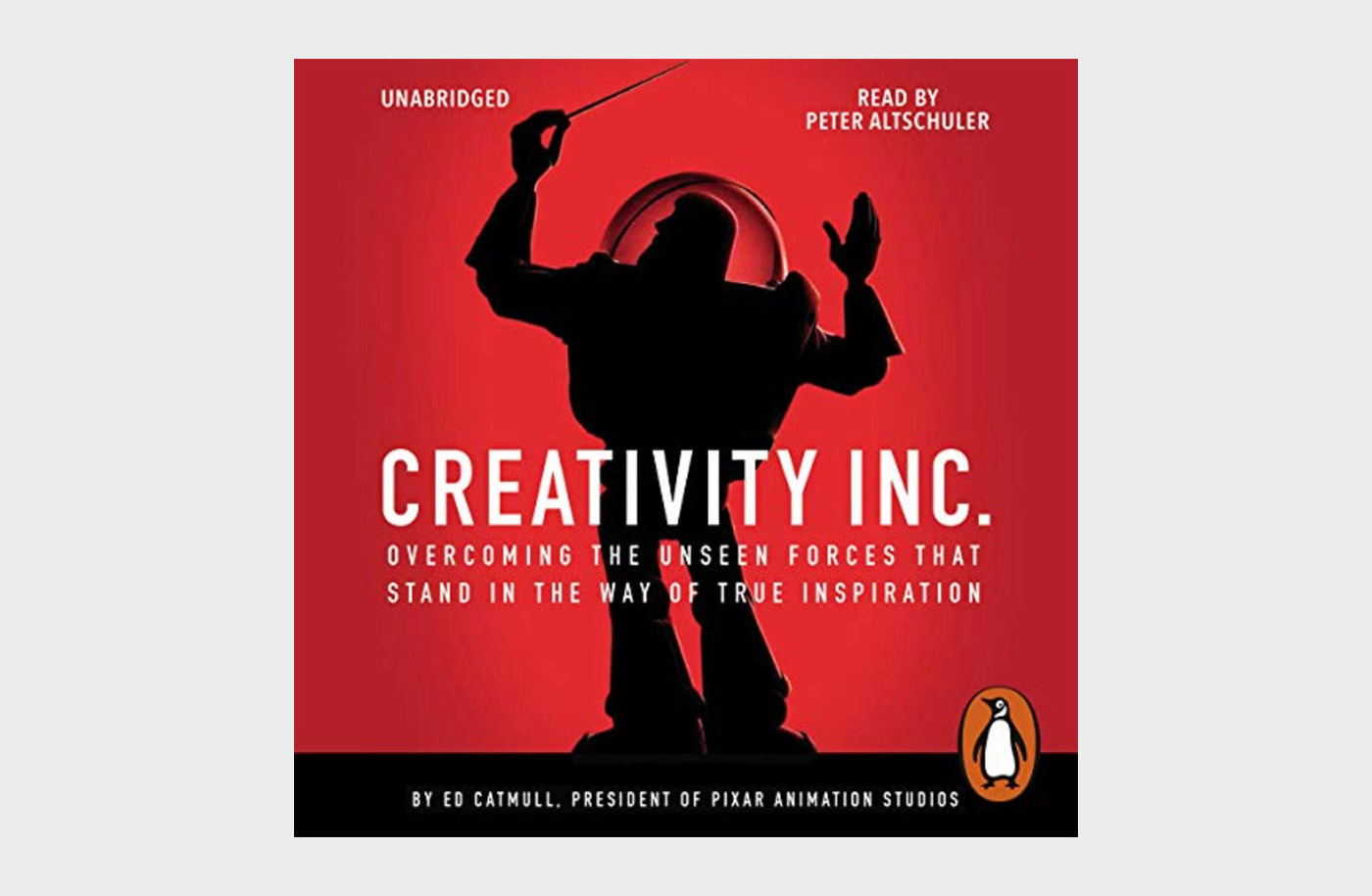
3. Creativity Inc

Creativity, Inc.: Overcoming the Unseen Forces That Stand in the Way

Creativity Inc. is a cumulation of years of work and experience of Ed Catmull, one of the founders of Pixar Animation company and the creator of the amazing Toy Story. The book talks about ideas, techniques, and creativity process that goes on in Pixar.

From the very core of it, the book is about creating and nurturing a creative culture in your organization. Designers, developers, and team managers can take it as their guide book for taking their work to new heights of originality.

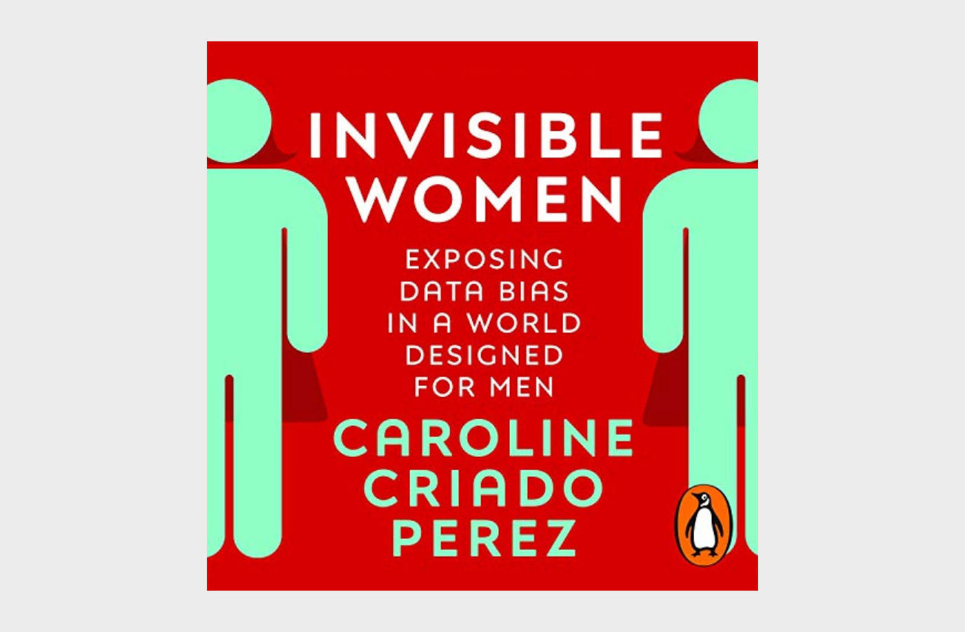
4. Invisible Women

Invisible Women: Exposing Data Bias in a World Designed for Men

Approximately half of the world’s population are women. However, they are constantly at the receiving end of gender bias that manifests in everyday life. This book The Invisible Women highlights how a world made by men systematic ignores women.

The book talks about data bias that almost all women face in their lives. Phone too big for your hands, medication not suitable for your body, greater likelihood of injuries you can get from an accident, and many such hurdles that are faced by women everyday.

5. The Lean Startup

The Lean Startup: How Today's Entrepreneurs Use Continuous

The Lean Startup is an interesting book that sheds light on some practical approaches to help startup businesses avoid failure through continuous innovation. It helps you shift your company’s direction and shorten product-development cycles.

By the dint of some useful concepts with practical examples in the book, you can change the way companies are built and new products are launched. It emphasizes on shorter more adjustable goals instead of creating elaborative business plans.

6. Paradox of Choice

Paradox of Choice: Why more is less

In today’s world, whether you’re buying something, choosing a career, or subscribing to a service, the choices are abundant. However, when the choices become a little too abundant, you start questioning your decision. And this is where this book comes in.

Written in accessible, engaging, and anecdotal prose, Barry Schwartz helps you understand the psychology of choice for humans. Designers and product creators can make good use of these insights when building their products and making them stand out from the rest.

7. Universal Principles of Design

Universal Principles of Design, Revised and Updated

Written by William Lidwell, The Universal Principles of Design is a richly-illustrated encyclopedia of designing and user experience. The book covers everything from usability, user perception, laws of design, guidelines, human biases, and general concepts important for a successful design.

You will find interesting visual examples to elaborated each concept as well as design guidelines that’ll encourage brainstorming and broaden your design knowledge.

It is equally useful for designers, artists, marketing managers, startup entrepreneurs, interior designers or anyone who’s designing a system for users.

8. Flow The Psychology of Happines

Flow: The Psychology of Happines

Penned by famous psychologist Milhay Csikszentmihalyi, this interesting book Flow explores the psychology behind optimal experience. According to the author, people are genuinely satisfied when things go in a certain flow.

The book further highlights that during the state of flow, people experience enjoyment, creativity, and total involvement. You can use these insights to work and improve your designs and products and create a better user experience.

9. How to Speak Machine

How to Speak Machine: Laws of Design for a Digital Age

Just as the name says, How to Speak Machine lays down some simple laws to control and manage computers of today and even machines of the future. It offers guidelines and useful framework for product designers, business leaders, and policy makers.

The author shares his vast experience as a design and tech thinker and shows trough this book how individuals and businesses can harness technology to create dynamic and inclusive products for users.

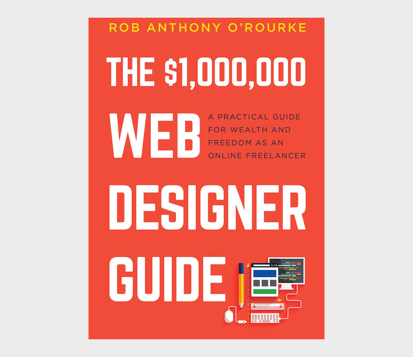
10. 1000000 Web Designer Guide

$1,000,000 Web Designer Guide

As more and more designers and creative professionals are going freelance, this wonderful book covers tips, tricks, and life lessons for designers who are on or planning to take the path to freelance career.

In this book, you’ll get some practical tips on taking a smart approach towards freelancing without getting overworked and underpaid. The book also has tips on balancing a successful work life and balancing it with a fulfilling personal life.

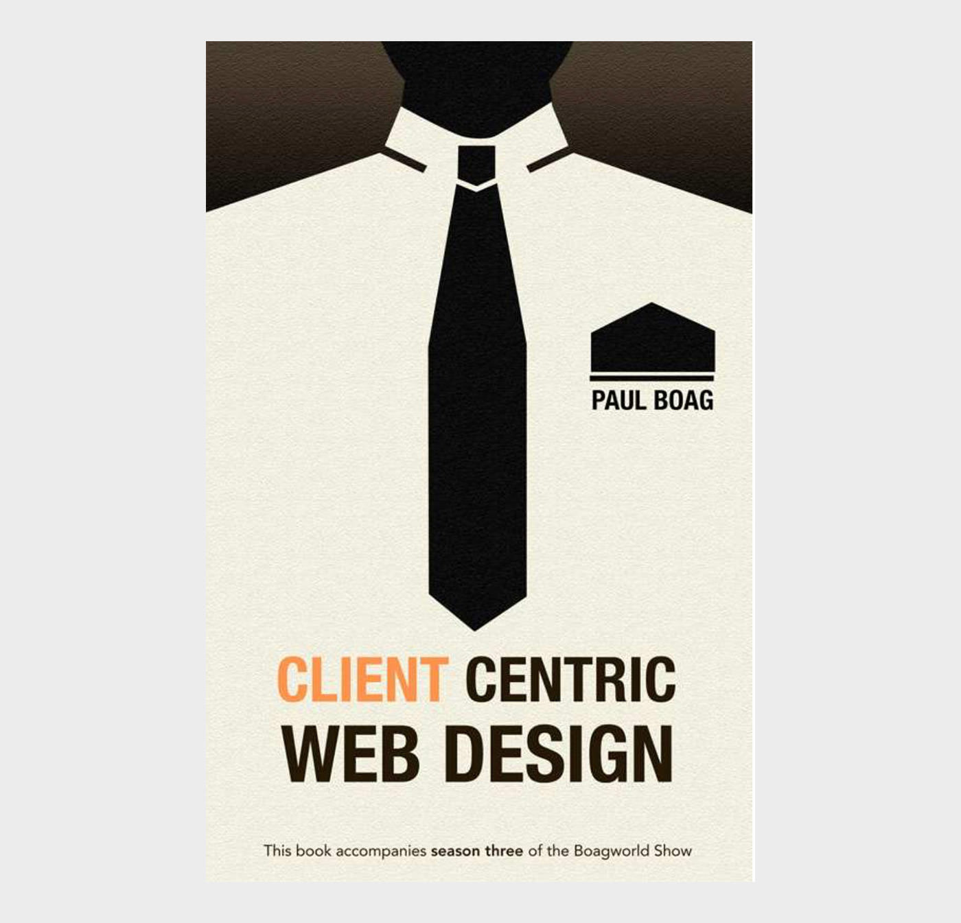
11. Client Centric Web Design

Client Centric Web Design

A client-centric web design methodology addresses the negative attitude that exists towards client work and has the potential to transform your business.

For the client/designer relationship, to work both parties need to respect the other. In this book you will explore how to move the clients’ perception of you as a pixel pusher to that of an expert.

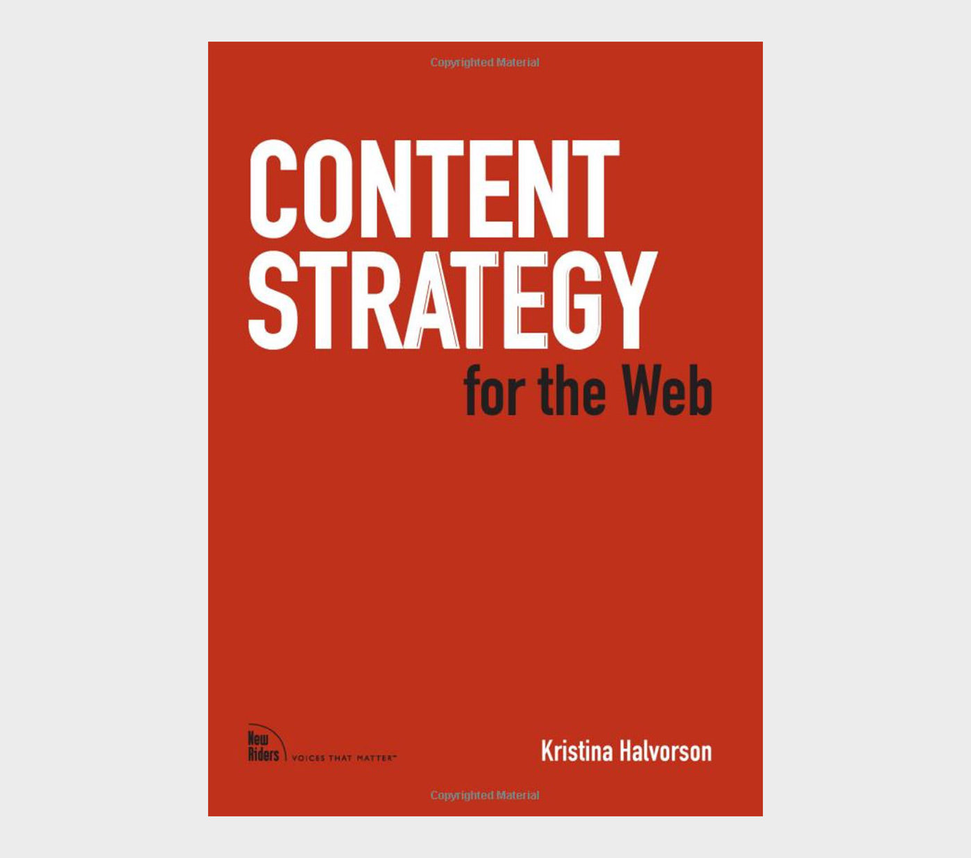
12. Content Strategy for the Web

Content Strategy for the Web

Without meaningful content, your website isn’t worth much to your key audiences. But creating (and caring for) “meaningful” content is far more complicated than we’re often willing to acknowledge. Content Strategy for the Web explains how to create and deliver useful, usable content for your online audiences, when and where they need it most. It also shares content best practices so you can get your next website redesign right, on time and on budget.

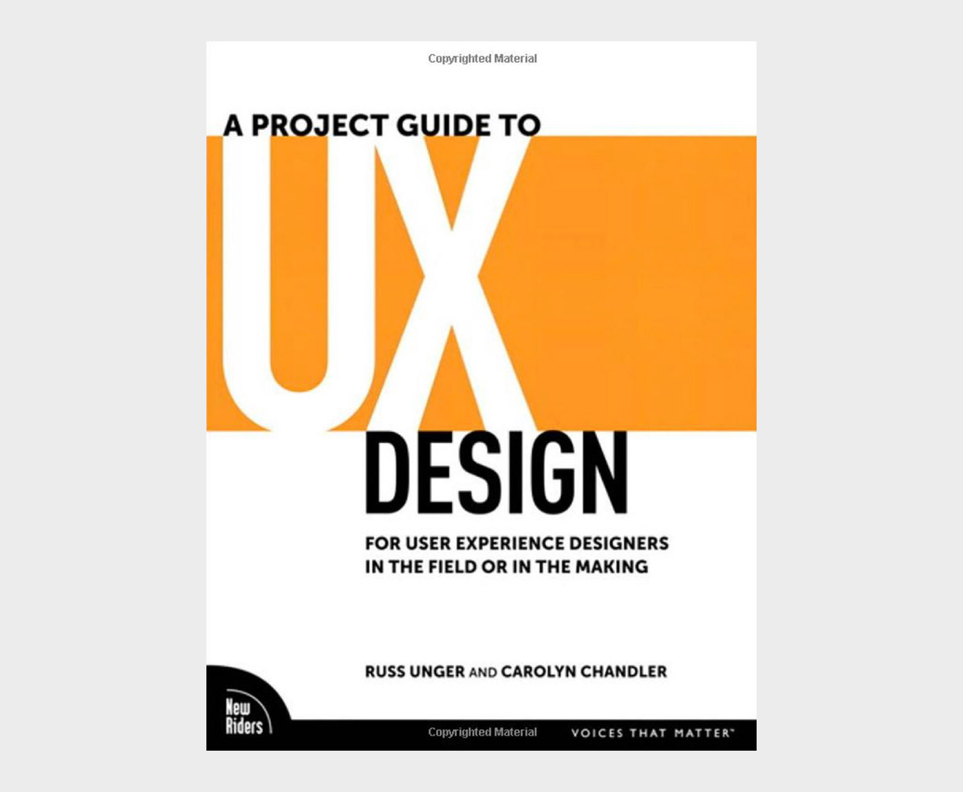
13. A Project Guide to UX Design

A Project Guide to UX Design: For user experience designers in the field or in the making

User experience design is the discipline of creating a useful and usable website or application — one that’s easily navigated and meets the needs of both the site owner and its users.

But there’s a lot more to successful UX design than knowing the latest Web technologies or design trends: It takes diplomacy, project management skills, and business savvy. That’s where this book comes in.

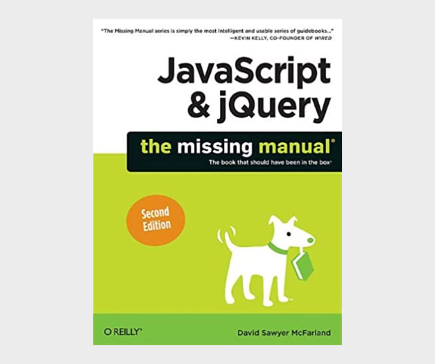
14. JavaScript jQuery

JavaScript & jQuery: The Missing Manual

JavaScript lets you supercharge your HTML with animation, interactivity, and visual effects, but many web designers find the language hard to learn. This jargon-free guide covers JavaScript basics and shows you how to save time and effort with the jQuery library of prewritten JavaScript code.

You’ll soon be building web pages that feel and act like desktop programs, without having to do much programming.

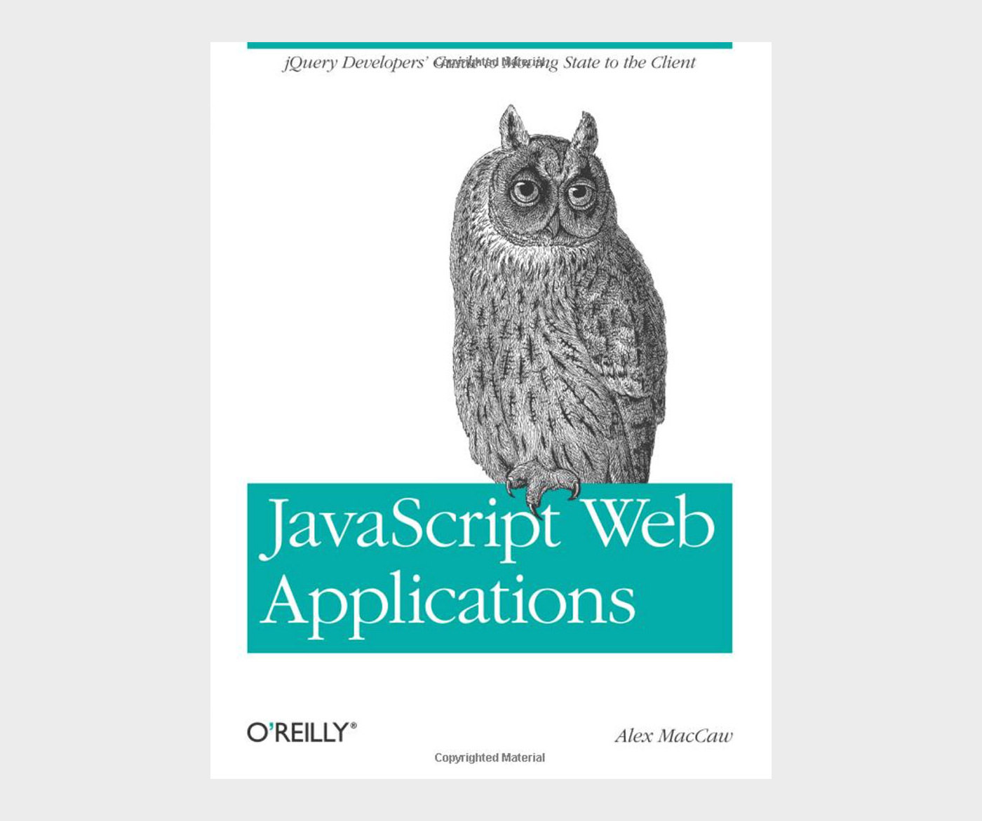
15. JavaScript Web Applications

JavaScript Web Applications

Building rich JavaScript applications that bring a desktop experience to the Web requires moving state from the server to the client side — not a simple task. This hands-on book takes proficient JavaScript developers through all the steps necessary to create state-of-the-art applications, including structure, templating, frameworks, communicating with the server, and many other issues.

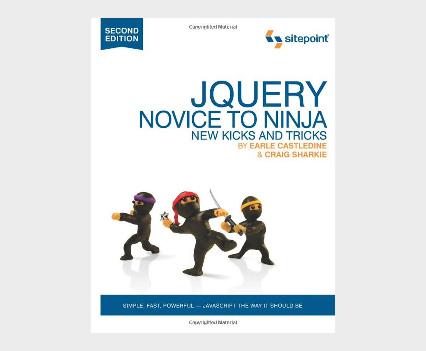
16. jQuery Novice to Ninja

jQuery: Novice to Ninja

jQuery: Novice to Ninja, 2nd Edition is the perfect book to jump-start your journey into jQuery. You’ll learn all the basics, so you’ll be able to truly appreciate the power of this JavaScript framework. Then you’ll move on to more advanced techniques, such as plugin development and the creation of almost every conceivable UI widget.

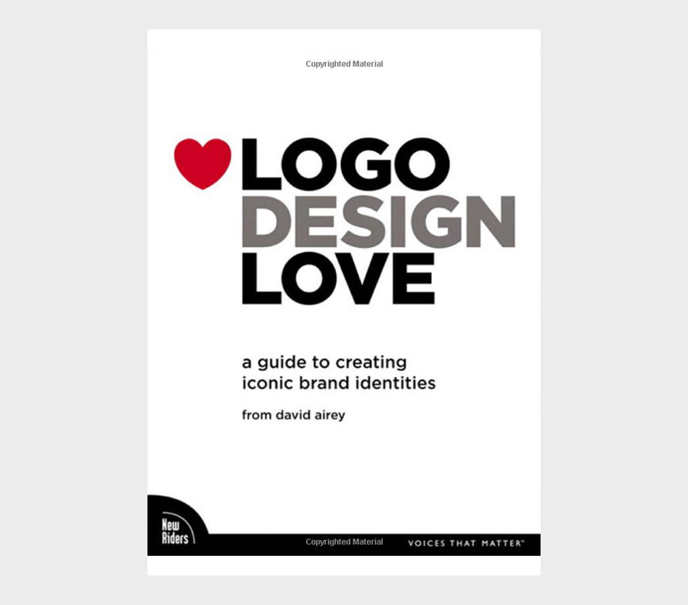
17. Logo Design Love

Logo Design Love: A Guide to Creating Iconic Brand Identities

There are a lot of books out there that show collections of logos, but David Airey’s “Logo Design Love” is something different. It’s a guide for designers (and clients) who want to understand what this mysterious business about logos is all about.

Written in reader-friendly, concise language, with a minimum of designer jargon, Airey gives a surprisingly clear explanation of the process, using a wide assortment of real-life examples to support his points.

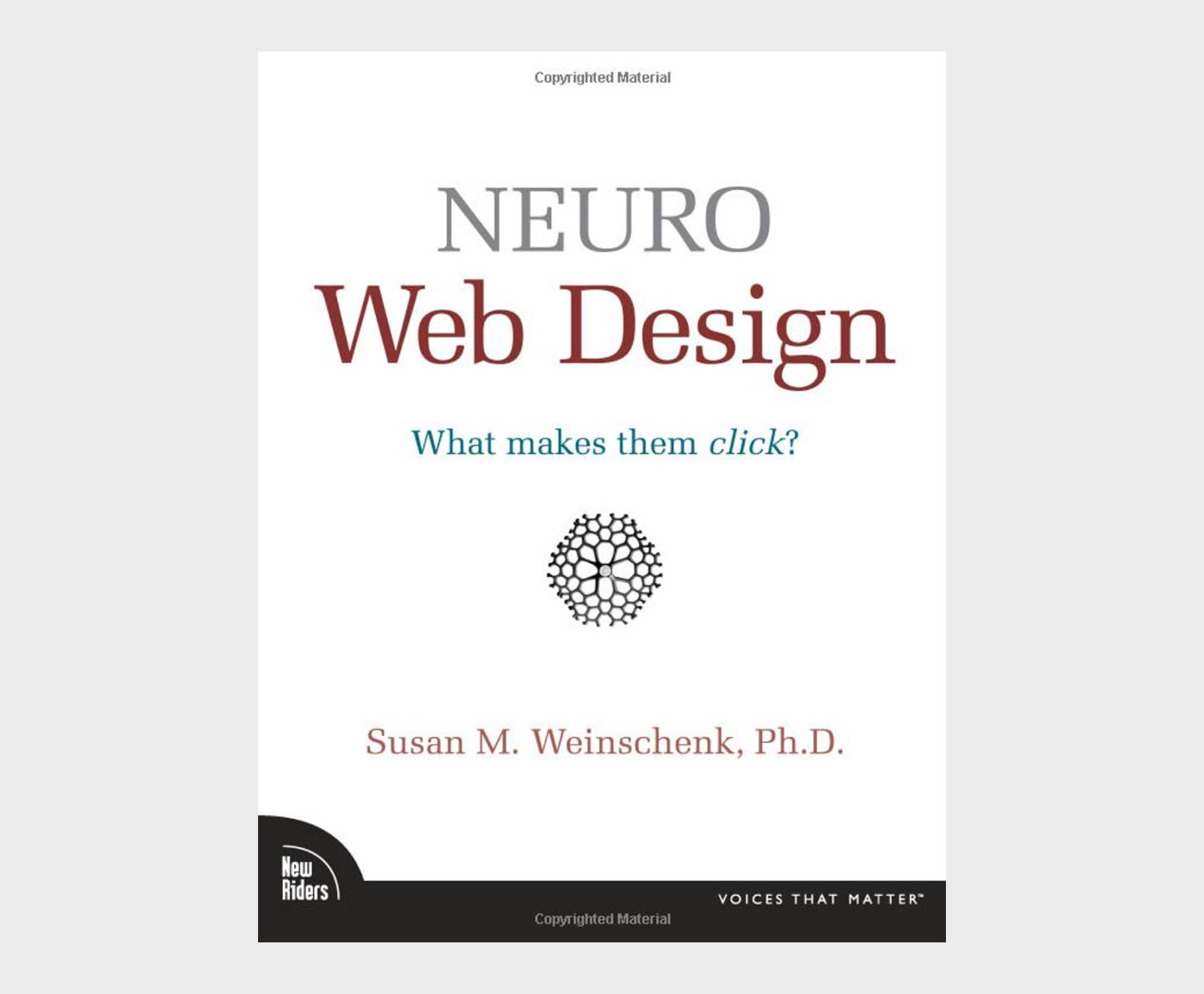
18. Neuro Web Design

Neuro Web Design: What Makes Them Click?

Neuro Web Design employs “neuro-marketing” concepts, which are at the intersection of psychology and user experience. It’s scientific, yet you’ll find it accessible, easy to read, and easy to understand. By applying the concepts and examples in this book, you’ll be able to dramatically increase the effectiveness and conversion rates of your own website.

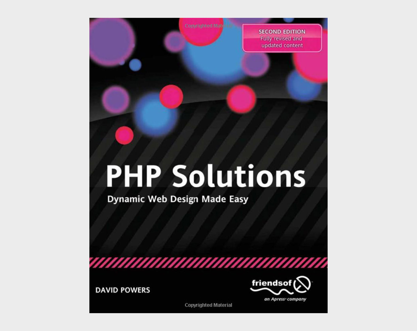
19. PHP Solutions

PHP Solutions: Dynamic Web Design Made Easy

You want to make your websites more dynamic by adding a feedback form, creating a private area where members can upload images that are automatically resized, or perhaps storing all your content in a database.

This book doesn’t just provide a collection of ready-made scripts: each PHP Solution builds on what’s gone before, teaching you the basics of PHP and database design quickly and painlessly.

By the end of the book, you’ll have the confidence to start writing your own scripts.

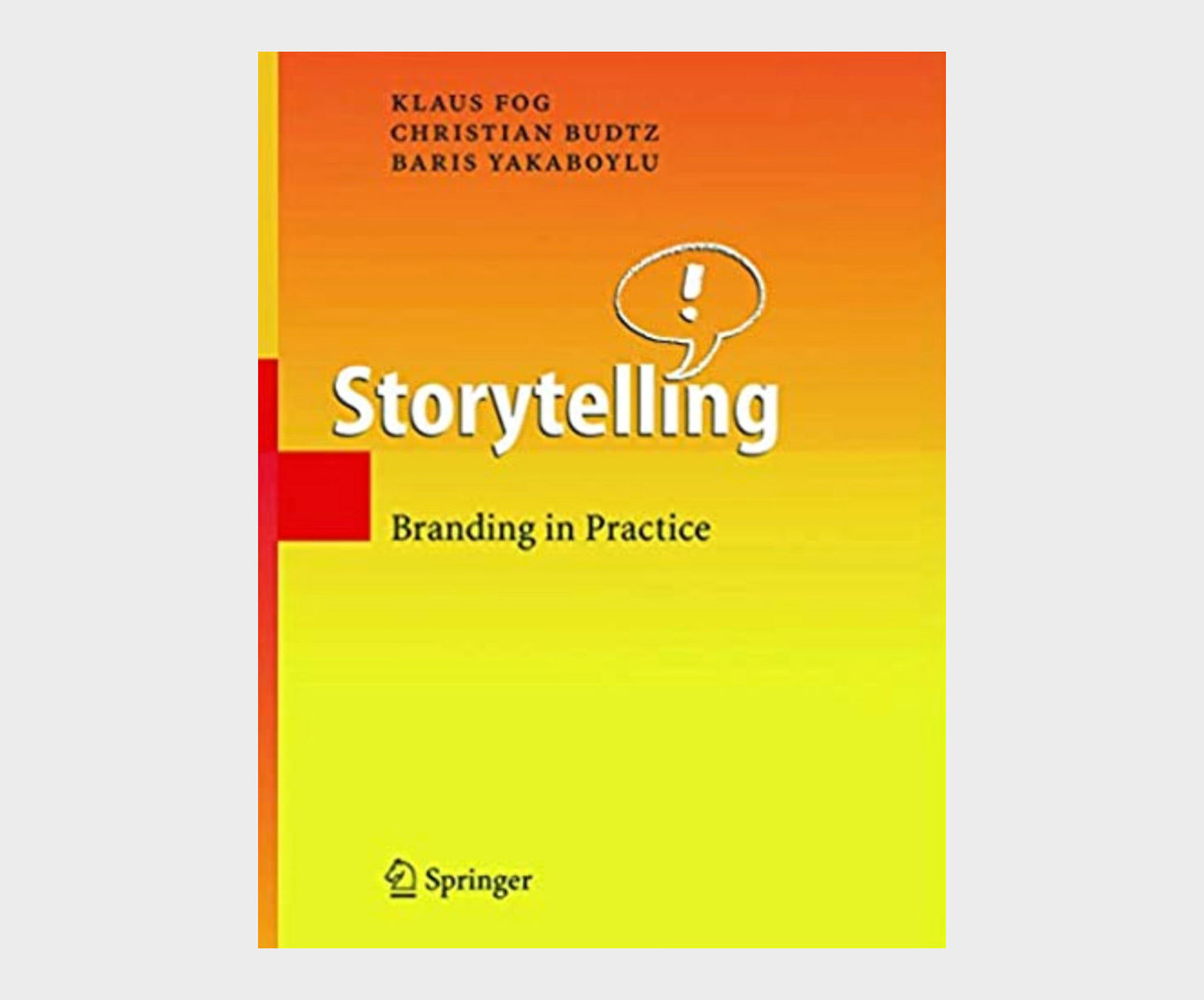
20. Storytelling Branding in Practice

Storytelling: Branding in Practice

This book is written for practitioners by practitioners. Through real life examples, simple guidelines and practical tools, the book aims to inspire companies to use storytelling as a means of building their brand — internally as well as externally.

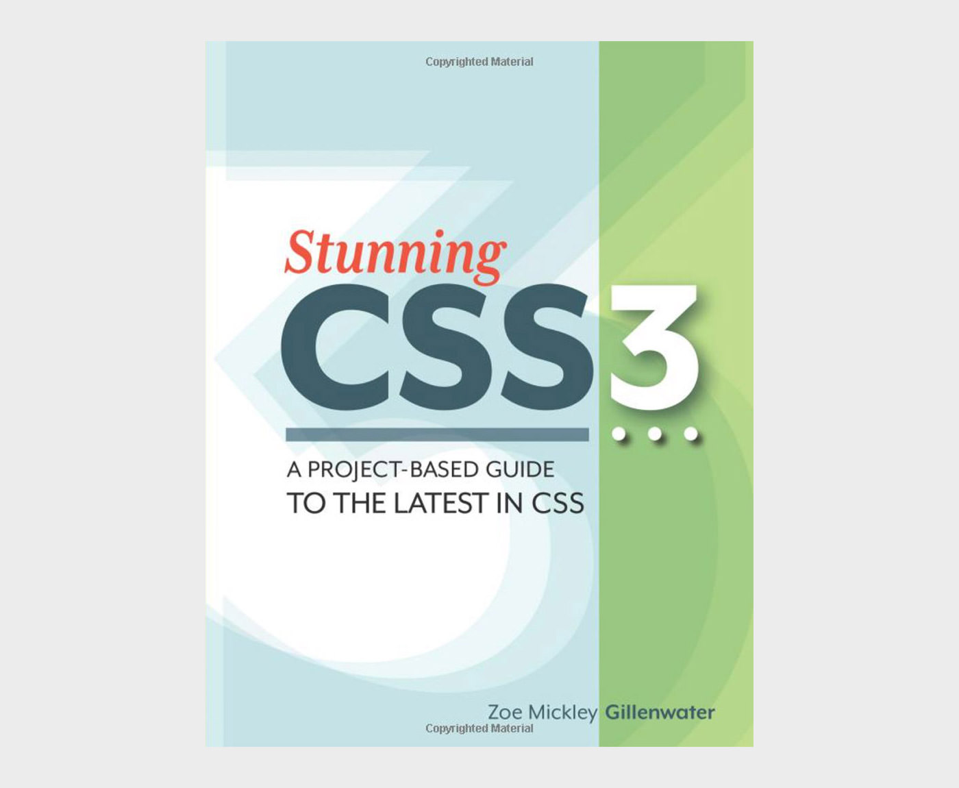
21. Stunning CSS3
Stunning CSS3: A project-based guide to the latest in CSS

By reading this book you’ll learn how to accomplish modern CSS3 effects and more by working through a series of practical yet cutting-edge projects.

Each chapter walks you through standalone exercises that you can integrate into projects you’re working on, or use as inspiration. You’ll learn all of the most popular, useful, and well-supported CSS3 techniques.

22. The Thank You Economy

The Thank You Economy

If this were 1923, this book would have been called “Why Radio Is Going to Change the Game”. The Thank You Economy is about something big, something greater than any single revolutionary platform.

It isn’t some abstract concept or wacky business strategy — it’s real, and every one of us is doing business in it every day, whether we choose to recognize it or not. It’s the way we communicate, the way we buy and sell, the way businesses and consumers interact online and offline.

23. The Elements of User Experience

The Elements of User Experience: User-Centered Design for the Web

The Elements of User Experience cuts through the complexity of user-centric design for the Web with clear explanations and vivid illustrations that focus on ideas rather than tools or techniques. Jesse James Garrett gives readers the big picture of Web user experience development, from strategy and requirements to information architecture and visual design.

This accessible introduction helps any Web development team, large or small, to create a successful user experience.

24. Thinking with Type

Thinking with Type: A Critical Guide for Designers, Writers, Editors, & Students

Thinking with Type is the definitive guide to using typography in visual communication, from printed page to computer screen.

This revised edition includes forty-eight pages of new content, including the latest information on style sheets for print and the Web, the use of ornaments and captions, lining and non-lining numerals, the use of small caps and enlarged capitals, as well as information on captions, font licensing, mixing typefaces, and hand lettering.

25. Web Design Confidential

Web Design Confidential

Drawing on survey statistics from over 5,400 web designers from around the world, and the insight and experiences of several design veterans, Amanda Hackwith unlocks the door and sheds light on the web design industry in Web Design Confidential.

Have you ever wondered if your hourly rate is too low or too high? Are you torn between freelance design work and full-time employment? Are you missing an essential design skill without even knowing it?

Whether you’re looking for the latest web design practices, words of wisdom from design veterans, or just a better understanding of your profession, Amanda Hackwith and 5400 colleagues have the answers to your questions and you’ll find what you need in Web Design Confidential.

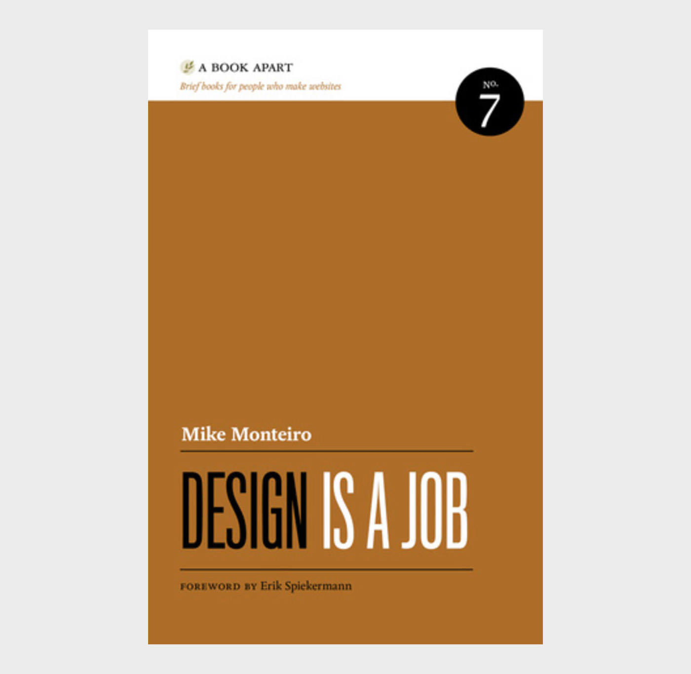
26. Design Is a Job

Design Is a Job

Co-founder of Mule Design and raconteur Mike Monteiro wants to help you do your job better. From contracts to selling design, from working with clients to working with each other, this brief book is packed with knowledge you can’t afford to not know.

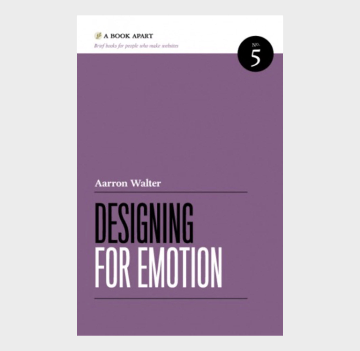
27. Designing for Emotion

Designing for Emotion

Make your users fall in love with your site via the precepts packed into this brief, charming book by MailChimp user experience design lead, Aarron Walter.

From classic psychology to case studies, highbrow concepts to common sense, Designing for Emotion demonstrates accessible strategies and memorable methods to help you make a human connection through design.

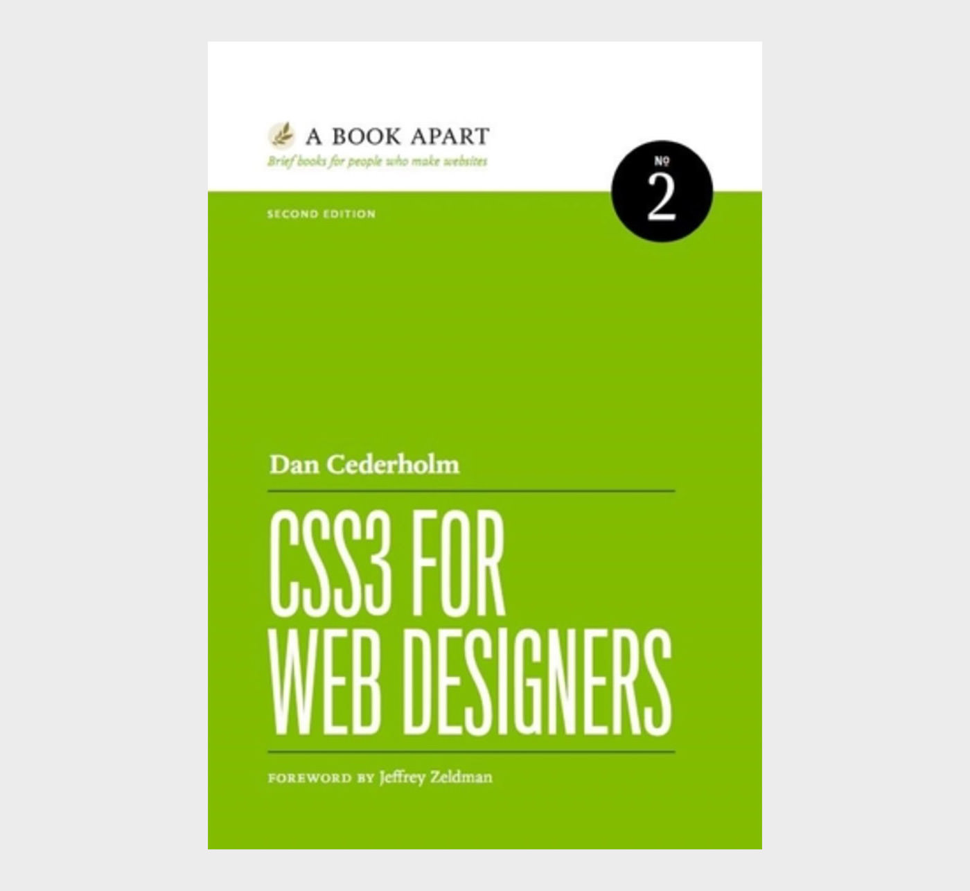
28. CSS3 for Web Designers

CSS3 for Web Designers

From advanced selectors to generated content to the triumphant return of web fonts, and from gradients, shadows, and rounded corners to full-blown animations, CSS3 is a universe of creative possibilities. No one can better guide you through these galaxies than world-renowned designer, author, and CSS superstar Dan Cederholm.

Learn what works, how it works, and how to work around browsers where it doesn’t work.

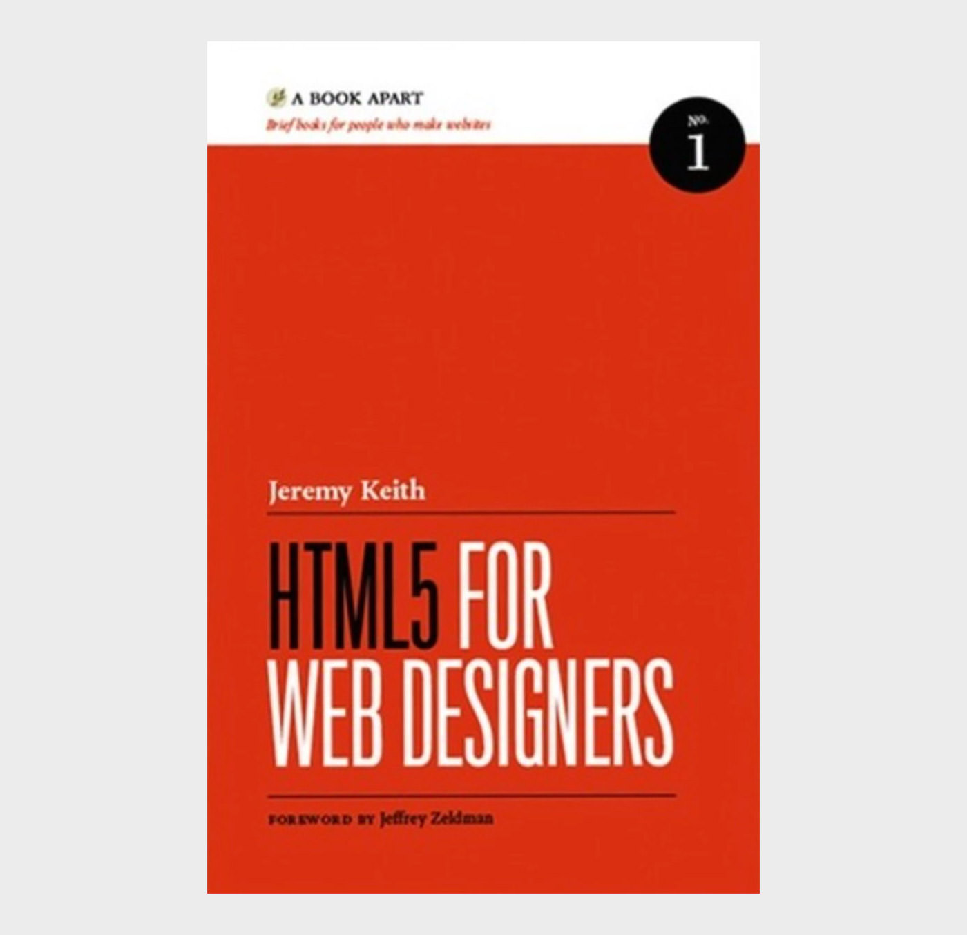
29. HTML5 for Web Designers

HTML5 for Web Designers

The HTML5 spec is 900 pages and hard to read. HTML5 for Web Designers is 85 pages and fun to read. Easy choice. HTML5 is the longest HTML specification ever written. It is also the most powerful, and in some ways, the most confusing. What do accessible, content-focused standards-based web designers and front-end developers need to know? And how can we harness the power of HTML5 in today’s browsers?

In this brilliant and entertaining user’s guide, Jeremy Keith cuts to the chase, with crisp, clear, practical examples, and his patented twinkle and charm.

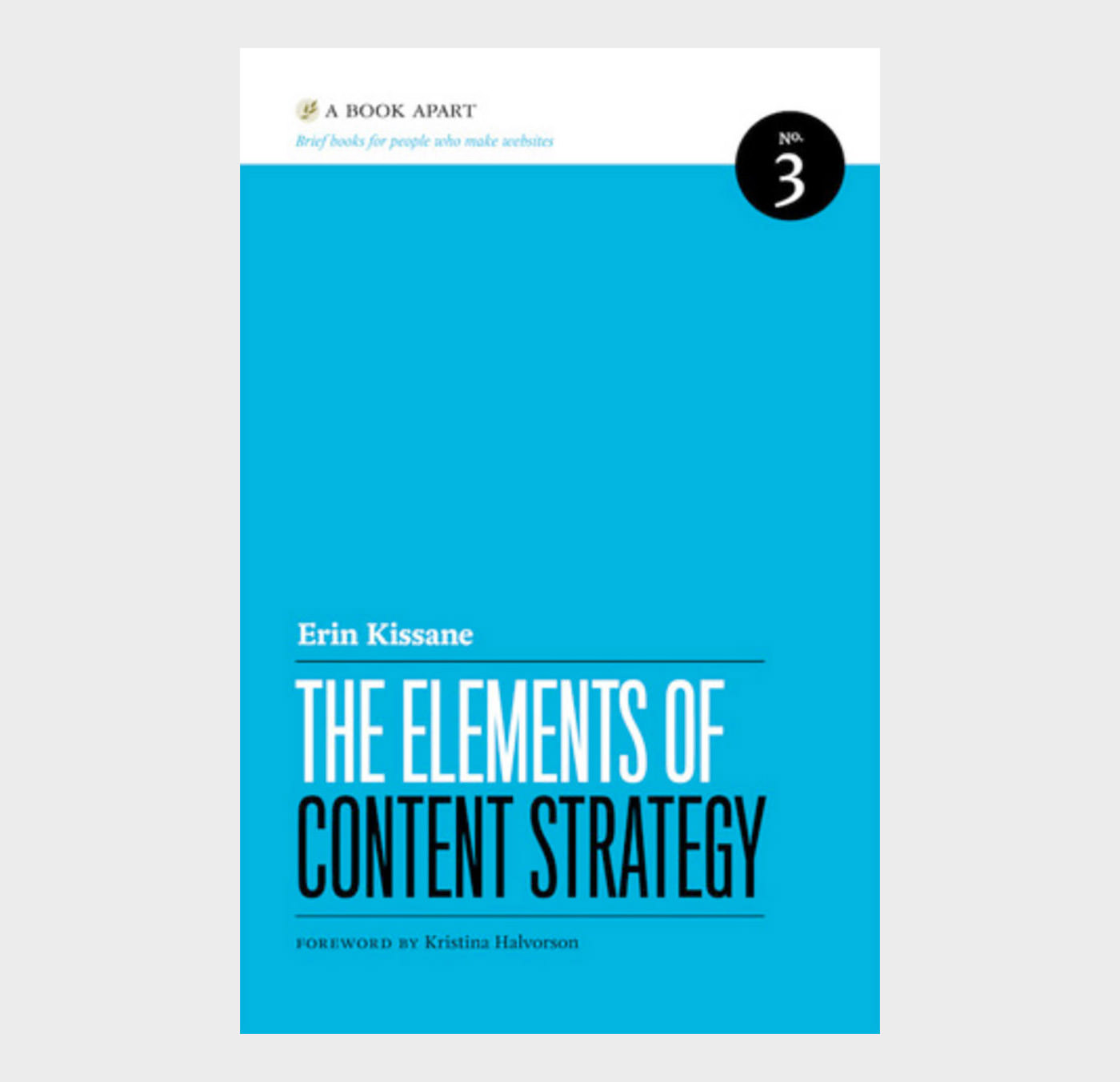
30. The Elements of Content Strategy

The Elements of Content Strategy

Content strategy is the web’s hottest new thing. But where did it come from? Why does it matter? And what does the content renaissance mean to you?

This brief guide explores the roots of content strategy, and quickly and expertly demonstrates not only how it’s done, but how it is done well. A compelling read for both experienced content strategists and those making the transition from other fields.

The post 30 Books For Web Designers and Developers appeared first on Hongkiat.

The Day When Web Design Gets Boring

Nothing can escape the iron teeth of time, and the day when web design gets completely boring and finally fades away will sooner or later come… or perhaps it has already happened? In an online world full of grid-based hero blocks, and yawn-inducing call-to-action buttons, we can’t be sure of anything anymore.

The best thing we can do is to approach the problem rationally, as it can be expected from good professionals.

In this post we try to figure out the time when the web will be fully deprived of creativity, and web designers won’t be anything more than framework-configuring bots. The clock keeps ticking, the dark times are coming, but don’t worry, if we know the schedule we can better prepare for the change.

First of all though, we need to take a look at the bigger picture, and understand how the field of design has managed to survive this long.

5 Free Tools to Design Creative Ads

5 Free Tools to Design Creative Ads

Whether you want to design ads for your new product or design banners for your online profile on… Read more

The Oldest Profession In The World

Design has been the oldest profession in the world. Have you heard it otherwise? Most likely those were just urban legends, dirty jokes or evil gossips.

Goods, products and everything that can be sold or bought need to be first designed. Money or other valuables that were offered in exchange for the service that is mistakenly considered the oldest profession also needed to be designed well before anything could have happened.

If you want to understand the impact design has had on humanity just quickly look around yourself wherever you are. Everything you see right now, other than natural forms and living creatures – objects, buildings, furniture, vehicles, clothes, your tea infuser and coffee mugs – first existed as ideas in designers’ minds, then were smartly prototyped by them.

The global influence of design is so enormous and has so many dimensions that it’s hard to grasp.

So how has the oldest profession in the world managed to survive this long? Throughout the neverending need for change, the constant diversification of the field, and via the theoretical and practical conflicts that have never ceased to exist.

Conflicts That Can Never Be Solved

Any domain that requires at least an ounce of creativity are full of conflicts. As design is creation per se, it is naturally loaded with a lot of dissent.

The questions have always been there: how to provide the best solution, what are the rules, are rules needed at all, along with many other debates and uncertainties. As this post is nothing more than an investigation about the final days of web design as we know it now, we will focus only on the conflict that has had the most impact on our field.

This conflict in design – and generally in art – began when mass production became widely available, around the beginning of the 20th century. Since then creators have been trying to comprehend how they can the best serve human needs while still coming up with creative and unique solutions that fill the void not only physically but also mentally and emotionally.

The opposition of Art Deco and Bauhaus – the handcrafted for the few and the functional for the masses – in the early 20th century excellently represents the nature of this conflict.

Bauhaus
Art Deco

Both produced elegant solutions on their own way without invalidating the existence of the other. Something similar happens these days in web design.

The Ever-Expanding Online Universe

When the World Wide Web was created it was hard to figure out how it would finally look like, just like we are right now struggling with finding the magical date when web design will turn insufferably boring.

It’s more and more sure though that the web formed a virtual world parallel to the physical one, that needs to be populated with virtual objects that we know as applications and websites.

The number of things from the physical world that get a representation in the virtual one is growing every day: we buy cool stuff from e-shops, our personalities are represented online, and fabulous solutions for our burning problems are also stored on the web. But not just that.

The rapidly emerging hardware technology also expands our opportunities both as users and creators, just think about the rise of wearables and other smart devices.

The Gray Side of The Early Web

A more complex online world naturally requires more solutions and a wider approach than a simpler one that was mainly about creativity and fun. Or was it? What if there have always been a gray, boring side of web design?

Websites We Visit: How They Look Like 10 Years Ago

Websites We Visit: How They Look Like 10 Years Ago

Most of us probably got our Internet connection somewhere 10 years back. It was also around that time… Read more

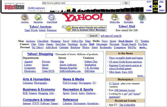
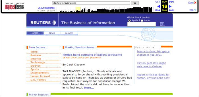
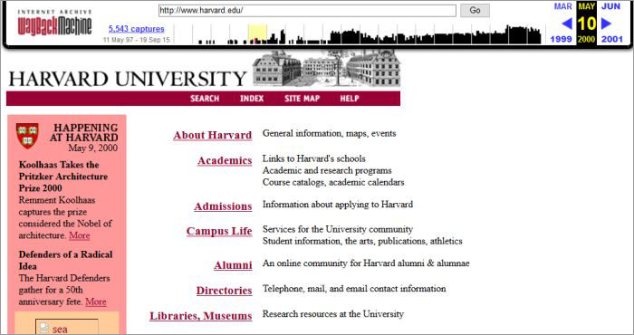
We are lucky, as with the help of the Wayback Machine we can easily get an accurate reply at least to this question. Let’s go back to the beginning of the new millennium to see if this frightening assumption can really be true.

Yahoo From 2000
Reuters From 2000
Harvard From 2000
Trip Down Memory Lane: Early Designs of Popular Sites

Trip Down Memory Lane: Early Designs of Popular Sites

Over the years websites update and change their design style gradually, sometimes for better, sometimes for worse, but… Read more

Wait, What?

Yup, this is how the most part of the web looked like in the year 2000. Business sites that had to make profit and web pages of organizations that required easy usability chose the straightforward, simple designs that didn’t leave too much space for imagination, even back in the good old days.

The tools have been constantly changing though, so at least the coding part has never become boring: back then devs used HTML tables, transparent gifs and other sneaky techniques to achieve the logical, easy-to-understand layout; these days we tend to use frameworks like Bootstrap and Zurb Foundation.

10 Lightweight Alternatives To Bootstrap & Foundation

10 Lightweight Alternatives To Bootstrap & Foundation

Choosing the right framework that is the perfect fit for your projects could be a little bit overwhelming… Read more

Tools Are Just Tools

Tools are just tool; it has always been the client and the designer who decide what to achieve with them. It’s possible to build beautiful, award-winning websites with Bootstrap, but of course aesthetics is not always the primary consideration.

User Experience and Usability are more of a concern these days for business clients who need to provide accessible websites for a wide user base. Luckilyclients who want artistic websites are also out there, like they have always been – just think about the needs of a music band, an art gallery or a conference organizer.

Elephant Restaurant's Website

The Final Date

As it has just turned out, web design has always had a functional side that can only use subtler visual elements. We unfortunately run into an infinite loop that will hardly come to an end.

The conflict between functionality and aesthetics is not simply a binary question; it exists on a spectrum that is influenced by more and more factors, as the online world becomes more complicated. Web designers need to reconcile newer and newer needs.

As we exist within an infinite loop that can only be solved with formatting the whole system, it doesn’t bear much sense to stare at our clocks, and worrying about the time when our field will be deprived all of its creativity.

The best thing we can do is to get rid of our annoyingly ticking clocks, and replace them with perpetuum mobiles. Gazing at them with an open mind can be a good meditation practice that can help us understand how we personally can contribute the best to the ever changing world of web design.

Now Read:
Changing The Face Of Web Design: A Case Study Of 25 Years

The post The Day When Web Design Gets Boring appeared first on Hongkiat.

Did you miss our previous article…
https://www.1clanek.info/?p=556

Designing For People With Accessibility Needs

The people who use the web are not a homogeneous mass but rather a huge group with incredibly high diversity. Many of them are not native English, or highly educated city dwellers with excellent health conditions. When we design for the public we need to pay attention to this fact; otherwise, we miss out on many potential users, as well as a great possibility to boost the search engine rankings of a site.

Universality and inclusivity are in the focus of the Accessibility web standards that are one of W3C’s web design related standards. The final goal of the Web Accessiblity Initiative (WAI) is to design a web that works “for all people, whatever their hardware, software, language, culture, location, or physical or mental ability”.

When we think about accessibility the most important thing we need to understand is that a user doesn’t need to have full loss of a sense or an ability to be in need for accessibility support. People who have problems such as partial sight loss, or mild hearing impairment also have acessibility needs.

Now let’s see who are the main groups, how they use the web and how the careful designer can improve their user experience.

Visual Impairments

People in this group can have mild or moderate vision impairments in one or both eyes, colour blindness, low vision, blindness or deaf-blindness

In many cases there is a need to change the presentation of the web content to adapt it to their needs. They require the ability to resize text size and images, and to customize fonts, colours, and spacing to increase readability. It’s also a good idea to ensure that people who can’t see the mouse-pointer can navigate through the content using only their keyboards.

Many visually disabled people use screen readers that only work properly if the frontend is semantically coded, otherwise their special assistive softwares can’t identify the structure of the web page and users would hardly be able to make sense of the content.

We need to provide these pages with proper descriptions for hyperlinks, icons, images, and other media types with the help of explanatory alt and title HTML attributes. The rule of thumb here is to make an equivalent text alternative available for each non-textual element.

It’s also important not to stop users from configuring their own browser settings, so if it’s possible, specify everything in relative units (ems, rems, or percentages) instead of exact sizes.

In fact, the bots of Google and other search engines can also be thought of as visually disabled agents, and keep in mind that everything that is good for visually impaired humans also pleases the bots thereby improving the SEO ranking of a site.

Auditory Disabilities

Web users who suffer from hearing impairments of different grades can’t always understand speech, especially when there is a background noise. The most frequent use case here is video content, that needs to be made accessible by adding visual assistance to the audio part.

According to the Media Access Group of the WGBH Radio “an estimated 24 million Americans have enough of a hearing loss that they cannot fully understand the meaning of a television program”.

Using closed captioning in which background noises such as music or explosions are also captioned can help them a lot. Providing options for captions and transcripts can also significantly improve the experience of people who are not native speakers of the recorded language.

We also need to be careful when designing web and mobile apps. If users have to rely solely on interactions using voice, people with auditory disabilities or those without proper audio hardware or software will be excluded from the usage.

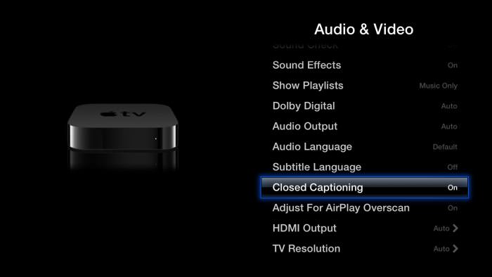
App designers also need to pay attention to always adding options to stop, pause, or adjust the volume. Apple TV is an excellent example of a device designed with the deaf and hard of hearing in mind, as it provides them with a nice user interface to customize subtitles and captions to their individual needs.

Auditory Disabilities

Cognitive and Neurological Disabilities

Disorders related to the brain or the peripheral nervous system impact how people move, see, hear and understand things. There are many people who need to process information slower than others, so we need to provide them with clearly structured content that facilitates orientation.

It can also help if we offer different ways of navigation: not only one huge dropdown menu, but also tag clouds, search option, breadcrumbs, and other smart and easy-to-understand solutions.

Enhancing the content with visual cues is crucial when we want to enable people with cognitive and neurological disabilities to understand the information we want to convey to them. Images, graphs, illustrations, and smart typography such as avoiding long paragraphs can do a lot for them.

Reducing the number of distractions like flashing or blinking ads and annoying popups can keep many of them on our sites, just think about those with ADHD (attention deficit hyperactivity disorder) or autism.

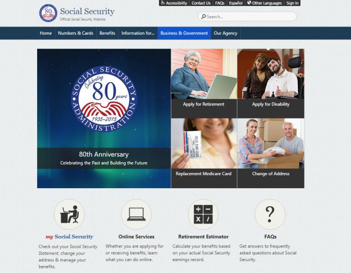
If you want to see an example of carefully designed, logically structured content with accessible navigation and descriptive visual cues, take a look at the U.S. government’s Social Security Administration site.

U.S. Government Social Security Administration

Physical Disabilities

Physically disabled people can have motor disorders, limitations of sensations or muscular control, joint problems, missing limbs, and can face many other physical impediments.

Probably the most important thing related to them is always providing full keyboard support, and giving enough time for them to complete tasks such as filling online forms, replying to questions or editing their previous content in comment sections.

Offering keyboard shortcuts, especially on touch-enabled devices can be godsend for this group.

Physically disabled people can face with difficulties when clicking small areas, so we always need to make sure that we design large enough, clickable areas like buttons.

It’s also important to keep in mind that many of them use assistive hardware or software. They can access the content with the help of an on-screen keyboard navigated through with a trackball, or they can use voice recognition or eye-tracking softwares.

Because of this, just like in the previous cases, it’s crucial to build logical, coherent navigation and a well-structured site without too many distractions.

Trackball

Conclusion

Creating web experiences for disabled people is an excellent design practice. If we build a site that takes the needs of the sensory impaired into consideration, we design a product that is logical, well-structured and easy-to-use. This is not only good for the disabled, but for every single user, as they have the same need for an intuitive and customizable website that is easy to understand.

If we give users a choice about how they want to consume the online content, and carefully think about all the possibilities they might interact with our site, we increase the overall user experience of our design in a significant way.

Now Read:
10 Assistive Tech for People With Disabilities

The post Designing For People With Accessibility Needs appeared first on Hongkiat.

Fresh Resources for Web Designers and Developers (April 2021)

A great product these days relies on the ecosystem. Imagine iPhone without the apps or WordPress without the plugins. They won’t be as useful as they are now.

In this round of the series, let’s take a look at some of the resources that support popular tools or libraries. Here we have quite a handful of React.js libraries, a couple of WordPress plugins, some VSCode extensions, and a lot more. Let’s jump in for the full list.

Fresh Resources for Web Designers and Developers (March 2021)

Fresh Resources for Web Designers and Developers (March 2021)

JavaScript is a wonderful language. You can build nearly anything with JavaScript; from a simple website, desktop application… Read more

Mesh Gradient

A Figma plugin that allows you to generate a beautiful Mesh Gradient. It allows you to edit the gradient axis to achieve a perfect gradient. Having Mesh Gradient can easily make your product design stands out from the crowd.

Notification

A WordPress plugin to notify actions that happen on a WordPress site. This plugin provides quite extensive APIs where you can do customization like sending notifications to selected recipients, call services, subscribing to particular actions, and whitelabeling. It’s a great plugin to keep you updated with your site activity.

Notification

Spatie Ray

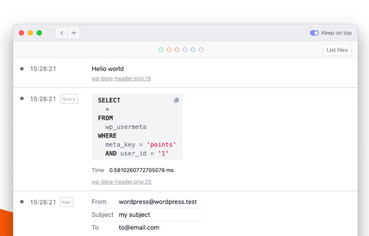
A plugin that connects your WordPress site to Ray.app, Spatie Ray is a desktop application that makes debugging and measuring code performance on your website more convenient. It is also available for some frameworks and CMS such Craft and Laravel.

Spatie Ray

Webhint

Webhint is an initiative from OpenJS Foundation to help developers build a better web by advocating and creating tools such as this VSCode extension and the browser extension to enforce some best practices.

This tool scans your code or your website and reports if the HTML is lacking in proper attributes, or if the site has some accessibility and performance issues.

Webhint

ScriptKit

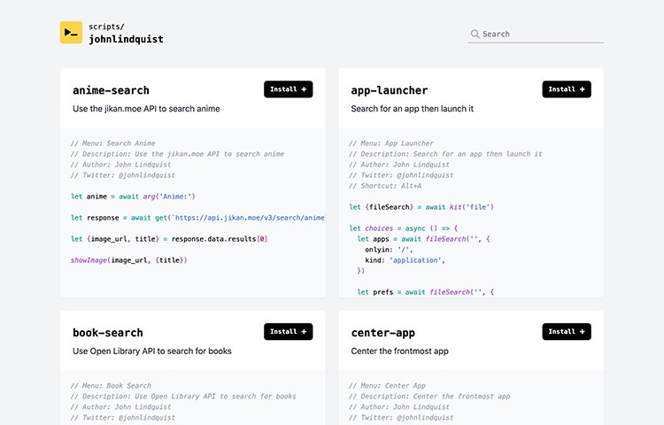
A desktop application for macOS that allows you to register a script to automate your tasks such as opening a browser and reading news, opening particular files or directories from a project, search for a book from particular sites, and much more.

It provides several pre-made scripts and will soon also provide collective scripts shared from its users. Script is written in Node.js or JavaScript, so if you’re familiar with the language you can create a custom script that suits your needs.

ScriptKit

Laravel Octane

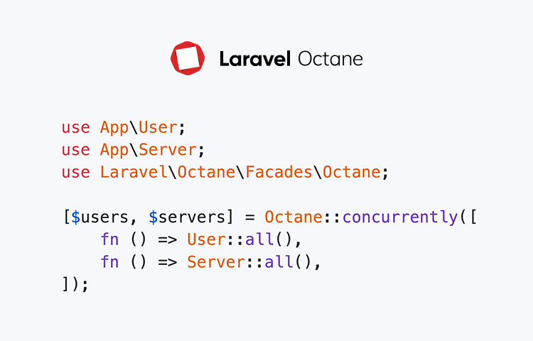
A Laravel library that greatly improves the performance of a Laravel application by leveraging high-performance PHP server environment Swoole or RoadRunner that enables concurrent requests. This allows Laravel to run blazing fast at 6000 req/s from the initial test.

Laravel Octane

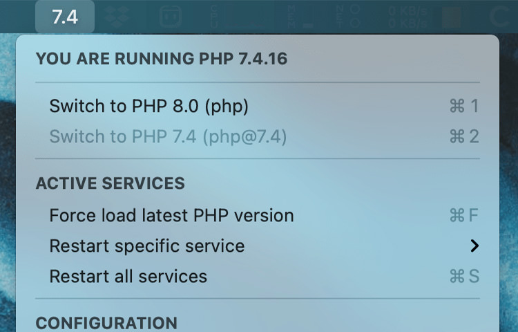
PHPMon

PHPMon is a macOS utility application to monitor the PHP service that runs on your machine. It adds a menu on the menu bar where you can see the PHP version that’s running, the extensions, and where the location configuration is. Pretty handy!

PHPMon

Heroicons

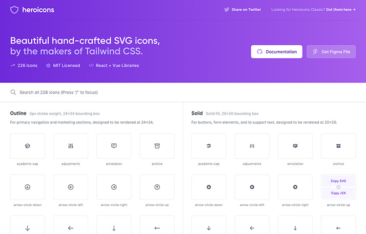
A collection of a beautiful hand-crafted collection of more than 200 icons. They come in two variants, Solid and Outline, and are available in SVG and JSX format so you can easily reuse them in your website or digital products.

Heroicons

FocalBoard

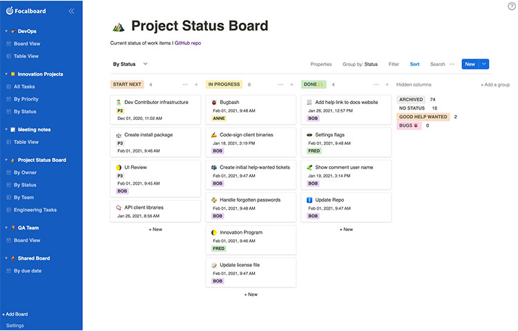
Focalboard is an open-source application to manage and organises tasks similar to apps like Trello and Notion. You can install FocalBoard on your own server or computers that give you more freedom and flexibility. A great alternative for those who prefer control over convenience.

FocalBoard

Gutenberg Icons

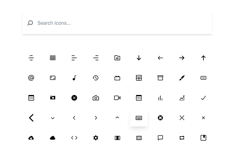
A collection of icons used by Gutenberg, the new WordPress editor. This site shows all the icons where you can generate the snippet to reuse it in Gutenberg block or simply download the SVG.

Gutenberg Icons

Haikei

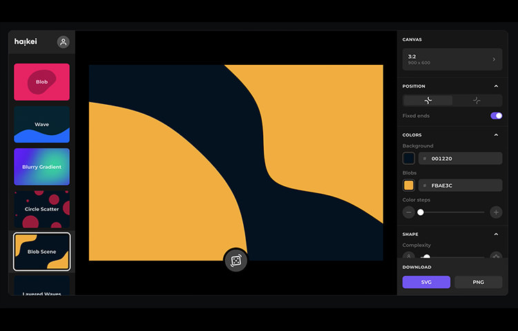
A collection of tools to generate shapes, backgrounds, and patterns to use in your design. It features a number of tools including one to generate a Blob, a Wave, Layer Waves, gradients, and a few more to come.

haikei

Design Patterns

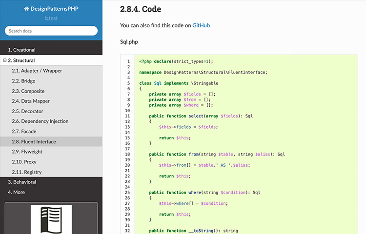
A collection of design patterns to structure your PHP codes. It covers various patterns and is recommended source if you intend to deep dive and improve your PHP development skills.

php-design-pattern

Accessibility Path

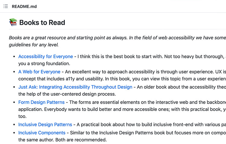
A collection of learning materials to know about web accessibility and inclusive design. You can find books, videos, articles from blogs, and tools. A great source to help you get started with the topics.

accessibility-path

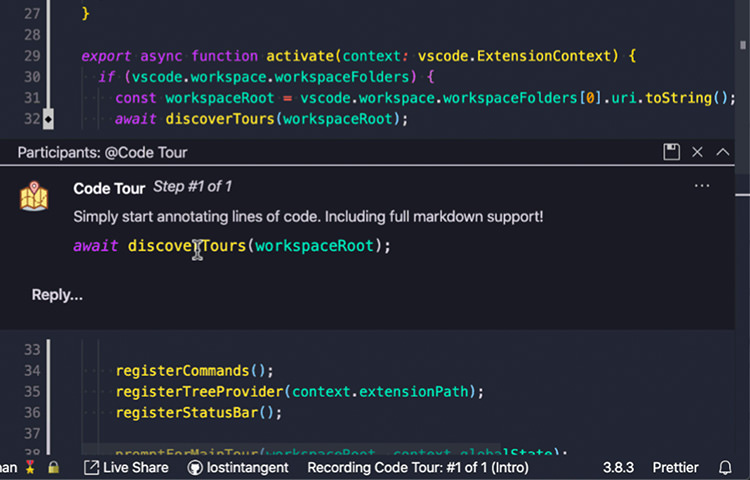
Code Tour

A VSCode extension to add a guided tour to help users walk through the codebase in a project. This is a great tool to help new developer to get familiar with the code quickly.

vscode-code-tour

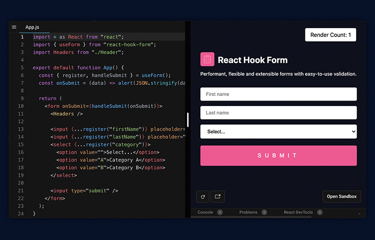
React Hook Form

An award-winning React.js library to create form. It is easy to use, lightweight, performant and renders proper markup with native HTML validation. On top of that, this library is also nicely integrated with tools like TypeScript for type validation, ReactNative for building form in a mobile app, and Validation library like yup for those who need go more advanced.

react-hook-form

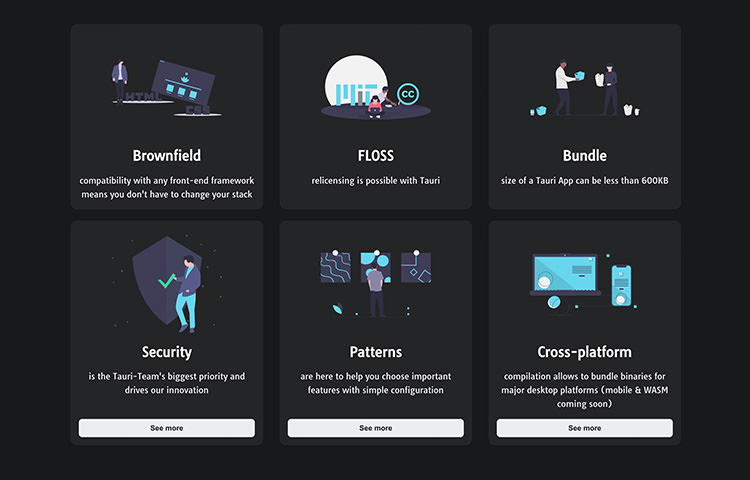
Tauri

A framework to build desktop applications with web technicalogies. Tauri focuses on performance, smaller app output, and provides a whole experience for developers to create an app. It provides CLI, API, Testing and CI framework. An example of an app built with Tauri can be just 600KB.

tauri

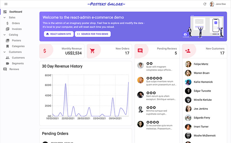
React Admin

A React.js library to develop a web application to manage any kind of data. It’s built on top of modern stack which includes REST and GraphQL APIs, ES6, React, and Material Design. This library is a great starting point to build an admin interface using React.js.

React Admin

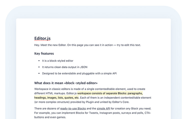
EditorJS

A JavaScript library to build an interactive text editor for modern browsers. It looks modern and clean than the usual WYSIWYG editor and is extensible with Plugins. It also generates a well-structured data that you can use anywhere on the website, mobile app, AMP, Instant Articles, and speech readers.

EditorJS

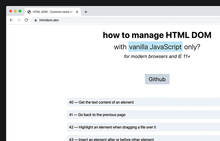
HTML DOM

A good resource that show you code snippets and tips to interact with DOM with just native API from the browser. These days you no longer need to use jQuery or Zepto.

HTML DOM

Awesome Compose

This is where you can find an awesome list of tools, apps, that can help to boost your productivity when working with Docker and Docker Composer.

Awesome Compose

The post Fresh Resources for Web Designers and Developers (April 2021) appeared first on Hongkiat.

Did you miss our previous article…
https://www.1clanek.info/?p=531

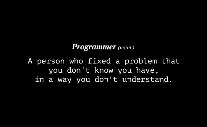
Insider Jokes Only Programmers Will Get

It isn’t easy being a programmer. They code all day, debug all night and go through thousands of code lines trying to clear up all possible messes before going live with their code. Sometimes, it takes a fellow programmer to understand the hardships of another programmer. The same can be said of their jokes.

In this post, we have collected a handful of jokes, that have been floating around the Web, which showcase a programmer’s sense of humor. Don’t worry if you don’t get all of them — just get a programmer to explain it to you.

30 Common Reactions Programmers Have When Things Go Wrong

30 Common Reactions Programmers Have When Things Go Wrong

Developing applications can be a very stressful job. Nobody is perfect, and running into buggy code is fairly… Read more

Some People Call It Magic
This Is Why You Should Hug Your Programmer
programmer insider jokes
So That’s What It Is!
programmer insider jokes
We Should Thank The Inventor Of “Hardware”
programmer insider jokes

Courtesy: csl

Well, Technically It’s True
programmer insider jokes

Courtesy: Claudio

Get It?
programmer insider jokes

Courtesy: Robert S.

Where Programmers Usually Hang Out.
programmer insider jokes
Programmers Are People Too
programmer insider jokes

Courtesy: gaylard

Riiiiiight
programmer insider jokes

Courtesy: CCH

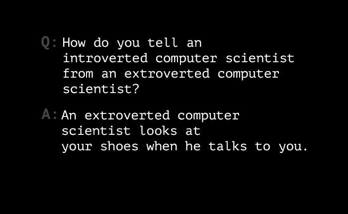
The difference between nerd introvert and extrovert.
programmer insider jokes
Brace For Backlash
programmer insider jokes
That’s Why You See Most Programmers Bespectacular!
programmer insider jokes

Courtesy: Arjan Einbu

Seriously, Try It
programmer insider jokes
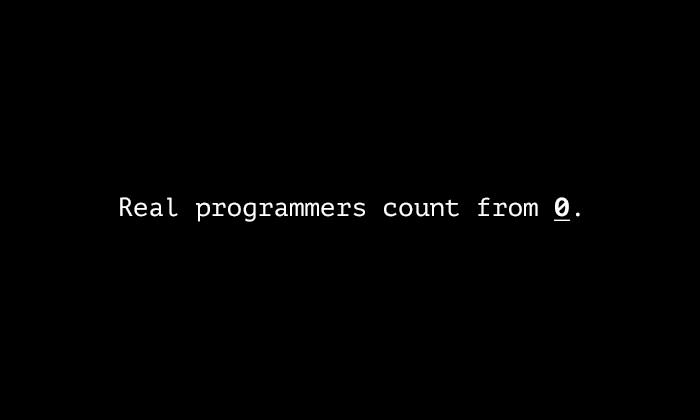
0, 1, 2, 3…
programmer insider jokes
Good Luck Getting An Explanation About This
programmer insider jokes
The Greatest Programmer Of All Time
programmer insider jokes
For Him Nothing Is Impossible.
programmer insider jokes
It’s An Addiction
programmer insider jokes
Hello World
programmer insider jokes

Courtesy: Don Neufeld

Java Programmers Should Know This
programmer insider jokes
Monkey See, Monkey Do
programmer insider jokes
Sometimes We Wonder Why Do We Bother
programmer insider jokes
Once Upon A Time…
programmer insider jokes
#programmerlogic
programmer insider jokes

Courtesy: GnevZmaja

Loop-dy-doo
programmer insider jokes

Courtesy: Adam Liss

SQL Clubbing
programmer insider jokes
Unix friends
programmer insider jokes

Courtesy: CodingBytes

The Programmer Has A Good Point
programmer insider jokes

Courtesy: Martin Cote

Ladies…
programmer insider jokes

Courtesy: Macke

Well, Does It?
programmer insider jokes

Courtesy: Adam Liss

Think Of The Possibilities!
programmer insider jokes
Reigning Champion
programmer insider jokes
Be awesome
programmer insider jokes
Hooray!
programmer insider jokes
Do You Think This Is A Game?
programmer insider jokes
XOR
programmer insider jokes
Never ever…
programmer insider jokes
No Class
programmer insider jokes
Which Are You?
programmer insider jokes
Conditional Love
programmer insider jokes

Courtesy: CommitStrip

programmer insider jokes

Now Read:
30 CSS Puns That Prove Designers Have A Great Sense Of Humor

The post Insider Jokes Only Programmers Will Get appeared first on Hongkiat.

Did you miss our previous article…
https://www.1clanek.info/?p=485