For Casual Users, Information on New WordPress Features Can Be Hard to Find

Virtually every software application evolves over time. For users, keeping track of the additions, subtractions, and bug fixes can be difficult. And, the more users an app has, the more challenging it is for developers to keep everyone in the know.

WordPress faces a unique uphill climb in this area. As a volunteer-driven, open-source project, there is a constant stream of changes. Various teams tackle their assigned tasks and, somehow, everything comes together and makes it to release.

It’s a testament to their hard work. But it also means that information regarding new features and compatibility changes can be spread amongst these different channels. Thus, they’re often difficult to locate.

For casual users (i.e., those who don’t follow every new development), this frequently leads to an information gap. When it comes time to apply an update to WordPress core, that could leave these users unaware of what’s included and scrambling to catch up.

Why is this so important? Let’s talk about what’s at stake, along with some ways to potentially close that gap.

The WordPress ‘Knowledge Bubble’

WordPress has seen several major changes in recent times. Features such as the Gutenberg block editor have reinvented how we work with the content management system (CMS). As it provides a relevant example, that’s the feature we’ll explore here.

For all of the community debate during the runup to launch, there were still users who had little or no idea that a change was coming. For those of us within the WordPress knowledge bubble, that may be hard to believe. But it speaks to the issue at hand.

There is a group of project contributors, web designers, and business people who pay close attention. They were able to stay on top of the information trickling out about the new editor. They were also the ones testing the beta plugin, becoming acutely aware of what the change would mean to the average website.

For others, that news may have completely missed them. True, there were assorted teasers within the WordPress dashboard before the launch. But some may have simply dismissed them without a full understanding of what was being communicated.

The result could leave you completely unprepared. Imagine logging into your website one day and seeing that the entire content creation process has changed. In addition, undetected theme and plugin incompatibilities posed their own potential to wreak havoc.

As for the information itself, it was scattered. There were several posts spread throughout various sections of WordPress.org. Outside of that official source, one would have to frequent sites such as WP Tavern or even this one. Otherwise, your only chance to get a detailed explanation would be through the odd link on social media – if you happen to follow relevant feeds.

The Structural Challenges

To be clear, any difficulty in accessing information isn’t due to a lack of effort. Indeed, the project’s dedicated volunteers can only work through the channels available to them.

The way I see it, the issue is more of a structural one. There currently isn’t an official one-stop location that puts all the need-to-know information in a single place. We’ll discuss some possible solutions (feasible or not) in a moment.

Outside sources can be quite valuable but are sometimes hit and miss in terms of what they cover. For instance, they may offer an outstanding Gutenberg tutorial for developers – but nothing that focuses on the everyday user.

And, let’s face it, there aren’t a lot of publications out there that are solely dedicated to WordPress news. It may be part of their mission, but it takes a lot of resources to provide the whole picture.

Then there are the users themselves. With a worldwide user base and all skill levels represented, it’s going to be nearly impossible to reach them all.

Still, it’s worth the effort to get the word out to as many people as possible.

An overhead view of multiple pathways.

A Multi-Pronged Approach to Spreading the Word

Realistically speaking, there probably isn’t a silver bullet that will bridge the WordPress information gap. But there are a few things that, when combined, could certainly help to keep more users in the know. Here are a few ideas:

Create an Official Source for Impactful Developments

Getting the details of upcoming changes usually requires sifting through a variety of posts on WordPress.org. These items may be strewn about the site, but are regularly updated.

Perhaps a dedicated, user-friendly page that focuses on the most impactful developments could bring these posts under one umbrella. That is, changes and features that are likely to affect a large segment of users and developers. I’ll leave defining the exact criteria to the experts.

But there’s plenty of room for creativity here. For example, the page could be sorted by topic, release, or even target audience (site administrators, developers, content creators, etc.). From there, readers could access a summary of the change and an archive of related posts.

This would provide users with an easy-to-digest source of information – one they can come back to time and again. With that in hand, they can gain an understanding of what’s happening and prepare their websites in advance.

It might also make for an engaging dashboard widget on WordPress installations. When someone logs into their website, they’ll have a summary of what they need to know right at their fingertips. Of course, care would need to be taken so as not to interfere with their ability to get things done.

A Community That Amplifies the Message

The WordPress community does a fantastic job of sharing information. Whether it’s code snippets or a helpful plugin, they can be counted on to pay it forward.

And, something tells me that having a well-organized source for new developments would encourage them to share even more. They’d have the opportunity to pass along official details, along with their own related content.

Helpful items like tutorials and summaries would add further context to what lies ahead. And the great news is that many people are already creating this type of content. The difference would be that, combined with the official source, an even bigger impact could be made.

In theory, users could first view the official rundown of a change. Then, they could dive into a community-driven tutorial that helps them better understand it and act accordingly.

Educate Users

Users, whether they’re website owners or designers, also have a key role to play. However, not everyone is keenly aware of the importance of staying informed.

Therefore, education is a big part of the solution. By helping them develop good website maintenance habits, users will be more likely to stay on top of upcoming changes. For some, just the mere practice of logging into their dashboard once a week could make all the difference.

WordPress is already taking some great steps in this area. Through their Learn WordPress initiative, users have access to a variety of helpful content. It can foster a connection that keeps people actively interested in the project.

A person holds a mobile phone.

The Quest to Reach Users

Even for those of us who follow WordPress closely, it’s easy to lose track of new features. For those who are a bit less involved, the ability to keep up is even harder.

For WordPress to continue growing, this information gap has to be narrowed. An informed user base is crucial for security, stability, and pushing the software forward.

The suggestions above are just that. I hope that they can serve as a catalyst for further discussion.

Regardless of how it’s implemented, opening up further lines of communication with users is a win for everybody.

The post For Casual Users, Information on New WordPress Features Can Be Hard to Find appeared first on Speckyboy Design Magazine.

8 Free Maintenance & Coming Soon Plugins for WordPress

When you run a WordPress website, you will inevitably have to perform essential maintenance that may result in temporary downtime. This could be testing new plugins, theme changes or updates, or some major server issues.

Many developers create offline sandboxes for testing, but once you push the updates to your live site, it’s good practice to take the site offline for a brief moment. This is also true with new domains where your site isn’t quite ready to launch, but you want to have something online – a coming soon page – to show potential users, visitors, or buyers.

The best solution you need is a good and reliable maintenance or coming soon plugin. Thankfully, WordPress has many of them freely available. We’ve curated the eight best choices here, with each having a different focus and set of resources for site admins to choose from.

Maintenance Mode by Lukas Juhas

I’ve used the Maintenance Mode plugin countless times and with great success. It’s probably the oldest plugin in this collection but is regularly updated and does come with many useful functions, so it does merit its place here.

If you are looking for something simple and easy to work with, then start with Maintenance Mode. It’s got years of experience behind it, so you know it’ll work right out of the box.

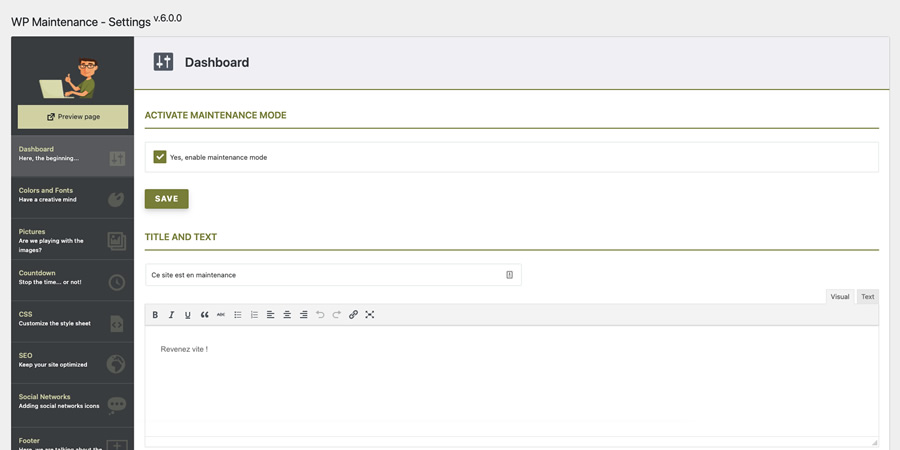
WP Maintenance by Florent Maillefaud

Another coming soon alternative is the WP Maintenance plugin. It comes with a great range of features, like a custom logo upload, extra languages, a countdown timer, and a shortcode area for adding an email opt-in field or contact form.

When you are updating your site, you may be doing so for only a few moments, but other times, you may be resolving time consuming server issues. Or you might not even have a site online yet, and you want to have a “stay tuned” message. With WP Maintenance, you can handle all of these situations with just one simple plugin.

WP Maintenance WordPress Plugin

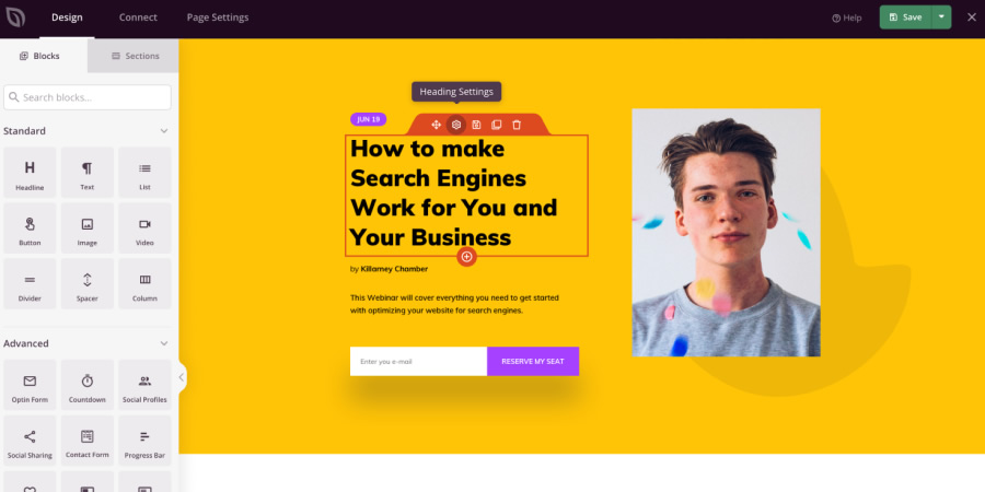
Coming Soon Page By SeedProd

For a more focused resource you might like to take a look at the Coming Soon Page plugin created by SeedProd. The plugin is all pretty standard with a typical “check back soon” message and an optin field for gathering email addresses. The page is fully responsive and built with CSS transitions to create a nice fading animation.

You can edit the template code manually, but you’ll need to know your way around HTML. The whole thing is easy to set up with a few clicks and it supports most languages, multi-site setups, and WordPress add-ons like BuddyPress.

Coming Soon Page WordPress Plugin

Coming Soon by Supsystic by Supsystic

If you’re looking for even more features, then you should take a look at the Coming Soon plugin built by Supsystic. It comes with a fantastic drag & drop system so you can rearrange the page to fit your needs very easily.

Other features include countdown timers, auto-embed videos, social sharing buttons, custom logos and backgrounds, and will also directly connect to most email service providers, like MailChimp and Aweber.

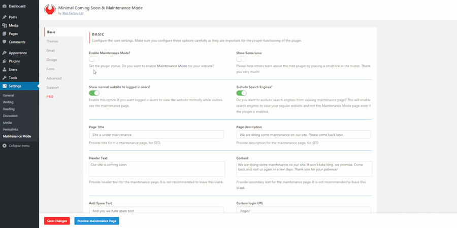
Minimal Coming Soon & Maintenance Mode by WebFactory Ltd

This plugin combines a “sorry we’re closed” message alongside an “opening soon” message. It’s called Minimal Coming Soon & Maintenance Mode and has been created by the team at WebFactory.

If you have multiple authors on your site, you can set permissions for who sees the initial maintenance page before going live, allowing you to define who has access to the site when it is being worked on, all at the click of a button.

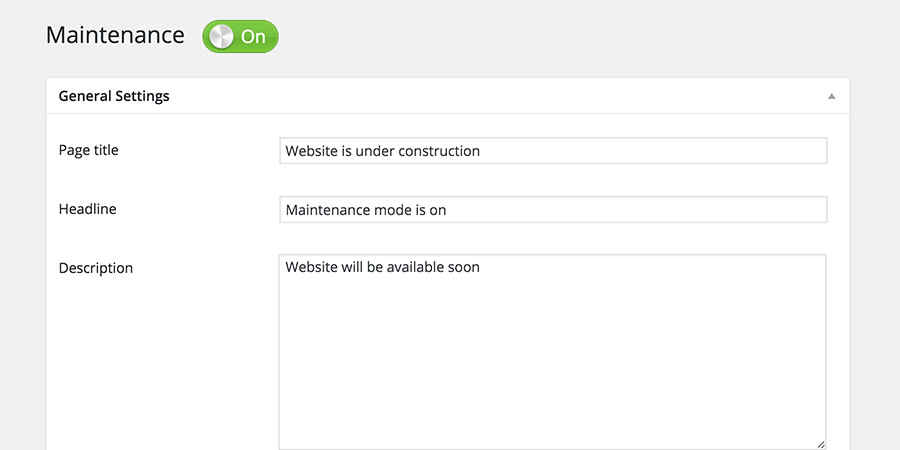
Maintenance Mode WordPress Plugin

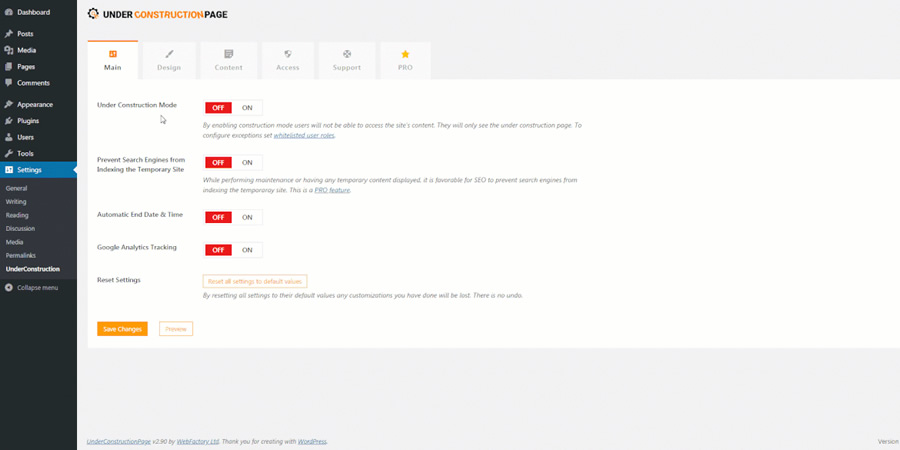
Under Construction by WebFactory Ltd

The Under Construction plugin is a great choice if you need to make regular theme edits, restore database entries, or just to test new features.

The default templates are surprisingly nice, so you might start with them if you don’t want to (or know how to) restyle a page on your own.

Under Construction WordPress Plugin

Maintenance by WebFactory Ltd

Simplicity is at the core of this plugin, and it’s probably the best choice for web admins who want to set it and forget it. Maintenance is completely free and comes with all the basic features you need.

You won’t find a congested admin panel or many features to dig through. They’re all pretty simple, like changing the background, logo, or header text on the page. Anyone can use this plugin, and I think it would be perfect for non-technical site owners.

Maintenance Mode WordPress Plugin

IgniteUp by Ceylon Systems

IgniteUp is a feature-packed coming soon plugin that allows you to whitelist certain user roles, whitelist IPs, send the 503 HTTP message, and many more useful features. It is a bit more complex than the rest, but it’s a multi-purpose plugin that will work on almost any site.

This plugin does also have a premium version, but the templates that comes bundled with the free plugin should be more than enough for most websites.

IgniteUp WordPress Plugin

The post 8 Free Maintenance & Coming Soon Plugins for WordPress appeared first on Speckyboy Design Magazine.
Did you miss our previous article…
https://www.1clanek.info/?p=310

Weekly News for Designers № 614

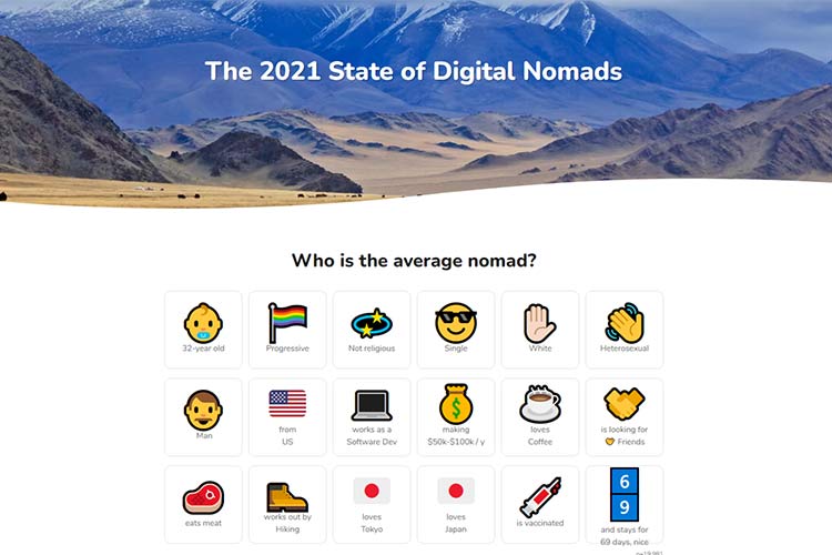
The 2021 State of Digital Nomads – Get the lowdown on who remote workers are with this report.
Example from The 2021 State of Digital Nomads

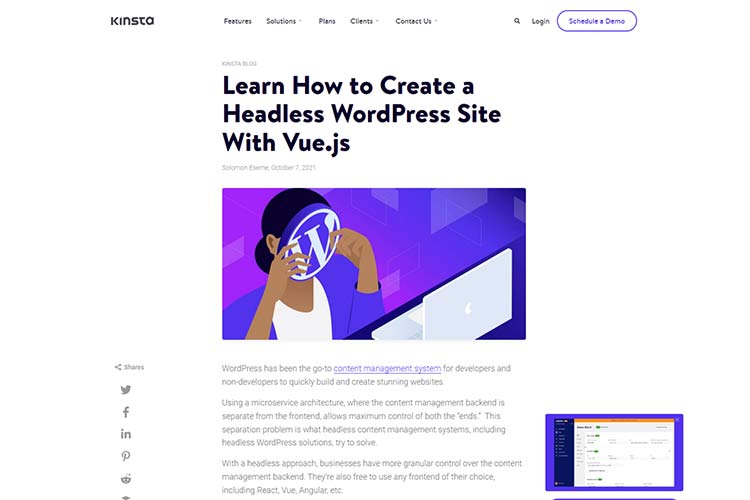
Learn How to Create a Headless WordPress Site With Vue.js – Learn about “headless” configurations and how to implement one.
Example from Learn How to Create a Headless WordPress Site With Vue.js

How to Implement and Style the Dialog Element – Explore the native HTML dialog element and how to customize it.
Example from How to Implement and Style the Dialog Element

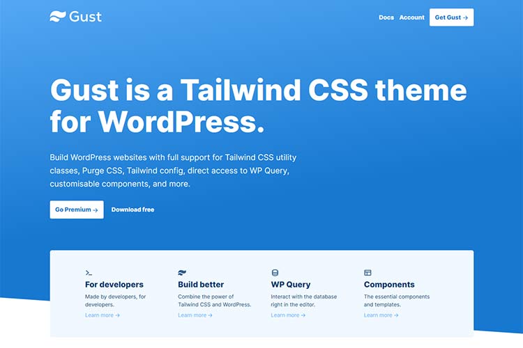
Gust – Check out this WordPress theme based on Tailwind CSS. Free and premium versions are available.
Example from Gust WordPress theme

The Challenge of Designing Websites for Large Screens – Helpful tips for keeping your designs usable on large screens.
Example from The Challenge of Designing Websites for Large Screens

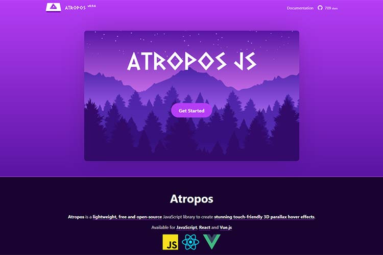
Atropos – An open-source JavaScript library for creating touch-friendly 3D parallax hover effects.
Example from Atropos

9 Figma Design System Tips – Learn how to speed up your design workflow in Figma with these tips.
Example from 9 Figma Design System Tips.

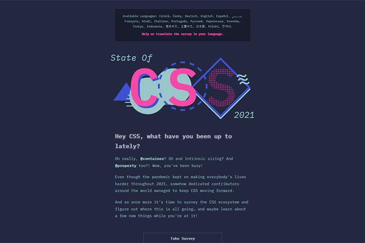
The State of CSS Survey – Help define the direction of CSS by taking this annual survey.
Example from The State of CSS Survey

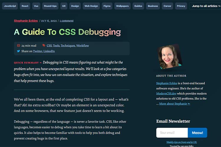
A Guide To CSS Debugging – Detect and resolve your CSS issues faster by using these tips.
Example from A Guide To CSS Debugging

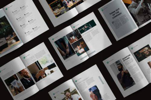
The 10 Best Templates for Creating Business Brochures – Give your business a professional look with these easy-to-use brochure templates.
Example from The 10 Best Templates for Creating Business Brochures

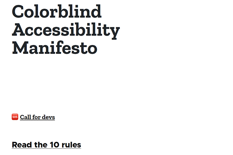
Colorblind Accessibility Manifesto – Learn how to make designs accessible to those with color blindness.
Example from Colorblind Accessibility Manifesto

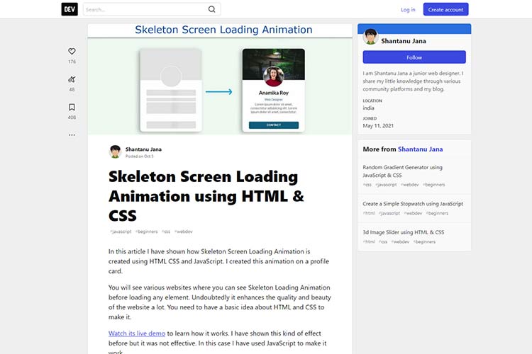
Skeleton Screen Loading Animation using HTML & CSS – Build your own “skeleton” screen animation with this tutorial.
Example from Skeleton Screen Loading Animation using HTML & CSS

Want UX Inspiration? Look To Classic Video Games – User experience lessons from the arcade.
Example from Want UX Inspiration? Look To Classic Video Games

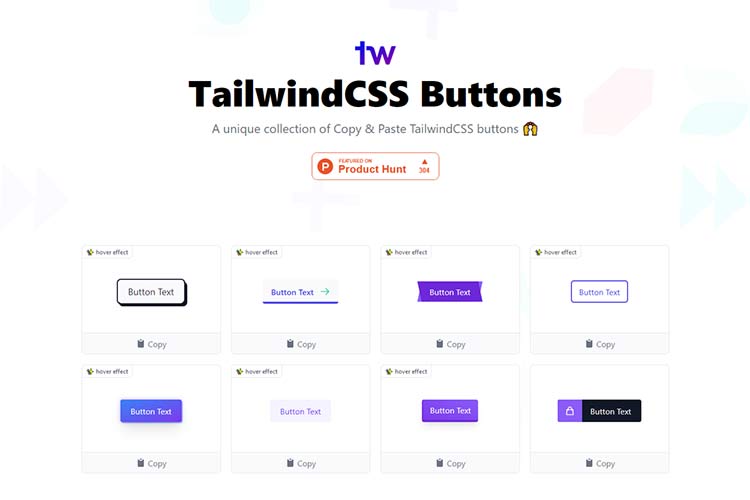
TailwindCSS Buttons – Check out this collection of copy-and-paste button styles.
Example from TailwindCSS Buttons

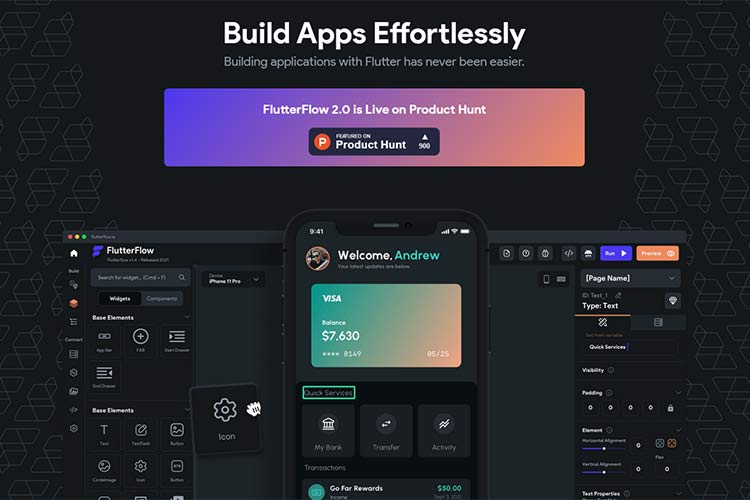
FlutterFlow – A drag-and-drop Flutter UI builder.
Example from FlutterFlow

Pondering the Future of the WordPress Sidebar – The sidebar has survived a lot of changes over the years – can it remain relevant in the age of Gutenberg?
Example from Pondering the Future of the WordPress Sidebar

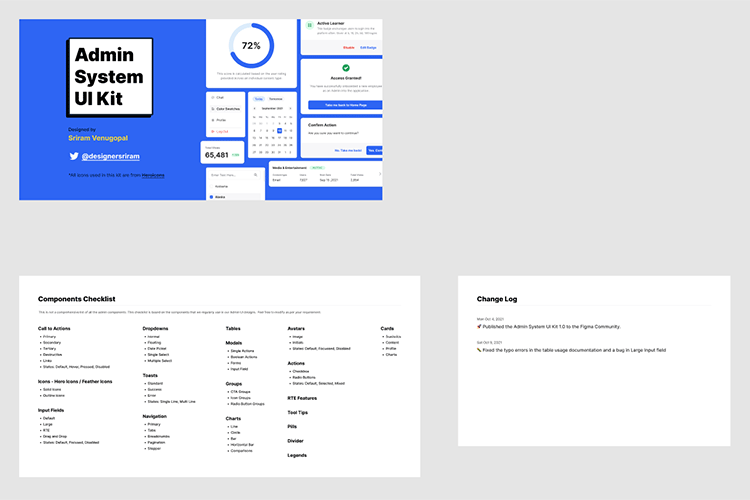
Admin System UI Kit – Download a copy of this attractive free UI kit for Figma.
Example from Admin System UI Kit

The post Weekly News for Designers № 614 appeared first on Speckyboy Design Magazine.
30 Quirky & Highly Creative Free Fonts for Designers

Regardless of the project, fonts will always play a pivotal role in design. A carefully selected typeface has the power to completely change the message and feeling you are to convey, and can elevate your design from the average to the inspiring.

However, very few designers are brave enough to step away from the safety of a clean serif or sans-serif. And even fewer will step away from choosing a non-conformist, rule-breaking, quirky font like the selection we have for you today.

Maybe the time has come for you to get truly creative and break your design rules.

If you want to make your designs unique and stand out from the crowd, there are many quirky and highly creative fonts available that you can download for free. So, today we have brought our favorite quirky and highly creative fonts from the past few years together for this collection.

These free fonts may not be for everyone, but they will undoubtedly help get your creative juices flowing. We hope you enjoy our collection!

Quinlliyk Free Retro Font by Creatype Studio

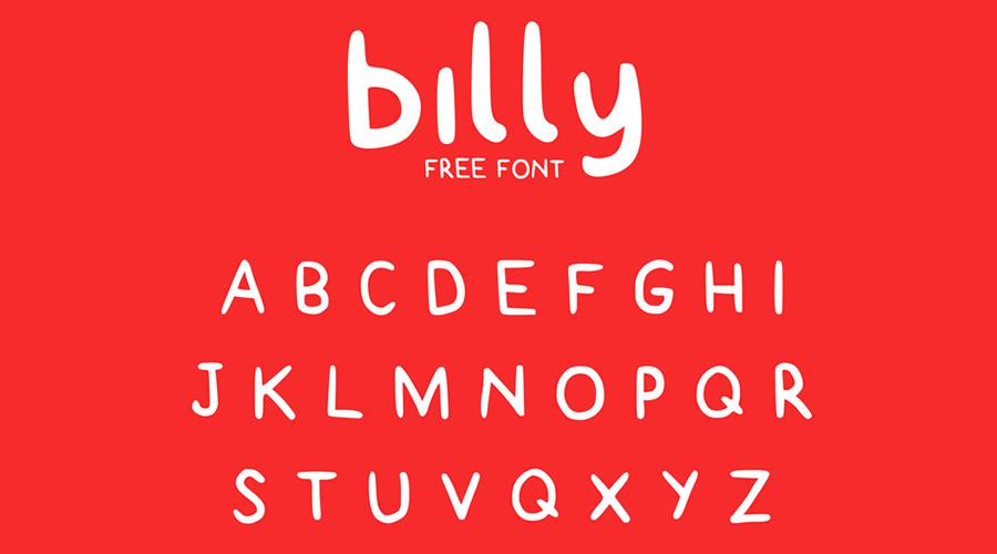
Billy Free Typeface by Claire Joines

Billy Free quirky creative font family typeface

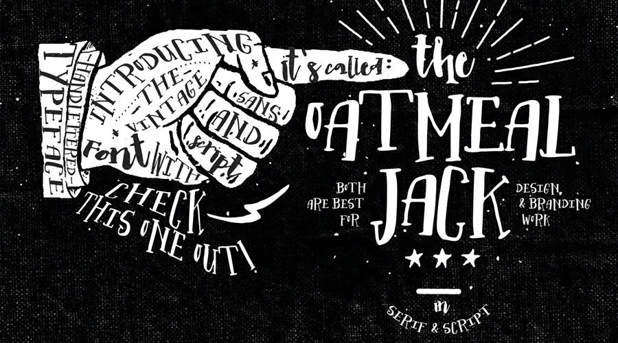
Oatmeal Jack Font on Envato Elements

Oatmeal Jack quirky creative font family typeface

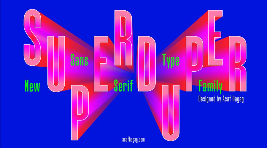
SuperDuper Free Sans-Serif Font by Asaf Hagag

SuperDuper Free Sans-Serif quirky creative font family typeface

Molen Free Display Font by Nurrontype

Molen Free Display quirky creative font family typeface

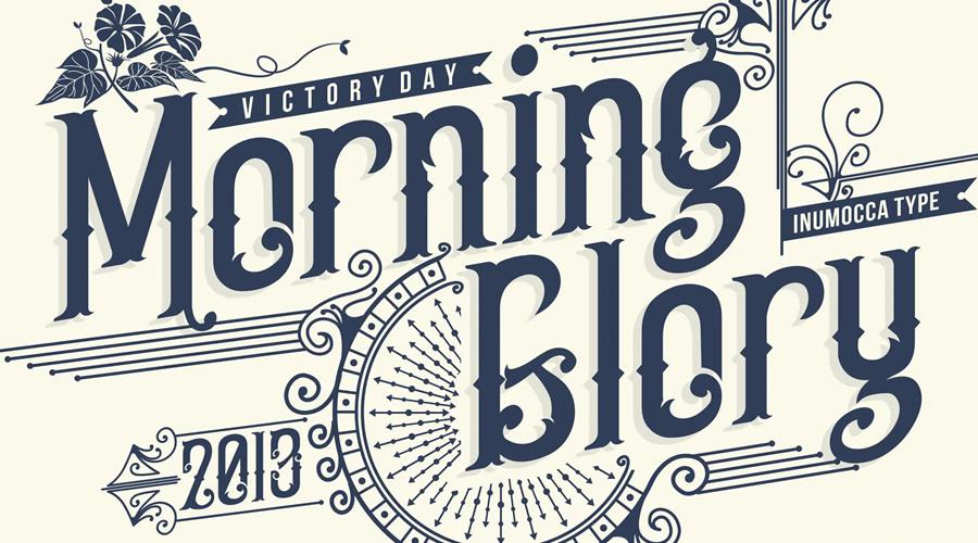
Morning Glory Font on Envato Elements

Morning Glory quirky creative font family typeface

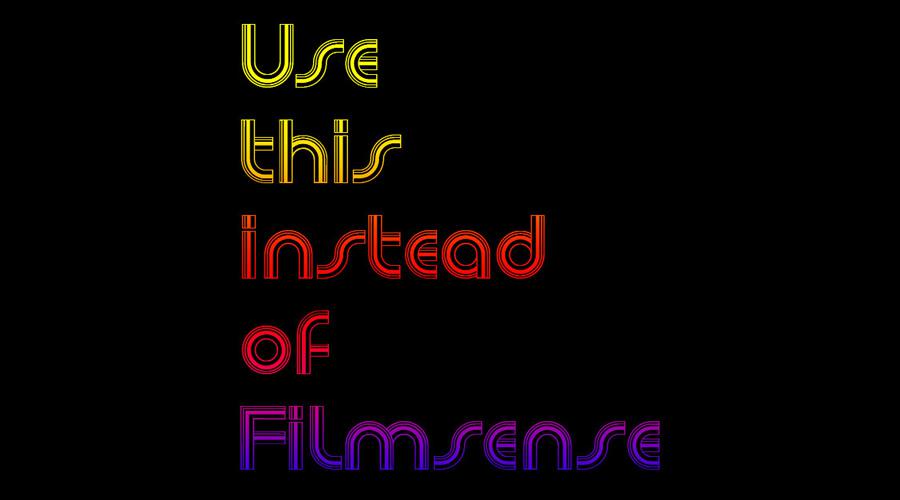
Newsense Free Font by Adrian Candela

Newsense Free quirky creative font family typeface

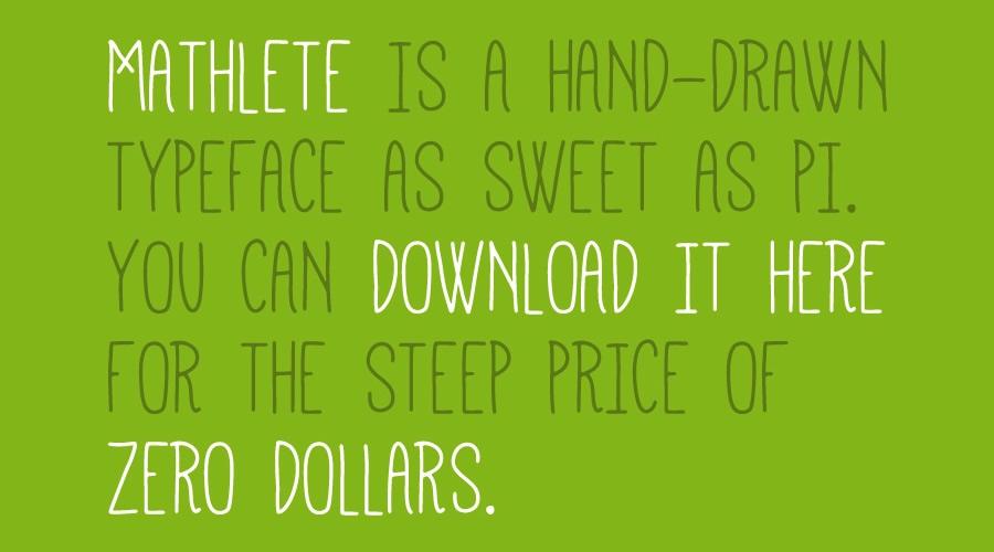
Mathlete Free Typeface by Mattox Shuler

Mathlete Free quirky creative font family typeface

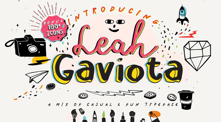
Leah Gaviota Font on Envato Elements

Leah Gaviota quirky creative font family typeface

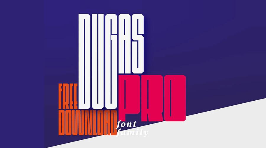
Dugas Pro Free Condensed Font Family by Jacek Macha Machowski

Dugas Pro Free Condensed quirky creative font family typeface

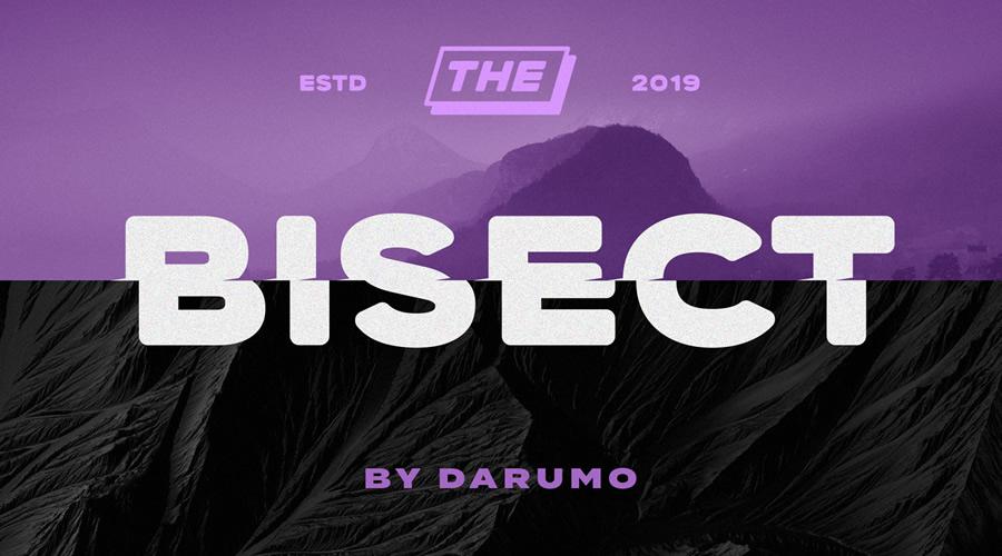
Bisect Free Display Font by Darumo

Bisect Free Display quirky creative font family typeface

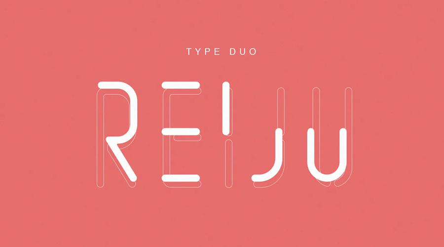
Reiju Font on Envato Elements

Reiju quirky creative font family typeface

Ontwerp Monospaced Typeface by Ill Type

Ontwerp Monospaced quirky creative font family typeface

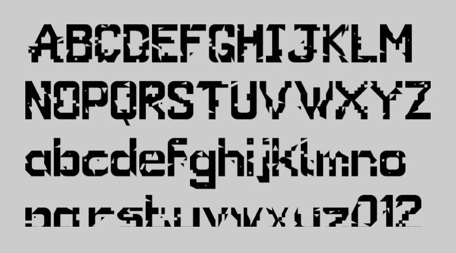
Glitch Free Font by Subversivetype

Glitch Free quirky creative font family typeface

California Jackpot Font on Envato Elements

California Jackpot quirky creative font family typeface

Valkyrie Free Type Family by Hendrick Rolandez

Valkyrie Free quirky creative font family typeface

London Font by Antonio Rodrigues Jr

London quirky creative font family typeface

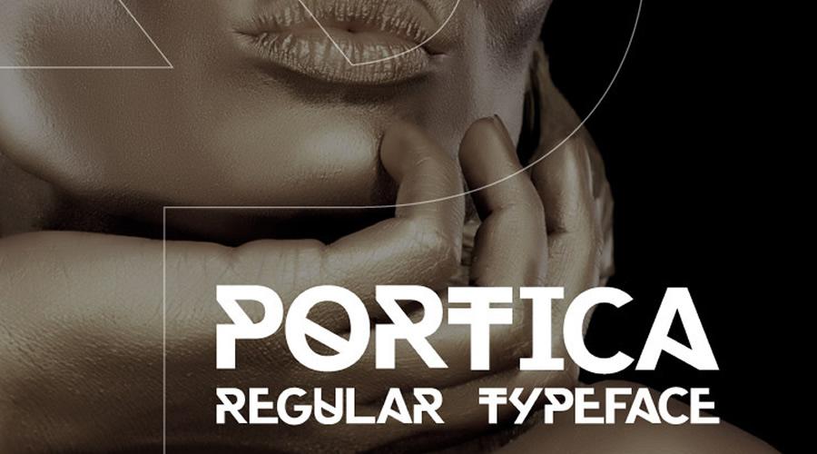
Portica Regular Typeface by Michael Nunes

Portica Regular quirky creative font family typeface

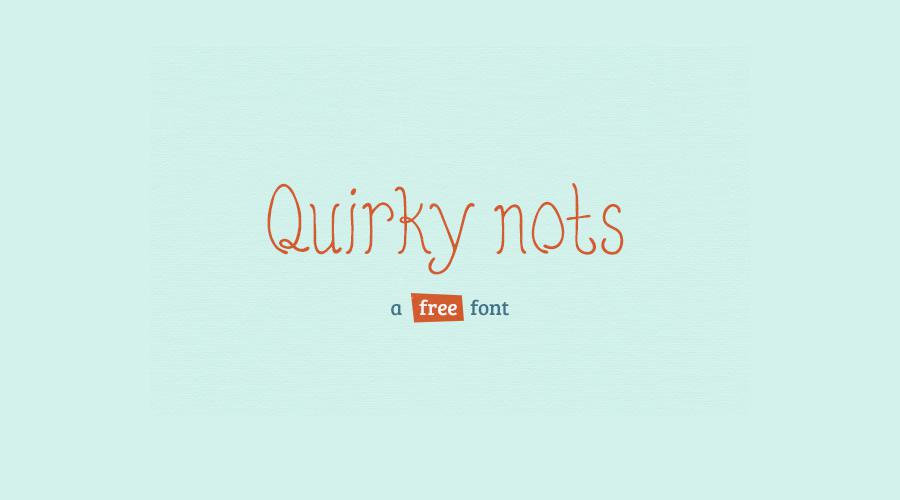
Quirky Nots Free Font by Amit Jakhu

Quirky Nots quirky creative font family typeface

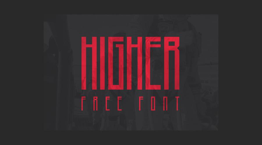
Higher Free Font by Marisa Passos

Higher Free quirky creative font family typeface

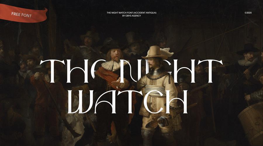
The Night Watch Free Font by obys

The Night Watch Free quirky creative font family typeface

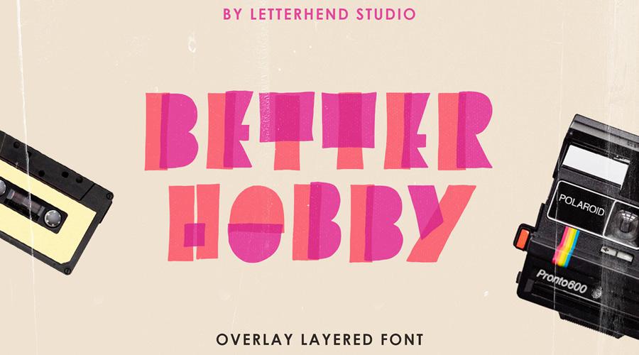
Better Hobby Free Display Font by Letterhead Studio

Better Hobby Free Display quirky creative font family typeface

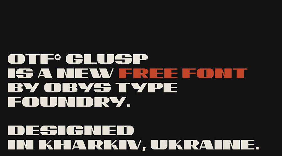
OTF Glusp Free Font by obys

OTF Glusp Free quirky creative font family typeface

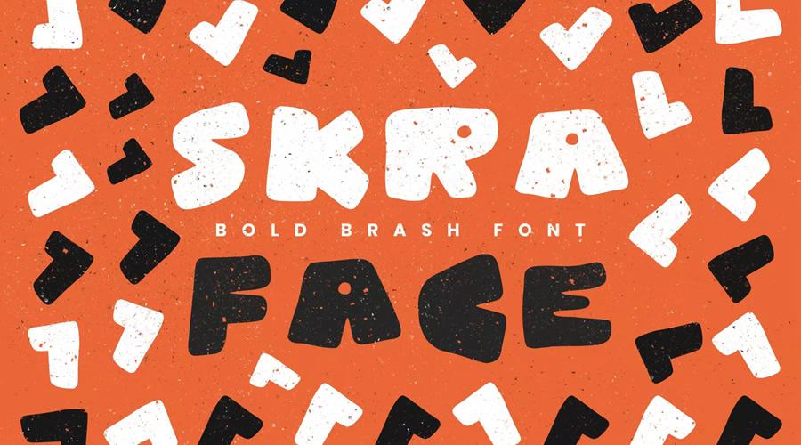
Skra Free Hand-Drawn Font by Delightful

Skra Free Hand-Drawn quirky creative font family typeface

Current Free Typeface by Matt Pendrill

Current Free quirky creative font family typeface

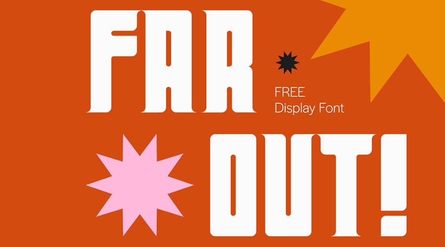
Far Out Free Display Font by Gaby Bacani

Far Out Free Display quirky creative font family typeface

Elianto Free Font by Emanuele Papale

Elianto Free quirky creative font family typeface

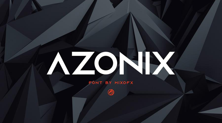
Azonix Free Modern Font by Mixo

Azonix Free Modern quirky creative font family typeface

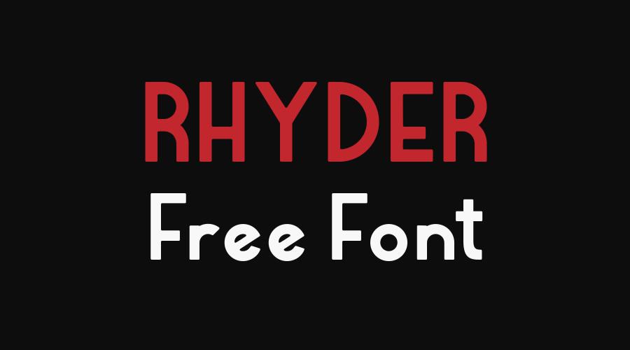
Rhyder Free Font by Adrian Candela

Rhyder Free quirky creative font family typeface

Misto Free Font by Katerina Korolevtseva

Misto Free quirky creative font family typeface

The post 30 Quirky & Highly Creative Free Fonts for Designers appeared first on Speckyboy Design Magazine.
Did you miss our previous article…
https://www.1clanek.info/?p=259

In Web Design, Easier Doesn’t Always Mean Better

There are a massive number of products and tools aimed at the web design industry. And it seems like something new arrives every day.

They may vary widely in scope, but most have one thing in common: the promise of making our job easier. Whether they’re writing superb code, promising can’t-fail functionality, or adding killer special effects, these solutions aim to do the dirty work for us. How convenient!

I, for one, feel a bit disappointed. Despite the hype, I’m not convinced things are that much easier. It’s not as if artificial intelligence (AI) has replaced my most monotonous tasks. In many respects, web design seems to have become even more complex over time.

Besides, much of what advertises an “easier” process tends to come with some serious tradeoffs. Unfortunately, easier doesn’t always mean better.

With that, here are a few things to consider before you trade the tried-and-true parts of your workflow for a quick fix.

Will You Be Locked Into a Bad Situation?

When it comes to designing and building a website, just about every decision requires some sort of buy-in. This is part of the process.

If you’re creating a layout mockup in Figma, Photoshop, or Sketch – you’re making a commitment. As your project progresses, you’ll need to come back to the chosen app again and again. The same principle applies to everything from DIY website builders to programming frameworks.

The difference is in the required level of commitment. Pick the wrong tool, and you may be stuck with it for longer than you’d like. Becoming locked into a specific path may limit your ability to evolve along with the web. And those new features that everyone else is using? It could be that they’re unavailable to you.

That’s why it’s vital to know what you’re getting into. An untested solution may seem attractive now, but where will it be in five years? If it doesn’t hold up, you could end up starting from scratch again.

In some cases, it may be worth the risk. But there’s also something to be said for having future flexibility.

Easier to Build, Harder to Maintain

The promise of a quicker path to launching a website has always attracted the attention of the design community. Skip over the hard stuff and get paid sooner – who wouldn’t want that?

It certainly sounds wonderful. The problem is that, sometimes, an easier start means more difficult maintenance down the road.

Take, for example, the culture of content management system (CMS) plugins. With a platform such as WordPress, it’s incredibly easy to build a website, piece by piece.

It’s certainly possible to build a site that works well enough with this approach. But there is danger in having bits of related functionality controlled by multiple plugins. It’s akin to using string to keep all of your favorite books together. Take one book out of the stack, and things are going to fall apart.

Likewise, if your functionality needs change, this delicate balance can start to crumble. Some plugins may no longer be suitable or are simply too rigid to achieve your goals. That could mean swapping out critical pieces and trying to patch a gaping hole.

This doesn’t mean that you shouldn’t use plugins. But it is worthwhile to think about sustainability. Determine the most sustainable path forward. That may take a little more work up front, but will save you from future difficulties.

An assortment of tools.

Cost vs. Benefit

Quite often, products advertised as making your job easier also tout cost savings as well. But is the easiest way forward really the cheapest?

That depends upon the factors mentioned above. If your website is up and running weeks earlier because of a specific tool, that’s great. But if it makes future maintenance a nightmare, any upfront savings may be short-lived.

Then there’s the ability for future growth. For example, subscribing to a proprietary website platform can get you access to a certain level of looks and functionality. But what happens if that service cannot provide the advanced features you’ll need down the road? And, in the meantime, how much money have you spent to continue using it?

Even if you end up with some savings, you may find that they simply weren’t worth the included hassles and limitations. Trading a few extra dollars in your pocket for a less-than-ideal website is unlikely to make you feel very good.

Before making any decisions, it’s wise to weigh the potential costs, benefits, and pitfalls of a given solution. This ensures that you’re thinking with both the short and long-terms in mind.

A potted plant surrounded by coins.

Beware of Easy Website Solutions

It’s worth remembering that every path to building a website has a cost associated with it. Whether you utilize free or commercial tools, there will always be time and effort required to use them. Beyond that, there’s also the cost of future maintenance.

Sometimes, you can find a solution that makes web design both easier and more cost-effective. However, it takes careful scrutiny to determine if that’s the case.

There are a lot of products out there that make such claims. Don’t take them at their word. Instead, conduct your own research and find the tools that will work best for you.

The post In Web Design, Easier Doesn’t Always Mean Better appeared first on Speckyboy Design Magazine.
Did you miss our previous article…
https://www.1clanek.info/?p=232

The Types of Freelance Design Clients You Should Avoid

Once they’re out of design school and battling it out in the real world, designers can find themselves in a pretty crappy predicament.

Maybe your teachers warned you to be as discerning as possible when taking on new clients (or maybe they told you the opposite, but you knew it was BS), but reality is often a rude awakening from what you expected when you first started working.

Bills pile up, the rent’s due date looms closer, and suddenly that shady dude who wants you to design his logo and website for $200 and “exposure” doesn’t look too bad.

We all know it can be hard to stick to our guns and seek out quality work that will enhance our careers, rather than drag them down into the mud, but think about one thing for a second.

When you take on a terrible client – one that, say, refuses to pay you either in full or in part, or one that has a million and one changes to make to your designs, you’re actually spending far more in labor costs – and sometimes even in legal fees – to complete that job than you would have if you’d had a few more instant meals and committed to finding a good client.

A bad client is bad news, period. It will always cost you more to maintain a bad client than it’s worth.

Avoiding Micromanager

Clients hire you for a reason: to improve the profitability of their business venture, whether it’s an information website, a product, or a personal brand. At least initially, they know they need a professional to step in and create something usable and which contributes to their overall goal of making more money.

I’ve found that reminding clients of this in a polite, but firm way is incredibly effective in getting them to slow down and hand you back the reins of the project.

Your ultimate goal as a designer is to find clients who will trust you. If there’s no trust there, your clients may become overwhelmed with anxiety and begin to micromanage.

Generally speaking (but not always), the higher you price your design services, the more frequently you’ll find clients who respect your judgment and who will trust you, and the more you’ll drive away those who only want to play dictator.

Make sure you always charge what you’re worth – if you compromise on your prices at any point in your career, it becomes exponentially harder to make up the difference later on.

See No Evil

Nowadays, more and more designers work remotely rather than in person, and many may never even meet their clients face to face. This is good and bad. If you get a good client, it’s awesome to just receive the design brief, communicate through email, and work your magic.

If your client is a bit more difficult, it can be a nightmare. There’s a ton of research that points to face-to-face interaction and body language as being two of the most important factors in building a relationship of any kind – particularly one that involves business.

If you’re working virtually, there’s no way to gauge the chemistry between yourself and your potential client. This is where Zoom can be an immense help, but if you can meet in person, that’s even better.

Regardless of whether you do it in person or on the computer, for long-term projects, it’s important to see your client’s face and hear from their own lips whether or not their personality is something you can deal with.

You can learn a lot about what kind of client someone will be from the way they speak to you, the words they use to describe their work, and the nature of the work they would like you to do, and even from the state of their desk or office.

If someone is a slob, that might be a red flag. But more importantly, if you get a bad feeling from a client, take that as a cue to get the heck out of dodge.

red flag warning

The Warning Signs

If your client doesn’t respect what you do, they will let you know in subtle (and sometimes not-so-subtle) ways, particularly in the way they discuss the project they have for you.

The most obvious red flags are clients who promise you “exposure” or “more clients” at some indeterminate point in the future. If you’ve been hanging around the online design community for any length of time, you’ll know that doing spec work is one of the most detrimental things you can do for your own career, and for the design industry in general.

But even paying clients will use this one when they know they’re offering you payment that a service provider in any other industry would consider an insult. You don’t want to work for “exposure.” Yes, it’s a nice thing to have, but potential clients who say this never mean it the same way you mean it.

For you, exposure is concrete referrals. If your client can provide you with a list of actual paying clients you can contact for future paying work, then that’s fantastic; “expose” away. But if they don’t do this, that means they’re trying to game you and getting payment from them will likely be more trouble than it’s worth. Run!


The next big warning sign is potential clients who downplay the amount of time, effort, or work involved in a project.

“Oh, it shouldn’t really take you that long,” or “a student could do this,” or my favorite: “it’s just a simple little thing – I’d do it myself, but I don’t really have the time.” (By the way, if they don’t have the time to do a “simple little thing,” what makes them so sure it’ll only take you five minutes?)

A client who automatically assumes that what you do won’t take any significant amount of time is a client who does not understand what’s involved in the design process.

This is a client you want to run from, and quickly. Why? Because these are the kind of clients who will always argue with you about your rates or fees, since they’re convinced you’ve been racking up extra hours just to cheat them.

Of course you should be making your clients sign contracts to prevent any legal fiascos, but why put up with the headache when you don’t have to? Just walk away.


The last and possibly most insidious of “red flag” clients is the “designer” or “art director” client. You know the kind. The divorce lawyer or communications startup CEO who secretly wishes they had gone to design school, and who actively wants to play a part in the design process despite having no knowledge of design whatsoever.

These types of clients are also known for being impossible for most sane designers to work with. Therefore they often have unfinished design work that they want to hire you to complete.

They might call you at 3AM with “urgent” changes or ideas they’ve had about your work, or they might be wishy-washy about what they actually want you to do or what they like.


Long before a problem ever arises, you can use these straightforward steps to ensure that you don’t get caught up in a nasty whirlwind of broken contracts and legal fees. Always keep in mind that when you meet with a first-time client, you are evaluating them as much as they’re evaluating you.

The right clients will always respect your time and expertise; they will respond to your questions or concerns in a timely manner, and they will be realistic and professional in their expectations.

The post The Types of Freelance Design Clients You Should Avoid appeared first on Speckyboy Design Magazine.

Did you miss our previous article…
https://www.1clanek.info/?p=217

8 ASCII Artwork Snippets That Utilize CSS & JavaScript

If you’re of a certain age, you may remember a time when ASCII ruled the internet. Before snarky memes or even the widespread use of animated GIFs, ASCII artwork was passed around like a bowl of candy.

Some background:ASCII (American Standard Code for Information Interchange) is a standard way to encode the text characters seen on electronic devices. Letters, numbers, and all manner of various symbols can be displayed via the format.

Early communication on the internet was text-based. As such, people with way too much time on their hands had a little fun with these assorted characters. Some truly clever artwork was created and routinely shared in newsgroups, bulletin boards and email. It could be impressive, particularly when you consider the technological limitations.

Some very creative developers haven’t forgotten ASCII art. In fact, they’ve used the latest CSS and JavaScript techniques to add movement and other enhancements.

Want proof? That’s why we’re here! Take a look at our collection of code snippets that add a modern touch to an old-school artform.

Trippy Text by Angela Galliat

We’ve seen some pretty far-out textures over the years. But this ASCII-meets-acid-trip text shader is among the most mesmerizing.

Characters seemingly melt into each other within a cluster of rainbows. You may need to take a walk outside after viewing this one.

See the Pen Ascii Text Shader (single text element, no canvas) by Angela Galliat

Delicious Donut by Housamz

Bringing an element of 3D to simple characters is a challenge. That this rotating donut is able to pull off the effect speaks to the power of CSS and JavaScript.

Even better is that the JavaScript source code is itself donut-shaped. That’s a level of dedication not seen since Homer Simpson.

See the Pen JavaScript Donut – ASCII Art by Housamz

ASCII Yourself by Tamino Martinius

Original creations are cool and all, but what about the ability to turn an image into ASCII? That’s what this art generator does.

Paste in the URL of an image, and you’ll see it rendered in character output. Adjust the sliders to add your own personal touch.

See the Pen ASCII Art Generator by Tamino Martinius

CSS Trickery by Tom Lutzenberger

While this snippet isn’t traditional ASCII art, it simulates the effect quite well. By utilizing CSS background-clip, a layer of characters is placed on top of a standard image.

The result is a quick-and-dirty image effect. Bonus points for the ability to change the characters in the HTML to whatever you want.

See the Pen Pseudo ASCII-Art by Tom Lutzenberger

Around the World by thykka

This spinning globe features a beautiful retro look. Seriously, it looks like something out of an 80s arcade game.

The three.js technology behind this beauty is anything-but-old, however. The animation is smooth and the colors vibrant.

See the Pen Rotating ASCII Globe by thykka

Flipping Awesome Animation by Takane Ichinose

While ASCII art can be incredibly intricate, there are times when simple is better. This snippet features just a small collection of characters, but is still effective in getting its message across.

By the way, that message is for you to flip a table. Click anywhere within the presentation to do so. Now, don’t you feel better?

See the Pen CSS Only ASCII Table Flip by Takane Ichinose

Lego Characters by Praveen Puglia

Here’s a unique way to leverage ASCII characters. This snippet takes an ASCII input pattern and outputs them like Lego blocks.

Add your own characters to the textarea, click the button and see your new creation.

See the Pen Legoscii! by Praveen Puglia

Characters Flying through the Air by Dave Kwiatkowski

At its core, this 3D animation is a collection of characters. But it’s also quite stunning to watch.

Notice the use of color and sizing to create the illusion of space. Larger and brighter colors are the “closest,” while the smaller and darker ones hang out in the back.

See the Pen The ASCII Galaxy by Dave Kwiatkowski

Adding Cool Characters to Web Design

What the snippets above show is that, in the right hands, even text can become art. They’re also a reminder of how CSS and JavaScript can breathe life into virtually any project. Put the two together, and you have something fun and, at times, a bit jaw-dropping.

We hope you enjoyed this new spin on ASCII artwork! If you want even more unique examples, please do check out our CodePen collection.

The post 8 ASCII Artwork Snippets That Utilize CSS & JavaScript appeared first on Speckyboy Design Magazine.

Did you miss our previous article…
https://www.1clanek.info/?p=216

The Challenge of Designing Websites for Large Screens

Mobile devices have taken over the web. Thus, so much designer attention has (rightly) gone towards ensuring that the websites we build are compatible. We are constantly refining how we implement responsive features so that they work flawlessly on small screens.

While this is a worthwhile endeavor, there are other screens to think about. Large viewports are also a pretty important consideration. It’s rare to find new desktop or laptop devices with screen resolutions below 1080p (1920 x 1080). And both 4k (3840 × 2160) and 8k (7680 x 4320) monitors provide even more screen real estate.

Taking advantage of large screens can be a challenge. The key is in creating a layout that is both usable and legible. In addition, care must be taken to avoid overwhelming users by placing too much in front of them.

If you’re looking to build a website that takes advantage of large screens, we’ve put together some general rules of thumb. They may not fit every situation but will provide you with some factors to mull over before you go big.

Scale Text and Parent Containers Accordingly

Full-width text on a 1080p or 4k screen is a big no-no. It takes too much effort to read and keep track of where you are within a passage. The more text you have, the more difficult it will be for users to digest.

Therefore, text works better when it’s within a limited-width container. Consider an ideal width to be no more than 900-1200 pixels. Whitespace is also important as it allows for some breathing room. Experiment with various container sizes, margins and padding to find what works best with your layout.

Font sizing is also a key factor when designing for large screens. Increasing the font size helps text to stand out and also limits the number of characters displayed on a given line.

Finally, consider increasing the CSS line-height property for adequate vertical spacing between lines. This improves legibility and adds some openness to the overall design.

The Atlantic limits article text to a narrow, easy-to-read container.

Take Advantage of Multi-Column Layouts

One of the big advantages of utilizing extra screen real estate is that it provides plenty of room for multi-column layouts. Perhaps that’s why this technique is often seen on news-oriented websites.

With a traditional 1,000-pixel grid and a layout consisting of three or more columns, the content within tends to get squeezed. A page width of, say, 1,800 pixels allows columns to be spaced with substantial margins. And there’s still room to add internal column padding while bumping the font size up as well.

A wider page can also enable the use of some advanced column configurations. For example, think of a “Latest News” area that takes up the left half of the page – complete with a featured image. Then, two 25% width columns show other text-based headlines to the right.

This may be the perfect type of layout for large screens. It avoids wasted space while potentially making it easier for users to identify content that interests them.

Even better is that a combination of CSS Grid and media queries allow you to cater to the biggest screen resolutions while gracefully adapting to smaller ones.

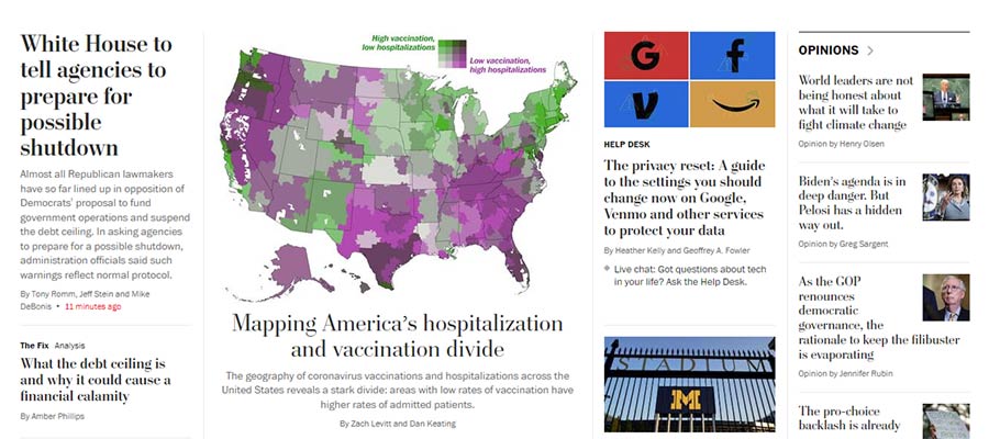
Example from The Washington Post's website.

The multi-column home page of The Washington Post.

Keep Important Items within Reach

Among the potential pitfalls of a super-wide layout is that some key items may require the user’s cursor to travel quite a long distance. At the very least, it’s an inconvenience and poor UX. At worst, it might be considered a pretty big accessibility issue.

However, these concerns can be addressed through design. A top navigation bar can be horizontally centered on the screen so that it doesn’t require a ton of mouse movement. Making it keyboard-friendly can ensure it’s accessible for those who don’t use a pointing device.

The extra width also means that other important pieces could easily get lost in a forest full of content. Elements such as login forms and calls-to-action need to be placed in highly-visible areas.

Integrating them into the site’s header or a static sidebar are possible solutions. A “sticky” header may also provide a path for keeping the most important items consistently within reach.

There’s plenty of room for creativity. But the main idea is making sure that users don’t have to constantly traverse the width of their screen to get to where they want to go.

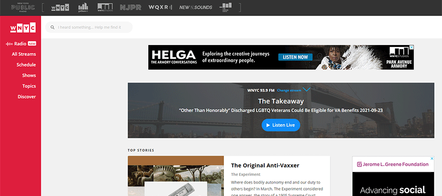
Example from WNYC Radio's website.

WNYC Radio utilizes a brightly-colored static sidebar to keep their website navigation in view.

Use Predictable Design Patterns

Taking all of the above into consideration, the overarching theme is in creating a predictable design pattern. This means that the website’s layout allows content to flow in an intuitive manner. While certain items can be designed to draw attention, they shouldn’t detract from the overall user experience.

How does this work in practice? One example is the aforementioned multi-column layout. There may be several sections on a page that utilize columns, each with their own unique number and positioning. That’s fine, so long as there are consistencies in spacing, typography and related styles.

On a news-oriented website, this might mean that the “Technology” and “Editorial” sections have different column layouts. The “Latest News” section could even utilize a different background color. If they are consistent in look, however, it helps to create a flow while also avoiding a monotonous browsing experience. Each section stands out, yet blends into the overall design.

As with any design project, a lot of planning and experimentation is needed when designing with large screens in mind.

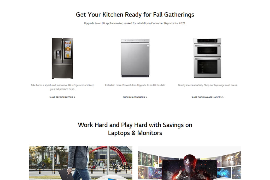
Example from the LG website.

LG utilizes an alternating pattern of column layouts on their home page.

Make Effective Use of Those Extra Pixels

The beauty of large, high-resolution screens is that they can be used to create an immersive experience. We see it all the time with games, movies and other media.

Accomplishing this with a website is a bit more of a challenge, though. It’s especially difficult with a text-heavy site. There are some definite risks when it comes to usability.

Still, a well-crafted layout can effectively take advantage of the extra screen real estate. It’s a matter of ensuring easy navigation, legibility and consistency in design.

However, these are the principles that web designers practice each and every day. Keep them in mind and you’ll create a website that looks pixel-perfect on everything from a handheld phone to a massive 8k monitor.

The post The Challenge of Designing Websites for Large Screens appeared first on Speckyboy Design Magazine.
Fresh Resources for Web Designers and Developers (September 2021)

There is lot happening this month in the tech industry; from Docker updating their business and plans, prominent WordPress businesses being acquired, Web3, NFT, as well as new resources and updates keep coming in HTML, CSS, and JavaScript. This is why we’ve put a few of these to keep you updated.

First, we have some cool JavaScript libraries to create animations, a CLI tool to help you manage and deploy your WordPress site on DigitalOcean, there are also a couple of resources on CSS category that will improve how you write CSS in modern applications, and a lot more. Let’s take a look.

Fresh Resources for Web Designers and Developers (August 2021)

Fresh Resources for Web Designers and Developers (August 2021)

There are new tools and techniques coming up every day in the field of web development. And sometimes,… Read more

Theather.js

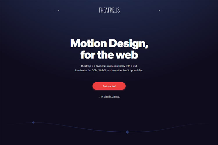
Theatre.js is a JavaScript library to write animation. It comes with a rich UI called “Studio” which makes it more intuitive to use compared to similar libraries. It’s also feature-rich; you can use it to animate HTML, SVG, WebGL, or use it with a 2D/3D graphic JavaScript library like Three.js or Pixie.js.

Sailed

A free open-source Command-line Interface (CLI) to manage your WordPress sites to DigitalOcean. The CLI allows you to manage your site efficiently, including provisioning servers.

You can also deploy the site, backup the site and do rollback, and even manage the DNS and SSL certificate with Let’s Encrypt. A great handy tool for WordPress power-users and SysOps.

Sailed

MetaTags

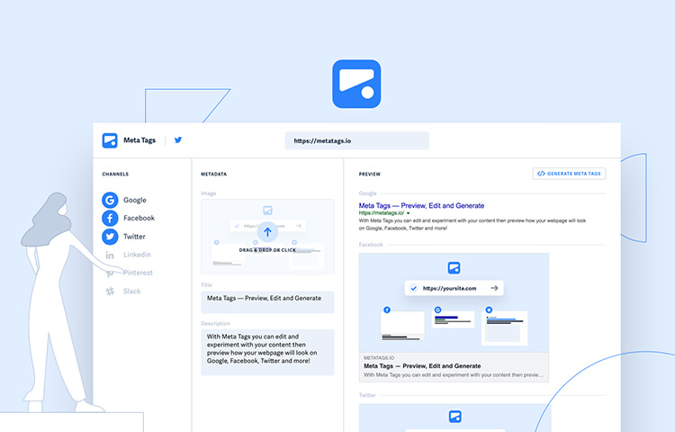
A web application to generate preview of your site on Google and several social media sites like Facebook, Twitter, Pinterest, and Slack. You can use this tool to manage your site title, description, and image to ensure that they fit in and are optimised before sharing it on those sites.

MetaTags

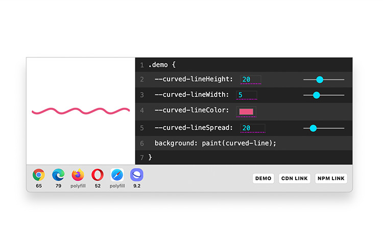
Houdini

“Houdini” makes CSS more powerful. It works similar to how the Custom Element works in HTML; it allows web developers to define custom CSS properties with their own custom functionalities.

So you can create something like --cool-text-decoration which will provide some custom richer text decoration than what the browser provides.

Houdini

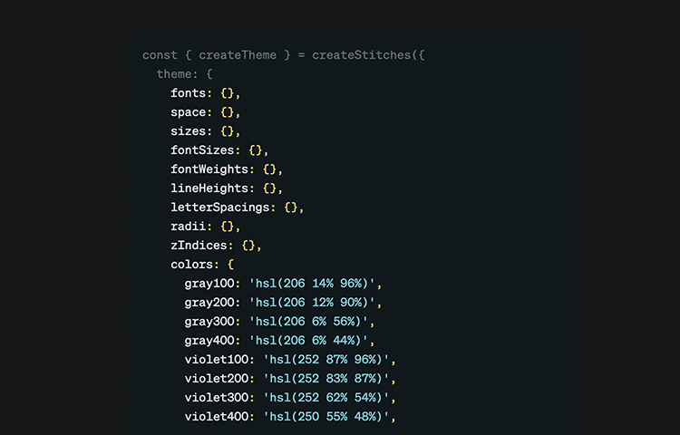
Stitches

A JavaScript library that allows you to write CSS for your application right in the JavaScript files; also known as CSS-in-JS. The library optimized CSS as it’s compiled.

It delivers only the CSS that’s needed by the app component and supports server-side rendering. Also, Stitches is framework-agnostic so you can use it in any of your favorites whether it’s React.js, Vue.js, or Svelte.

Stitches

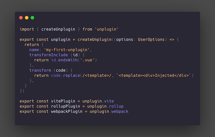
Unplugin.js

Unplugin is a JavaScript library that aims to provide a unified system for creating plugin for build tools like Webpack, Rollup, and Vite. If you’re a developer looking to support several of these build tools, this is the library that you might want to look into that may save you time and speed up development.

Stitches

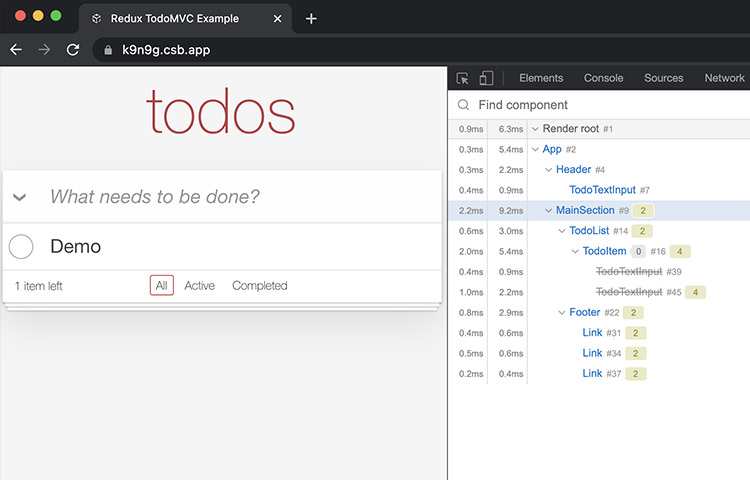
React Render Tracker

Sometimes rendering a React.js component can be quite expensive for the browser to process and might affect the performance of the application. You can use this tool to inspect how many times the component is rendered on the browser.

You’d want to make sure that the component is not re-rendered excessively. A handy tool to debug and optimise your React.js application.

React Render Tracker

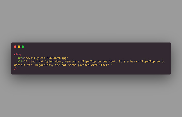
Great “Alt” Text

Alt text is an important piece of information on the image. It provides the additional information of the image that would benefit not only search engine but also assitive device. This allows your image to perform better on Search Engine and makes your website more accessible to users.

But how do you make a great “alt” text? Jake Archibaled of Google Developer Advocate have some tips for you.

Great "Alt" Text

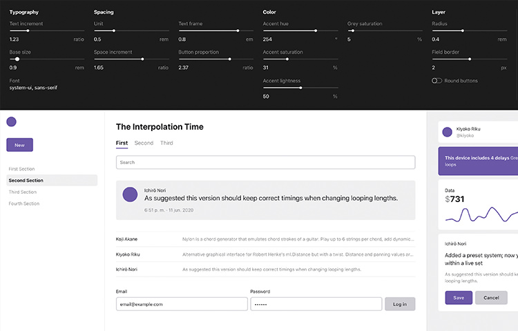
Shaper

This little tool can help you create a prototype of your next awesome web application fast. Rather than creating it from scratch, you can save time by using this tool to generate UI base styles with some defined parameters like Font Family, Text Size, Color Accent, and their proportion.

The tool will immediately generate the preview and base CSS that you can copy-paste it onto your website stylesheet.

Shaper

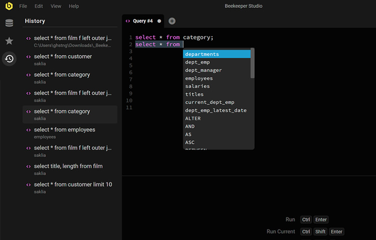
BeeKeeperStudio

A desktop application to connect and manage the database. It supports several types of database including MySQL, Postgres, SQLite, and SQL Server. With this application, you can perform several database operations conveniently such as creating or deleting database, run an SQL query, and more.

BeeKeeperStudio is available for macOS, Windows, and some Linux distros. It’s open-source and free; and it will always be free.

BeeKeeperStudio

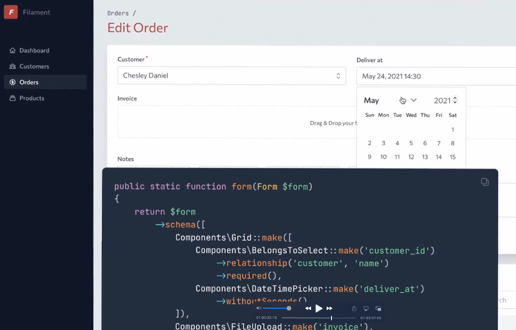
Filament Admin

Filament is a TALL (Tailwind, Alpine.js, Laravel, and Livewire) stack to build an Admin planel application. It’s pre-packaged with features that you would need to build a functioning standard application such as User Authentications, Authorization, and some utilities that make development easier and boost productivity.

Filament Admin

Motion.dev

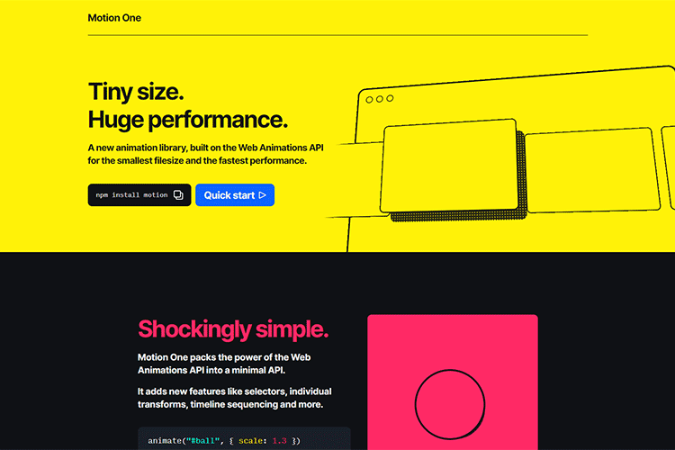
A JavaScript animation library with a focus on performance and simplicity. It leverages Animation API that allows it to stay small (3.1kb) while providing native animation features such as transform, transitions, and keyframes out of the box.

On top of that, it also provides options and easing to create an animation that feels more alive.

Motion.dev

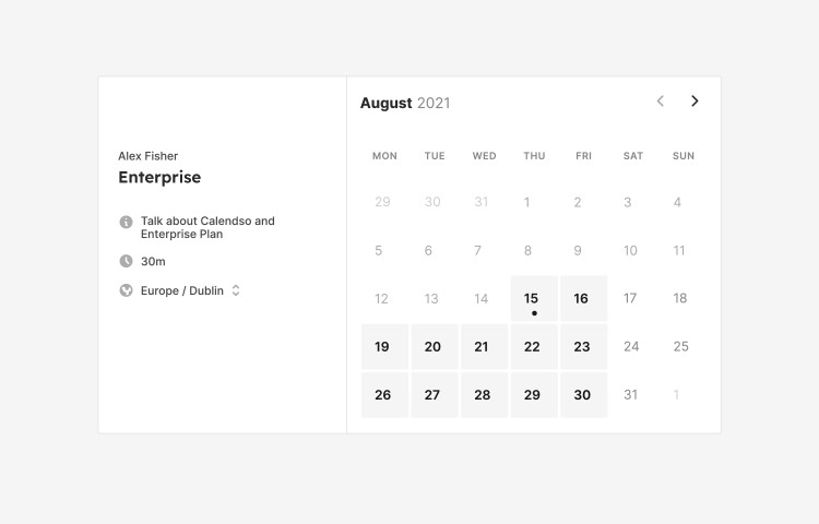
Cal.com

Recently changed its name to Cal.com, Calendso is an open-source tool to host and manage your own calendar application. It’s an overall good alternative to Google Calendar or Calendly especially if it needs to have full control over the data and customize however you like to fit in your business or development requirement.

Cal.com

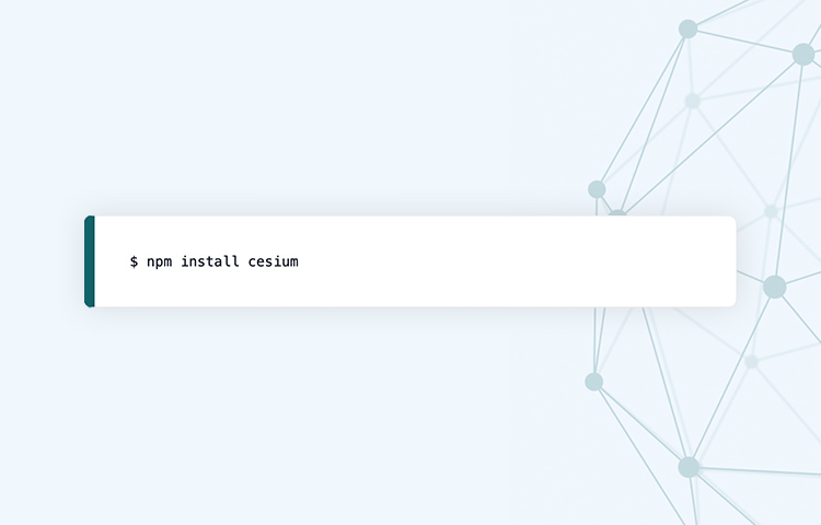
Cesium

A cross-browser JavaScript library for creating 3D or 2D objects. It uses WebGL for hardware-accelerated graphics. Designed for dynamic precision and visual quality, Cesium is the perfect library for creating interactive 3D models like globe, cityscape, terrain, and other dynamic visualization.

Cesium

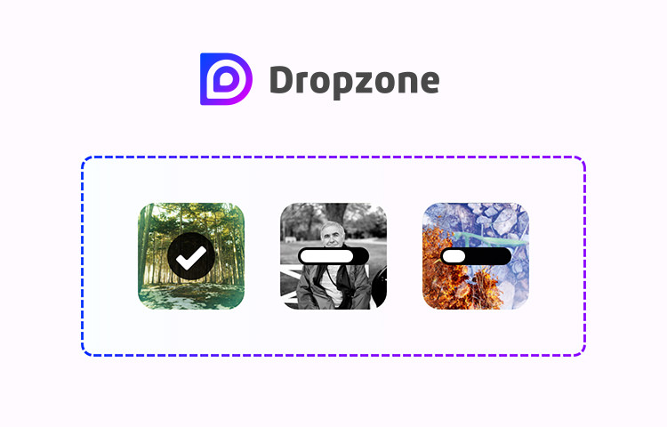
Dropzone

This is another cool JavaScript library worth mentioning. Dropzone.js turns any HTML element into, well, a “dropzone”. You can drag and drop a file onto it.

It will display the file preview, handle the upload process as well as render the progress. If you’re looking to improve the UX to upload files on your site, this is the JavaScript library you want.

Dropzone

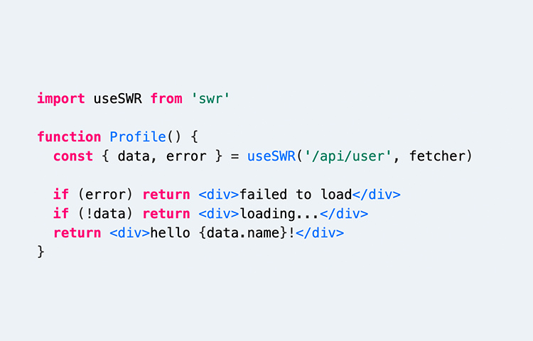
SWR

A React Hook that improves as well as simplifies data fetching for a web application. Unlike the traditional data fetch, SWR covers the common requirements for a modern application with React.

Not only that it’s fast, lightweight, and reusable, but it’s also compatible with both SSR (Server-side Rendering) and SSG (Server-side Generator), React Suspense, and React Native. This library has got you covered so you can focus on developing the best of user experience for your application.

SWR

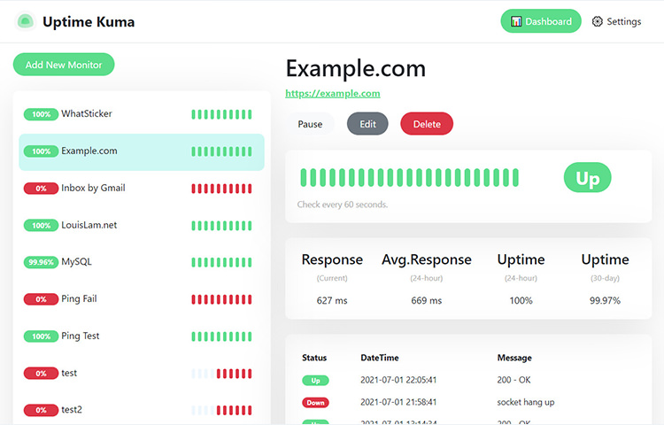
UptimeKuma

A self-hosted application for site monitoring. UptimeKuma features a nice interactive UI and supports a number of protocols such as the basic HTTP(S), TCP, Ping, or through DNS records.

You can set it to send notification to a number of channels including Email, Slack, Discord, Telegram, etc. UptimeKuma is a nice alternative to the commercial offering like Uptime Robot; it’s open-source, and you can add as many as the site you’d like to monitor without the additional $ cost.

UptimeKuma

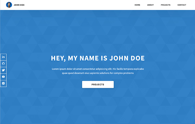
Dopefolio

A boilerplate and template to create an online portfolio quickly. It’s built with just HTML, CSS (Sass), and JavaScript. It’s preconfigured so all you need to do is to fill in the HTML page, customize the styles with Sass, and run NPM command to compile the styles. It’s fast, responsive, and since it’s just a static site you can easily deploy it to static site hosting like Netlify or Cloudflare Pages.

Dopefolio

Nord

A carefully curated color palette aims to create clear, elegant designs following a minimal and flat style pattern. This palette has been translated to color some popular developer applications such as Atom, Coda, JetBrains, SublimeText, Terminal, and even Slack. A great initiative to tie your daily apps together with a unified color scheme.

Nord

The post Fresh Resources for Web Designers and Developers (September 2021) appeared first on Hongkiat.

Weekly News for Designers № 612

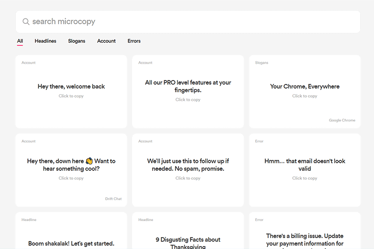
Microcopy – A collection of click-to-copy short text for use on your website.
Example from Microcopy

Theatre.js – A GUI-based JavaScript animation library.
Example from Theatre.js

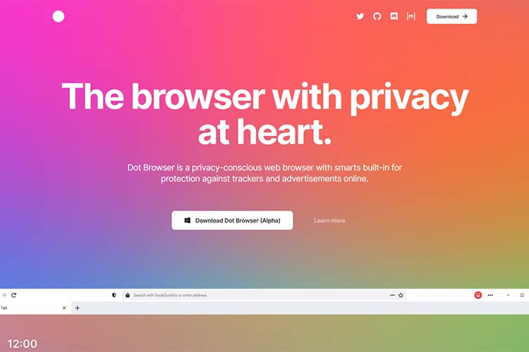
Dot HQ – Concerned about online privacy? Give this new web browser a try.
Example from Dot HQ

Motion One – This animation library promises “huge” performance while keeping a tiny file size.
Example from Motion One

Navigating Harsh Judgements and Self-Worth in Web Design – Some advice for tuning out the darkest parts of the web design community.
Example from Navigating Harsh Judgements and Self-Worth in Web Design

Menu and Thumbnail Stack Animation – Learn the process behind this unique menu animation.
Example from Menu and Thumbnail Stack Animation

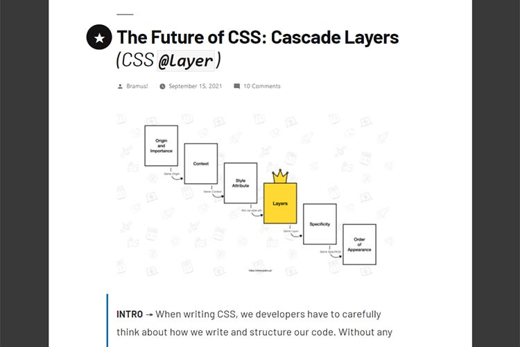
The Future of CSS: Cascade Layers – Find out how this new CSS feature can help designers take control of the cascade.
Example from The Future of CSS: Cascade Layers

8 Best WordPress Plugins for Providing Customer Support – Add a variety of customer support functionality to your website with these handy plugins.
Example from 8 Best WordPress Plugins for Providing Customer Support

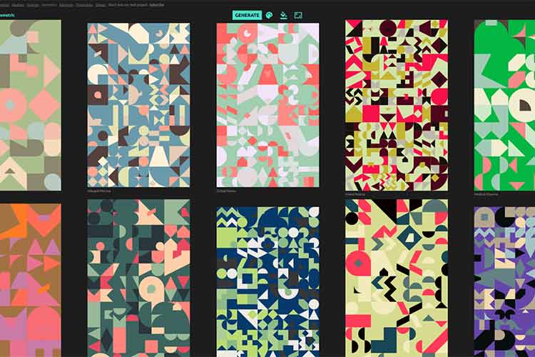
Geometric Art – Use this tool to generate unique art that can be downloaded for your projects.
Example from Geometric Art

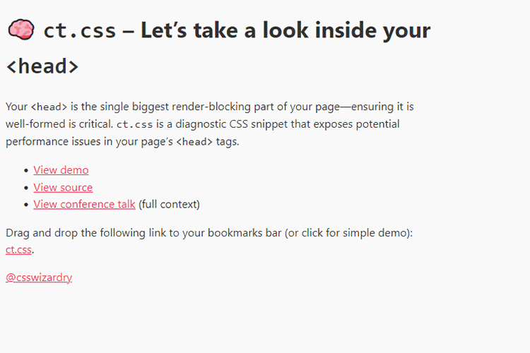
ct.css – This diagnostic CSS snippet exposes potential performance issues in your page’s <head> tags.
Example from ct.css

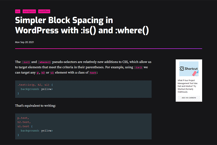
Simpler Block Spacing in WordPress with :is() and :where() – How these CSS pseudo-selectors can help you tackle spacing in the Gutenberg block editor.
Example from Simpler Block Spacing in WordPress with :is() and :where()

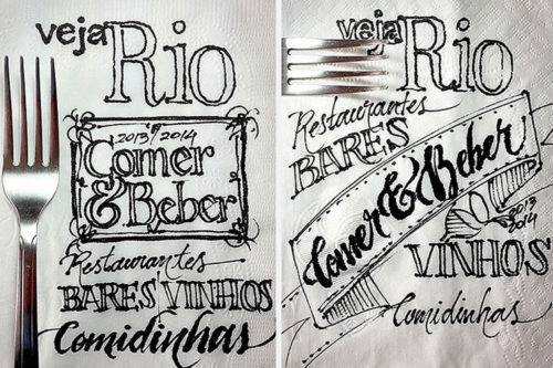
The Idea Generation Process of Scribbling on a Napkin – Explore the idea generation process familiar to many designers: the scribbled idea on a restaurant napkin.
Example from The Idea Generation Process of Scribbling on a Napkin

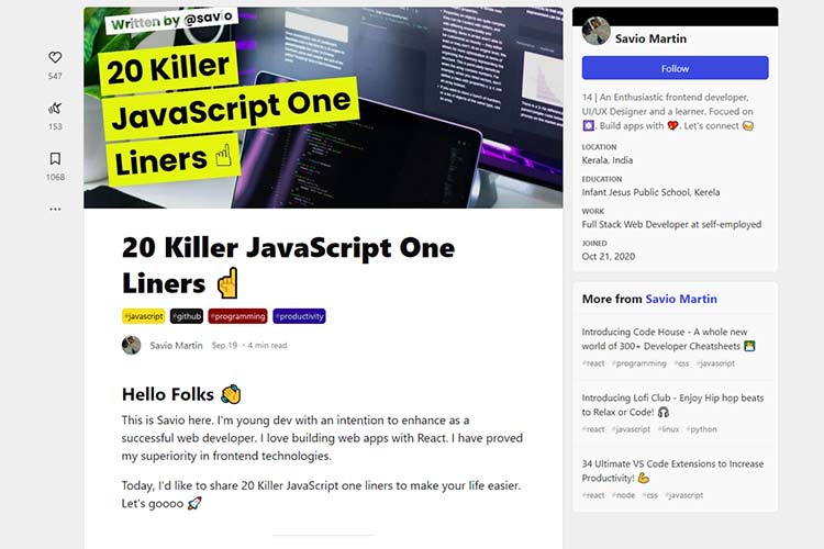
20 Killer JavaScript One Liners – Bookmark this list of handy JavaScript snippets.
Example from 20 Killer JavaScript One Liners

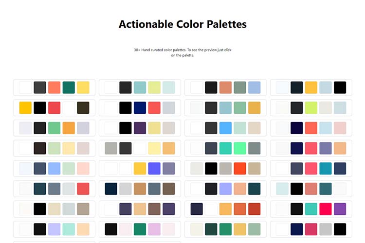
Actionable Color Palettes – Check out this attractive collection of hand-curated color palettes.
Example from Actionable Color Palettes

Love a WordPress Plugin or Theme? Pay It Forward. – Take time to positively impact the people and products that help make our websites better.
Example from Love a WordPress Plugin or Theme? Pay It Forward.

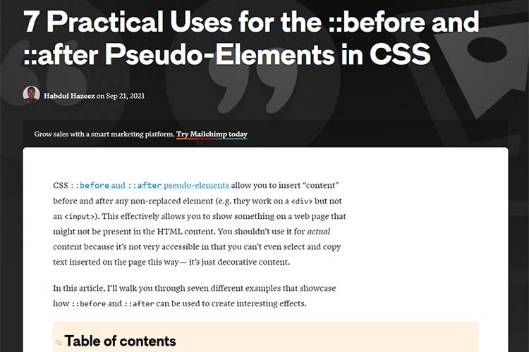
7 Practical Uses for the ::before and ::after Pseudo-Elements in CSS – Examples of how designers can leverage these pseudo-elements to create a better UX.
Example from 7 Practical Uses for the ::before and ::after Pseudo-Elements in CSS

The post Weekly News for Designers № 612 appeared first on Speckyboy Design Magazine.
Did you miss our previous article…
https://www.1clanek.info/?p=73