If you are a designer or developer, you probably know that this field is one of the most innovative and fastest growing industry in the world. If you want to keep up to date and stay ahead of your competitors you must learn new things all the time and follow trends.
Even though the Internet is the best place for the Creatives to learn anything for free, I would highly recommend you to spend a few bucks and get some design and development books. There are a lot of experts who have encountered problems and found solutions which they share with us in the books, so why not take advantage of their best practices and smart approaches to problems?
These books will definitely help you become a better designer, developer or both. You will gain a lot of useful and practical knowledge in design psychology, user experience, branding, storytelling, programming, coding, business and much more.
Hopefully this list of books will help you choose the next book to read during rainy evenings.
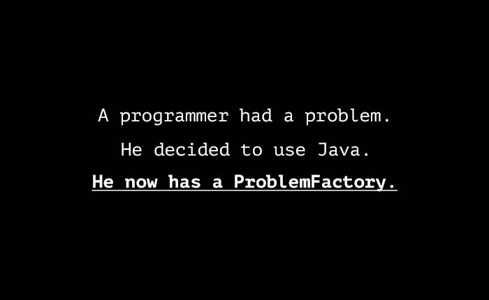
Why All Developers Should Learn Command Line
Some developers cringe at the mere thought of opening a terminal window. For the uninitiated it can be… Read more
1. How to Build Habit-Forming Products

Written by Nir Eyal, Hooked is a practical guide to help you create the kind of products that people would want to use. It introduces the ‘hook model’ – a four-step process that most brands use to shape consumer habits.
The book is packed with consumer behavioral insights, tips on taking actionable steps in creating enticing products, and many case studies to help you understand the concepts.
It is written for designers, product managers, marketers, start up founder, or just any one who’s interested in consumer behavioral patterns.
2. Don’t Make Me Think
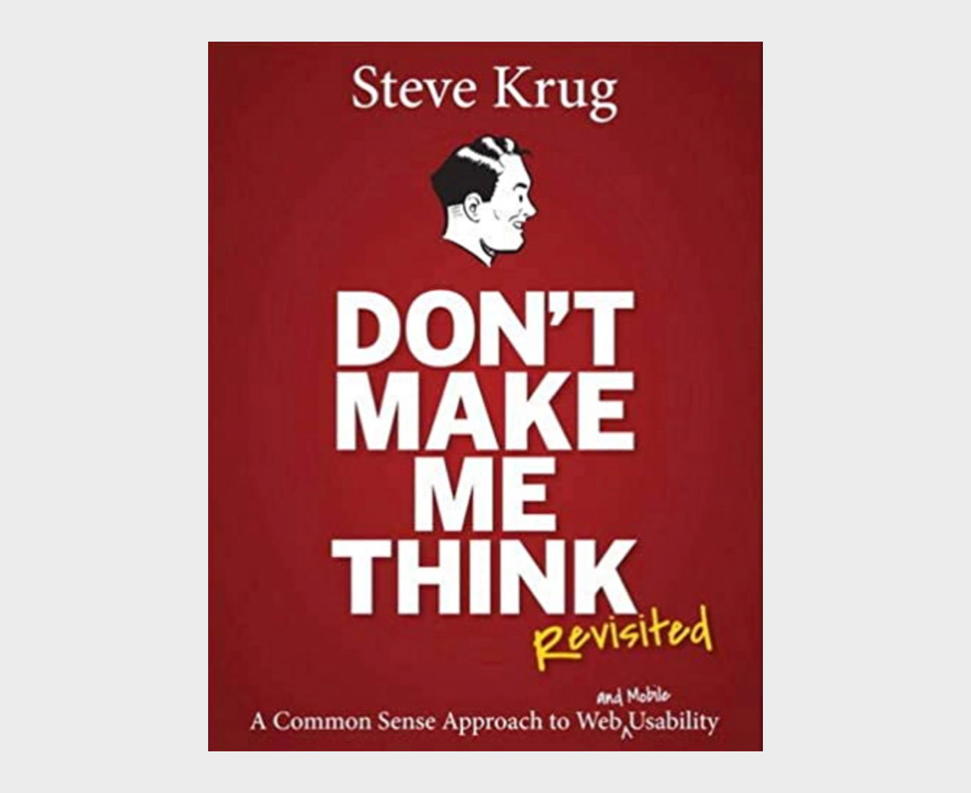
Dubbed as the usability guru, Steve Krug is the writer of this wonderful book Don’t Make Me Think that talks about intuitive navigation and information design. This revised version gives you fresh perspectives and updated case studies along with a chapter on mobile usability.
You will find the book to be witty, highly practical, and full of commonsense-based points. Either you’re a web or graphic designer or a web developer, you’ll find the usability concepts mentioned in the book to be highly applicable to everyday designing.
3. Creativity Inc
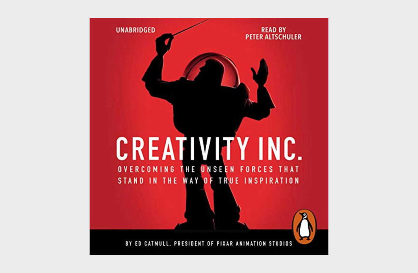
Creativity Inc. is a cumulation of years of work and experience of Ed Catmull, one of the founders of Pixar Animation company and the creator of the amazing Toy Story. The book talks about ideas, techniques, and creativity process that goes on in Pixar.
From the very core of it, the book is about creating and nurturing a creative culture in your organization. Designers, developers, and team managers can take it as their guide book for taking their work to new heights of originality.
4. Invisible Women
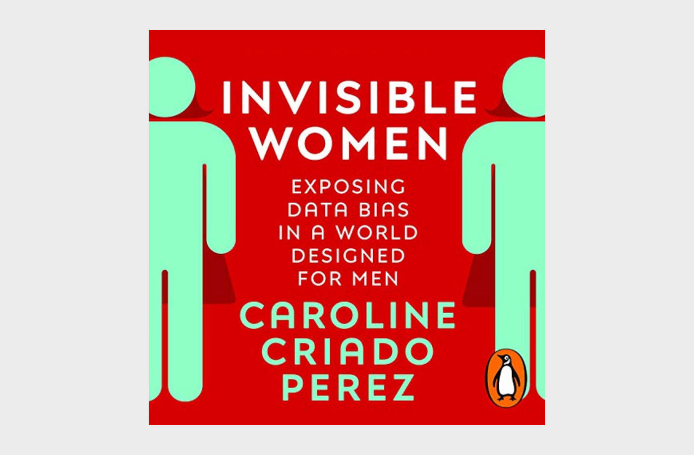
Approximately half of the world’s population are women. However, they are constantly at the receiving end of gender bias that manifests in everyday life. This book The Invisible Women highlights how a world made by men systematic ignores women.
The book talks about data bias that almost all women face in their lives. Phone too big for your hands, medication not suitable for your body, greater likelihood of injuries you can get from an accident, and many such hurdles that are faced by women everyday.
5. The Lean Startup
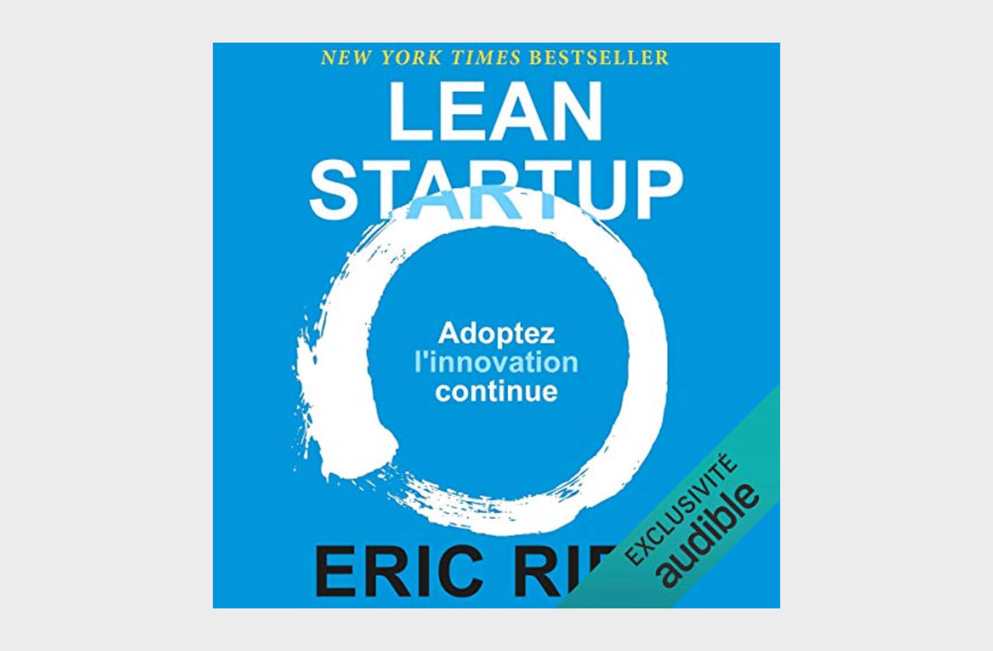
The Lean Startup is an interesting book that sheds light on some practical approaches to help startup businesses avoid failure through continuous innovation. It helps you shift your company’s direction and shorten product-development cycles.
By the dint of some useful concepts with practical examples in the book, you can change the way companies are built and new products are launched. It emphasizes on shorter more adjustable goals instead of creating elaborative business plans.
6. Paradox of Choice
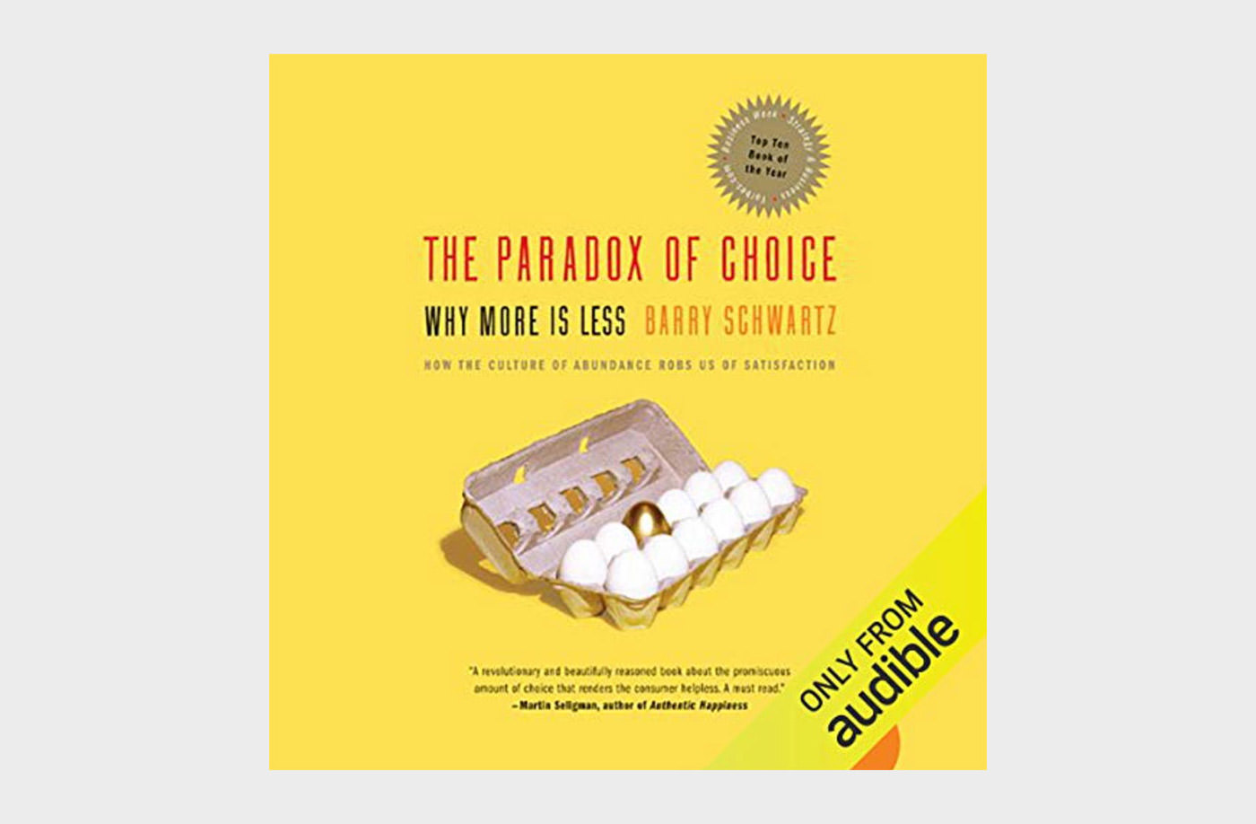
In today’s world, whether you’re buying something, choosing a career, or subscribing to a service, the choices are abundant. However, when the choices become a little too abundant, you start questioning your decision. And this is where this book comes in.
Written in accessible, engaging, and anecdotal prose, Barry Schwartz helps you understand the psychology of choice for humans. Designers and product creators can make good use of these insights when building their products and making them stand out from the rest.
7. Universal Principles of Design
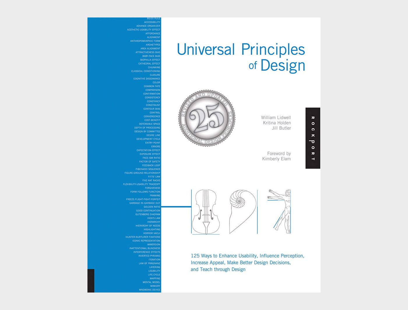
Written by William Lidwell, The Universal Principles of Design is a richly-illustrated encyclopedia of designing and user experience. The book covers everything from usability, user perception, laws of design, guidelines, human biases, and general concepts important for a successful design.
You will find interesting visual examples to elaborated each concept as well as design guidelines that’ll encourage brainstorming and broaden your design knowledge.
It is equally useful for designers, artists, marketing managers, startup entrepreneurs, interior designers or anyone who’s designing a system for users.
8. Flow The Psychology of Happines
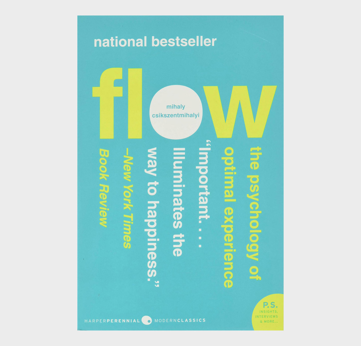
Penned by famous psychologist Milhay Csikszentmihalyi, this interesting book Flow explores the psychology behind optimal experience. According to the author, people are genuinely satisfied when things go in a certain flow.
The book further highlights that during the state of flow, people experience enjoyment, creativity, and total involvement. You can use these insights to work and improve your designs and products and create a better user experience.
9. How to Speak Machine
Just as the name says, How to Speak Machine lays down some simple laws to control and manage computers of today and even machines of the future. It offers guidelines and useful framework for product designers, business leaders, and policy makers.
The author shares his vast experience as a design and tech thinker and shows trough this book how individuals and businesses can harness technology to create dynamic and inclusive products for users.
10. 1000000 Web Designer Guide
As more and more designers and creative professionals are going freelance, this wonderful book covers tips, tricks, and life lessons for designers who are on or planning to take the path to freelance career.
In this book, you’ll get some practical tips on taking a smart approach towards freelancing without getting overworked and underpaid. The book also has tips on balancing a successful work life and balancing it with a fulfilling personal life.
11. Client Centric Web Design
A client-centric web design methodology addresses the negative attitude that exists towards client work and has the potential to transform your business.
For the client/designer relationship, to work both parties need to respect the other. In this book you will explore how to move the clients’ perception of you as a pixel pusher to that of an expert.
12. Content Strategy for the Web
Without meaningful content, your website isn’t worth much to your key audiences. But creating (and caring for) “meaningful” content is far more complicated than we’re often willing to acknowledge. Content Strategy for the Web explains how to create and deliver useful, usable content for your online audiences, when and where they need it most. It also shares content best practices so you can get your next website redesign right, on time and on budget.
13. A Project Guide to UX Design
User experience design is the discipline of creating a useful and usable website or application — one that’s easily navigated and meets the needs of both the site owner and its users.
But there’s a lot more to successful UX design than knowing the latest Web technologies or design trends: It takes diplomacy, project management skills, and business savvy. That’s where this book comes in.
14. JavaScript jQuery
JavaScript lets you supercharge your HTML with animation, interactivity, and visual effects, but many web designers find the language hard to learn. This jargon-free guide covers JavaScript basics and shows you how to save time and effort with the jQuery library of prewritten JavaScript code.
You’ll soon be building web pages that feel and act like desktop programs, without having to do much programming.
15. JavaScript Web Applications
Building rich JavaScript applications that bring a desktop experience to the Web requires moving state from the server to the client side — not a simple task. This hands-on book takes proficient JavaScript developers through all the steps necessary to create state-of-the-art applications, including structure, templating, frameworks, communicating with the server, and many other issues.
16. jQuery Novice to Ninja
jQuery: Novice to Ninja, 2nd Edition is the perfect book to jump-start your journey into jQuery. You’ll learn all the basics, so you’ll be able to truly appreciate the power of this JavaScript framework. Then you’ll move on to more advanced techniques, such as plugin development and the creation of almost every conceivable UI widget.
17. Logo Design Love
There are a lot of books out there that show collections of logos, but David Airey’s “Logo Design Love” is something different. It’s a guide for designers (and clients) who want to understand what this mysterious business about logos is all about.
Written in reader-friendly, concise language, with a minimum of designer jargon, Airey gives a surprisingly clear explanation of the process, using a wide assortment of real-life examples to support his points.
18. Neuro Web Design
Neuro Web Design employs “neuro-marketing” concepts, which are at the intersection of psychology and user experience. It’s scientific, yet you’ll find it accessible, easy to read, and easy to understand. By applying the concepts and examples in this book, you’ll be able to dramatically increase the effectiveness and conversion rates of your own website.
19. PHP Solutions
You want to make your websites more dynamic by adding a feedback form, creating a private area where members can upload images that are automatically resized, or perhaps storing all your content in a database.
This book doesn’t just provide a collection of ready-made scripts: each PHP Solution builds on what’s gone before, teaching you the basics of PHP and database design quickly and painlessly.
By the end of the book, you’ll have the confidence to start writing your own scripts.
20. Storytelling Branding in Practice
This book is written for practitioners by practitioners. Through real life examples, simple guidelines and practical tools, the book aims to inspire companies to use storytelling as a means of building their brand — internally as well as externally.
21. Stunning CSS3
By reading this book you’ll learn how to accomplish modern CSS3 effects and more by working through a series of practical yet cutting-edge projects.
Each chapter walks you through standalone exercises that you can integrate into projects you’re working on, or use as inspiration. You’ll learn all of the most popular, useful, and well-supported CSS3 techniques.
22. The Thank You Economy
If this were 1923, this book would have been called “Why Radio Is Going to Change the Game”. The Thank You Economy is about something big, something greater than any single revolutionary platform.
It isn’t some abstract concept or wacky business strategy — it’s real, and every one of us is doing business in it every day, whether we choose to recognize it or not. It’s the way we communicate, the way we buy and sell, the way businesses and consumers interact online and offline.
23. The Elements of User Experience
The Elements of User Experience cuts through the complexity of user-centric design for the Web with clear explanations and vivid illustrations that focus on ideas rather than tools or techniques. Jesse James Garrett gives readers the big picture of Web user experience development, from strategy and requirements to information architecture and visual design.
This accessible introduction helps any Web development team, large or small, to create a successful user experience.
24. Thinking with Type
Thinking with Type is the definitive guide to using typography in visual communication, from printed page to computer screen.
This revised edition includes forty-eight pages of new content, including the latest information on style sheets for print and the Web, the use of ornaments and captions, lining and non-lining numerals, the use of small caps and enlarged capitals, as well as information on captions, font licensing, mixing typefaces, and hand lettering.
25. Web Design Confidential
Drawing on survey statistics from over 5,400 web designers from around the world, and the insight and experiences of several design veterans, Amanda Hackwith unlocks the door and sheds light on the web design industry in Web Design Confidential.
Have you ever wondered if your hourly rate is too low or too high? Are you torn between freelance design work and full-time employment? Are you missing an essential design skill without even knowing it?
Whether you’re looking for the latest web design practices, words of wisdom from design veterans, or just a better understanding of your profession, Amanda Hackwith and 5400 colleagues have the answers to your questions and you’ll find what you need in Web Design Confidential.
26. Design Is a Job
Co-founder of Mule Design and raconteur Mike Monteiro wants to help you do your job better. From contracts to selling design, from working with clients to working with each other, this brief book is packed with knowledge you can’t afford to not know.
27. Designing for Emotion
Make your users fall in love with your site via the precepts packed into this brief, charming book by MailChimp user experience design lead, Aarron Walter.
From classic psychology to case studies, highbrow concepts to common sense, Designing for Emotion demonstrates accessible strategies and memorable methods to help you make a human connection through design.
28. CSS3 for Web Designers
From advanced selectors to generated content to the triumphant return of web fonts, and from gradients, shadows, and rounded corners to full-blown animations, CSS3 is a universe of creative possibilities. No one can better guide you through these galaxies than world-renowned designer, author, and CSS superstar Dan Cederholm.
Learn what works, how it works, and how to work around browsers where it doesn’t work.
29. HTML5 for Web Designers
The HTML5 spec is 900 pages and hard to read. HTML5 for Web Designers is 85 pages and fun to read. Easy choice. HTML5 is the longest HTML specification ever written. It is also the most powerful, and in some ways, the most confusing. What do accessible, content-focused standards-based web designers and front-end developers need to know? And how can we harness the power of HTML5 in today’s browsers?
In this brilliant and entertaining user’s guide, Jeremy Keith cuts to the chase, with crisp, clear, practical examples, and his patented twinkle and charm.
30. The Elements of Content Strategy
Content strategy is the web’s hottest new thing. But where did it come from? Why does it matter? And what does the content renaissance mean to you?
This brief guide explores the roots of content strategy, and quickly and expertly demonstrates not only how it’s done, but how it is done well. A compelling read for both experienced content strategists and those making the transition from other fields.
The post 30 Books For Web Designers and Developers appeared first on Hongkiat.