20 Beautifully Designed Coming Soon Pages for Inspiration

If you are working on a new website, service, or app, you should consider getting a jump start on your marketing campaigns by having a presence online that you can show to potential users or buyers, so that when you do launch, you can hit the ground running.

Coming soon pages are the first step in that process. You certainly aren’t showing the finished product – but it’s enough to start building up a social media following, gauge product interest, or even to get users to register for beta testing when ready.

But just because it’s only a temporary landing page, that doesn’t mean it shouldn’t be thoughtfully designed. The quality of the coming soon page you create can greatly impact the success of your product.

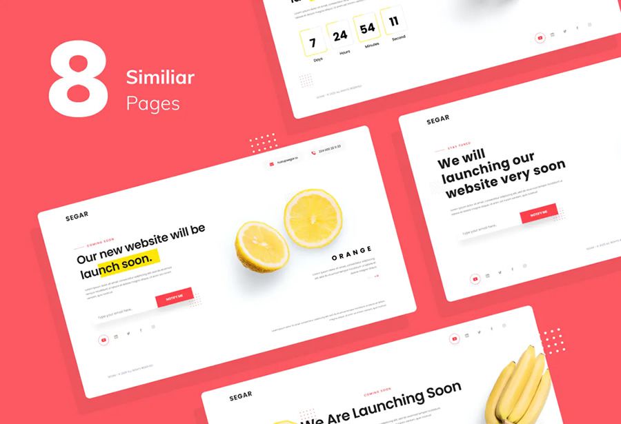
As it’s so important to have a thoughtfully designed coming soon page, we have a collection of some of our favorites. The coming soon pages are all fairly recent examples of pages that we think do a great job of explaining the product and building hype and excitement for those people who would be the service’s target audience.

If you are working on a startup or are looking to create your own prelaunch landing page, we hope this collection gives you plenty of inspiration and ideas.

Coming Soon Page Concept by Oksana Zenicheva

Coming Soon Website Template for Figma & Photoshop by Peter Draw

Website Template Figma Photoshop coming soon page web design inspiration

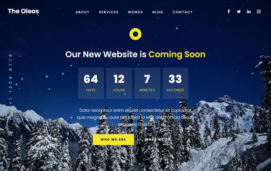
The Oleos Coming Soon Page by Designesia

The Oleos coming soon page web design inspiration

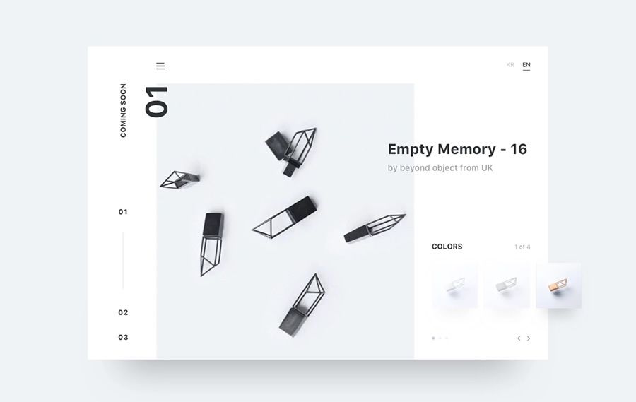
Minimal Coming Soon Concept by Hijin Nam

Minimal coming soon page web design inspiration

Under Construction Figma & Photoshop Website Template by Peter Draw

Under Construction Figma Photoshop Website Template coming soon page web design inspiration

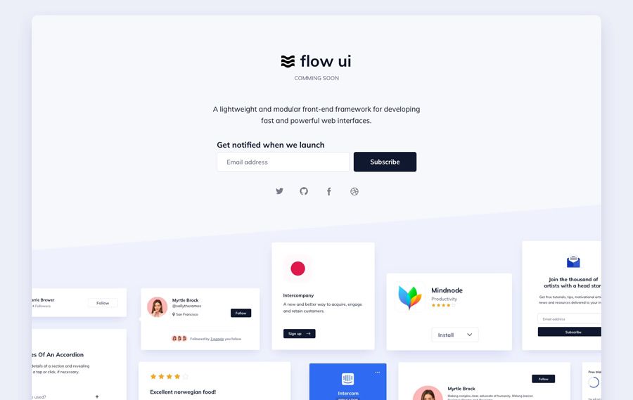
Flow UI Coming Soon Design by Ildiko Gaspar

Flow UI coming soon page web design inspiration

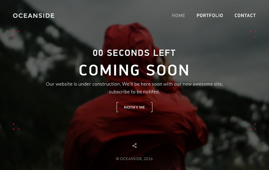
OceanSide Coming Soon HTML Template by WpWay

OceanSide HTML Template coming soon page web design inspiration

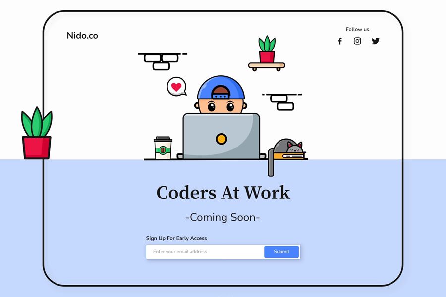
Coders at Work Coming Soon Page Design by Abhinav Khare

Coders at Work coming soon page web design inspiration

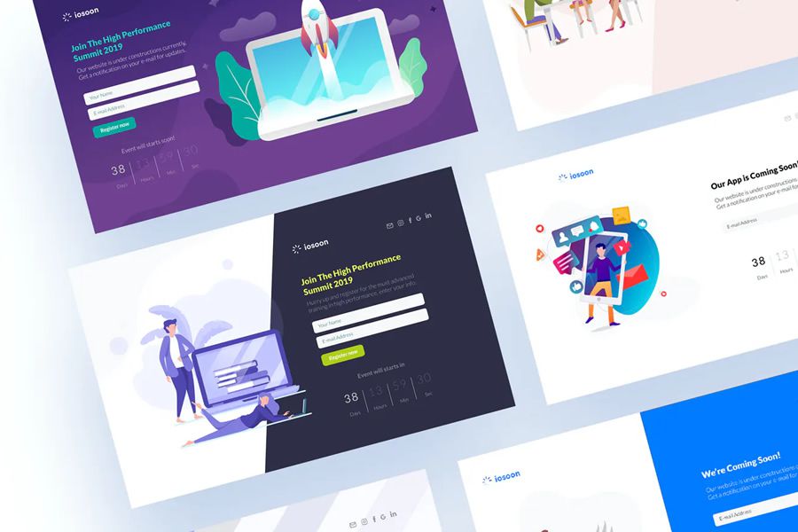
Iosoon Coming Soon HTML Template by Brandio

Iosoon coming soon page web design inspiration

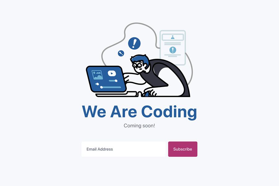
We Are Coding Coming Soon Page Idea by Eddie Enkhtuya

We Are Coding Idea coming soon page web design inspiration

Base Apparel Coming Soon Page by Gary Byrne

Base Apparel coming soon page web design inspiration

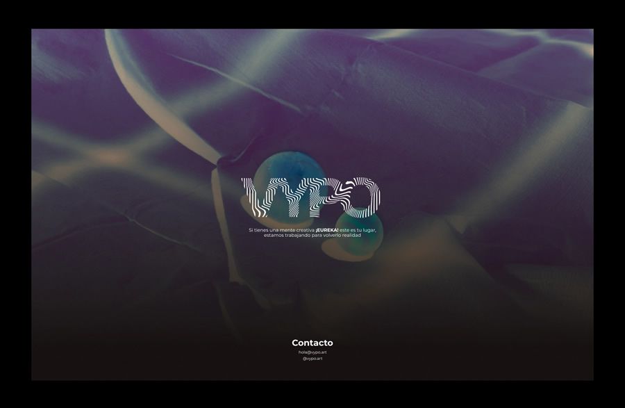
VYPO Coming Soon Page by Jorge Toloza

VYPO coming soon page web design inspiration

Innovo Coming Soon HTML Template by ThemeStarz

Innovo HTML Template coming soon page web design inspiration

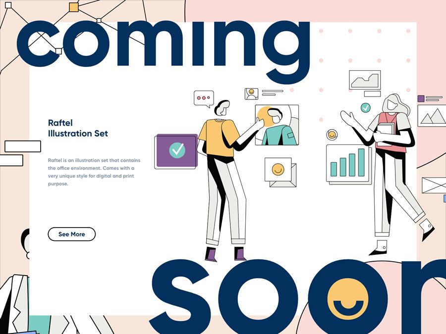
Raftel Coming Soon Illustration by Nugraha Jati Utama

Raftel Coming Soon Illustration page web design inspiration

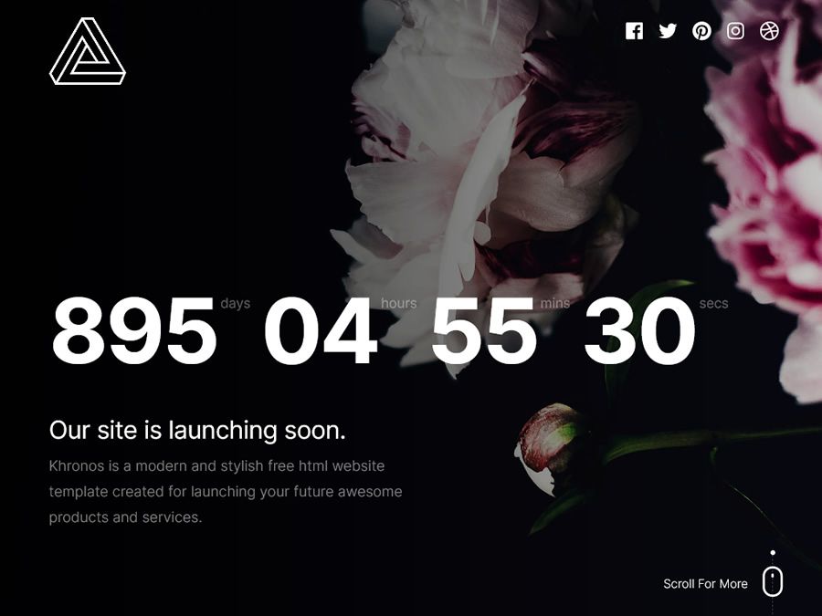
Khronos 2.0 Coming Soon Page by Styleshout

Khronos 2.0 coming soon page web design inspiration

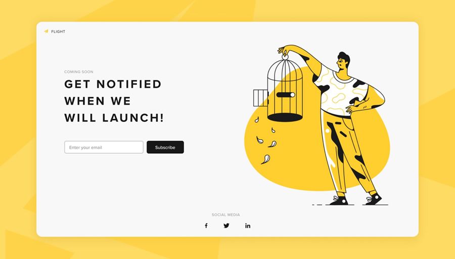
Flight Coming Soon Concept by Nathalie Tran

Flight coming soon page web design inspiration

Coming Soon & Error Page Ideas by Huyền Nguyễn

Error Page Ideas coming soon page web design inspiration

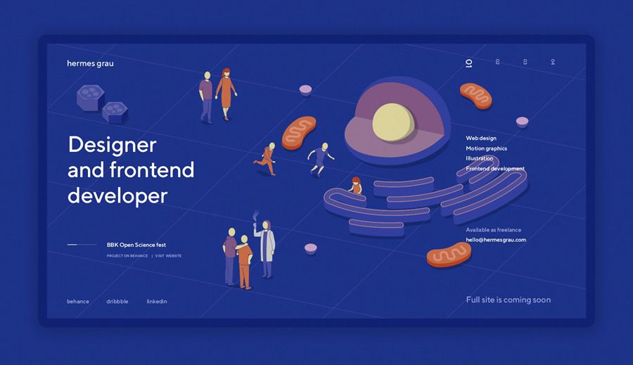
Hermes Grau Personal Coming Soon Page by Hermes Grau

Hermes Grau Personal coming soon page web design inspiration

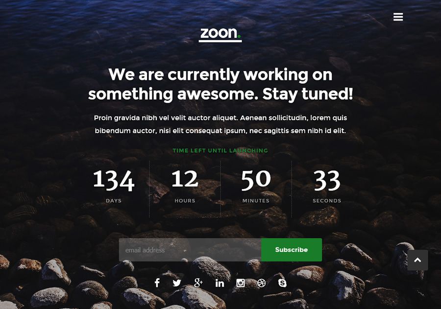
Zoon Coming Soon Template by Styleshout

Zoon coming soon page web design inspiration

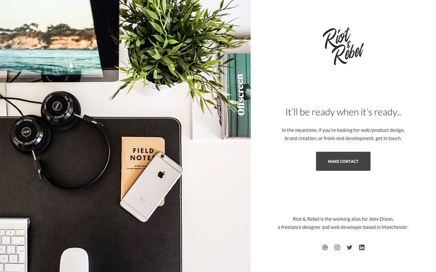
Riot & Rebel Minimal Holding Page by Alex Dixon

Riot Rebel Minimal Holding coming soon page web design inspiration

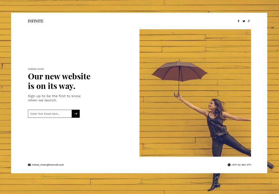
Hero Section Coming Soon Concept by Irshad Meer

Hero Section coming soon page web design inspiration


Generally, the best pre-launch or coming soon pages all do three things well:

  1. They build excitement by giving a quick, short insight into what the product will do, and what problems it solves.
  2. They give some finer details about the features and benefits that it will have.
  3. And finally, and perhaps most importantly, they give visitors the ability to sign up and register interest.

That last step is fundamentally crucial, as it means that – come launch time – you have a (hopefully large) list of potential users or buyers that you can contact to let them know your new product has launched. Good luck!

The post 20 Beautifully Designed Coming Soon Pages for Inspiration appeared first on Speckyboy Design Magazine.

In Web Design, Easier Doesn’t Always Mean Better

There are a massive number of products and tools aimed at the web design industry. And it seems like something new arrives every day.

They may vary widely in scope, but most have one thing in common: the promise of making our job easier. Whether they’re writing superb code, promising can’t-fail functionality, or adding killer special effects, these solutions aim to do the dirty work for us. How convenient!

I, for one, feel a bit disappointed. Despite the hype, I’m not convinced things are that much easier. It’s not as if artificial intelligence (AI) has replaced my most monotonous tasks. In many respects, web design seems to have become even more complex over time.

Besides, much of what advertises an “easier” process tends to come with some serious tradeoffs. Unfortunately, easier doesn’t always mean better.

With that, here are a few things to consider before you trade the tried-and-true parts of your workflow for a quick fix.

Will You Be Locked Into a Bad Situation?

When it comes to designing and building a website, just about every decision requires some sort of buy-in. This is part of the process.

If you’re creating a layout mockup in Figma, Photoshop, or Sketch – you’re making a commitment. As your project progresses, you’ll need to come back to the chosen app again and again. The same principle applies to everything from DIY website builders to programming frameworks.

The difference is in the required level of commitment. Pick the wrong tool, and you may be stuck with it for longer than you’d like. Becoming locked into a specific path may limit your ability to evolve along with the web. And those new features that everyone else is using? It could be that they’re unavailable to you.

That’s why it’s vital to know what you’re getting into. An untested solution may seem attractive now, but where will it be in five years? If it doesn’t hold up, you could end up starting from scratch again.

In some cases, it may be worth the risk. But there’s also something to be said for having future flexibility.

Easier to Build, Harder to Maintain

The promise of a quicker path to launching a website has always attracted the attention of the design community. Skip over the hard stuff and get paid sooner – who wouldn’t want that?

It certainly sounds wonderful. The problem is that, sometimes, an easier start means more difficult maintenance down the road.

Take, for example, the culture of content management system (CMS) plugins. With a platform such as WordPress, it’s incredibly easy to build a website, piece by piece.

It’s certainly possible to build a site that works well enough with this approach. But there is danger in having bits of related functionality controlled by multiple plugins. It’s akin to using string to keep all of your favorite books together. Take one book out of the stack, and things are going to fall apart.

Likewise, if your functionality needs change, this delicate balance can start to crumble. Some plugins may no longer be suitable or are simply too rigid to achieve your goals. That could mean swapping out critical pieces and trying to patch a gaping hole.

This doesn’t mean that you shouldn’t use plugins. But it is worthwhile to think about sustainability. Determine the most sustainable path forward. That may take a little more work up front, but will save you from future difficulties.

An assortment of tools.

Cost vs. Benefit

Quite often, products advertised as making your job easier also tout cost savings as well. But is the easiest way forward really the cheapest?

That depends upon the factors mentioned above. If your website is up and running weeks earlier because of a specific tool, that’s great. But if it makes future maintenance a nightmare, any upfront savings may be short-lived.

Then there’s the ability for future growth. For example, subscribing to a proprietary website platform can get you access to a certain level of looks and functionality. But what happens if that service cannot provide the advanced features you’ll need down the road? And, in the meantime, how much money have you spent to continue using it?

Even if you end up with some savings, you may find that they simply weren’t worth the included hassles and limitations. Trading a few extra dollars in your pocket for a less-than-ideal website is unlikely to make you feel very good.

Before making any decisions, it’s wise to weigh the potential costs, benefits, and pitfalls of a given solution. This ensures that you’re thinking with both the short and long-terms in mind.

A potted plant surrounded by coins.

Beware of Easy Website Solutions

It’s worth remembering that every path to building a website has a cost associated with it. Whether you utilize free or commercial tools, there will always be time and effort required to use them. Beyond that, there’s also the cost of future maintenance.

Sometimes, you can find a solution that makes web design both easier and more cost-effective. However, it takes careful scrutiny to determine if that’s the case.

There are a lot of products out there that make such claims. Don’t take them at their word. Instead, conduct your own research and find the tools that will work best for you.

The post In Web Design, Easier Doesn’t Always Mean Better appeared first on Speckyboy Design Magazine.

Did you miss our previous article…
https://www.1clanek.info/?p=232

10 Free Plugins for Customizing the WordPress Dashboard

The WordPress administration area (aka the Dashboard) can be customized in many ways. Menu items can be added, hidden, or rearranged. Access to settings can be set for specific user roles. Custom widgets can be added to help guide or pass important information on to users.

No matter what kind of tweaks you’re looking to make, there is most likely a WordPress plugin available to make it a reality. Let’s explore 10 WordPress plugins you can use to personalize the Dashboard to meet your needs.

White Label CMS

A stock installation of WordPress doesn’t feel very personal. That’s why White Label CMS exists. It allows you to integrate your brand into various areas of the back end.

It starts with a custom login page, then moves on to the admin header and footer areas. But it doesn’t stop there – you can also choose which admin menus to display, and create a completely custom dashboard. As a bonus, it also works with page builders such as Beaver Builder and Elementor.

Remove Dashboard Access

Remove Dashboard Access offers a solution for those who want to keep certain user roles from accessing all or parts of the back end. This is great for membership sites, where users typically have a front-end profile (optional back-end profile access is possible).

In addition, the plugin lets you redirect users to a custom URL and display an optional message on the login screen.

Remove Dashboard Access

Widget Disable

Widget Disable works on both the front and back ends of your WordPress website. It allows administrators to easily turn off access to specific widgets.

With regards to the dashboard, it’s a great way to remove clutter for your site’s users. Too often, plugins litter the screen with widgets that are little more than advertisements. Widget Disable helps to make for a cleaner back-end experience.

Widget Disable

Catch IDs

There are times when you need to access the ID of a particular post, page, category, or user. Catch IDs is a simple plugin that makes this information readily available.

Once installed and activated, the ID number is displayed within the various admin content and user listings. Oh, and it also works for media attachments!

Catch IDs

Admin Columns

Admin Columns is a commercial plugin (with a free version) that enables to you add custom columns to page /post listings and more.

There are over 160 columns to choose from. For example, you can easily add a featured image column to the post listing. Not only can you display various columns, but you can also sort and filter posts by them as well. It works with all content types and can integrate with lots of plugins, including Advanced Custom Fields and WooCommerce.

Simple History

Simple History doesn’t add some major functionality to the WordPress dashboard. But it sure is helpful. A widget is added to the dashboard home page that shows you which users recently added or updated posts when a widget has been added or removed or even uploaded an image to the Media Gallery.

It also tracks things like plugin activations, user profile updates, logins, and more. Very useful for administrators who want to stay on top of whom is doing what.

Simple History

Admin Menu Editor Pro

While somewhat similar to Adminimize, Admin Menu Editor Pro does have some unique features worth checking out. For instance, not only can you hide dashboard menu items in general or by user role, you can create your own items as well.

Those custom menu items can point to any internal or external URL. The plugin also lets you move individual items to different submenus, change titles and even icons. A free version is also available.

Admin Menu Editor Pro

Custom Dashboard Widgets

The WordPress dashboard can get a little cluttered. Custom Dashboard Widgets helps alleviate some of that clutter by allowing you to replace all the standard home page widgets with simpler versions.

Consisting of a label and a FontAwesome icon, each widget can be displayed or hidden based on a user’s role. You can also add your own custom links as well.

Custom Dashboard Widgets

Ultimate Dashboard Pro

Ultimate Dashboard Pro lets you take control of the WordPress dashboard homepage. You can easily disable any and all default widgets, as well as those from third parties.

Create your own simplified widgets with either text-only or icon-based options. The plugin is compatible with WordPress Multisite. A free version is also available.

Nested Pages

A seemingly ignored part of WordPress is the cumbersome approach to managing large amounts of pages or posts. Nested Pages is a plugin that aims to fix this by turning listings into interactive tree-style menus.

It also allows you to add pages in bulk, right from within the page listing. The slick drag-and-drop interface helps to make repositioning content less stressful. A native WordPress menu is also created and updated to match your nested structure.

Nested Pages

Make it Your Dashboard

The main idea behind tweaking the WordPress administration area is to improve your workflow. By adding helpful information and streamlining what gets displayed (and to whom it’s displayed), we’re making site management that much easier.

The plugins above feature creative and practical ideas for lessening the learning curve for new users and saving administrators loads of time.

If these plugins don’t help, you could try these 20 Snippets & Hacks to Help Make WordPress Easier for Your Clients.

The post 10 Free Plugins for Customizing the WordPress Dashboard appeared first on Speckyboy Design Magazine.

Did you miss our previous article…
https://www.1clanek.info/?p=222

The Types of Freelance Design Clients You Should Avoid

Once they’re out of design school and battling it out in the real world, designers can find themselves in a pretty crappy predicament.

Maybe your teachers warned you to be as discerning as possible when taking on new clients (or maybe they told you the opposite, but you knew it was BS), but reality is often a rude awakening from what you expected when you first started working.

Bills pile up, the rent’s due date looms closer, and suddenly that shady dude who wants you to design his logo and website for $200 and “exposure” doesn’t look too bad.

We all know it can be hard to stick to our guns and seek out quality work that will enhance our careers, rather than drag them down into the mud, but think about one thing for a second.

When you take on a terrible client – one that, say, refuses to pay you either in full or in part, or one that has a million and one changes to make to your designs, you’re actually spending far more in labor costs – and sometimes even in legal fees – to complete that job than you would have if you’d had a few more instant meals and committed to finding a good client.

A bad client is bad news, period. It will always cost you more to maintain a bad client than it’s worth.

Avoiding Micromanager

Clients hire you for a reason: to improve the profitability of their business venture, whether it’s an information website, a product, or a personal brand. At least initially, they know they need a professional to step in and create something usable and which contributes to their overall goal of making more money.

I’ve found that reminding clients of this in a polite, but firm way is incredibly effective in getting them to slow down and hand you back the reins of the project.

Your ultimate goal as a designer is to find clients who will trust you. If there’s no trust there, your clients may become overwhelmed with anxiety and begin to micromanage.

Generally speaking (but not always), the higher you price your design services, the more frequently you’ll find clients who respect your judgment and who will trust you, and the more you’ll drive away those who only want to play dictator.

Make sure you always charge what you’re worth – if you compromise on your prices at any point in your career, it becomes exponentially harder to make up the difference later on.

See No Evil

Nowadays, more and more designers work remotely rather than in person, and many may never even meet their clients face to face. This is good and bad. If you get a good client, it’s awesome to just receive the design brief, communicate through email, and work your magic.

If your client is a bit more difficult, it can be a nightmare. There’s a ton of research that points to face-to-face interaction and body language as being two of the most important factors in building a relationship of any kind – particularly one that involves business.

If you’re working virtually, there’s no way to gauge the chemistry between yourself and your potential client. This is where Zoom can be an immense help, but if you can meet in person, that’s even better.

Regardless of whether you do it in person or on the computer, for long-term projects, it’s important to see your client’s face and hear from their own lips whether or not their personality is something you can deal with.

You can learn a lot about what kind of client someone will be from the way they speak to you, the words they use to describe their work, and the nature of the work they would like you to do, and even from the state of their desk or office.

If someone is a slob, that might be a red flag. But more importantly, if you get a bad feeling from a client, take that as a cue to get the heck out of dodge.

red flag warning

The Warning Signs

If your client doesn’t respect what you do, they will let you know in subtle (and sometimes not-so-subtle) ways, particularly in the way they discuss the project they have for you.

The most obvious red flags are clients who promise you “exposure” or “more clients” at some indeterminate point in the future. If you’ve been hanging around the online design community for any length of time, you’ll know that doing spec work is one of the most detrimental things you can do for your own career, and for the design industry in general.

But even paying clients will use this one when they know they’re offering you payment that a service provider in any other industry would consider an insult. You don’t want to work for “exposure.” Yes, it’s a nice thing to have, but potential clients who say this never mean it the same way you mean it.

For you, exposure is concrete referrals. If your client can provide you with a list of actual paying clients you can contact for future paying work, then that’s fantastic; “expose” away. But if they don’t do this, that means they’re trying to game you and getting payment from them will likely be more trouble than it’s worth. Run!


The next big warning sign is potential clients who downplay the amount of time, effort, or work involved in a project.

“Oh, it shouldn’t really take you that long,” or “a student could do this,” or my favorite: “it’s just a simple little thing – I’d do it myself, but I don’t really have the time.” (By the way, if they don’t have the time to do a “simple little thing,” what makes them so sure it’ll only take you five minutes?)

A client who automatically assumes that what you do won’t take any significant amount of time is a client who does not understand what’s involved in the design process.

This is a client you want to run from, and quickly. Why? Because these are the kind of clients who will always argue with you about your rates or fees, since they’re convinced you’ve been racking up extra hours just to cheat them.

Of course you should be making your clients sign contracts to prevent any legal fiascos, but why put up with the headache when you don’t have to? Just walk away.


The last and possibly most insidious of “red flag” clients is the “designer” or “art director” client. You know the kind. The divorce lawyer or communications startup CEO who secretly wishes they had gone to design school, and who actively wants to play a part in the design process despite having no knowledge of design whatsoever.

These types of clients are also known for being impossible for most sane designers to work with. Therefore they often have unfinished design work that they want to hire you to complete.

They might call you at 3AM with “urgent” changes or ideas they’ve had about your work, or they might be wishy-washy about what they actually want you to do or what they like.


Long before a problem ever arises, you can use these straightforward steps to ensure that you don’t get caught up in a nasty whirlwind of broken contracts and legal fees. Always keep in mind that when you meet with a first-time client, you are evaluating them as much as they’re evaluating you.

The right clients will always respect your time and expertise; they will respond to your questions or concerns in a timely manner, and they will be realistic and professional in their expectations.

The post The Types of Freelance Design Clients You Should Avoid appeared first on Speckyboy Design Magazine.

Did you miss our previous article…
https://www.1clanek.info/?p=217

Average Costs to Resurface Pools

When you’re thinking of installing a new swimming pool in your backyard, you’ll want to get an estimate on Tampa Pool Restorations. You can usually get a free estimate from the contractor’s business card. Be careful about referrals–too many to be accurate and not enough for you to feel confident. Find one that has good references, reasonable prices and that seems to offer fair offers.

A very rough estimate on your pool resurfacing cost would be: A pool’s square footage multiplied by the following average cost per square foot: A fiberglass pool (for non-fiberglass pools), $125; A vinyl pool, $150; A concrete pool, including the lining and deck, at least double the price of a fiberglass or vinyl pool. The surface area (the space surrounding the pool and around the pool itself) should be measured by an engineer. A rough estimate is not exact, so you may have extra, unexpected costs, depending on the pool you choose and the size of your pool area. Average surface area will be dependent on how many people will be using the pool and the type of pool you have. For example, a larger pool will tend to have more surface area than a smaller pool, meaning the average cost will be higher.

Depending on the number of steps necessary to prepare the pool for installation, the total swimming pool resurfacing cost can vary. Most professional contractors will quote you approximately three phases: First, the preparation, including: removing existing siding, cleaning the pool surface, removing debris, sanding and painting. Second, if there’s any trimming, staining, or carving needed, thirdly and most importantly, the coating. Depending on the type of surface, coating is either a solid or semi-solid application, which depends on whether you’re applying a paint or a sealer.

Professional pool contractors can help you determine exactly what steps are involved in your project. Typically, labor costs will be the biggest factor, especially if you choose a do-it-yourself contractor. It is common for contractors to charge based on the day of the job, but overtime and certain types of jobs may incur additional charges. Labor costs will vary greatly based on the type of pool you have and the size of the project. For example, concrete surfaces incur more labor costs than fiberglass.

Other factors that may affect the overall pool resurfacing cost include: geographical location, whether you have stairs leading to your pool or not, and whether you use a lift or not. In addition, the type of materials used to build your structure will also vary depending on whether you’re using concrete or fiberglass. Lastly, the depth of the area in which the pool is situated will also play a large role in the overall costs. For example, installing an above ground or in ground pool in a deeper part of your backyard will cost less in labor.

Even if you decide to hire a professional contractor, you’ll still need to research the average cost to resurface pools. The reason is because different contractors will come into your home offering different rates for the same service. Before choosing one, you should make sure that you’re getting the best deal possible based on the specific needs you have.

One way that you can research average pool resurfacing costs is to ask friends and family members for recommendations. If a particular company offers you a great rate, then chances are that it’s also a good company to work with on other projects. Additionally, you can ask your pool builder for a quote based on their previous work. If they have several years of experience with inground pools, they likely have a good idea of what the average costs are.

Once you’ve decided on the resurfacing process that will best meet your needs, you should also consider the chemical levels of your pool surface. The depth of the area in which the repairs will take place will impact the chemical levels needed to properly repair the area. For instance, small cracks may not require any chemical levels at all, but larger cracks could. Small cracks will simply be repaired using sand and grout while larger cracks will require some type of chemical to properly seal the area.

8 ASCII Artwork Snippets That Utilize CSS & JavaScript

If you’re of a certain age, you may remember a time when ASCII ruled the internet. Before snarky memes or even the widespread use of animated GIFs, ASCII artwork was passed around like a bowl of candy.

Some background:ASCII (American Standard Code for Information Interchange) is a standard way to encode the text characters seen on electronic devices. Letters, numbers, and all manner of various symbols can be displayed via the format.

Early communication on the internet was text-based. As such, people with way too much time on their hands had a little fun with these assorted characters. Some truly clever artwork was created and routinely shared in newsgroups, bulletin boards and email. It could be impressive, particularly when you consider the technological limitations.

Some very creative developers haven’t forgotten ASCII art. In fact, they’ve used the latest CSS and JavaScript techniques to add movement and other enhancements.

Want proof? That’s why we’re here! Take a look at our collection of code snippets that add a modern touch to an old-school artform.

Trippy Text by Angela Galliat

We’ve seen some pretty far-out textures over the years. But this ASCII-meets-acid-trip text shader is among the most mesmerizing.

Characters seemingly melt into each other within a cluster of rainbows. You may need to take a walk outside after viewing this one.

See the Pen Ascii Text Shader (single text element, no canvas) by Angela Galliat

Delicious Donut by Housamz

Bringing an element of 3D to simple characters is a challenge. That this rotating donut is able to pull off the effect speaks to the power of CSS and JavaScript.

Even better is that the JavaScript source code is itself donut-shaped. That’s a level of dedication not seen since Homer Simpson.

See the Pen JavaScript Donut – ASCII Art by Housamz

ASCII Yourself by Tamino Martinius

Original creations are cool and all, but what about the ability to turn an image into ASCII? That’s what this art generator does.

Paste in the URL of an image, and you’ll see it rendered in character output. Adjust the sliders to add your own personal touch.

See the Pen ASCII Art Generator by Tamino Martinius

CSS Trickery by Tom Lutzenberger

While this snippet isn’t traditional ASCII art, it simulates the effect quite well. By utilizing CSS background-clip, a layer of characters is placed on top of a standard image.

The result is a quick-and-dirty image effect. Bonus points for the ability to change the characters in the HTML to whatever you want.

See the Pen Pseudo ASCII-Art by Tom Lutzenberger

Around the World by thykka

This spinning globe features a beautiful retro look. Seriously, it looks like something out of an 80s arcade game.

The three.js technology behind this beauty is anything-but-old, however. The animation is smooth and the colors vibrant.

See the Pen Rotating ASCII Globe by thykka

Flipping Awesome Animation by Takane Ichinose

While ASCII art can be incredibly intricate, there are times when simple is better. This snippet features just a small collection of characters, but is still effective in getting its message across.

By the way, that message is for you to flip a table. Click anywhere within the presentation to do so. Now, don’t you feel better?

See the Pen CSS Only ASCII Table Flip by Takane Ichinose

Lego Characters by Praveen Puglia

Here’s a unique way to leverage ASCII characters. This snippet takes an ASCII input pattern and outputs them like Lego blocks.

Add your own characters to the textarea, click the button and see your new creation.

See the Pen Legoscii! by Praveen Puglia

Characters Flying through the Air by Dave Kwiatkowski

At its core, this 3D animation is a collection of characters. But it’s also quite stunning to watch.

Notice the use of color and sizing to create the illusion of space. Larger and brighter colors are the “closest,” while the smaller and darker ones hang out in the back.

See the Pen The ASCII Galaxy by Dave Kwiatkowski

Adding Cool Characters to Web Design

What the snippets above show is that, in the right hands, even text can become art. They’re also a reminder of how CSS and JavaScript can breathe life into virtually any project. Put the two together, and you have something fun and, at times, a bit jaw-dropping.

We hope you enjoyed this new spin on ASCII artwork! If you want even more unique examples, please do check out our CodePen collection.

The post 8 ASCII Artwork Snippets That Utilize CSS & JavaScript appeared first on Speckyboy Design Magazine.

Did you miss our previous article…
https://www.1clanek.info/?p=216

25 Tutorials for Mastering Adobe Premiere Pro

Adobe Premiere Pro is a powerful video editor, but it can be a little intimidating to learn. On top of that, it has tons of features that can help you take your videos to the next level.

However, knowing where to go to find quality tutorials for Adobe Premiere Pro is time-consuming, which is why we’ve done the work for you. In this collection, you will find the best Premiere Pro tutorials suitable for intermediate users.

You might also like our collection of free Premiere Pro templates. And if you’re looking for After Effects tutorials we have those as well here.

Multi-Camera Editing in Adobe Premiere Pro

Want to get the most out of a multi-camera setup? Then this step by step video tutorial is all you need! Get ready to make videos that truly wow with multiple camera angles that can drive your message further.

Color Grading Using the Lumetri Color Panels

Lighting is often the bane of videos. Too much or too little lighting and it makes the subject matter to see. Learn how to get the most out of the available light with this step by step tutorial using color grading curves for your lighting corrections.

Color Grading Using the Lumetri Color Panels

How to Make Your Audio Sound Incredible

Get professional audio results for your videos with this step by step video tutorial. Learn how to mix and master audio so that it has cinema quality sound throughout the video without being overpowering.

How to Make Your Audio Sound Incredible

Working With Proxies in Adobe Premiere Pro

Speed up your video editing workflow with the use of proxy files. With this step by step tutorial you will learn how to create, edit, and get your videos ready for publishing by using proxy videos.

Working With Proxies Adobe Premiere Pro

How to Create Credits in Adobe Premiere Pro

Add your very own scrolling credits to all your videos with this handy step by step tutorial. By using this technique you will give your videos a more polished look and better overall quality .

How to Create Credits in Adobe Premiere Pro

Using Warp Stabilizer for Shaky Footage in Premiere Pro

Get rid of minor camera shake by using the built in warp stabilizer during your post production editing! This video tutorial will show you how to minimize camera shake and make the video look great.

Using Warp Stabilizer for Shaky Footage in Premiere Pro

Adding Markers in Premiere Pro

Markers are an editor’s holy grail, especially when doing collaborative works. With this step by step tutorial you will learn how to maximize the potential for markers from segmented production or a single render for multiple videos.

Adding Markers in Premiere Pro

How to Clean Up Noisy Video in Premiere Pro

Learn how to clean up grainy subpar videos and make production worthy videos. With these skills, you will worry less about the camera or video age because you can give them the facelift they deserve in no time at all.

How to Clean Up Noisy Video in Premiere Pro

The Fastest Way to Edit Video in Premiere Pro

When editing your videos, you can quickly and easily use sections of clips to fill your timeline after watching this step by step video tutorial. Shave, trim, or extend your clip needs with these techniques.

The Fastest Way to Edit Video in Premiere Pro

9 Cuts Every Editor Should Know

In this video tutorial, you will learn about 9 essential cut styles that every editor should know how to use. From the montage to your J and L cuts, these styles of cuts will help you tell your story fluidly.

Cuts Every Editor Should Know

How to Create Looping Animated Backgrounds in Premiere Pro

Learn how to make a background that is animated and loops seamlessly in your video. This tutorial includes sample material to help you get started.

How to Create Looping Animated Backgrounds in Premiere Pro

How to Adjust Colors and White Balance in Premiere Pro

Get all the color and white balance you need with this handy video tutorial. By the end of the tutorial, you will turn your videos into a cinematic masterpiece.

How to Adjust Colors and White Balance in Premiere Pro

How to Create a Photographic Background for Green Screen Footage

Green screens allow you to make wonderful custom backgrounds. Follow this tutorial to learn how to use those backgrounds to take your video production to the next level.

How to Create a Photographic Background for Green Screen Footage

How to Create Custom Keyboard Shortcuts in Adobe Premiere Pro

Shortcuts make everything easier to manage. Making your own shortcuts has never been easier with this video tutorial. You will learn how to create your own shortcuts that match your workflow.

How to Create Custom Keyboard Shortcuts in Adobe Premiere Pro

How To Make Your Text Look Better In Premiere Pro

Want to get your text to look as good as possible? Then this video tutorial is for you. Get perfect text for your videos when using correct contrast, correct sizing, and learn exactly how much text to use, all at once.

How To Make Your Text Look Better In Premiere Pro

How to Make L and J Cuts in Premiere Pro

Learn everything you need to know about L and J cuts with this video tutorial. Learn what they are, why they are important, and how to correctly get them done to make the most out of your videos.

How to Make L and J Cuts in Premiere Pro

How to Make a Cinemagraph in Adobe Premiere Pro

Making a cinemagraph is truly easy in Adobe Premiere Pro. All you need is a small clip to use, a little time, and this step by step video tutorial. You’ll be making your own cinemagraphs in no time at all.

How to Make a Cinemagraph in Adobe Premiere Pro

How to Improve Contrast with Color Correction

Get the colors you need with no effort at all with this step by step tutorial. Give your video a high end polish with color corrections and making stark contrasts when and where you need them.

How to Improve Contrast with Color Correction

How to Reduce Output File Size in Premiere Pro

File sizes can make or break your upload times and render times. The smaller the file size the faster everything goes. With this step by step video tutorial you learn how you can reduce your file size so that you can port them anywhere.

How to Reduce Output File Size in Premiere Pro

How to Create a Montage in Premiere Pro

A great montage shot can show goal progression better than anything else. With this video tutorial, you will learn how to put yours together as well as add impact to your videos.

How to Create a Montage in Premiere Pro

How to Create a Glitch Effect in Premiere Pro

Glitch effects have become quite popular and for good reason. They can make transitions between scenes and blocks of text memorable, and with this tutorial you will learn exactly how to do it in Adobe Premiere Pro!

How to Create a Glitch Effect in Premiere Pro

How to Create Animated Presets

Animate your creations inside Adobe Premiere Pro! With the techniques learned in this step by step video tutorial, you will become a master at manipulating keyframes and animating your projects!

How to Create Animated Presets

How to Edit Vertical Videos in Premiere Pro

In today’s age, vertical videos are not so uncommon. But, watching videos with black bars on the left and right is not the best experience. Thanks to this tutorial, you’ll be able to edit your vertical video to look great and without the black bars.

How to Edit Vertical Videos in Premiere Pro

How to Create a Clean Cinematic Animation Title

Master the techniques needed to create cinema quality title screens and animations with this handy step by step video tutorial. Make perfect transitions on each and every video.

How to Create a Clean Cinematic Animation Title

5 Little Video Editing Tricks for Premiere Pro

After watching this step by step video tutorial, you will be using them every time you go to edit a video. These tricks save time during the editing process and produce quality effects.

5 Little Video Editing Tricks for Premiere Pro

Conclusion

Once you master the basics of Adobe Premiere Pro, it’s time to take your skills to the next level. The tutorials in this article will help you get there, and you will learn a variety of ways to speed up your workflow and new editing tricks. We hope you enjoy them and put your new knowledge to good use.

The post 25 Tutorials for Mastering Adobe Premiere Pro appeared first on Speckyboy Design Magazine.

Did you miss our previous article…
https://www.1clanek.info/?p=191

Weekly News for Designers № 613

Xplorer – This cross-platform file explorer software works via web technologies.
Example from Xplorer

Changing Hands: Should You Worry When a WordPress Plugin Has a New Owner? – Why a change in ownership can be a reason for cautious optimism.
Example from Changing Hands: Should You Worry When a WordPress Plugin Has a New Owner?

Flowrift – Check out this library made of beautifully designed Tailwind CSS UI blocks.
Example from Flowrift

Using Modern Image Formats: AVIF And WebP – A compression and performance comparison of old-school and modern image formats.
Example from Using Modern Image Formats: AVIF And WebP

Access Guide – Bookmark this friendly resource that walks you through various accessibility guidelines.
Example from Access Guide

What’s the right font size in web design? – Things to consider when setting the size of your type.
Example from What’s the right font size in web design?

10 Free InDesign Templates for Creating Professional Resumes – Stand out from the competition by using one of these excellent resume templates.
Example from 10 Free InDesign Templates for Creating Professional Resumes

How I Make CSS Art – A look at how you can express your creativity through CSS.
Example from How I Make CSS Art

10 Free WordPress Plugins for Adding jQuery Effects to Your Site – Leverage the power of jQuery on your website without having to write any code.
Example from 10 Free WordPress Plugins for Adding jQuery Effects to Your Site

How a Designer Might Create Timeless Designs – Exploring what makes a design “timeless”, and how you might go about creating one of your own.
Example from How a Designer Might Create Timeless Designs

Kinetic Typography Page Transition – Build a UI where background letters come into the foreground and reveal a new content level.
Example from Kinetic Typography Page Transition

goodbrief – This design brief generator can help to get your creativity flowing.
Example from goodbrief

The Impossible Question: How Long Does It Take to Build a Website? – Exploring some factors that can impact your project’s launch date, with tips for making more accurate projections.
Example from The Impossible Question: How Long Does It Take to Build a Website?

DashNav – Grab a copy of this free dashboard navigation kit based on Bootstrap 5.
Example from DashNav

Creating the Perfect Commit in Git – How to make commits that are both clean and granular in focus.
Example from Creating the Perfect Commit in Git

The 15 Best Free eCommerce & Shopping Themes for WordPress – Take your online store to the next level with one of these free WordPress themes.
Example from The 15 Best Free eCommerce & Shopping Themes for WordPress

The post Weekly News for Designers № 613 appeared first on Speckyboy Design Magazine.

Did you miss our previous article…
https://www.1clanek.info/?p=174

The Challenge of Designing Websites for Large Screens

Mobile devices have taken over the web. Thus, so much designer attention has (rightly) gone towards ensuring that the websites we build are compatible. We are constantly refining how we implement responsive features so that they work flawlessly on small screens.

While this is a worthwhile endeavor, there are other screens to think about. Large viewports are also a pretty important consideration. It’s rare to find new desktop or laptop devices with screen resolutions below 1080p (1920 x 1080). And both 4k (3840 × 2160) and 8k (7680 x 4320) monitors provide even more screen real estate.

Taking advantage of large screens can be a challenge. The key is in creating a layout that is both usable and legible. In addition, care must be taken to avoid overwhelming users by placing too much in front of them.

If you’re looking to build a website that takes advantage of large screens, we’ve put together some general rules of thumb. They may not fit every situation but will provide you with some factors to mull over before you go big.

Scale Text and Parent Containers Accordingly

Full-width text on a 1080p or 4k screen is a big no-no. It takes too much effort to read and keep track of where you are within a passage. The more text you have, the more difficult it will be for users to digest.

Therefore, text works better when it’s within a limited-width container. Consider an ideal width to be no more than 900-1200 pixels. Whitespace is also important as it allows for some breathing room. Experiment with various container sizes, margins and padding to find what works best with your layout.

Font sizing is also a key factor when designing for large screens. Increasing the font size helps text to stand out and also limits the number of characters displayed on a given line.

Finally, consider increasing the CSS line-height property for adequate vertical spacing between lines. This improves legibility and adds some openness to the overall design.

The Atlantic limits article text to a narrow, easy-to-read container.

Take Advantage of Multi-Column Layouts

One of the big advantages of utilizing extra screen real estate is that it provides plenty of room for multi-column layouts. Perhaps that’s why this technique is often seen on news-oriented websites.

With a traditional 1,000-pixel grid and a layout consisting of three or more columns, the content within tends to get squeezed. A page width of, say, 1,800 pixels allows columns to be spaced with substantial margins. And there’s still room to add internal column padding while bumping the font size up as well.

A wider page can also enable the use of some advanced column configurations. For example, think of a “Latest News” area that takes up the left half of the page – complete with a featured image. Then, two 25% width columns show other text-based headlines to the right.

This may be the perfect type of layout for large screens. It avoids wasted space while potentially making it easier for users to identify content that interests them.

Even better is that a combination of CSS Grid and media queries allow you to cater to the biggest screen resolutions while gracefully adapting to smaller ones.

Example from The Washington Post's website.

The multi-column home page of The Washington Post.

Keep Important Items within Reach

Among the potential pitfalls of a super-wide layout is that some key items may require the user’s cursor to travel quite a long distance. At the very least, it’s an inconvenience and poor UX. At worst, it might be considered a pretty big accessibility issue.

However, these concerns can be addressed through design. A top navigation bar can be horizontally centered on the screen so that it doesn’t require a ton of mouse movement. Making it keyboard-friendly can ensure it’s accessible for those who don’t use a pointing device.

The extra width also means that other important pieces could easily get lost in a forest full of content. Elements such as login forms and calls-to-action need to be placed in highly-visible areas.

Integrating them into the site’s header or a static sidebar are possible solutions. A “sticky” header may also provide a path for keeping the most important items consistently within reach.

There’s plenty of room for creativity. But the main idea is making sure that users don’t have to constantly traverse the width of their screen to get to where they want to go.

Example from WNYC Radio's website.

WNYC Radio utilizes a brightly-colored static sidebar to keep their website navigation in view.

Use Predictable Design Patterns

Taking all of the above into consideration, the overarching theme is in creating a predictable design pattern. This means that the website’s layout allows content to flow in an intuitive manner. While certain items can be designed to draw attention, they shouldn’t detract from the overall user experience.

How does this work in practice? One example is the aforementioned multi-column layout. There may be several sections on a page that utilize columns, each with their own unique number and positioning. That’s fine, so long as there are consistencies in spacing, typography and related styles.

On a news-oriented website, this might mean that the “Technology” and “Editorial” sections have different column layouts. The “Latest News” section could even utilize a different background color. If they are consistent in look, however, it helps to create a flow while also avoiding a monotonous browsing experience. Each section stands out, yet blends into the overall design.

As with any design project, a lot of planning and experimentation is needed when designing with large screens in mind.

Example from the LG website.

LG utilizes an alternating pattern of column layouts on their home page.

Make Effective Use of Those Extra Pixels

The beauty of large, high-resolution screens is that they can be used to create an immersive experience. We see it all the time with games, movies and other media.

Accomplishing this with a website is a bit more of a challenge, though. It’s especially difficult with a text-heavy site. There are some definite risks when it comes to usability.

Still, a well-crafted layout can effectively take advantage of the extra screen real estate. It’s a matter of ensuring easy navigation, legibility and consistency in design.

However, these are the principles that web designers practice each and every day. Keep them in mind and you’ll create a website that looks pixel-perfect on everything from a handheld phone to a massive 8k monitor.

The post The Challenge of Designing Websites for Large Screens appeared first on Speckyboy Design Magazine.

Want UX Inspiration? Look To Classic Video Games

Web designers are always looking for inspiration. Something that will jumpstart our creativity and lead us to reach new heights.

Quite often, we find what we’re looking for by studying other websites. And there’s certainly nothing wrong with that. Design communities such as Awwwards and Behance offer plenty of worthy examples. The very best of these websites is something we can learn from and aspire to.

But it can also be beneficial to explore other forms of design. Websites may be the most relevant, but they certainly aren’t the only creations that can inspire us.

Take classic video games, for example. Sure, they may not be much to look at in terms of graphics. Those pale by today’s standards.

But they do have something to say about usability and intuitive design. And those are lessons that web designers can take to heart.

Press Play for Hours of Fun

Some of my fondest childhood memories were made in the arcade. For a small-town kid, the arcade was a place to explore the world (along with a few outer galaxies).

By dropping my quarter into a game’s slot, I could be anything and everything. A pilot, racecar driver, athlete, or commando. The only limits were the number of coins in my mother’s purse (or those she was willing to part with, at least).

Much to the chagrin of dear old mom, I could turn just a few of those quarters into a whole lot of playing time. I can still recall her walking up to me in the middle of an intense game, tapping my shoulder and asking when I was going to be done.

My response? “Aw, can’t dinner wait? I’m winning!”

This brings a smile to my face – but also a thought. How was I able to make those coins last for so long? I wasn’t a particularly skilled player. For sure, there were other kids who stretched their minuscule allowances even further.

What was the secret to my hours-long gaming sessions? Maybe it had something to do with how those games were designed…

The Challenges of Arcade Game Design

One can imagine the challenges faced by game designers – especially in an era when technology wasn’t so advanced. Chief among them was creating a game that anyone can reasonably master within a few minutes.

This was vital in a fast-paced arcade environment. The machine not only had to grab a potential player’s attention, but it also had to quickly educate them in the quest to create a loyal customer.

Regardless of the game’s premise, there were a common set of usability concerns to think about:

  • Instructions for play had to be minimal. They were either printed in tiny fonts directly on the machine or displayed on the screen. Either way, designers couldn’t expect players to spend a lot of time reading. Therefore, only the basics could be covered.
  • Controller options were limited. In many cases, a couple of buttons and joysticks were the main instruments. Steering wheels, pedals, and trackballs were also possibilities. Designers had to work within these limitations without making things too complex.
  • The game needed to guide players. Since there were no detailed instruction manuals or online resources, the game had to lead users in the right direction. This was often done through the demo mode that was displayed before players inserted a coin. It helped attract people to the game and show them how it was played. In-game helpers like arrows or other visual cues also played a role.

These could be monumental challenges for game designers. But the most enduring games seem to be the ones that got it right.

One shining example is the longtime favorite PAC-MAN. There’s no big secret as to why it has endeared itself to gamers for over 40 years.

By watching the game’s demo mode, a player could gain a clear understanding of what it was all about. The dead-simple joystick control required very little physical skill.

Within a couple of minutes, you could find your way around the maze, elude a few ghosts, and conquer that first level. Even as subsequent levels became harder, it always left you wanting more.

That sounds a little bit like what web designers strive to accomplish, no?

PAC-MAN's "Game Over" screen.

What Do Websites and Video Games Have in Common?

Perhaps websites and old-school video games are a few lightyears apart in terms of technology. But many of their end goals are strikingly similar.

In both cases, designers have very little time to make a first impression. If a website doesn’t provide users with an immediate path forward, it’s likely “game over.”

Games drew attention with flashing screens and loud noises. That was necessary for a busy, competitive environment. Websites have to be a bit more subtle. But the desired result is the same – to entice users to stick around and keep coming back.

And, just as with classic games, a simple UI tends to work better on the web. A website that is too hard to navigate or fails to meet accessibility standards will not become a fan favorite.

The worst games tended to be the most overwhelming to play. The same can be said for poorly designed websites. No one wants to waste their time and money on something that isn’t enjoyable to use.

Then there’s the challenge of educating users on completing specific tasks. In the world of web design, visual cues like onboarding UIs and microinteractions are the name of the game.

Arcade machines.

Learn from the Classics

Back when I first became a web user, I experienced feelings of awe and wonder. Never being one to pick up on the obvious, it took me a few years to realize when and where I’d felt that way before.

Just as the arcade could easily transport me into a scene from Star Wars, the web took me to all kinds of places I’d never been. Once again, it felt like the universe was at my fingertips.

And now, in the same spirit of game designers from back in the day, being a web designer means guiding users. It’s about building an interface that takes people where they want to go.

The details of the mission may be different. But the goal is still to get users on to that next level.

The post Want UX Inspiration? Look To Classic Video Games appeared first on Speckyboy Design Magazine.

Did you miss our previous article…
https://www.1clanek.info/?p=167