(Guest writer: Amtul Rafay)
Logos are one of the core parts of a company’s branding strategy. These company symbols are the first thing that a consumer is exposed to. If it does not portray your brand message effectively, it will fail to attract and drive leads to the company.
Although there are many other components to a business’s branding plan, the logo occupies a special place of importance. As a visual medium of communication, it’s the logo’s job to convey your brand values and message to a possible lead, attracting them into wanting to learn more.
Moreover, it helps people remember your brand more easily. Statistically, people find it easier to absorb information visually than through any other medium. And if the logo design itself is simple, it makes it even easier for a consumer to remember and associate that symbol with your brand.
According to RenderForest, logos are the most recognizable brand identifiers at 75% in 2021. Therefore, let’s look at how the design of your logo can affect consumers’ perceptions of your brand.
5 Things Your Brand Must Have Besides A Logo
Lots of people, many designers included, think a “brand” is just a nice looking logo. Wrong. So, so… Read more
Simple Design Equals Highly Memorable
If you look at a few of the most famous symbols depicting a business or personal brand, you will notice that they all have one thing in common. They all sport a simple yet distinct design.
Suppose we take the example of the McDonald’s logo. The simple golden arches of the symbol have become so iconic that even a child as young as four years of age can recognize it by design alone. However, it is so distinct that it is hard to mistake the logo for anyone else’s.
Similarly, logos for brands like Twitter, Facebook, and Nike are simple in design yet sufficiently unique. Consumers do not find it hard to associate with the brand. All these examples point to one fact – the simpler the design, the easier it is for a consumer to remember it.
But it takes a fine line between making a logo unique and straightforward and turning it into a generic design. Moreover, your logo needs to be able to embody and portray your brand message effectively. Let’s look at a few symbols to understand how to keep your design simple yet effective.
Minimalist Logos That Effectively Portray Their Brand
In branding, we have many examples that successfully portray simplistic logo design effects on brand perception. From many fictional superhero logos to real-life company logos that have made their intended mark, minimalist designs have shown effectiveness.
Let’s take a look.
Batman Logo

Batman’s iconic logo has changed many times over the years. The underlying concept has always been the same. But over the years, changing notions of how specific comic characters should be perceived, his logo has taken on a darker color palette.
The initial design featured a simple silhouette of a bat with flared wings, thrown in shadow due to bright light behind it. The plan depicted the character’s predisposition to be a vigilante at night and be as stealthy as a bat. The design was predominantly created for print on paper. Therefore the choice of a brighter color combination was made.
Over the years, with TV and film eclipsing the popularity of print comics, the logo has taken on a darker color to portray the character and their personality better. Now sporting a deep black over dark grey, the new design suits Gotham’s vigilante aesthetic far better than any previous logo.
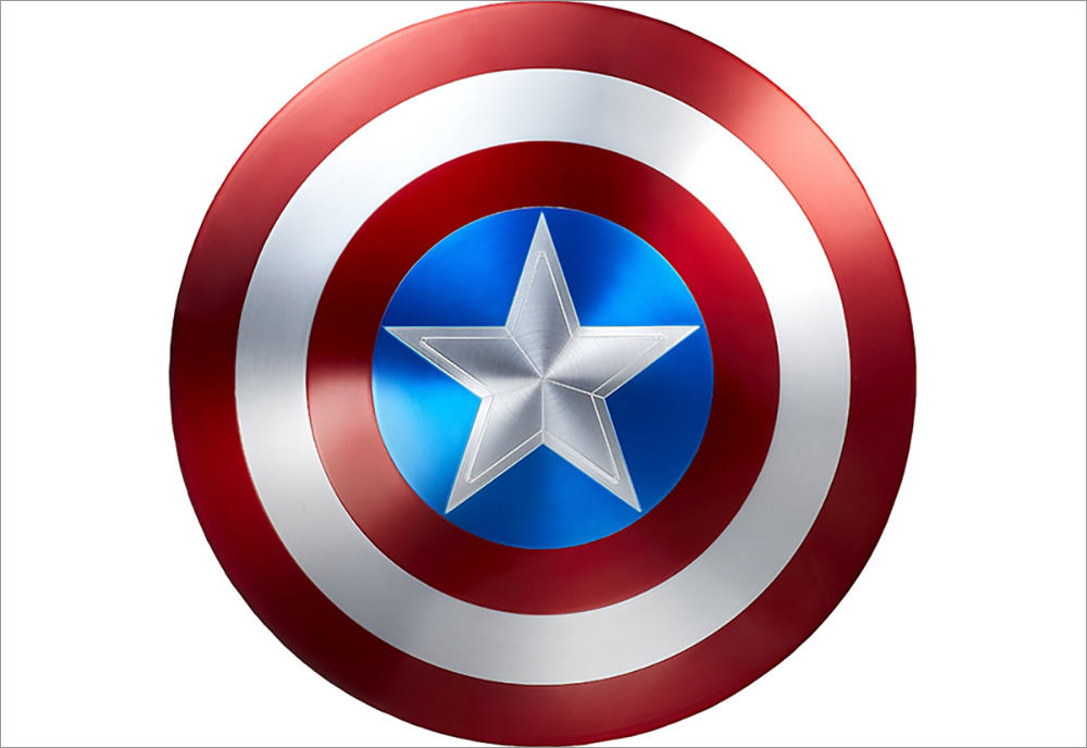
Captain America Logo

Next up, we have Captain America’s logo. Unlike Batman, Cap is a character that acts in the open. Moreover, he is meant to be a role model and a rallying symbol for the entire United States of America.
That is why the symbol and his popular color palette contain bright shades and a distinct design meant to stand out rather than blend in.
Sporting the colors of the US flag, Captain America’s logo features a big and bright white star in the middle of the shield. Encircling the star are four alternating colorful blue and red bands, signifying America’s trademark “stars and stripes.”
The entire theme of this simple logo effectively portrays the character as a bright, shining beacon of hope, strength, and trustworthiness. That makes it one of the best examples of how logo design can affect a brand’s perception.
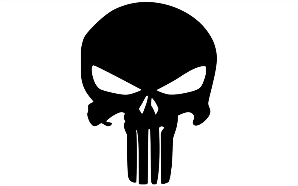
Punisher Logo

Punisher is another character that uses its logo design to affect how viewers perceive the brand. In the comics, the antihero is usually working against established villains, making a reader assume that the character is a hero. Yet, the actions of the Punisher are often quite similar to those used by the villains themselves.
Now, this might have confused comic fans who were not aware of the character’s fictional history. However, the logo for the Punisher makes it assume that he is anything but a superhero.
Utilizing an elongated white skull over a black background, the logo can be easily considered a symbol representing one of the bad guys. Now you might be thinking, doesn’t that cause mixed signals in the minds of the readers?
Surprisingly, no. The entire premise of the character is that the Punisher doesn’t want normals or other good guys thinking that he is a hero. Yet, he doesn’t care what his foes feel about him. That is why the symbol is the perfect identification for the Punisher and gives the accurate perception that the character hopes to portray.
Twitter Logo

Now let’s come to a real-life brand that has used a simple logo design to affect consumer perception.
The name, logo, and operating concept of Twitter have always been unique. Taking inspiration from the short and shrill sound a bird makes, the social media platform developed a way to communicate via short messages.
The logo is straightforward, featuring a simplified outline of a small bird’s body, effectively portraying the name. And when taken as part of a larger branding strategy, it is pretty ingenious. The logo brings to mind the name of the brand, which makes us remember the platform USP.
The bright blue color palette also signifies freedom of expression that is the platform’s hallmark.
Logo Design and Social Media
An essential aspect of logo design for your brand is that it should look and be perceived the same, whether for a digital medium or a physical one.
That is where social media comes in. As one of the most popular and vital marketing tools nowadays, your brand logo must be perfectly legible and compelling.
Featuring on various social media platforms on different screen sizes, such as Instagram, which allows a maximum resolution of 180 x180 pixels, your logo needs to be distinct to instill the desired perception.
That is how a logo’s design can affect its brand’s perception in the eyes of its consumers.
(This guest post is written by Amtul Rafay for Hongkiat.com. Amtul is a content marketer at leading graphic design agency – Logo Poppin (logopoppin.com). She loves to explore futuristic trends in the tech industry while believing in the influential power of research-backed opinions. Being passionate about blogging, she writes on a variety of topics including digital marketing, graphic designing, branding, and social media. Besides that, she is also fond of traveling & an avid reader by heart.)
The post How Does Logo Design Affect Your Online Brand Perception? appeared first on Hongkiat.
Did you miss our previous article…
https://www.1clanek.info/?p=469