A Guide to Choose Fonts for Your Web Design

(Guest writer: Amelia Harper)

Though it may look like a trivial element, however, choice of fonts influences the success of your web design. A suitable typeface helps maintain the UI’s overall consistency and makes the website look aesthetically satisfying. It also increases the website’s readability for a good user experience.

Choosing the fonts depends on the purposes and tone of your website, but if you are confused, or you do not have enough knowledge about how to select the correct fonts for web designing, don’t worry; this short and interesting guide contains the key points for you to choose the correct fonts.

So, just take a look at this interesting and helpful guide based on the tips shared by experts with the ten important things to consider before selecting the fonts for web designing.

20 Ultra Light and Elegant Fonts for Web Designers

20 Ultra Light and Elegant Fonts for Web Designers

Along with color and layout selections, choosing the right font is essential for producing pretty much any good… Read more

Things to consider when choosing fonts:

Communications play an important role in web designing for establishing a good connection between the website and the users. Communication refers to the textual part of the website where good typography makes the reading seamless for the users, while bad typography turns users off.

Here are 10 key points that can help you choose the best fonts for web your web design for better readability and aesthetics.

1. Limit the number of fonts

If you use more than three different fonts for the same website, then your web design may turn out to be shapeless and unprofessional because the excess of type sizes and styles in one website can ruin its layout.

So, for a good website, you must have to limit the number of fonts to a minimum of 2 or 3 typefaces.

45 Beautiful Free Fonts For Designers (Updated)

45 Beautiful Free Fonts For Designers (Updated)

It’s time to dust off your long-forgotten treasure chest filled with fonts and bring in new ones before… Read more

2. Use the standard fonts

You can access a lot of interesting standard fonts like Gotham, Garamond, Arial, and Roboto on the font embedding services like Google Fonts and Adobe Fonts (Typekit).

These fonts can give your website a fresh and professional look. These are also good for increasing readability for users, branding purposes, and providing a good user experience.

25 Best Websites to Download Free Fonts

25 Best Websites to Download Free Fonts

In the design industry, there’s always a gold rush for a good font that may add impact to… Read more

3. Type of font family

Try to opt for a versatile font family. Some font families like Gotham font free, Garamond, Open sans, and Yellowtail are super due to their amazing versatility that allows web designers to work with more freedom having a lot of options.

4. Use attractive themes

The theme of a typeface is a predefined combination of size, color, and style of the text that can be easily applied to the selected text.

It is a set of formatting choices, including effects, colors, and adjustment options for making your website more attractive to increase site users’ interest.

5. Set line length

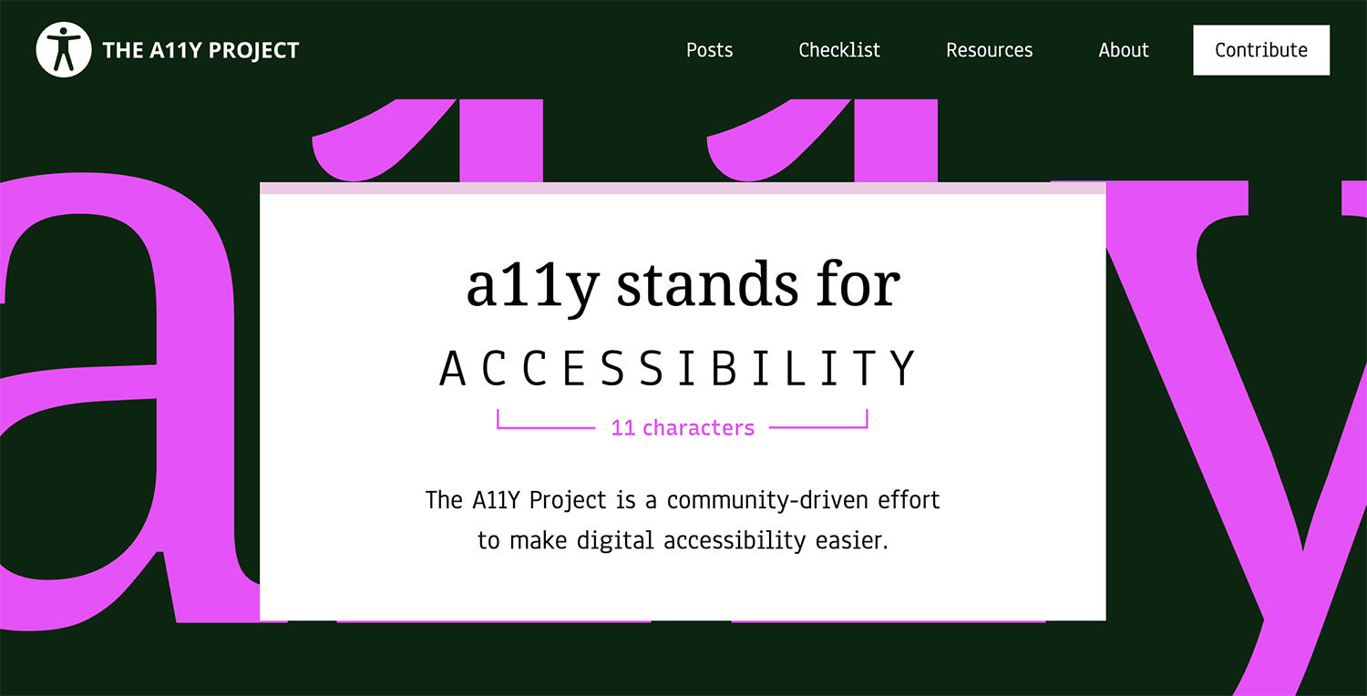
The length of the line really matters. You can visit any professional website to check the limited number of characters used in each line.

The correct number of characters used in each line always increases the readability of the website. According to the Baymard Institute, you should have around 60 characters per line if you want a good reading experience.

6. Use a font that’s good for multiple sizes

The users may visit your website using different devices with different screen sizes, so you have to choose a suitable font for both small and big sizes and resolutions.

You should choose a font that is legible in multiple sizes because the extreme number of fonts can wreck your site and will not maintain readability and useability.

7. Avoid using similar fonts

Using similar fonts can make it easy to confuse the same letterforms. So be careful when choosing a font and make sure that it uses different contexts that will not cause any issue for the site users.

8. Avoid using all caps

Using ALL CAPS may be good for the text such as titles or logos. But for the body text you should never use all capital letters. Otherwise, it may be read as if someone is shouting out that text.

9. Do not use less spacing between the lines

In typography, you should not decrease the spacing between the lines, but you have another good term to use that is leading. By increasing the leading, you can increase the vertical space between the lines. Leading should be 30 % more than the character height, which is good for website viewers.

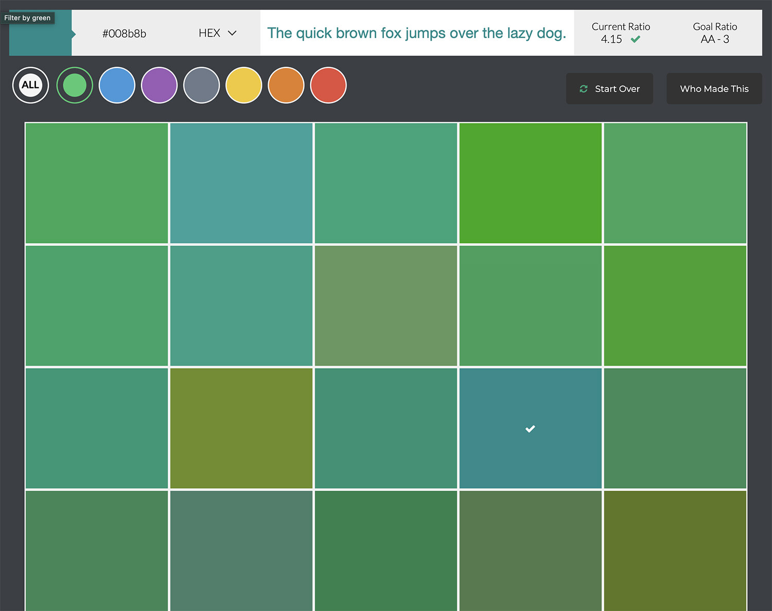
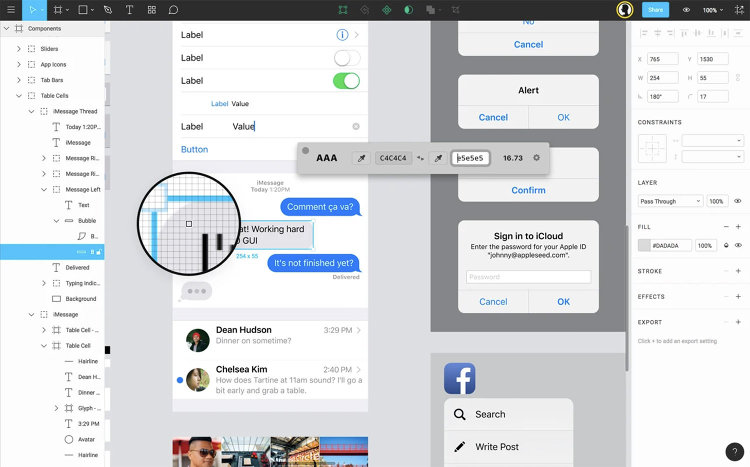
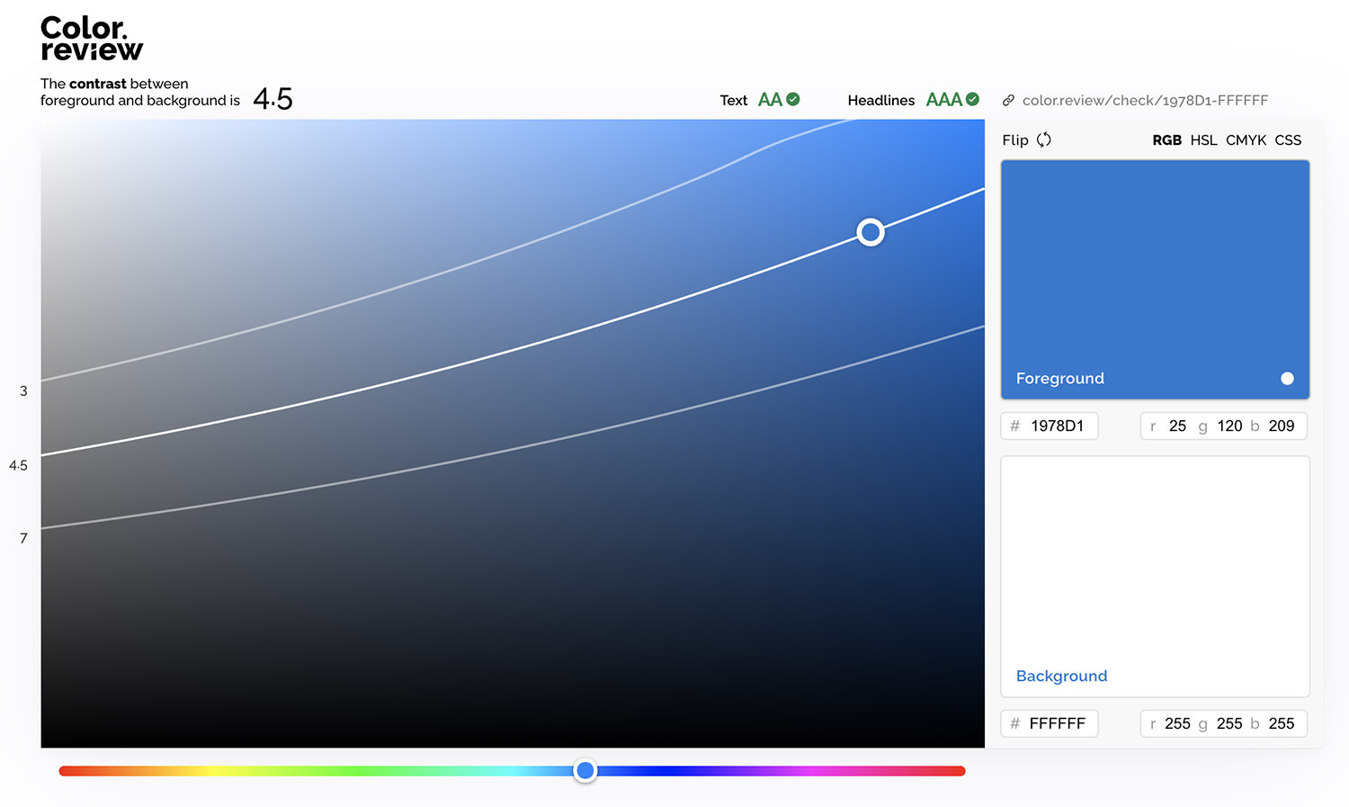
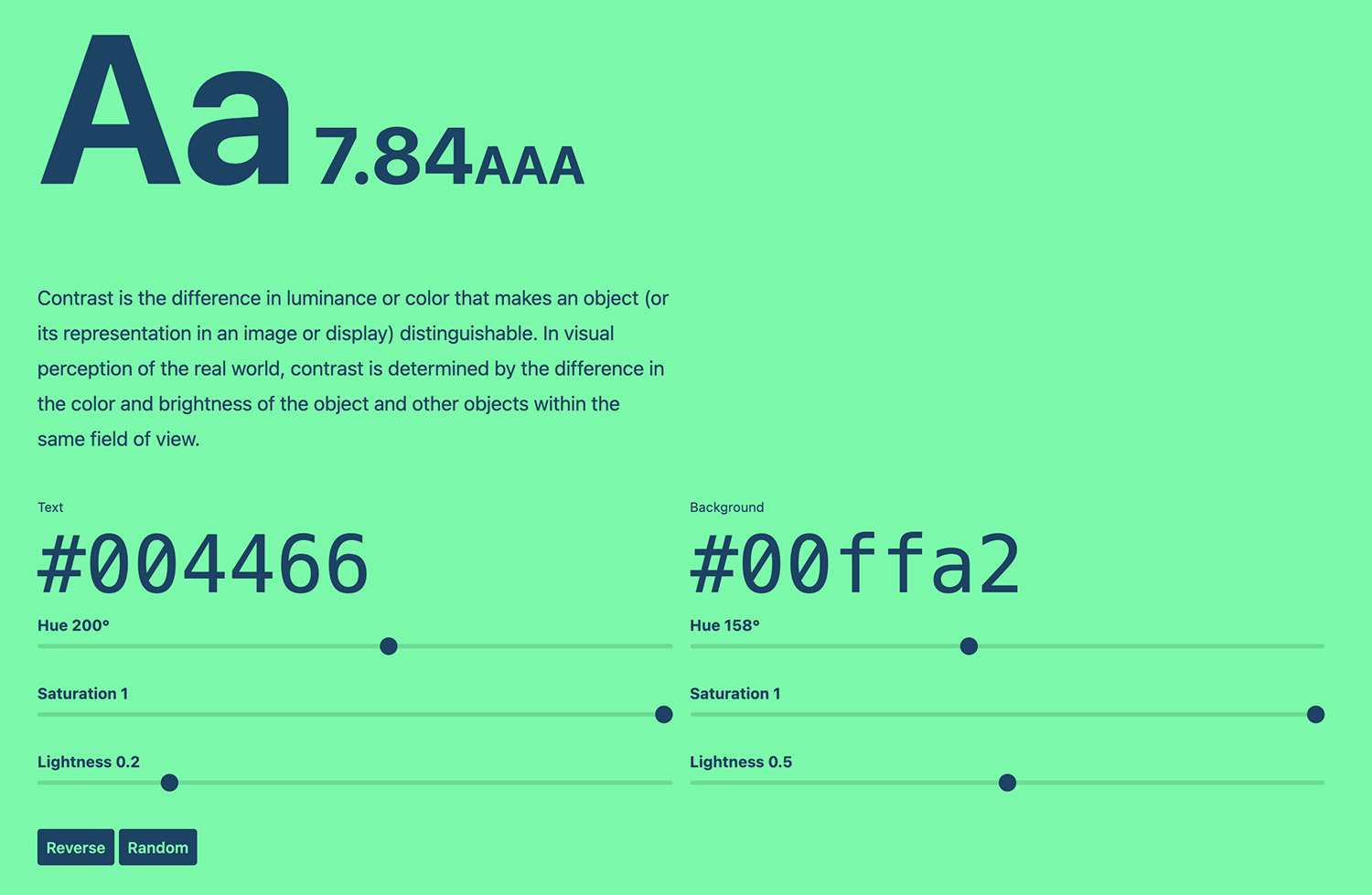
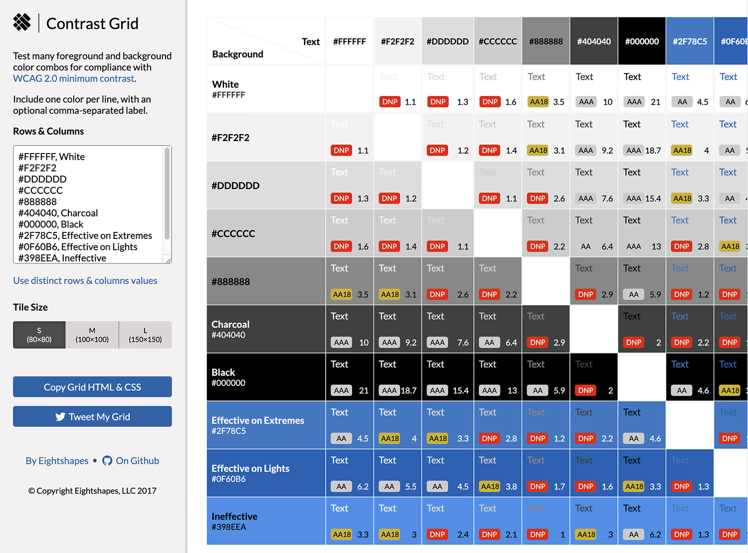
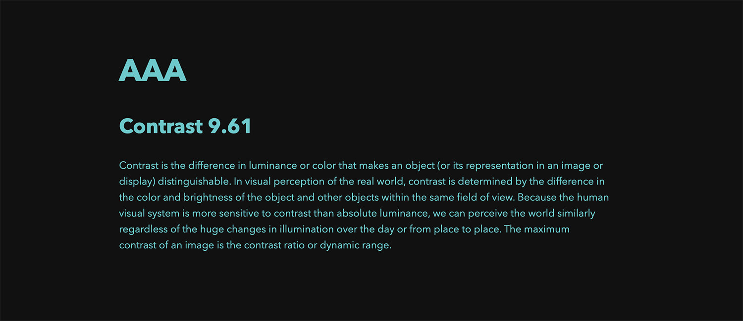
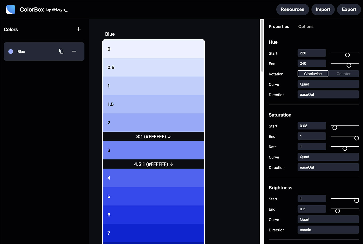
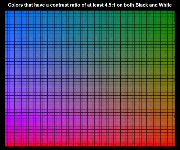
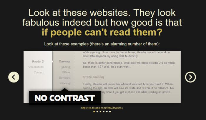
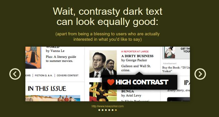
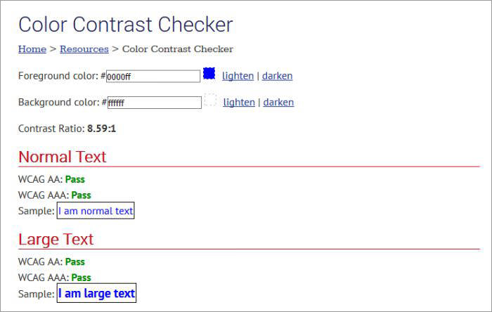
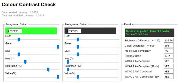
10. Use enough color contrast

Try to use different colors for text and background because it will make your website more attractive, and it will not let the user leave the site.

The small and large color contrasts should have the ratio of 4.5:1 and 3:1, respectively, that most professional designers use for web designing.

Conclusion

So, these were some key points you should consider when you’re selecting a font for your website. By following these key points, you can create a professional website that is seamless to read and aesthetically pleasing.

(This guest post is written by Amelia Harper for Hongkiat.com. Amelia is a professional graphic designer and writer. She has experience of 15 years experience in graphic design and a long stint of freelancing in Sydney and London. She relished the challenge of joining the international design school in New York City and her aim to introduce everyone to graphic design. She likes to write about graphic design, typography, and entrepreneurship.)

The post A Guide to Choose Fonts for Your Web Design appeared first on Hongkiat.

Showcase of 10 Talented Freelance Designers (And Their Portfolios)

(Guest writer: Marvin Espino)

If there’s anything that could make a freelancer more marketable, it’s the power and allure of their website portfolios. And among freelancers, there’s none other than designers who feel the need to make their websites more visually appealing.

Because what could be a better way to showcase a designer’s experience than to present their work through beautifully crafted websites? Yes, experience matters — length and depth of expertise in particular. But a website laden with the most interactive features, unique typefaces, and punching imagery can speak better for the designer than experience alone.

So it would not be surprising to find that some portfolios of designers are that beautiful. Simplicity? They don’t know that. Extravagance and elegance? Yes indeed.

Are you looking for inspiration? Browse these portfolios and learn a thing or two about professionally designed websites.

5 Ways to Make Passive Income For Freelance Designers

5 Ways to Make Passive Income For Freelance Designers

Each day, more and more freelancer designers are looking for a way to earn more money than the… Read more

Roby Leonardi

Roby Leonardi is a freelancer based in New York City. His website portfolio is packed with game-design inspiration. Lots of vivid colors and vector graphics embellished the space. It’s also complete with information.

There’s a short bio, as well as his recent projects and contact details. His main website is only an introduction to his actual portfolio, which is well presented through a game experience.

As you scroll, there’s a figure who resembles Roby, and he plays the game while in the background shows his background, hobbies, skills, experiences, and awards.

Yul Moreau

Yul Moreau

Yul Moreau is a digital art director based in Paris. His website speaks of his ingenuity in UX and UI design.

Upon entering the site, you’ll be greeted with immersive videos in the background. His short bio in white sans serif font is in the foreground.

Scrolling a little bit more and you’ll find well-presented projects in big pictures and short video explainers. Overall, his website is a carefully curated experience.

Robin Mastromarino

Robin Mastromarino

Robin Mastromarino is an interactive designer from Paris. His works vary in style. Some are high-quality photos. Others are vector and 3d images. Images are big and take up the whole space, and Robin did a great job curating them in beautiful slides.

There’s no doubt why the website has been a winning favorite from the award-recognizing website “awwward.”

Ben Mingo

Ben Mingo

Ben Mingo has worked with big brands like Nokia. He’s a freelance designer from Southern California, and he also operates under a design studio called Basic.

But his website is far from basic. It’s unique and interactive — the mouse cursor blends with the website design, where the dominating color is black and white. Projects are well-curated with lots of sample pictures. So visitors and potential clients will have fun navigating through the site.

Kuon Yagi

Kuon Yagi

Kuon Yagi is a Japanese freelance web designer and mark-up engineer. His portfolio includes big, bold white letters and shades of red.

Kuon did not just typically display the pictures, but they come and go every time you scroll through, providing an animated experience.

Julie Bonnemoy

Julie Bonnemoy

Julie is a freelance graphic designer living in Amsterdam, Netherlands. Her website boasts several projects which showcase her design ability.

But more importantly, the website design itself is visually arresting. The front page boasts animated pink bubbles dancing in the background. The colors have fade-in fade-out effects. And whenever you point the cursor to the images, it produces a rippling effect.

Étienne Godiard

Étienne Godiard

The concept on Etienne Godiard’s website is simple, but the size and vividness of the picture and the fonts are what make the portfolio alluring enough.

Etienne is a visual designer based in Paris, and she specializes in technology brands. The website is laden with different colors covering the whole page. It changes depending on the project it showcases, and each project shows embossed pictures of her work samples.

Koco

Koco

KOCO is short for Kochenburger Company. Michael Kochenburger is a freelance product designer. He has an extensive work project

Black is not the usual color for a website, but KOCO nailed this unusual display. The texts and pictures are clear despite the black background. And the best part is how clean the arrangement of all his design projects makes the website so easy to navigate.

Dot Lung

Dot Lung

Dot Lung is a social media expert. Her website is one of a kind due to the contrasting colors of purple and neon orange.

It’s not funny to look at. In fact, the difference in colors is a wow factor. Plus, the 3d shapes and images of her favorite figure, unicorn, are well placed along with the site, creating an otherworldly experience.

Sofia Papadopoulou

Sofia Papadopoulou

Sofia Papadopoulou is a visual designer and an art director. Black is the theme of her portfolio. But what makes it uniquely good is the use of shades and light. The mouse cursor acts as a flashlight that helps shine the words brighter. Plus, in the background sits an abstract moving black or white figure. There’s no doubt why this portfolio hoards website awards since 2017.

Final Thoughts

Ready to take on the challenge of making your portfolio unique? But to make your brand stand out, you must carefully consider which elements go in and which should be left out. Meaning, all content is well-curated for future clients to have a seamless viewing experience.

First, you need to integrate your personality. Your name, logo, slogan, or even colors must reflect your personality and your services. You can design a logo through logo makers for a small amount. And some of the branding designs can be crafted in free services like Canva, Visme, and Adobe. It’s where you can choose slogans and colors to your liking.

Afterward, consider placing only the most important, relevant, and the best projects — the ones that stand out. Because a portfolio is not a detailed history of your professional work, it only acts as an attractive pedestal to lure clients.

Over to you, write in the comments things you consider for your website. Do these portfolio samples inspire you? Or what factors did not sit right with your design taste? Share in the comments.

(This guest post is written by Marvin Espino for Hongkiat.com. Marvin has been writing since high school. A background in journalism marked a career in reporting and freelance writing. He has written several articles on marketing, technology, and small businesses on BrandCrowd (brandcrowd.com). Outside work, Marvin reads a lot and hoards well-written pieces for inspiration. And he sings and bakes goodies too.)

The post Showcase of 10 Talented Freelance Designers (And Their Portfolios) appeared first on Hongkiat.

Fresh Resources for Web Designers and Developers (July 2021)

As a web developer, there’s always something you can learn every day and grow. You can learn design principles, user experience, user interface design, and user behaviors through analytics data. Or, you can branch yourself into servers such as installing and running a server package yourself.

In this round of the series, we’ve put together different resources from tools, podcasts, articles, and a lot more where you can learn multiple disciplines beyond just creating the website itself. Let’s get started!

Fresh Resources for Web Designers and Developers (June 2021)

Fresh Resources for Web Designers and Developers (June 2021)

Being a web developer means constant learning as the field keeps evolving with new updates coming in every… Read more

UI Glass Generator

Glassy user-interface is making a comeback. We can see it now is an integral part of the new interface design in Windows, and macOS. Thanks to the latest CSS feature, we can also adopt a similar interface for the website, and this tool will make it even easier and quicker to create one.

You can use the GUI to adjust the color, opacity, and background of your website and it will generate the CSS that you can copy and paste.

VS Code Fortnite Theme

A Fortnite-inspired theme for Visual Studio Code. It comes with some special effects by enabling the Fortnite: Enable Legendary option. If you enjoy the game and the flares while coding, this VSCode theme is for you.

VS Code Fortnith Theme

MakerStations

This site collects desk setups from various professionals (designers, developers, writers, etc.). Not only that it presents these for inspiration but also dig into the owner’s personalities and reasons behind the setup.

If you’re currently looking inpiration for your new desk setup, look no further. You’ll surely find some good ones in MakerStations.

MakerStations

React.js ARIA

A collection of React.js functions that helps in creating accessible UI components and design systems for your web application.

It’s designed to deliver the best possible interactive experience for users whether they’re using a keyboard, mouse, or assistive device. It’s a great initiative from Adobe for a better web.

React.js ARIA

React Hooks Testing Library

Hooks is a concept in React.js for creating components less rigid and we can create custom Hooks aside from the ones provided built-in.

Now if you have come across a situation where you’d like to perform an automated test for the custom Hook, this library will come in handy. It provides the pattern to test your custom React.js Hook as close as when it’s used within a real component.

React Hooks Testing Library

WiFi Card

This tool makes sharing WiFi credentials more convenient using QR code. You simply need to enter the WiFi name and the password. Print and attach it somewhere in the room.

ifi Card

Umami

Umami is an open-source application to collect analytic data. It’s easy to install in your own server or VPS with minimum requirements. You only need Node.js and MySQL (or PostgreSQL). It’s a great application if you’re looking for an alternative to Google Analytics where you own and control all the data.

Umami

The CSS Podcast

Run by Google Developer Advocates duo, Una Kravets and Adam Argyle, you will learn so much about CSS; from practical tips, accessibility, performance, and much more. It’s one of the best quality sources to learn CSS and web development in general.

The CSS Podcast

Fosscard

Discord is rising as an interactive communication tool for communities. You can join various groups including groups for web development and programming, to chat with the community or make a voice or video call.

Discord is a SaaS though. If you’re looking for a self-host where you can have more control, Fosscard can be a good alternative.

Fosscard

Clean Code PHP

A collection of advice to write PHP codes that are readable, reusable, and most importantly maintainable. It’s a great resource where you can learn some pracatical tips; such as how to best name variables, how to structure conditional block, and how to name a function and the arguments, to name a few.

Clean Code PHP

MiniCLI

A tiny PHP library to build Command Line Interface (CLI). It provides the base structure to register your custom command lines as well as the helper and utility functions to handle user input and the output. A great starting for creating a PHP-based command line.

MiniCLI

UniformCSS

A generator and utility-first CSS framework built with Sass. It’s a mix of the good of both worlds in which you can leverage the flexibility of utility-first workflow while still have the power of Sass such as the variables, mixins, and functions.

UniformCSS

Layout Generator

An online tool to generates a base layout for your website. It utilizes Grid for the layout and provides GUI to generate the layout. For example, you can set the number of columns, rows, and alignments. I find it’s a more intuitive way to generate a layout with CSS Grid.

Layout Generator

Fower

Utility-first CSS methodology is getting quite popular. It offers flexibility to be scaleable on small or large websites. If you’re into writing CSS-in-JS for your web application and lean-to a utility-first CSS approach to compose the styles, you might be interested in trying this library.

Fower is framework-agnostic so you can apply it in various frameworks such as React.js, Vue.js, and Svelt, or plain JavaScript.

Fower

RTL WTF

A great source to learn tips, use cases, and best practices to build a website for the right-to-left writing direction such as Arabic and Hebrew. This website should be on your bookmark.

RTL WTF

Notistack

A React.js library that makes it easy to display “toast” notifications on your web app. It’s highly configurable that allows you to present the best possible user experience.

To name a few, you can set the number of maximum notifications, prevent duplicates by not showing notifications with the same message, and set the type of transition.

RTL WTF

Kopio

An open-source server application that you can use to run and manage backups in your own cloud servers. Kopia also provides a nice desktop application that runs on Windows, macOS, and Linux where you can manage it conveniently such as to create a snapshot and restore the snapshot.

Kopio

Web Components DevTools

Web Component allows you to create a custom component that the browser can understand and render. If you’ve come across to require build custom Web Component, you will be needing this Chrome extension that allows you to debug the Web Component on the browser.

Web Components DevTools

Fluid Typography

A handy little tool to create text size that scales with the window size. The tool helps you generate the style that allows the text on your website to look great and proportional on any screen.

Fluid Typography

MillionJS

A tiny JavaScript library (less than 1KB) to create an interactive user interface for your website. It implements Virtual DOM behind the scene and some unique approaches that make it fast to render on the browser.

I think it can be a good alternative to some more established frameworks like React.js and Vue.js, especially if you just need to just the bare of Virtual DOM.

MillionJS

The post Fresh Resources for Web Designers and Developers (July 2021) appeared first on Hongkiat.

Fresh Resources for Web Designers and Developers (June 2021)

Being a web developer means constant learning as the field keeps evolving with new updates coming in every other day. Especially when it comes to HTML, CSS, and JavaScript, there’ll always be some new tools and materials we can learn from.

In this round of the series, we’ve gathered various types of resources for web developers. These include some handy tools, learning materials to brush up your skills in web development, and some PHP as well as JavaScript packages.

Without further ado, let’s see the full list.

Fresh Resources for Web Designers and Developers (May 2021)

Fresh Resources for Web Designers and Developers (May 2021)

One of the things that I like being a web developer is that you never stop learning. There’s… Read more

Awesome CLI Apps

Command Line Interface (CLI) is powerful, fast, and allows you to automate tasks that would be slower or not possible at all if you do with its UI counterpart.

This is the list of all the available CLI applications – from a CLI to retrieve football score and download a Youtube video to interact with Facebook and Spotify and many other things.

TerminalsAreSexy

On this platform, you can find a list of Terminal applications such as Bash ZSH, and Fish, etc. editor applications like VIM, and emacs and other types of editors, package managers, plugins, and a list of community sites.

If you’re looking to learn more on using Terminal and CLIs, you should bookmark this site as a comprehensive learning resource.

terminal-are-sexy

Charts Blocks

A plugin to insert charts intuitively in the WordPress block editor with just a couple of clicks. The plugin supports several types of charts including the Bar, Line, Pie, and Doughnut chart.

charts-block

Laravel Prose Linter

A Laravel package to check the textual content on your Laravel application. It can check translations, typos, slang, and can suggest a better writing style. It’s a quite unique linter actually.

laravel-prose

Radar

An app that allows you to put together different types of real-time data that you’d like to monitor in one single place. You can add, for example, the Bitcoin price, Twitter follower count, currency exchange, AdSense earning, and a lot more.

radar

Learderboard Performance

A tool to benchmark across several different websites to compare their performance. It utilizes Lighthouse under the hood and will generate not only the LCP and FCP but also the accessibility report and the carbon footprint. It’s a great tool if you need to monitor how other websites are doing.

perf-leaderboard

Astro Build

A modern framework-agnostic tool to build a static site. You can use, your favourite framework like React, Vue, Web Components, or just plain old HTML+CSS while Astro will do all the work to compile all these components into a fast static site.

astro

IconVG

IconVG is Google’s initiative for alternative format for simple small graphics like icons, logos, and emoji which is commonly used on the web. It’s up to 3x smaller compared to SVG and much smaller compared to PNG.

At the time of this writing, this format is experimental; nonetheless, it’s quite exciting to see how this format would be adopted in the future on the web.

iconvg

DaisyUI

A UI kit built on top of Tailwind CSS. What’s unique about DaisyUI is the theme collection. It provides a number of options to choose from as your UI persona besides the traditional dark and light theme.

You can, for example, select the “Retro” theme to change the UI to old-looking colors or “Luxury” to make it more classy.

daisy-ui

Mobile Palette

If it’s been hard to find the right color combination for your mobile app, this handy web application may help. Simply select the color base, it will automatically generate a nice color scheme for the mobile UI.

mobile-plate-generator

Boring Avatars

As the name implies, this is a tool to create an avatar image, a boring one. The tool generates the avatar based on the combination of pattern, colors, and usernames.

It provides 6 types of appearances, 2 shapes, and 3 sizes to create an avatar. You can copy the generated SVG or use the URL, for example:

https://source.boringavatars.com/marble/120/Jon%20Doe?colors=264653,2a9d8f,e9c46a,f4a261,e76f51
boringavatars

MoneyPHP

Dealing with currency can be tricky, and this is a PHP library that aims to make it easy. It allows you to do addition, subtraction, and comparison. You can do advanced stuff like calculating the ratio, converting currency, and formatting.

money-php

N8N

A tool for workflow automation without needing to code. It can connect to many services like Github, Slack, Google Spreadsheet, Dropbox, and many more. A great alternative to IFTTT and Zapier, N8N is free and open-source, and you can run it on your own server.

n8n

30 Seconds of Code

A collection of tips and code snippets for some common problems in programming and web development. It covers JavaScript, Python, React, and Git.

In the collection, for example, you can find several examples of algorithmic operations, math, dealing with Browser APIs, arrays, objects, and some practical examples like converting JSON to CSV.

30secondsofcode

HashID

A library that allows you to generate short, unique, and non-sequential ID. The ID would be like Vz5prKnEoo. It looks similar to an ID of a Youtube video. The library is available in many different languages including PHP, JavaScript, Ruby, Python, Swift, and many more.

hashids

DevToolsTips

Another useful site to bookmark, DevToolTips contains a lot of tips and tricks to use the DevTools. It covers DevTools of Chrome, Firefox, Edge, and even Safari. I’m sure you’ll find little tricks that you’ve never known before.

devtoolstips

roave/no-leaks

A PHPUnit plugin to detect memory leaks in your tested codes. A great tool to make sure that your code won’t cause to exhaust memory when deployed to production.

no-leaks

Coffee with Charli and Shopify: Scaling Systems

An interesting talk in Coffee with Charli episode by Figma. This episode gives you a glimpse of how Shopify creates a design system that scales and handles the challenges.

shopify-scaling-systems

Plow

A performant CLI for benchmarking web requests. It comes with a web UI and terminal that you can use to see how the benchmark progress in real-time.

The CLI accepts a number of options to emulate the request for the benchmark such as the number of concurrencies, the number of requests, duration, and the method request.

plow

Tinywind

A small collection of components built with built-in Tailwind CSS classes. Each component is simple, with no additional or superfluous styles. It’s showing a great example of what we can build with Utility classes and HTML.

tinywind

The post Fresh Resources for Web Designers and Developers (June 2021) appeared first on Hongkiat.

10 Best Accessibility Tools For Designers

Today is the world of inclusive technology – websites, apps, and tech gadgets that are made for people with different kinds of abilities and inabilities. So when you’re designing a website, you include features that make your design accessible to as many people as possible. And this is where accessibility tools come into play.

Instead of creating everything from scratch, here’s a list of cool accessibility tools for designers. From creating color combinations according to WCAG standards to adding different reading modes to your website, these tools are a must-haves for every designer. Take a look at the list to know about each tool in detail.

Designer’s Guide to the Basics of Web Accessibility Design

Designer’s Guide to the Basics of Web Accessibility Design

The web should be a place where everyone can access the same content from anywhere in the world…. Read more

1. Stark

Stark a feature-filled accessibility tool that helps web and mobile designers to add accessibility features into their UI designs to make their designs work for everyone. Either you are designing a product from scratch or updating your existing design system, it gives you a hassle-free way to create accessible products at any level.

One of the best things about this tool is that it integrates seamlessly with Figma, Sketch, Adobe XD, and Google Chrome and readers support all through the product lifecycle. Some of the accessibility features that the tool can add to your design are contract checker, colorblind generator, rapid contrast checking, and many more.

  • Supports: Figma, Adobe XD, Sketch
  • Stark Price: Free
  • Premium app/subscriptions? Yes (Check pricing)

2. ColorSafe

ColorSafe

To make your website accessible for users with different visual capabilities, ColorSafe offers a bunch of features that are very easy to integrate in your design. It enables you to create visually beautiful and functionally accessible color palettes as well as text and background contrast ratios based on WCAG guidelines.

The working of this tool is pretty simple. All you have to do is enter a background color and determine the styling of your text and ColorSafe will do the rest. Once you decide the text-to background contrast ratio, you can apply it in your design and test the results.

  • Supports: Browser
  • ColorSafe Price: Free
  • Premium app/subscriptions? No

3. Contrast

Contrast

Just as the name says, Contrast is an accessibility tool that takes the manual labour out of color contrast ratio testing and does it quickly and automatically. Created by two professional designers who knew how badly such a tool was needed from the aspect of usability and aesthetics.

Being a user-friendly tool, the tool gives you precise color contrast information (contrast score) according to the WCGA standards and updates the entire app in a jiffy. At the time of writing, however, it is available for macOS only.

  • Supports: macOS
  • Contrast Price: $6.99
  • Premium app/subscriptions? Yes

4. Color Review

Color Review

Color Review is a simple web-based tool that helps you in making an informed decision about which colors and color combinations to use in your UI design, especially when it comes to creating a design for people who perceive colors differently than others.

Built on the basis of WCAG standards of visual design, the tool tool works on two levels I.e., AA and the more strict one AAA. There’s also a Color Review app available for OS X, Windows, iPhone, and Android with interesting features like swatches and eyedrops and and requires you to sign up to get it.

  • Supports: Browser
  • Color Review Price: Free
  • Premium app/subscriptions? No

5. Colorable

Colorable

Colorable is a web-based color combination contrast tester that enables you to decide upon the most suitable background to text contrast ratio for your website or mobile app’s interface design. With a pass/ fail score based on WCAG accessibility guidelines, you are able to make your UI universally accessible for users – especially those with visual impairments.

With this tool you can take a set color palette and instantly get contrast values different types of combinations. To use it just enter an array of color strings or an object with color strings as values and it will return a list of color combinations for these colors along with their WCAG contrast values.

  • Supports: Browser
  • Colorable Price: Free
  • Premium app/subscriptions? No

6. The A11y Project

The A11y Project

Offering a beautiful, accessible and inclusive digital experience, the A11y Project upholds the value of providing equal opportunities when it comes to design and tech. It helps you in developing completely accessible products by the dint of an array of wonderful resources like backgrounds, icons, color palettes, and helpful guides.

The best thing about this tool is that it is created and constantly updated by a community of talented individuals. Moreover, there’s an option to help you conduct an accessibility audit through a comprehensive checklist according to the accessibility guidelines.

  • Supports: Browser
  • The A11y Project Price: Free
  • Premium app/subscriptions? No

7. Contrast Grid

Contrast Grid

When you’re working on a huge web or mobile app design project, you have a many choices to make in terms of color combinations. Contrast Grid is a tool that enables you to test a number of foreground and background color combinations.

The web-based tool has a simple interface in which you can manually enter different colors that you want to use as rows and columns and it will create a grid that is compliant with WCAG 2.) minimum contrast requirements. You can then copy the grid code for HTML or CSS and even share your grid on Twitter.

  • Supports: Browser
  • Contrast Grid Price: Free
  • Premium app/subscriptions? No

8. Clrs.cc

Clrs.cc

Clrs.cc is a sort of library or repository of different color combinations that give you a good dose of inspiration for creating accessible user interface for color blind or visually challenged individuals. From light to dark background, you’ll find many interesting options of color combos.

There are total of 90 color combinations on the site along with their respective contrast values as well as AA or AAA values. You can choose any of these background to text ratios or simply mix and match to create one of your own.

  • Supports: Browser
  • Clrs.cc Price: Free
  • Premium app/subscriptions? No

9. Who Can Use

Who Can Use

Who Can Use is an interesting tool that helps web and graphic designers understand how different color combinations and color contrasts affect people with different visual disabilities. Using plugins like Chroma.js and Color-blind, it helps in making your designs inclusive for everyone.

Keeping the recommendations of WCAG in consideration, this intuitive tool features a background color picker with slider and tells you the contrast ratio and WCAG grading of each color. Moreover, with each color you get to see how this color will be seen by people of different vision types along with a simulation run.

  • Supports: Browser
  • Who Can Use Price: Free
  • Premium app/subscriptions? No

10. ColorBox

ColorBox

Colorbox is a simple tool that enables you to create color combinations for accessible UIs that make your website usable for visually challenged users. You can either one color and many colors and manually adding hue, saturation, and brightness values.

The tool also allows you to import color codes to get the appropriate color combination options, an option to export the selected color information as color codes that you can integrate in your web design as well as sharing the URL of the color information that you select.

  • Supports: Browser
  • ColorBox Price: Free
  • Premium app/subscriptions? No

The post 10 Best Accessibility Tools For Designers appeared first on Hongkiat.

Perfection in Design: Why It’s a Bad Idea

If you are a designer or a developer, you’d probably know that trying to make your project perfect can extend the time needed to complete the project-even several times. There’s always that one last element you want to improve quickly before sending it. But in my opinion Perfection is equal to fascism.

That’s a bold statement, I know. But look around you. Is there at least one defective item in your house or garage?

Your car? You need to refuel it and once in a while, it breaks down-not perfect. Your computer? Breaks down, and crashes, and the hard drive dies before you can manage to back up your data-not perfect. Bread? It goes stale too soon-not perfect. Glasses? Glass is vulnerable-far from perfect. So what’s the conclusion?

Why Designing Without A Design Brief Is Like Playing Charades

Why Designing Without A Design Brief Is Like Playing Charades

(Guest writer: Devora Homnick) We had a wonderful moment in the Kars4Kids design department recently when our manager… Read more

Perfection harms development

Nothing that surrounds us is perfect. There’s always at least one thing that can be improved. If everyone leads their product to perfection before launching it to the public, then today we would have nothing! Not even electricity or wheel.

Since everything surrounding you is not perfect, would you rather not own them? Would you rather wait until someone leads them to perfection before they let you have them? Probably not.

Therefore while working on your projects, always takes other’s failures as a reference – be creative, but don’t try to be perfect.

Why is perfection harmful?

Because it doesn’t favor achieving goals when starting the work, you always have some actual goals to reach with the design. It can be something as apparent as increasing sales or unusual ones like creating some awareness for your aquatic kickboxing training center.

Nevertheless, those should be the goals you need to focus on, and every time you want to do something new, you should ask yourself the question: “does this thing bring me closer to the goals?”

And now the funny part. The pursuit of perfection does not bring you closer to the goals. On the other hand – coming up with the simplest possible solution does. That’s right – most straightforward and reliable, not the best. In one of the early stages of the project, you can’t be 100% sure which solution will be the best one.

Because how would you know this when you haven’t even launched it? Only the feedback from the market (the real users) can give you genuine ideas for possible improvements to your website and its usability. That feedback is the improvement you need to focus on. not what you’ve thought would be the best for them.

This is the blatant truth (unfortunately). You’ll never know what people want or need, so working on some complex solution, which can end up not being needed, is a waste of time. That’s why you need to start with the solution that makes it possible to achieve the goals in the simplest possible way. And one more thing you should know:

Perfection very often remains unnoticed.

Unfortunately, all this extra time you’ve spent pursuing perfection can remain unnoticed and unappreciated. There’s a reason why the recipient of your project might not even notice your extra effort.

And that is simply because they didn’t see the previous version of the project, so they don’t have anything to refer to and compare to. The only thing they’ll notice and criticize will be basic functions and elements.

Working on details (tiny fragments of your graphic design) robs most of your time. That one little thing that keeps agitating you or some additional function you think would be cool and handy.

So, before you realize it, the total project completion time has extended several times. Do you want to spend 60% of your work time perfecting the details and only 40% on achieving the goals?

trying-for-perfect-design

If you’re freelancing, you can be sure that every client will be 100 times more grateful for a simple, easy to use and understandable project focused on achieving goals than a beautiful work of art, which looks great but doesn’t put any extra money in their pocket.

Abandoning perfection is far from abandoning a good project.

As I’ve said before, during the creation phase of the project/product/design, you can’t be sure what will the perfect solution really be, so the whole idea of pursuing it is doomed from the get-go.

When you’re working on something, then the only way you can judge perfection is by your own subjective motives-One man’s meat is another man’s poison.

The most important rule of designing: You are not your client or visitor. That’s why you can’t judge the thing you’re designing only according to your own opinions and assumptions.

You will create a much better website by not being perfect.

It’s simple (and true). If you did not try to make every detail perfect and focus on the most important key elements instead, these key elements will not only be clearly visible in the final solution, but you will also finish the work earlier.

So by hiding perfection in the pocket, you’ll be much more productive and deliver much better results.

Here are the benefits that can be brought by forgetting about perfection and creating a simple version of the website instead:

  1. The website can be launched earlier.
  2. The website can make money / get exposure earlier.
  3. The feedback from visitors will arrive earlier.
  4. Because of the early feedback, you will improve the website by focusing on the things the visitors pointed out (not only the things you thought would be cool).
website-creation

The most important conclusion here is (even though it sounds kind of strange) that a simple solution is better than a perfect solution. “Ok, but how to implement this approach?”

Divide your tasks into two groups: “Important ones” & “Details.”

The important ones are important such as achieving goals and objectives, building the basic functions, etc.), and the details are just, well, just details.

Details consume a massive amount of time. That’s why you need to skip them and get back to them later, during one of the next phases of the work (or don’t get back to them at all). So what do I mean by “later”? When is the best time to get back to details?

Work iteratively

Here’s what I mean, just bear with me – When you finish dividing the tasks into two groups, then in the first iteration, you should try to focus only on the important ones and try to complete them in the easiest possible way. At the end of this iteration, you will have a finished website ready to be launched (SCRUM-like approach). You can start another one if you want to.

In this iteration, you can try to improve the previous version. (You will get the ideas for improvement from the feedback from your clients/visitors.) After the second iteration, you will have an improved version of the website.

If you want to continue the work and constantly improve the website, you can start the third iteration and then the next ones. This is the right moment for getting back to the things you’ve classified as “details” at the beginning of the work, but you might as well realize that these “details” are completely redundant judging by the reaction of the visitors/clients (a very common thing).

work-iteratively

This is a real strength of the iterative approach. During each step of the work, you have a complete website ready to be launched, and you can improve it constantly. This is a much better situation to be in compared to working on something in a closed room for ten years, trying to make it perfect without any feedback from the world.

The iterative approach is much safer as well. What is a better scenario – Realizing that your idea is a piece of you-know-what and there is no demand on the market after a month of work, or realizing it after ten years of work?

Just a side note: Due to this approach, I was able to complete my Master’s Degree paper a couple of months before my colleagues did. What I did was focus on the most important thing about each chapter, got it done as soon as possible, and left all the details for later.

If I had wanted to make each perfect chapter right from the beginning, then probably I wouldn’t have finished it until today. Also, it has been over two years now since I’ve defended my M.Sc.

Work quickly and effectively.

This is an all-purpose tip, and it can be put into practice while working on a project for your client as well as while working on your own website. These are the only things that matter now: quick work and fast results. It’s about time to adapt.

Always try to deliver fast results (focus on achieving goals) by providing the simplest possible solution, not the “perfect” solution by your own subjective opinion. Remember – you don’t need to be perfect. “Good enough” is good enough.

One more thing – What are your experiences with projects at which you’ve tried to deliver a perfect solution?

The post Perfection in Design: Why It’s a Bad Idea appeared first on Hongkiat.

Did you miss our previous article…
https://www.1clanek.info/?p=673

40+ Tools to Build Premium-looking Website

Below, we handpicked 40+ super tools that will help you create and run a premium website in 2021.

These tools are covering all the aspects you need for your website, i.e., website creation, logo, invoicing, fonts and icons, optimizations and development.

You will find complete info about these solutions and in plus we included a super development team that will help you big time if you have complicated and hard projects.

If you have a WordPress website, don’t forget to check the guide about optimizing core web vitals, it is the best in the market.

Take your time to read the article, it is long but useful.

1. BrandCrowd — Online Logo Maker

BrandCrowd is a superb online logo maker that features world’s largest DIY logo library (over 50,000 designs) and is the only platform with all the icons handcrafted by designers.

On this platform you will find logos created with gorgeous icons as well as free icon libraries. The quality of these logos is outstanding as if created by professional designers. And the price is almost nothing for such fine quality.

To use BrandCrowd, write your business name or select the industry you are in. Within seconds, the platform will show you thousands of logo design ideas. When you see the one you like, click the Edit button and start customizing it. You can change text, fonts, colors, background, layout, and even request complex edits (you will hire a BrandCrowd in-house designer for that).

2. pCloud — Secure Cloud Storage
pCloud

Cloud storage is the future and pCloud makes it easy for all of us. It is Europe’s most secure cloud storage, is super easy to use, and offers the best free plan in the market — up to 10 GB of free cloud storage for lifetime.

pCloud works on all OSs (Windows, Mac, Linux, etc.), mobile devices (iOS, Android), and the web so you can access and store your files with any of these devices. The sync and backups are made in real-time so any modification you make, will be instantly seen on all the other devices.

In terms of computer backups, pCloud lets you choose any local folder to be backed up. The backups are made automatically, in real-time, and you can access older versions till up to 1 year.

As for file sharing, it has many interesting features to offer such as password-protected download, expiration date, and upload/download access.

pCloud offers a free version – with limited features – or pick the premium plan with advanced features and one-time payment, and a bundle of features.

3. Total Theme
Total Theme

Total is the WordPress theme with a whole bunch of features. There are 40+ high-quality pre-made designs that you can install with just one click and your website will look exactly as in the selected demo.

The theme is bundled with 3 premium plugins namely Visual Page Builder, Templatera, and Slider Revolution and a lot of customization options.

4. 99 Robots
Robots

99 Robots is a premium digital agency that will stimulate the growth of your online. They help you in managing Amazon, Facebook, and Google PPC ads as well as WordPress development, and web designing services.

The agency is specialized in creating stunning websites which are optimized for SEO, traffic, navigation, and sales.

5. Mobirise Website Builder
Mobirise

Mobirise is an offline website builder to create a stunning website for your project, no matter which industry you are in. You will find over 4,000 awesome website templates, and tons of elements to create stunning websites on this platform.

6. Argento Theme
Argento Theme

If you need the best Magento theme for your store, take a look at Argento. The theme looks very professional, loads lightning-fast, s easy to customize, comes with free installation, and includes 7 unique designs to choose from and 20 extensions that will add tons of cool functionalities to your store.

7. Taskade — To-do List for Remote Teams + Mindmap

Taskade is a free productivity app for the web, mobile, and desktop, to collaborate with your remote teams. The platform is very simple to use and intuitive, and you can create a unified workspace for remote teams and projects, keeping everything well organized.

8. Codester
Codester

Codester is a popular marketplace filled with premium PHP scripts, app, codes, website themes, and much more. They have a Flash Sale section where you can find hugely discounted items are being sold.

9. Deeezy.com
Deeezy

To create a super website, you need super graphics, fonts, photos, templates, textures, etc. You will find all these high-quality creative resources here, on Deeezy.com.

10. Goodie
Deeezy

Goodie is a professional web development service by the famous Xfive company. It will help you with simple websites, WordPress development, newsletter designs, and much more.

11. Ampfluence
Ampfluence

Ampfluence is a highly popular agency that will grow your Instagram account using the right methods, no bots or gimmicks. They have huge experience in working with all kinds of companies and brands, delivering outstanding results.

12. Mailmunch
Mailmunch

Mailmunch will exponentially grow your email list by helping you create stunning forms and landing pages. The platform is feature-rich, contains tons of highly customizable templates, and thousands of royalty-free photos. Also, the interface is super intuitive to use.

13. Unlayer
Unlayer

Unlayer is an email editing tool capable of boosting your email marketing campaigns for getting more qualified leads. The software offers multiple drag and drop design features to build beautiful emails.

14. Ramotion
Ramotion

Ramotion will help you with brand identity, UI/UX design, web design, and app development. They will take your company at the next level in terms of creating a solid online presence.

15. Miquido — Custom Software Development Company
Miquido

Miquido helps you design visually stunning, functional and user-oriented websites or mobile apps, develop future-oriented software, or deploy a Cloud. They excel in UX/UI design, product strategy as well as custom web, and mobile development.

They have over 10 years of experience and they created over 150 digital products, being one of the leading software development companies in the world.

16. Web Designers in Kansas City
Web Designers in Kansas City

If you are looking for a local web designer or developer located in Kansas City, check this page out. Here you will find complete information about the best 10 web designers and developers in the city.

17. Complete SEO
Complete SEO

Complete SEO is a digital agency that enables you to get large volumes of organic traffic from search engines. They have decades of experience in helping companies from different industries with smart SEO strategies.

You can get a free consultation and website audit from Complete SEO to find out where you stand and the elements that you can improve.

18. DWS
DWS

DWS is a complete agency offering all kinds of services including SEO, content, blogger outreach, animation, and website development). You can either select the service you need or get a package of services tailored perfectly for your needs.

19. Heroic Inbox
Heroic Inbox

If you have a WordPress website and you want to quickly manage customer support emails directly from your website, get Heroic Inbox plugin. The plugin is feature rich and very simple to use.

20. Web Design Auckland — Web design company

Web Design Auckland is a complete internet design agency offering all kinds of services including custom website design, unique branding, stunning photography, SEO, and digital marketing etc.

Fresh Resources for Web Designers and Developers (May 2021)

One of the things that I like being a web developer is that you never stop learning. There’s always something you could learn every day despite being in the industry for a decade.

In this round of the series, we’ve gathered a couple of references to help you get better at testing web performance and a handful of new tools that can help you in being more productive. So, let’s take a look at the full list.

Fresh Resources for Web Designers and Developers (April 2021)

Fresh Resources for Web Designers and Developers (April 2021)

A great product these days relies on the ecosystem. Imagine iPhone without the apps or WordPress without the… Read more

Notea

Notea is a self-hosted note-taking web application that can be installed on your own server with Docker. You can use it to write and share almost any type of content such as documentations, Wikis, blogs, and even newsletters with beautuiful typography.

HTTPDump

This tool provides a unique URL where we can mock response, dump data over an HTTP request, and shows it in a human-friendly way. It’s useful for testing the integration of third-party APIs or Webhooks.

httpdump

Slidev

A Slide framework built for developers. It’s similar to PowerPoint or Google Slides where you can create presentation slides except it also comes with features that developers will appreciate such as being able to embed code snippets, interactive components, and a live code editor.

slidev

Iconic

A huge collection of free icons that you can use on your website and in your apps. It features icons from many categories including Arrows, Folders, Files, Business, Finance, and many more.

iconic

Iconoir

Another website where you can find a good collection of icons for your web or app design projects. At the time of this writing, it contains more than 900 icons in SVG. It’s open-source, completely free and without any limits and restrictions.

iconoir

ZX

ZX is Google’s initiative to help you create scripts with JavaScript and Node.js libraries more conveniently. It provides wrappers around Node child_process, escapes arguments, and sensible defaults that allows you to be more productive in writing scripts instead of setting up the library configs.

zx

Playground macOS

A macOS desktop UI replica built with React.js, Redux, and TailwindCSS. A good source if you’d like to dig in front-end development and sharpen your skills around the stacks.

playground-macos

RustDesk

A remote desktop client built with Rust. It’s free and open-source. You can configure it with your own server so you have control over the entire data. It’s a good alternative to TeamViewer and AnyDesk.

rustdesk

WebDev for Beginners

A curriculum provided by Azure Cloud Advocates at Microsoft that includes lessons, exercises, and quizzes of basic HTML, CSS, and JavaScript. A great resource for anyone who is just getting started in web development.

web-dev-for-beginners

Vanilla Extract

A tool that provides a new take on building CSS for your JavaScript application. You can use TypeScript to compose your CSS selectors, variables, and themes, etc., and generates a static CSS file on build. It works with any front-end framework including webpack, esbuild, and Vite.

vanilla-extract

CSSHell

This site provides a collection of common CSS mistakes; you will find why certain ways of writing CSS is a mistake and it also shows you how to fix them. This a great resource to sharpen your CSS skills.

csshell

Puppeteer Recipes

Puppeteer is a great tool to run performance testing on your website. But sometimes it might not be so obvious as how should we get started. In this article, Addy Osmani – one of Google Chrome Engineers – shares some handy code recipes you can copy and reuse to start profiling your website performance with Puppeteer.

puppeteer-recipes

Kretes

Kretes provides a coherent environment for developing applications with TypeScript, the build tools, and deep integration with Visual Studio Code editor. This tool gives you a boost in productivity when starting application development.

kretes

Persistent Dismissable

A PHP library to handle custom dismissable notice in the WordPress admin area. It optimizes the database call under the hood and is compatible with WordPress Multisite setup out of the box. Overall it’s a handy PHP library for WordPress plugin developers.

persistent-dismissable

BrandBird

BrandBird helps you generate a perfect image for your website. It’s a useful tool to make sure that your brand looks good on social media and helps you avoid awkward auto-cropping when shared on social media like Twitter. You can set the background, border-radius, shadows, and some other elements of the image.

brandbird

Bumbag Styles

A collection of UI React and ReactNative components. It’s themeable, composable, and accessible out of the box. This library makes it fast to create applications that works across different platforms.

bumbag-style

Schema Validator

An online tool to validate Schema structure on a website. It’s compatible with several specifications including JSON-LD, RDFa, and Microdata. It’ll display these data and show if it identifies the syntax error.

schema

TypeSense

TypeSense is a tool designed to improve performance and search accuracy with typo tolerance, configurable ranking, synonyms, grouping, and a lot more. It’s easy to configure and free, which makes it a great alternative to ElasticSearch and Algolia.

typesense

MermaidJS

Mermaid.js is a JavaScript library that allows you to generate flowcharts, diagrams, and other types of visualizations with just text and code syntax; it’s like Markdown for graphics. The library provides API for configurations and integrations. Most likely this library is already integrated into your favourite tool or application; see this “Integration” page.

mermaid

WinterCMS

WinterCMS is a fork of its predecessor, OctoberCMS, due to the switch of the project into a proprietary CMS. WinterCMS inherits the features and flexibility including the theme and plugins.

The team also puts an exciting roadmap to develop WinterCMS further such as Laravel 9 LTS support, Tailwind-based CSS and UI, and CLI to improve productivity for developers.

wintercms

The post Fresh Resources for Web Designers and Developers (May 2021) appeared first on Hongkiat.

Did you miss our previous article…
https://www.1clanek.info/?p=606

Using High Colour Contrast For More Accessible Design

A high bounce rate is frequently caused by the poor visual accessibility of a website. When fonts are too small, or they are hardly legible, when there are too many distractions or not enough whitespace, many people just leave the site without a second thought.

One of the most frequent reasons for early abandonment is the poorly selected colour schemes that decrease the readability of the content.

According to the statistics of WHO, there are about 285 million visually impaired people around the world, many of whom are partially or fully colour blind.

Visual disabled people see colours differently, so avoiding low colour contrast in our designs is inevitable if we want to provide our customers with an accessible and user-friendly website.

Web Standards For Colour Contrast

Colour contrast ratio measures the difference in contrast between two colours. The higher the value is, the easier it is to distinguish the object (text, image, graphic) in the foreground from the background.

Colours can contrast in many different ways, such as in hue, value and saturation. Colour contrast ratio is calculated by a formula provided by W3C, the main international standards organization for the World Wide Web.

It can take a value between 1:1 (no contrast at all, the foreground and the background have the same colour) and 21:1 (the maximum contrast that only exists between black and white).

W3C’s lastest Web Content Accessibility Guidelines (WCAG) 2.0 provides web developers and content creators with benchmarks for the minimum (Level AA) and the enhanced (Level AAA) value of acceptable colour contrast ratio.

Level AA requires at least 4.5:1 ratio for regular text, and 3:1 for large text. It’s much easier to read large text like subtitles, that’s why it needs a lower colour contrast.

If you want to reach Level AAA which is the enhanced level, you need to design your colour scheme with a greater care, as it requires at least 7:1 contrast ratio for normal text, and 4.5:1 for large. If a text is part of a logo or a brand name, there’s no minimum colour contrast requirement at either WCAG level.

We can only call a website visually accessible if the colour contrast ratio between every foreground object and its background reaches at least Level AA.

Colours With Suitable Contrast
Benefits of High Colour Contrast Ratio

By ensuring better readability you don’t only engage visually impaired users, but also people who read your content on small screens such as on a smartphone or a smartwatch, among bad lighting conditions, and on lower quality monitors.

People also read faster when there’s higher contrast between the text and the background, so it will most likely take more time for them to get bored with the content of the site.

If you worry that applying higher contrast ratio will have a negative impact on the aesthetics of your design, you need to check out the Contrast Rebellion web project which proves, with real-life examples, that sticking to the high contrast ratio rules can still result in attractive and cool designs.

Example for No Contrast
Example for High Contrast

Apps For Checking Colour Contrast

There are many great free tools all over the web that can help designers check the colour contrast ratio of their website.

The easiest way of testing your design for colour contrast is to pick the main colours with either Photoshop or a suitable browser extension like this one for Firefox, and copy the values into one of the apps below.

The most important thing to remember is that you always need to compare the foreground colour such as text colour to its surrounding area (background colour).

1. WebAim Colour Contrast Checker

WebAim (Web Accessibility In Mind) is an organization promoting web accessibility that offers developers a simple but reliable colour contrast checker among many other great accessibility tools such as Wave, a general accessibility evaluation app that can help you quickly assess your site’s accessibility issues.

WebAim’s Colour Contrast Checker tells you if your colours pass the WCAG AA and AAA tests, both for normal and large texts.

WebAim Colour Contrast Checker
2. Snook Colour Contrast Check

Jonathan Snook, currently working as lead front-end developer at Shopify, has been hosting his handy colour contrast check tool for over a decade. Snook’s app allows you to change the HSL and RGB values of the foreground and background colour one by one by using convenient range sliders until you reach a result that is compliant with the WCAG 2.0 benchmarks.

Snook Colour Contrast Check
CheckMyColours

CheckMyColours created by Giovanni Scala allows you to check the colour contrast ratio of all foreground-background colour combinations on a live website.

It calculates luminosity contrast ratio, brightness difference, and colour difference, and provides you with a full report about the results. CheckMyColours’ report can significantly facilitate your understanding of how you can improve the visual accessibility of your site.

CheckMyColours Contrast Checker Tool
Color Scheme Designer

Color Scheme Designer is not particularly a colour contrast checker, but a tool for designing complete colour schemes.

We include it in this collection, because it has a feature that allows you to see how your colour scheme is perceived by people with different types of visual disabilities.

You can test your colours for full colour blindness, protanopy, deuteranopy, and many other visual impairments. The app has a newer version called Paletton that makes even a more sophisticated vision simulation possible (you can also test for things like lousy LED display or weak CRT display).

Color Scheme Designer

W3C also provides you with a huge Web Accessibility Evaluation Tools List where you can find many other colour contrast tools such as this helpful Accessibility Color Wheel.

Tips For Creating Visually Accessible Websites

If you want to create a visually accessible website, it’s always a good idea to avoid using colour alone to convey functionality or meaning. Icons that change their colour based on their current state are typical examples for this.

If it’s possible, always design additional visual cues that assist people who see colours differently in understanding functionality.

Never forget to pay extra attention to the colour contrast of buttons, links and menus, as they are the means of navigation on your site. If users can’t navigate easily on your site, you’ll quickly lose them. Accessible colours for call-to-action buttons are also crucial for good conversion rates.

It’s a good workflow practice to test colour contrast ratio as early as possible in the design process as it will be hard to persuade your client to change the colour scheme of the site later on down the design process.

Now Read:
Practical Approach To Choosing Website Color Scheme

The post Using High Colour Contrast For More Accessible Design appeared first on Hongkiat.

Did you miss our previous article…
https://www.1clanek.info/?p=597

Why Designing Without A Design Brief Is Like Playing Charades

(Guest writer: Devora Homnick)

We had a wonderful moment in the Kars4Kids design department recently when our manager said, and I quote, “So we all agree the design brief works, now how do we…” And the soundtrack played its crescendo in the background and I shed some happy tears and thought, “my work here is done.”

The story leading up to this epic piece of drama is a delightful journey that goes something like this. But first, my background story. As the art director of an in-house design team, part of my job is to streamline the process for the graphic design projects that come our way from the many and varied departments of our organization.

Freelancers: Collecting Comprehensive Creative Brief from Your Client

Freelancers: Collecting Comprehensive Creative Brief from Your Client

I had ordered a special cake for a friend’s birthday and had given the receptionist all the specifications… Read more

The quest for the perfect design brief

It was a couple of years ago, and we as a company, especially the marketing team, were growing fast. I was set on the very specific project of creating an official process for the design projects we tackle.

Until then, we operated in a very casual, informal way but it quickly became clear that some order was in order, if we were to be an efficient design team.

After much research and mad professor-ish note-taking, I revealed my magnum opus: The Design Brief. For some well-oiled-machine designers, that might have been a duh moment, but for me, it was putting a name to a face, the answer to my “there must be a better way” quest.

Behold, Le Design Brief

The design brief is a who, what, when and why form for design projects that has to be filled out with all the project details and goals before we do any actual design. By customizing the information gathered on the brief, I was able to provide a valuable tool in avoiding some of the most frustrating problems our team encounters.

Never again would we get halfway through a project without knowing what exactly it is that we’re asking the target market to do. The information would be right there, on the line next to “call to action.”

Instead of adding a mailing block and indicia to a brochure right at the deadline as it was on the way to the printer, we would simply fill in the “method of distribution” space on the brief with “self-mail, bulk indicia” right at the beginning of the project.

And most importantly for an in-house team, my design brief has a slot for “internal goal for this project.” This not only helps focus the entire project, it allows us to measure the project’s success for future action.

Getting the design brief accepted

There was only one problem with my dream solution: getting the other departments, ultimately our clients, to accept what they saw as, at best, red tape and at worst, cruel and unusual punishment.

Part of the challenge of working in-house is familiarity. You and your “clients” are like an old married couple. They can drive you nuts and do everything you asked them not to do in the safety of knowing that you’re not going anywhere and will still work like crazy to get them a good product.

taking-design-brief

So if I wanted to change the way we worked with the other departments, I was going to really have to sell it. How did I explain why we can’t just take notes on a legal pad as the project is described in a minute or two and then work out the details as we go along?

Designing a project without a design brief is like…

Being a fan of metaphorical speaking, I became a veritable storyteller of a tale with many twists. The title: Designing a project without a design brief is like…

Here are the best of Designing a project without a design brief is like…

  1. Filling an order for a steak in a restaurant kitchen which reads, “I’ll have a cow piece, thanks.
  2. Playing charades. Designer: “Okay, you’re pointing to a paper, so this must be a print project… no? Wait – Web! You’re holding up three fingers, so you need it in three weeks? WHAT?! THREE HOURS?
  3. playing-charades
  4. Being a fortune teller with a crystal ball. Designer: “Ooooh, I see you have a big event coming up. You will need an advertising campaign. It will be all wrong until 4 a.m. the night before we go to print. Yes, the Great Designer never guesses, she knows.
  5. A forensic artist drawing a suspect. Designer: “From what you described, this is what you want for your brochure.” Client: “No, that’s basically my competitor’s brochure. I wanted that but BETTER.
  6. Buying your wife surprise jewelry. Designer: “Last time we met, my client mentioned tri-folds. She probably wants a tri-fold. And she always signs her email in comic sans. She must like comic sans. And the design will match her signature!

Closing argument

If your design department is not using a formal design brief, be the hero and introduce it. Just remember, a little humor goes a long way in making something new and unfamiliar acceptable. Here are a few more posts that can help you sort this out while still staying on your client’s good side:

(This guest post is written by Devora Homnick for Hongkiat.com. Devora is the Art Director at Kars for Kids, a national car donation charity that funds educational and youth programs, where she leads a team of talented designers and creative marketers. You can find Devora on LinkedIn.)

The post Why Designing Without A Design Brief Is Like Playing Charades appeared first on Hongkiat.