A Guide to Choose Fonts for Your Web Design

(Guest writer: Amelia Harper)

Though it may look like a trivial element, however, choice of fonts influences the success of your web design. A suitable typeface helps maintain the UI’s overall consistency and makes the website look aesthetically satisfying. It also increases the website’s readability for a good user experience.

Choosing the fonts depends on the purposes and tone of your website, but if you are confused, or you do not have enough knowledge about how to select the correct fonts for web designing, don’t worry; this short and interesting guide contains the key points for you to choose the correct fonts.

So, just take a look at this interesting and helpful guide based on the tips shared by experts with the ten important things to consider before selecting the fonts for web designing.

20 Ultra Light and Elegant Fonts for Web Designers

20 Ultra Light and Elegant Fonts for Web Designers

Along with color and layout selections, choosing the right font is essential for producing pretty much any good… Read more

Things to consider when choosing fonts:

Communications play an important role in web designing for establishing a good connection between the website and the users. Communication refers to the textual part of the website where good typography makes the reading seamless for the users, while bad typography turns users off.

Here are 10 key points that can help you choose the best fonts for web your web design for better readability and aesthetics.

1. Limit the number of fonts

If you use more than three different fonts for the same website, then your web design may turn out to be shapeless and unprofessional because the excess of type sizes and styles in one website can ruin its layout.

So, for a good website, you must have to limit the number of fonts to a minimum of 2 or 3 typefaces.

45 Beautiful Free Fonts For Designers (Updated)

45 Beautiful Free Fonts For Designers (Updated)

It’s time to dust off your long-forgotten treasure chest filled with fonts and bring in new ones before… Read more

2. Use the standard fonts

You can access a lot of interesting standard fonts like Gotham, Garamond, Arial, and Roboto on the font embedding services like Google Fonts and Adobe Fonts (Typekit).

These fonts can give your website a fresh and professional look. These are also good for increasing readability for users, branding purposes, and providing a good user experience.

25 Best Websites to Download Free Fonts

25 Best Websites to Download Free Fonts

In the design industry, there’s always a gold rush for a good font that may add impact to… Read more

3. Type of font family

Try to opt for a versatile font family. Some font families like Gotham font free, Garamond, Open sans, and Yellowtail are super due to their amazing versatility that allows web designers to work with more freedom having a lot of options.

4. Use attractive themes

The theme of a typeface is a predefined combination of size, color, and style of the text that can be easily applied to the selected text.

It is a set of formatting choices, including effects, colors, and adjustment options for making your website more attractive to increase site users’ interest.

5. Set line length

The length of the line really matters. You can visit any professional website to check the limited number of characters used in each line.

The correct number of characters used in each line always increases the readability of the website. According to the Baymard Institute, you should have around 60 characters per line if you want a good reading experience.

6. Use a font that’s good for multiple sizes

The users may visit your website using different devices with different screen sizes, so you have to choose a suitable font for both small and big sizes and resolutions.

You should choose a font that is legible in multiple sizes because the extreme number of fonts can wreck your site and will not maintain readability and useability.

7. Avoid using similar fonts

Using similar fonts can make it easy to confuse the same letterforms. So be careful when choosing a font and make sure that it uses different contexts that will not cause any issue for the site users.

8. Avoid using all caps

Using ALL CAPS may be good for the text such as titles or logos. But for the body text you should never use all capital letters. Otherwise, it may be read as if someone is shouting out that text.

9. Do not use less spacing between the lines

In typography, you should not decrease the spacing between the lines, but you have another good term to use that is leading. By increasing the leading, you can increase the vertical space between the lines. Leading should be 30 % more than the character height, which is good for website viewers.

10. Use enough color contrast

Try to use different colors for text and background because it will make your website more attractive, and it will not let the user leave the site.

The small and large color contrasts should have the ratio of 4.5:1 and 3:1, respectively, that most professional designers use for web designing.

Conclusion

So, these were some key points you should consider when you’re selecting a font for your website. By following these key points, you can create a professional website that is seamless to read and aesthetically pleasing.

(This guest post is written by Amelia Harper for Hongkiat.com. Amelia is a professional graphic designer and writer. She has experience of 15 years experience in graphic design and a long stint of freelancing in Sydney and London. She relished the challenge of joining the international design school in New York City and her aim to introduce everyone to graphic design. She likes to write about graphic design, typography, and entrepreneurship.)

The post A Guide to Choose Fonts for Your Web Design appeared first on Hongkiat.

Showcase of 10 Talented Freelance Designers (And Their Portfolios)

(Guest writer: Marvin Espino)

If there’s anything that could make a freelancer more marketable, it’s the power and allure of their website portfolios. And among freelancers, there’s none other than designers who feel the need to make their websites more visually appealing.

Because what could be a better way to showcase a designer’s experience than to present their work through beautifully crafted websites? Yes, experience matters — length and depth of expertise in particular. But a website laden with the most interactive features, unique typefaces, and punching imagery can speak better for the designer than experience alone.

So it would not be surprising to find that some portfolios of designers are that beautiful. Simplicity? They don’t know that. Extravagance and elegance? Yes indeed.

Are you looking for inspiration? Browse these portfolios and learn a thing or two about professionally designed websites.

5 Ways to Make Passive Income For Freelance Designers

5 Ways to Make Passive Income For Freelance Designers

Each day, more and more freelancer designers are looking for a way to earn more money than the… Read more

Roby Leonardi

Roby Leonardi is a freelancer based in New York City. His website portfolio is packed with game-design inspiration. Lots of vivid colors and vector graphics embellished the space. It’s also complete with information.

There’s a short bio, as well as his recent projects and contact details. His main website is only an introduction to his actual portfolio, which is well presented through a game experience.

As you scroll, there’s a figure who resembles Roby, and he plays the game while in the background shows his background, hobbies, skills, experiences, and awards.

Yul Moreau

Yul Moreau

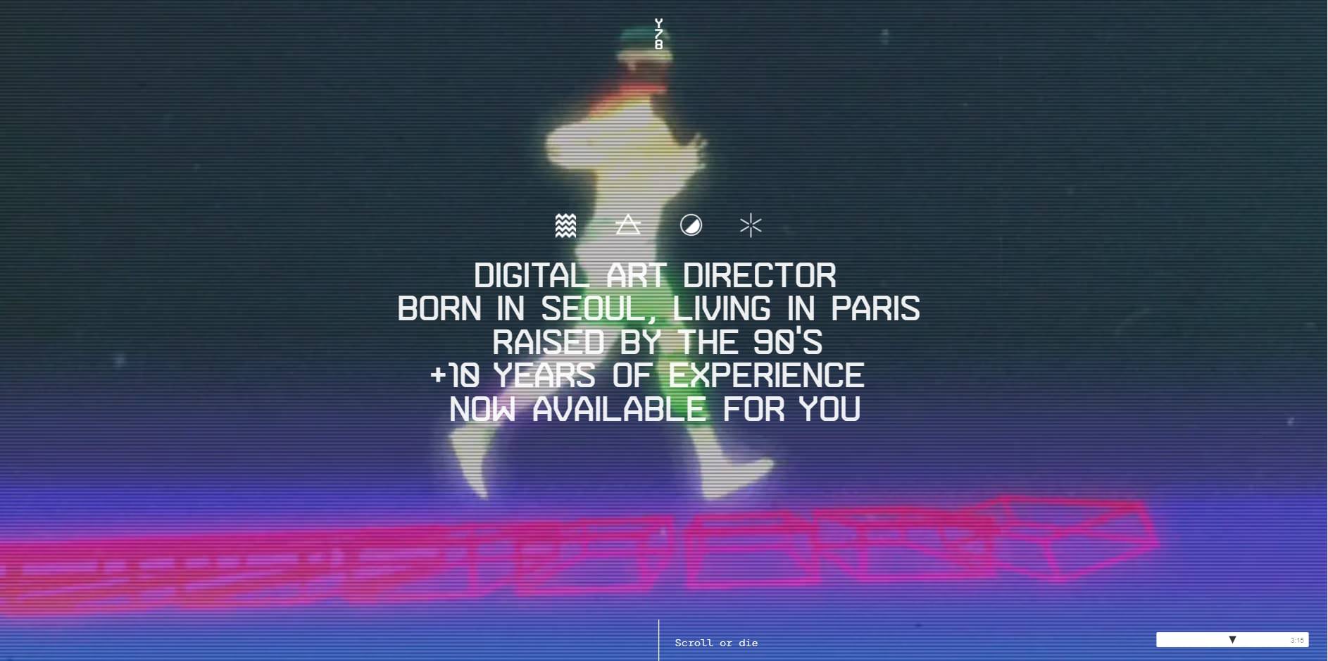
Yul Moreau is a digital art director based in Paris. His website speaks of his ingenuity in UX and UI design.

Upon entering the site, you’ll be greeted with immersive videos in the background. His short bio in white sans serif font is in the foreground.

Scrolling a little bit more and you’ll find well-presented projects in big pictures and short video explainers. Overall, his website is a carefully curated experience.

Robin Mastromarino

Robin Mastromarino

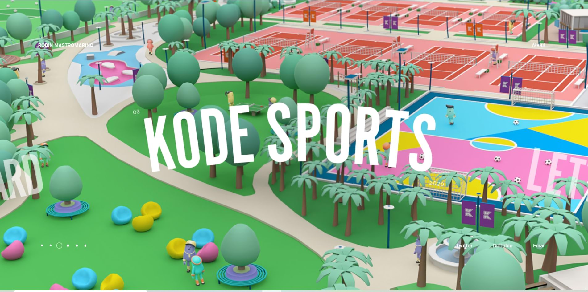
Robin Mastromarino is an interactive designer from Paris. His works vary in style. Some are high-quality photos. Others are vector and 3d images. Images are big and take up the whole space, and Robin did a great job curating them in beautiful slides.

There’s no doubt why the website has been a winning favorite from the award-recognizing website “awwward.”

Ben Mingo

Ben Mingo

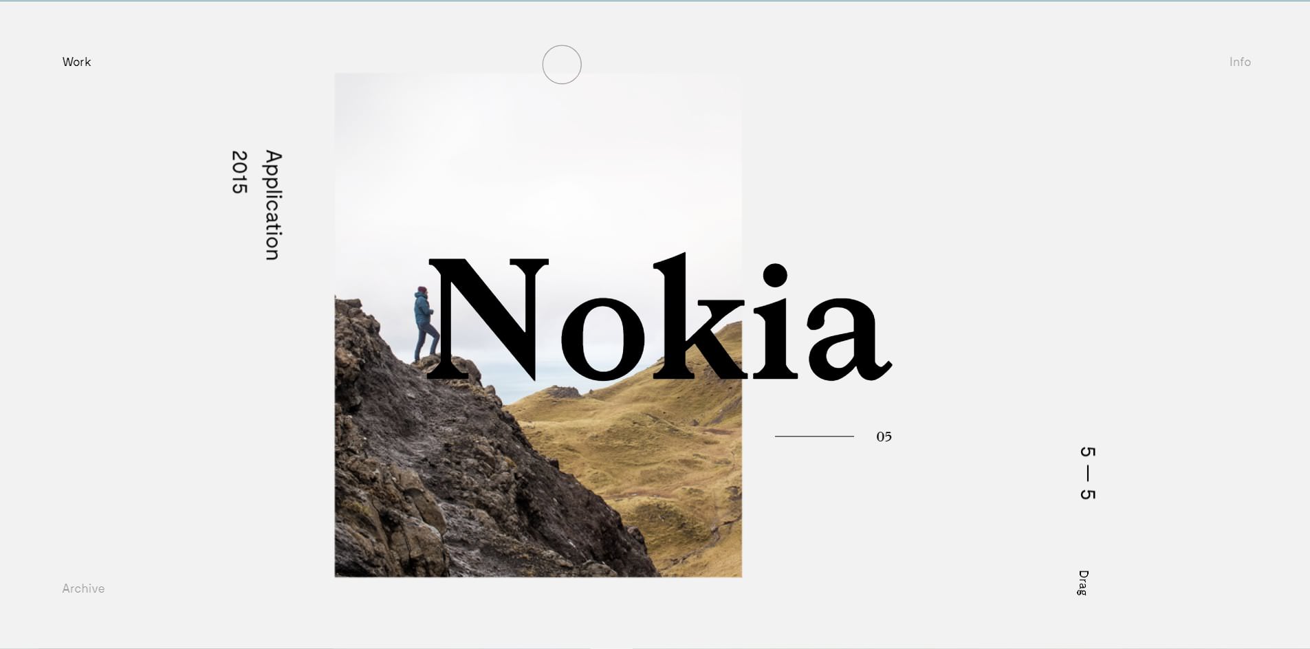
Ben Mingo has worked with big brands like Nokia. He’s a freelance designer from Southern California, and he also operates under a design studio called Basic.

But his website is far from basic. It’s unique and interactive — the mouse cursor blends with the website design, where the dominating color is black and white. Projects are well-curated with lots of sample pictures. So visitors and potential clients will have fun navigating through the site.

Kuon Yagi

Kuon Yagi

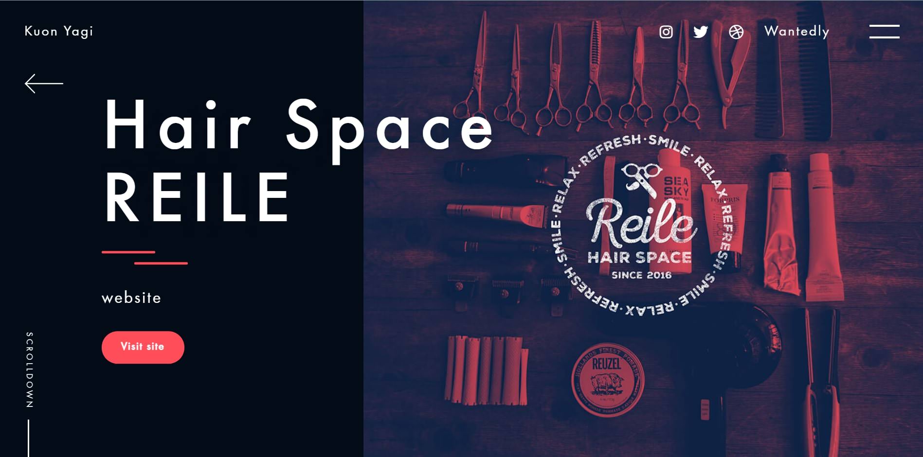
Kuon Yagi is a Japanese freelance web designer and mark-up engineer. His portfolio includes big, bold white letters and shades of red.

Kuon did not just typically display the pictures, but they come and go every time you scroll through, providing an animated experience.

Julie Bonnemoy

Julie Bonnemoy

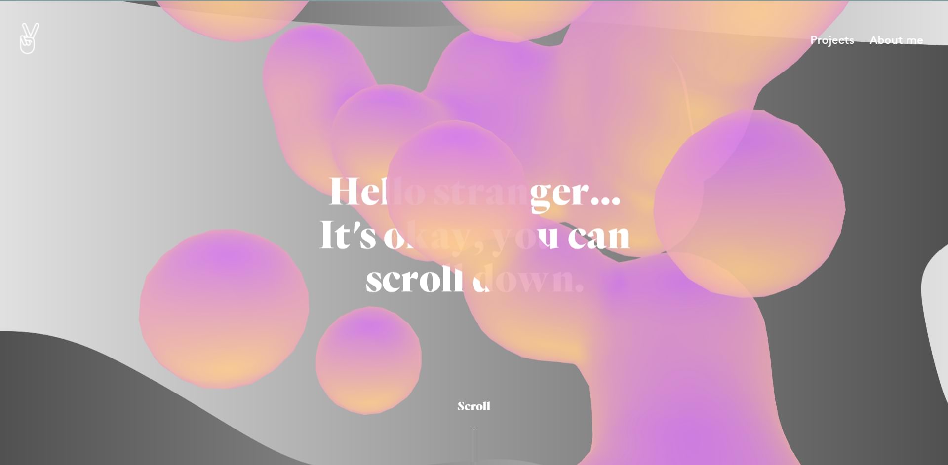
Julie is a freelance graphic designer living in Amsterdam, Netherlands. Her website boasts several projects which showcase her design ability.

But more importantly, the website design itself is visually arresting. The front page boasts animated pink bubbles dancing in the background. The colors have fade-in fade-out effects. And whenever you point the cursor to the images, it produces a rippling effect.

Étienne Godiard

Étienne Godiard

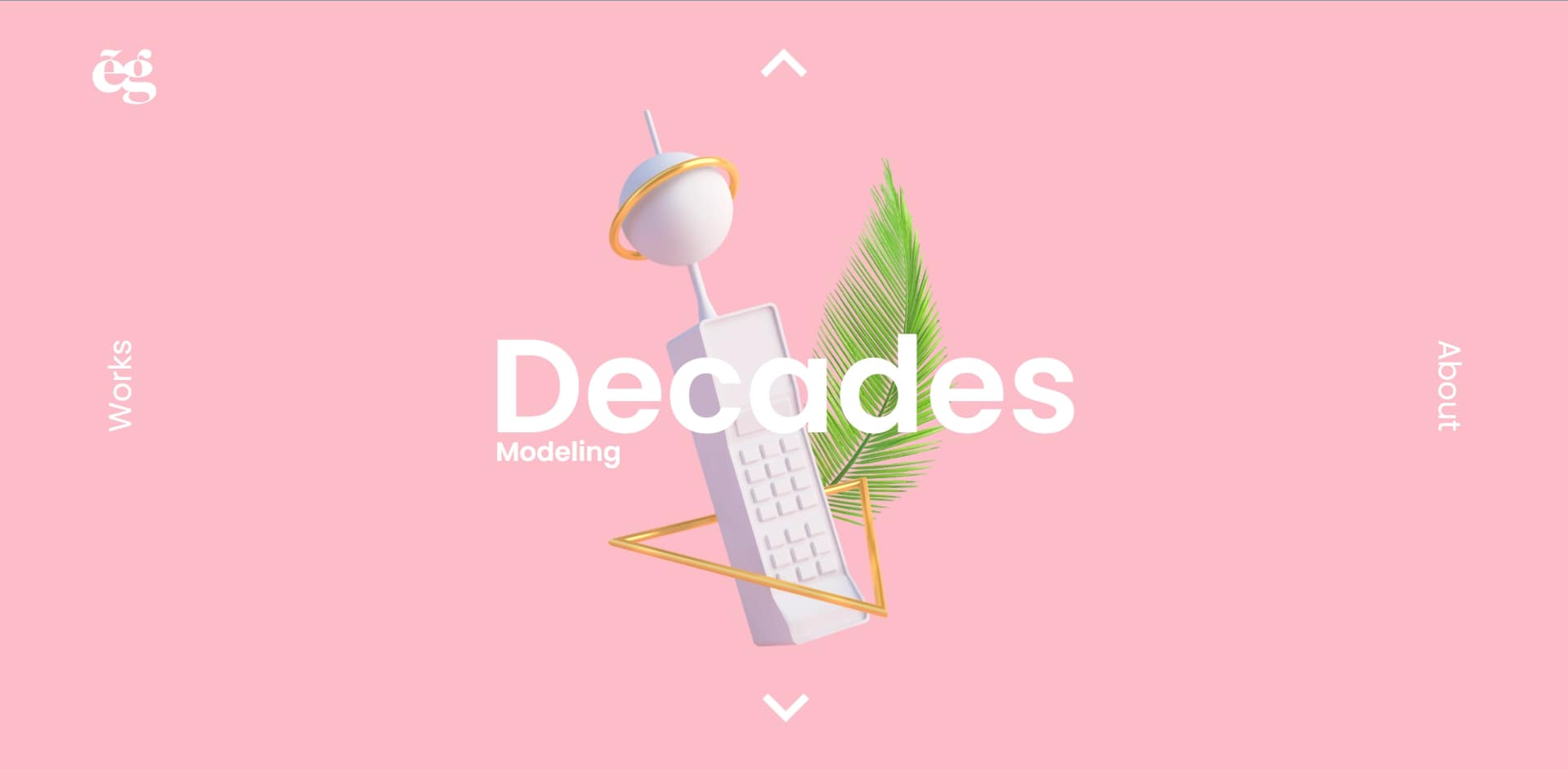
The concept on Etienne Godiard’s website is simple, but the size and vividness of the picture and the fonts are what make the portfolio alluring enough.

Etienne is a visual designer based in Paris, and she specializes in technology brands. The website is laden with different colors covering the whole page. It changes depending on the project it showcases, and each project shows embossed pictures of her work samples.

Koco

Koco

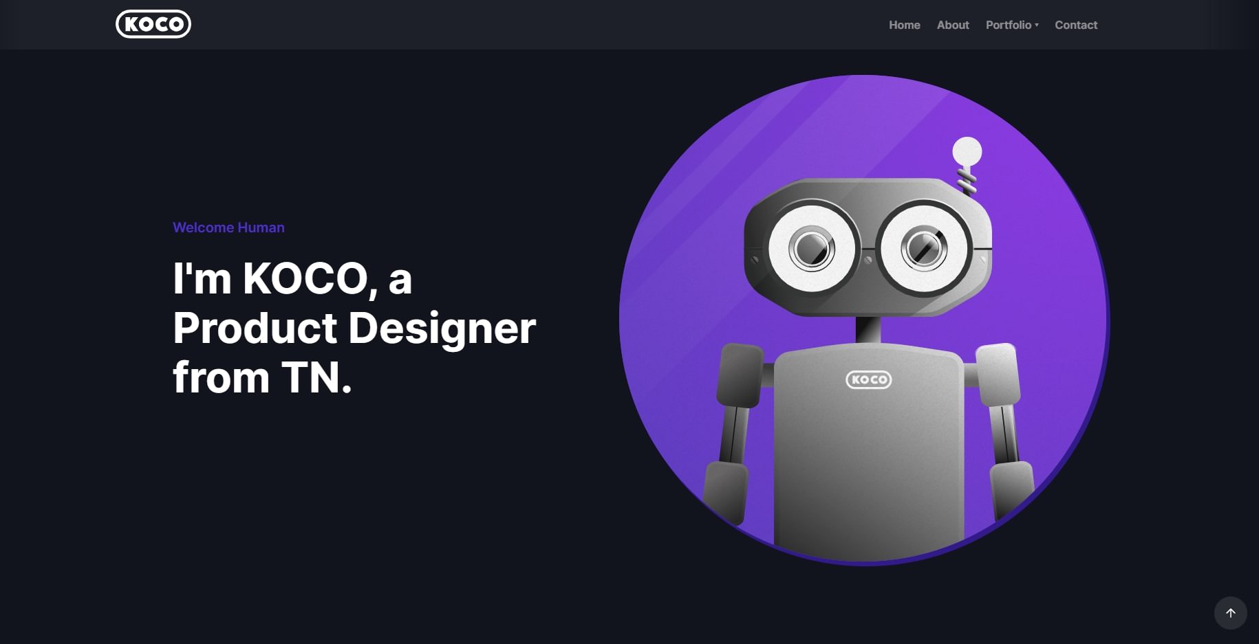
KOCO is short for Kochenburger Company. Michael Kochenburger is a freelance product designer. He has an extensive work project

Black is not the usual color for a website, but KOCO nailed this unusual display. The texts and pictures are clear despite the black background. And the best part is how clean the arrangement of all his design projects makes the website so easy to navigate.

Dot Lung

Dot Lung

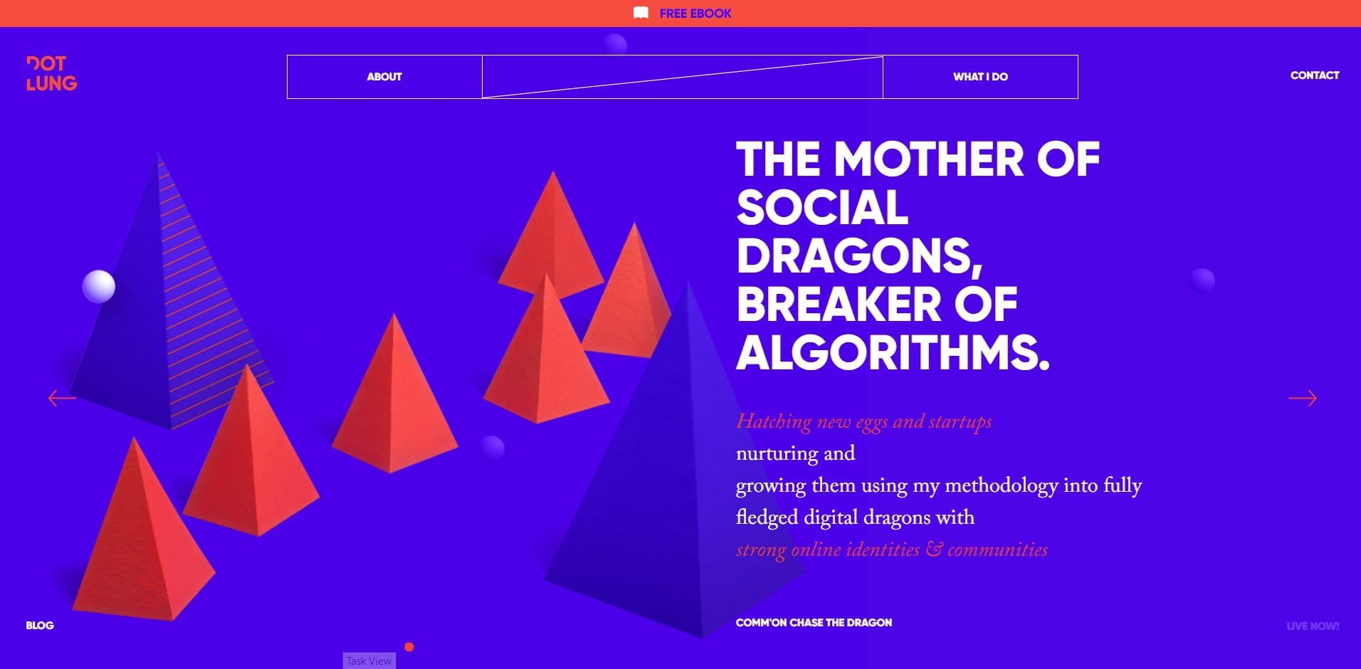
Dot Lung is a social media expert. Her website is one of a kind due to the contrasting colors of purple and neon orange.

It’s not funny to look at. In fact, the difference in colors is a wow factor. Plus, the 3d shapes and images of her favorite figure, unicorn, are well placed along with the site, creating an otherworldly experience.

Sofia Papadopoulou

Sofia Papadopoulou

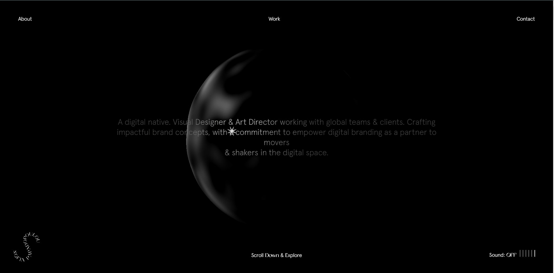
Sofia Papadopoulou is a visual designer and an art director. Black is the theme of her portfolio. But what makes it uniquely good is the use of shades and light. The mouse cursor acts as a flashlight that helps shine the words brighter. Plus, in the background sits an abstract moving black or white figure. There’s no doubt why this portfolio hoards website awards since 2017.

Final Thoughts

Ready to take on the challenge of making your portfolio unique? But to make your brand stand out, you must carefully consider which elements go in and which should be left out. Meaning, all content is well-curated for future clients to have a seamless viewing experience.

First, you need to integrate your personality. Your name, logo, slogan, or even colors must reflect your personality and your services. You can design a logo through logo makers for a small amount. And some of the branding designs can be crafted in free services like Canva, Visme, and Adobe. It’s where you can choose slogans and colors to your liking.

Afterward, consider placing only the most important, relevant, and the best projects — the ones that stand out. Because a portfolio is not a detailed history of your professional work, it only acts as an attractive pedestal to lure clients.

Over to you, write in the comments things you consider for your website. Do these portfolio samples inspire you? Or what factors did not sit right with your design taste? Share in the comments.

(This guest post is written by Marvin Espino for Hongkiat.com. Marvin has been writing since high school. A background in journalism marked a career in reporting and freelance writing. He has written several articles on marketing, technology, and small businesses on BrandCrowd (brandcrowd.com). Outside work, Marvin reads a lot and hoards well-written pieces for inspiration. And he sings and bakes goodies too.)

The post Showcase of 10 Talented Freelance Designers (And Their Portfolios) appeared first on Hongkiat.