Is There a Perfect Solution to a Design Problem?

You’re probably thinking of your own version of the “perfect” design. Whatever it is, you probably have fond, nostalgic feelings around it, and would likely defend its rightful place among the best in the world.

The thing is, there are probably some people who share your opinion, but many more who don’t. This is perfectly okay, because it means that you as a designer have even more opportunities to reach your own special niche audience.

Don’t Think Of Everyone

You don’t have to try to make that “perfect design” that will appeal to everyone. I can’t even imagine what that would look like, but it likely would be terrible.

Why? Because people have such different expectations that trying to fulfill them all is always going to fail miserably.

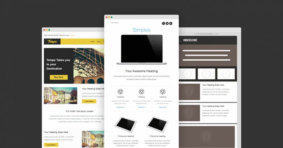
This is why generic designs never sell as well as many clients seem to think they will.

The next time your client insists that you try to reach a more “general” audience with your design, remind them that no one wants to bother with something that’s made with “everyone” in mind.

Think about it: what else is made for “everyone”?

Let’s see… car dealerships (with a thousand different choices and options), hospitals and health care facilities (with multiple specialists to cater to virtually anyone’s particular problem), newspapers (with hundreds of sections for people to flip right to the information that interests them).

Do you see a pattern here? Even things that are supposedly for everyone have many, many sub-categories, so that “everyone” can filter themselves into more easily manageable groups.

What You Want Vs. What Is Best

You have to line up your message with the needs of your niche audience. If this happens to include your own needs, then it will be easier for you to engage personally with whatever it is you’re selling.

There’s a lot to be said for being able to stomach the work you must do as a designer. If you hate the message you’re sending out, perhaps you need to question whether or not you need to find new clients.

The relationship between designer and client should be symbiotic, and also sync up with whatever it is your client’s target market is looking for.

Which Version Is The “Right” One?

There is never one perfect solution to a design problem that will satisfy absolutely everyone. There are only a series of perfect solutions, each one tailor-made to fit a very specific group of people – sometimes extremely specific.

Malcolm Gladwell famously outlined this tendency of ours to prefer a multitude of different solutions in his legendary TED talk about spaghetti sauce.

He gave examples of the spaghetti sauce manufacturer, Prego, that stumbled upon a completely untapped market when it began offering “chunky” spaghetti sauce, in addition to the thinner, more traditional Italian-style sauces.

To use an even more specific example of multiple solutions to problems, most cat owners are perfectly happy training their cat to use the litter box.

Some owners, on the other hand, choose to take things a step further, and actually hire someone to train their cat to use the toilet. That’s right. There are cats who are actually potty trained.

Quite literally, there is a product or service out there that caters to every possible need.


Don’t confuse your personal favorite designs with the one your target audience is hungry for. Make sure you choose a market that you understand and you can satisfy without selling your soul.

Figure out that unique, perfect solution to your clients’ needs, and the needs of their customers, and everything will be just “perfect” from there.

The post Is There a Perfect Solution to a Design Problem? appeared first on Speckyboy Design Magazine.

Did you miss our previous article…
https://www.1clanek.info/?p=960

An Introduction to the WordPress theme.json File

As the WordPress Gutenberg block editor has evolved, theme developers have been encouraged to integrate it into their work. But in some ways, the editor itself is still a work in progress. That has led to frustration.

While including some features have been simple enough, there are challenges. Among the biggest headaches have been customizing block styles and setting up default color palettes.

These items have to be declared and styled in separate parts of a theme. When you need to make changes, that could mean editing multiple files. And if you switch to a new theme, you’ll have to recreate it all from scratch.

The solution? Enter the WordPress theme.json file. It aims to be an all-encompassing place for styling the block editor on both the front and back ends.

Today, we’ll take a look at what theme.json can do and how it will benefit WordPress theme developers. Let’s get started!

Bringing Block Styles and Defaults Under One Roof

According to the Block Editor Handbook, the rationale behind theme.json is to provide “a canonical way to define the settings of the block editor”. In practice, it offers theme developers granular control over how various blocks are styled and what options are available to users in the back end.

This allows for setting sitewide defaults for styling colors, fonts, and even the editor itself. But it also enables developers to go deeper and manage things on a per-block basis.

With theme.json, it’s possible to account for one-off situations where a specific block has different defaults than the others. For instance, if you wanted to provide a unique default font size for the Columns block, you can do so within this file. Likewise, you might also remove spacing options from that same block.

The result is a block editor that is more closely aligned with the theme. Developers no longer have to settle for Gutenberg’s out-of-the-box defaults or deal with clunky workarounds. In addition, they can set parameters for how users can manipulate blocks in an easier-to-maintain manner.

And now for the “magic” part: WordPress will read the settings in your theme.json file and output the necessary CSS for you. There’s no need to hack away at your stylesheet and only one file to change. How cool is that?

There are also some performance benefits. Normally, customizing block styles within the editor means both the original and edited versions are loaded in.

As the Handbook states, “…if a theme and a user set the font size for paragraphs, we only enqueue the style coming from the user and not the theme’s.” Fewer lines of CSS mean faster load times.

Prerequisites

Before we start configuring our theme.json file, there are a few requirements to get out of the way:

WordPress 5.8 and above is required.

The file should reside in your theme’s root directory. For example: /wp-content/themes/mytheme/theme.json

The available settings are expected to grow over time and some are experimental. Thus, you may need to install the official Gutenberg plugin to access certain items.

Still, there are plenty of goodies to play with! Let’s explore a basic example.

Creating a Basic theme.json File

As its name indicates, the theme.json file is written in JSON. And, once you have a basic template, it’s possible to edit or add to the file by following the established syntax.

Eventually, one can envision a vast array of boilerplates and code generators for developers to use. For this demo, we used the Gutenberg Theme.json Creator. It provides a simple interface for generating a custom file.

Goals

Our mission will be to clean up the color options on our website. By default, there are simply too many possible colors a user could choose from – including creating their own custom hues.

That could lead to an inconsistent user interface. Therefore, we’ll scale things back to just our brand’s color palette.

The WordPress block editor with a full palette of color options.

To do so, we’ll tweak the following in Gutenberg Theme.json Creator:

  • Disable “Custom Colors” and “Custom Gradient” options;
  • Add a custom color palette with our brand’s colors;

Now, we can copy the generated output into a new theme.json file, which we’ll save to the root directory of our theme (we’re using Twenty Nineteen here).

The Result

Our custom theme.json file worked as expected. The simplified color palette we configured has replaced the default setting. And the user’s ability to create custom hues and gradients has been removed from the block editor.

In addition, WordPress has written all of the required CSS for us. Thus, any color changes we make in the block editor are also reflected on the front end.

Color palette changes reflected on the front end of a website and within the CSS.

Finally, because all of this resides in a single file, making future changes and additions will be a relatively simple process.

Going Further with theme.json

We’ve only scratched the surface of what theme.json is capable of. If you’re looking to further your knowledge, check out these helpful resources:

The post An Introduction to the WordPress theme.json File appeared first on Speckyboy Design Magazine.

Did you miss our previous article…
https://www.1clanek.info/?p=956

Weekly News for Designers № 616

51 git commands that you’ll ever need to get started with Git – This handy reference provides need-to-know git commands.
Example from 51 git commands that you'll ever need to get started with Git

Repetitive Typography Animation – Check out this experimental typography animation, where words get duplicated several times.
Example from Repetitive Typography Animation

Typographica Library – Level up your typography game with this digital bookshelf of type and lettering resources.
Example from Typographica Library

8 Free Maintenance & Coming Soon Plugins for WordPress – Use these free plugins to inform your visitors about ongoing maintenance or a brand-new site.
Example from 8 Free Maintenance & Coming Soon Plugins for WordPress

CSS Squid Game – Squid Game challenges, recreated using pure CSS.
Example from CSS Squid Game

Expandable Sections Within a CSS Grid – Learn how to create a full-width, expandable section that works beautifully with CSS Grid.
Example from Expandable Sections Within a CSS Grid

For Casual Users, Information on New WordPress Features Can Be Hard to Find – Some ideas for closing the WordPress knowledge gap.
Example from For Casual Users, Information on New WordPress Features Can Be Hard to Find

HOCUS :FOCUS – Get into the Halloween spirit with this keyboard accessibility horror game.
Example from HOCUS :FOCUS

Lorem.space – This placeholder image API features movie posters, fashion images and other real-world items.
Example from Lorem.space

2021 Design Tools Survey – Take this annual survey and share your experience with design tools.
Example from 2021 Design Tools Survey

Is It Really Worthwhile Having a Personal Portfolio? – Why a portfolio site may not be as valuable as it used to be.
Example from Is It Really Worthwhile Having a Personal Portfolio?

Nord Design System – Get inspired by this publicly-available design system from Nordhealth.
Example from Nord Design System

Evaluating Clever CSS Solutions – Clever CSS tricks are nice, but usually not necessary.
Example from Evaluating Clever CSS Solutions

Definitive edition of “How to Favicon in 2021” – A look at implementing favicons that work across devices and use cases.
Example from Definitive edition of "How to Favicon in 2021"

Defining a Vision for Your Web Design Business – A look at some ways to better understand who you are and what you want out of web design.
Example from Defining a Vision for Your Web Design Business

uiGradients – Find your favorite gradients with this collection of copy-and-paste styles.
Example from uiGradients

Compressio – Save precious bandwidth with this image compression tool.
Example from Compressio

The post Weekly News for Designers № 616 appeared first on Speckyboy Design Magazine.

Did you miss our previous article…
https://www.1clanek.info/?p=938

30 Free Responsive Email & Newsletter Templates

Newsletters have been a critical area of marketing since the inception of the web. They have been and continue to be an essential method of communication for brands and businesses to share new content and product updates. Even though social media is hugely popular, there is no replacement for email. Most users would rather keep their business within their private inbox – and their personal lives on social networks.

When you consider that there will be an estimated 330 billion emails sent and received per day next year (2022), and that over 90% of those emails will be checked or opened on a mobile device, the importance of using a responsive template for your email marketing campaigns has never been higher.

As you will probably already know, designing simple HTML emails is challenging in itself. But creating emails that work well across all email clients and also work on all of the various mobile devices and sceeen sizes is even more challenging.

Thankfully, there are many designers and developers that have done most of the work for you by creating easy to edit and free responsive newsletter templates that work well on all email clients and devices. You will find the best of them below.

Pre-Designed Responsive Newsletter Templates

Briar Free Responsive Email Template (by Slicejack)

Briar is a free responsive newsletter template with a simple design. It has been thoroughly tested with Litmus and EmailOnAcid, and works perfectly well in all email clients. This template is MailChimp-ready.

Green Village Free HTML Template (by Pixelbuddha)

Green Village is a clean pre-designed email template that is suitable for various purposes and business types. The download package includes both a layered PSD template and the HTML source files.

Green Village HTML free responsive newsletter template email

Olivia eCommerce Responsive Email Template (on Envato Elements)

Compatible with almost all email service providers, Olivia is a responsive newsletter template that comes bundled with thirteen pre-designed modules so you can create your newsletter exactly how you want it.

Olivia eCommerce responsive newsletter template email

Bussy Free HTML Email Template (by MailBakery)

Bussy is a free newsletter template that has been designed with a simple layout and dark blue and soft red color scheme, making it ideal for corporate business.

Bussy Free HTML responsive newsletter template email

Passion Free Responsive Email Template (by Pixelbuddha)

Modern and clean, Passion is a multi-purpose email template that various business types can use. It is compatible with both MailChimp and CampaignMonitor, and works in all major email clients.

Passion free responsive newsletter template email

Madeline eCommerce Responsive Email Template (on Envato Elements)

Easy to customize and bundled with nine pre‑designed modules, Madeline is the perfect responsive newsletter template for fashion and eCommerce businesses. You can create your newsletter without writing a single line of code by using the built-in email builder.

Madeline eCommerce responsive newsletter template email

MailPortfolio Free Responsive Email Template (by Slicejack)

With a simple and clean design, MailPortfolio is a free responsive email newsletter for sending personal portfolio or blogging updates to your readers and followers.

MailPortfolio free responsive newsletter template email

Emailology Responsive Email Template (by Email On Acid)

Released by Email on Acid, Emailology is a pre-designed template that offers three layouts that trigger based on the screen’s width. By default, it supports either one, two or three columns, and as you activate each media query, the template converts to a one column layout for mobile devices.

Emailology free responsive newsletter template email

Way Mail Email Template (on Envato Elements)

Way Mail is a collection of email templates that comes with over thirty pre-designed modules. Responsive, compatible with all major email service providers, and also includes the PSD templates of the original design.

Way Mail responsive newsletter template email

Creative Boost HTML Email Template (by MailBakery)

Creative Boost is a free newsletter template from MailBakery that is fully responsive and tested in all major email clients. It comes with a dark color scheme that would be perfect for most types of businesses.

Creative Boost HTML free responsive newsletter template email

Free Material Design HTML Email Template (by Paul Goddard)

Created by Paul Goddard and based on the design aesthetics of Google’s Material Design, this simple newsletter template has been fully Litmus tested and is completely free to use.

Material Design HTML free responsive newsletter template email

Dazzle Photography Email Newsletter Template (on Envato Elements)

Even though the minimally designed Dazzle newsletter template has been specifically built for photographers, it could easily be edited and used by any creative person or agency. It comes with an online builder, so you don’t need to know any coding to design your newsletter.

Dazzle Photography free responsive newsletter template email

Daily Times Email Template (by Email On Acid)

The free newsletter template Daily Times is perfect for online newspapers, magazines, and personal bloggers to share content with their followers and readers. It can even deliver dynamic ads when paired with LiveIntent’s software.

Daily Times free responsive newsletter template email

Shopilicious Free HTML Email Template (by MailBakery)

Thoroughly tested in all major email clients, Shopilicious is a free responsive newsletter template that has been designed specifically for eCommerce stores.

Shopilicious HTML free responsive newsletter template email

Litmus Responsive Email Templates (7 Templates, by Stamplia)

Designed by Stamplia and released by Litmus, this is a collection of seven pre-designed responsive email templates that been thoroughly ‘Litmus-tested.’ They also come with the PSD source files.

Litmus HTML free responsive newsletter template email

Barebones Responsive Newsletter Templates

Cerberus Responsive HTML Email Templates (3 Templates, by Ted Goas)

Cerberus is a small collection of robust and thoroughly tested barebones HTML email templates. The Fluid template is percentage-based and shrinks on mobile screens, the Responsive template uses media queries, and finally, there’s a Hybrid template which uses a blend of both percentages and media queries.

Antwort Responsive Layouts for Email (3 Templates)

Antwort offers a small collection of barebones responsive layouts for email that fits and adapts to client widths. The one, two, and three column templates work perfectly well on all major desktop and mobile email clients. The templates also come with extensive documentation.

Email Blueprints HTML Email Templates (6 Templates, by MailChimp)

MailChimp released this collection of six bare-bones responsive templates, entitled Email Blueprints, so that they could be used as a solid starting point for designing email newsletters. The templates include some MailChimp specific template language elements, but they can be easily removed if you are not a MailChimp user.

Basic Free HTML Email Template (by MailBakery)

Designed to be used as a base for your own responsive email newsletters, Basic is a free to download template that comes with just enough CSS and a simple layout so that you can get started quickly.

Responsive Table-Based Email Template (by Phil Wareham)

This barebones template has been based on MailChimp’s Email Blueprints and the Email Boilerplate from Sean Powell. It is a responsive table-based email template that includes MailChimp merge tags, but they can be removed if you don’t need them.

Responsive Newsletter Frameworks

Foundation for Emails (11 Templates)

Previously called Ink, Foundation for Emails is a responsive email framework from ZURB that includes a flexible grid system and some simple UI elements for rapid email prototyping. Foundation for Emails also has 11 responsive email templates available.

MJML Responsive Email Framework (21 Templates)

MJML is a markup language that has been designed to reduce the pain of coding a responsive email. Its semantic syntax makes the language straightforward, while its rich standard components library shortens your development time and lightens your email codebase. MJML’s open-source engine takes care of translating the MJML you wrote into responsive HTML.

Bojler Responsive Email Framework (2 Templates)

The Bojler Framework has been built by the team at Slicejack to make it easier for you to create lightweight and responsive newsletters. The framework has been thoroughly tested on numerous email clients and devices.

The HTML Email Framework (3 Templates)

The HTML Email Framework has been developed to help you build responsive HTML email templates using pre-set grid options and simple components needed for building responsive HTML email templates. It support’s over 60+ email clients.

Maizzle Framework for Rapid Email Prototyping (5 Templates)

Powered by Tailwind CSS and a Node.js build system, Maizzle is a modern framework for developing HTML emails and newsletters. The framework doesn’t use tags like row or column; instead, you use real HTML tags that you style with Tailwind CSS’s utility classes.

The post 30 Free Responsive Email & Newsletter Templates appeared first on Speckyboy Design Magazine.

Did you miss our previous article…
https://www.1clanek.info/?p=923